Vancouver [Quenched]
Moderator: Cartographers
Forum rules
Please read the Community Guidelines before posting.
Please read the Community Guidelines before posting.

-
porkenbeans

- Posts: 2546
- Joined: Mon Sep 10, 2007 4:06 pm
Re: Vancouver Map [D, GP, GR] (Aug4 - p21)
I was asked to come give my input. I am happy to do it. at what stage of the process, that the foundry decides to do it, is up to them.the.killing.44 wrote:a) http://www.conquerclub.com/forum/viewto ... 27&t=78887porkenbeans wrote:Mr. benn, I am on the foundrys review list. If you want me to weigh in earlier, you guys should send the pm earlier.MrBenn wrote:Pork - it would be better if you were to engage with maps a little earlier in the process
I prefer the map as it stands - the increased saturation does little for me.
Also, If you do not see the improvement, what can I say, but that, I believe you may want to get your eyes examined.
That's the similar mailing list for maps that are just entering the Foundry Proper. I suggest you sign up.
b) "the improvement" is a subjective matter.
.44
Get your act together guys and girls. Stop chiding people that respond to your request for reviews. Not very polite, and smacks of high noses.
And yes, it is indeed a subjective matter. I suppose that there will always be those that prefer fords' over Rolls Royces'.
Weather shakey uses any of my suggs is totally up to her. I am only making suggestions as I was asked to do. Although I would prefer sometimes (if I like the map) just go ahead and show, rather than try to explain my sugg.
Last edited by porkenbeans on Mon Aug 10, 2009 10:20 pm, edited 1 time in total.

-
the.killing.44

- Posts: 4724
- Joined: Thu Oct 23, 2008 7:43 pm
- Gender: Male
- Location: now tell me what got two gums and knows how to spit rhymes
- Contact:
Re: Vancouver Map [D, GP, GR] (Aug4 - p21)
… which is why I linked you to the other spot where we're putting out requests for input?porkenbeans wrote: at what stage of the process, that the foundry decides to do it, is up to them.
-
porkenbeans
- Posts: 2546
- Joined: Mon Sep 10, 2007 4:06 pm
Re: Vancouver Map [D, GP, GR] (Aug4 - p21)
I am already on the reviewers list. If the foundry wants the reviews earlier, then just go ahead and call for them earlier.the.killing.44 wrote:… which is why I linked you to the other spot where we're putting out requests for input?porkenbeans wrote: at what stage of the process, that the foundry decides to do it, is up to them.
Don't ask me here, and then after my review, tell me that I should have come sooner.
NOT VERY COOL ...or smart.
-
the.killing.44
- Posts: 4724
- Joined: Thu Oct 23, 2008 7:43 pm
- Gender: Male
- Location: now tell me what got two gums and knows how to spit rhymes
- Contact:
Re: Vancouver Map [D, GP, GR] (Aug4 - p21)
You are not on the Preliminary Review List, you are on the Final Review list. Different things — did you click the link I posted above?porkenbeans wrote:I am already on the reviewers list. If the foundry wants the reviews earlier, then just go ahead and call for them earlier.the.killing.44 wrote:… which is why I linked you to the other spot where we're putting out requests for input?porkenbeans wrote: at what stage of the process, that the foundry decides to do it, is up to them.
Don't ask me here, and then after my reivew, tell me that I should have come sooner.
NOT VERY COOL ...or smart.
-
porkenbeans
- Posts: 2546
- Joined: Mon Sep 10, 2007 4:06 pm
Re: Vancouver Map [D, GP, GR] (Aug4 - p21)
Maybe you could tell me what the difference is in the two lists. Is the first for mapmakers, and the second for players ?

Re: Vancouver Map [D, GP, GR] (Aug4 - p21)
Kindly do not hijack my thread 
I have the graphics stamp.
I spent this afternoon pulling gremlins out of my XML and repairing their damage. I'm not sure how they got in there, but it finally ran through as 'valid' on the xml checker, so now I just have to check that it actually does what I want it to do.
I have the graphics stamp.
I spent this afternoon pulling gremlins out of my XML and repairing their damage. I'm not sure how they got in there, but it finally ran through as 'valid' on the xml checker, so now I just have to check that it actually does what I want it to do.
Current Map Project: Tokyo
-
sully800

- Posts: 4978
- Joined: Wed Jun 14, 2006 5:45 pm
- Gender: Male
- Location: Bethlehem, Pennsylvania
Re: Vancouver Map [D, GP, GR] (Aug4 - p21)
The final review is pretty much to check for errors and very minor improvements. No gameplay changes (unless a mistake of some sort was missed) and no broad graphical changes. Those types of suggestions are much better in the preliminary review when a map has not been fine tuned.porkenbeans wrote:Maybe you could tell me what the difference is in the two lists. Is the first for mapmakers, and the second for players ?
To be fair, I wouldn't classify your changes as broad since you changed nothing in the layout. Though I think you might be better suited to adjust the images as you did, and then post a list of changes to explain what you did and why you did it. This will help the artist to recognize what could be changed and a reason to do so. I do like that you take the time to show the changes yourself, because it is much clearer than many posters who don't illustrate their examples. But as I said, the reasoning is what is really important to the foundry process, because without reason it just becomes a decision between two equally good images.
Re: Vancouver Map [D, GP, GR] (Aug4 - p21)
Just wanted to pour out my congratulations and support for the finalization steps of this map!! and I look forward to playing it with the Map's Creator once complete.
Great Job Shakeycat, and good luck!
Lzrman
Great Job Shakeycat, and good luck!
Lzrman
-
porkenbeans
- Posts: 2546
- Joined: Mon Sep 10, 2007 4:06 pm
Re: Vancouver Map [D, GP, GR] (Aug4 - p21)
Thanks for the info.sully800 wrote:The final review is pretty much to check for errors and very minor improvements. No gameplay changes (unless a mistake of some sort was missed) and no broad graphical changes. Those types of suggestions are much better in the preliminary review when a map has not been fine tuned.porkenbeans wrote:Maybe you could tell me what the difference is in the two lists. Is the first for mapmakers, and the second for players ?
To be fair, I wouldn't classify your changes as broad since you changed nothing in the layout. Though I think you might be better suited to adjust the images as you did, and then post a list of changes to explain what you did and why you did it. This will help the artist to recognize what could be changed and a reason to do so. I do like that you take the time to show the changes yourself, because it is much clearer than many posters who don't illustrate their examples. But as I said, the reasoning is what is really important to the foundry process, because without reason it just becomes a decision between two equally good images.
I understand exactly where you are coming from. Although I have already been discussing my reasons with Shakey in a game that we are playing, I will post them here as well.
OK, I basically created 3 new layers.
1st. layer -I selected the water with the wand, and filled it with white. Then I threw on a drop shadow, inner shadow, color overlay, and gradient. Each one of those have many different transfer mode settings.
2nd. I selected the water again, but inverted it, so as to get a layer for the land. Then I threw on a bevel and drop shadow.
#3rd. I made a dup. of that layer. and threw on a bevel and gradient.
As to the reasons, I wanted to make the map stand up a bit. Give it some depth and take it from flat to FAT, if you follow my meaning.
imagine running your hand over the map. through your eyes, you can actually FEEL the relief.
These very, very subtle tweeks, are aimed at trying to accomplish this.
I suppose that I could just post a shitload of suggs, but in the time it takes to do that , I could just go ahead and illustrate what I mean. And, provide the product of my reasoning. This is better I think, than just spouting off what you would do. I see a bunch of that unproductive crap, plugging the pipeline in the foundry, as it is.
I guess that When it comes down to it, I would like to be considered the polisher at the end of the car wash. I did NOT make the car, but I can polish up, just about anything that comes down the line.
-
porkenbeans
- Posts: 2546
- Joined: Mon Sep 10, 2007 4:06 pm
Re: Vancouver Map [D, GP, GR] (Aug4 - p21)
I have just noticed a matter that goes to the Westminster area. I think a color change is needed there. Red or blue maybe. The green color it has now is too close to the other bonus area next to it.
Re: Vancouver Map [D, GP, GR] (Aug4 - p21)
Porky,
I wanted a colour in there that would flow with the colours of the map. A red or blue would stand out too much, draw the eye. The green fits. When I run it through the vischeck, it usually looks closer to Richmond's orange than Tricities' green. And if one looks at the legend, the single-territory bonus is noted with the same name, complete with a little picture of it so you know it isn't part of anybody else.
I wanted a colour in there that would flow with the colours of the map. A red or blue would stand out too much, draw the eye. The green fits. When I run it through the vischeck, it usually looks closer to Richmond's orange than Tricities' green. And if one looks at the legend, the single-territory bonus is noted with the same name, complete with a little picture of it so you know it isn't part of anybody else.
Current Map Project: Tokyo
-
Peter Gibbons

- Posts: 1077
- Joined: Wed Sep 10, 2008 9:21 am
- Gender: Male
- Location: Washington, DC
Re: Vancouver Map [D, GP, GR] (Aug4 - p21)
Without getting into the technical weeds on when he should have offered the advice, I will say that I do prefer porkenbeans' more saturated version. If it's too late to change, no problem, because it is great as is--I just think porkenbeans' version is a little more visually appealling.
I don't share his concern, however, about New Westminster.
There's only one (relatively) major concern I have with this map after really examining it. Are Hastings and Downtown adjacent? I've been following this map for several weeks now and I've always thought Downtown was a peninsula extending from Kitsliano. I've presumed that the three rail lines extending into Downtown were either over bridges or via tunnels. But looking at it closely, it appears that Hastings and Downtown connect. To my eyes, that fact (if true) is not clear enough. I don't know how it can be fixed, without distorting the desired geographical shape of the Downtown territory or moving the Downtown station to the west of the territory (which I presume is geographically inaccurate). So I'm pointing out what I think is an issue without really suggesting a solution. Maybe others have ideas? Or maybe I'm the only one that thinks this is an issue???

Re: Vancouver Map [D, GP, GR] (July 29 - p20)
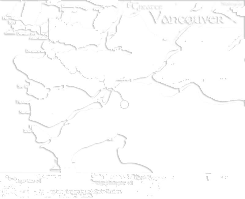
- Click image to enlarge.

That Downtown-Hastings connection should probably be tweaked. You could move the Downtown Station up and to the right, and then move the actual territory number into the sea a bit more.
That's a really good spot by Peter Gibbons

PB: 2661 | He's blue... If he were green he would die | No mod would be stupid enough to do that
-
porkenbeans
- Posts: 2546
- Joined: Mon Sep 10, 2007 4:06 pm
Re: Vancouver Map [D, GP, GR] (Aug4 - p21)
Yes, I have noticed how you have gone against the standard views, of the mapmakers of old. They would put the colors down in a way to produce the greatest visual separation. I was not sure at first , if I really liked your idea of placing the colors down in a fashion that, groups them into like colors. But, upon further study, I realized that this effect had a direct link, to its overall pleasant appearance.shakeycat wrote:Porky,
I wanted a colour in there that would flow with the colours of the map. A red or blue would stand out too much, draw the eye. The green fits. When I run it through the vischeck, it usually looks closer to Richmond's orange than Tricities' green. And if one looks at the legend, the single-territory bonus is noted with the same name, complete with a little picture of it so you know it isn't part of anybody else.
Taking that into account, maybe you could switch the colors for Barnaby and westminster ?
This would still allow for the same flow of colors, but make it more clear that there is a separate bonus there. Since it is such a small area and all.
Also, I see a couple of places where the names could be centered up a touch. Fleetwood and Stevenson. Stevenson could be moved down and to the left, over the water.
Everything else looks good in this respect.
-
porkenbeans
- Posts: 2546
- Joined: Mon Sep 10, 2007 4:06 pm
Re: Vancouver Map [D, GP, GR] (July 29 - p20)
or you could try to fix it by, just enlarging the island towards the right. Then you could shift the name "downtown" and the number circle to the left. This would give you the room that you need to extend the downtown station to the upper left. It may also help to move downtown's southern bridge to the left.MrBenn wrote:Hmm
- Click image to enlarge.
That Downtown-Hastings connection should probably be tweaked. You could move the Downtown Station up and to the right, and then move the actual territory number into the sea a bit more.
That's a really good spot by Peter Gibbons
Re: Vancouver Map [D, GP, GR] (Aug4 - p21)

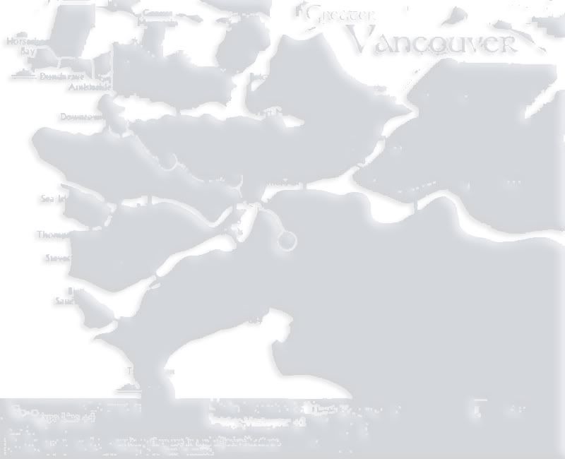
What if I did this? I removed the bridge, and linked Downtown and Kitsilano in a different way, while making the border between Downtown and Hastings more obvious. Moved Downtown station so it doesn't confuse into Kitsilano or Hastings.
Current Map Project: Tokyo
Re: Vancouver Map [D, GP, GR] (Aug4 - p21)
kinda like this ?

i just moved the station up a little but i think its improve both the borders
but it might be clutered
i just moved the station up a little but i think its improve both the borders
but it might be clutered
-
Peter Gibbons
- Posts: 1077
- Joined: Wed Sep 10, 2008 9:21 am
- Gender: Male
- Location: Washington, DC
Re: Vancouver Map [D, GP, GR] (Aug4 - p21)
I like this change as a start. I think that if you also change the curvature of the Canada (green) rail line so that there is an arc toward the west, it would be much better. That way the green line isn't too close to the Kitsilano/Hastings and Kitsilano/Downtown borders.shakeycat wrote:
What if I did this? I removed the bridge, and linked Downtown and Kitsilano in a different way, while making the border between Downtown and Hastings more obvious. Moved Downtown station so it doesn't confuse into Kitsilano or Hastings.
Not sure how you feel about it, but it might also help to expand the size of the Downtown territory a little to the northeast, taking away some of the water area. The Hastings/Downtown border would become even more obvious that way.
I also did notice one other very small issue, which is the Port Moody territory. I'm nitpicking very much here, but do you (or others) think that the army circle should be more toward the geographic center of that territory? If the army circle is below the Port Moody text, it might make people less apt to overlook the Port Moody/SFU connection. Then again, it might make the text in the Tri-Cities bonus region too cluttered, so I'm not totally sold on the change.
Other than that, I think this is totally ready for Beta and really can't wait to play. Since I've joined this site about a year ago, the only two new maps that I've been this excited about were Charleston and Europa.
-
porkenbeans
- Posts: 2546
- Joined: Mon Sep 10, 2007 4:06 pm
Re: Vancouver Map [D, GP, GR] (Aug4 - p21)
Yes, Peter is right about making the Downtown island larger. You have room to the east and west. If the downtown station was clearly inside the borders. I think it would go a long way to fix this issue.
Peter is also correct about the green line. It needs to be moved away from those converging common border lines. I would shift it all the way till it skirts the kits and kerri. text. also that green line has the same issue just south of that spot. The line is partially covering a bridge.
Peter is also correct about the green line. It needs to be moved away from those converging common border lines. I would shift it all the way till it skirts the kits and kerri. text. also that green line has the same issue just south of that spot. The line is partially covering a bridge.
Re: Vancouver Map [D, GP, GR] (Aug4 - p21)
I cannot switch New Westminster and Burnaby's colours.
Here's what it would look like if I did: http://www.atomation.com/~thazzard/fun/gva/greenup.jpg
According to vischeck, it would look like this for colourblind: http://www.atomation.com/~thazzard/fun/gva/visg.jpg
The regular one with light yellow Burnaby looks like this, which offers more clear contrast: http://www.atomation.com/~thazzard/fun/gva/visy.jpg
I knew I made it like that for a reason
Current Map Project: Tokyo
Re: Vancouver Map [D, GP, GR] (Aug4 - p21)
boo vischeck the pictures look the same
and i think that new border works great maybe just drop the Y part a little more and adjust frasierviews border down a pixel or two and the should be perfect
and i think that new border works great maybe just drop the Y part a little more and adjust frasierviews border down a pixel or two and the should be perfect
-
porkenbeans
- Posts: 2546
- Joined: Mon Sep 10, 2007 4:06 pm
Re: Vancouver Map [D, GP, GR] (Aug4 - p21)
I see also.
but look at Richmond and Westminster. they look like the same color. I would be interested to see if the 3 layers that I made would allow you to switch the colors, as I suggested. The extra saturation as some have put it, may just do the trick.
If I upload those 3 layers to photobucket, can't you download and use them ?
I will go ahead and try, then post the links here.
layer 1 -
layer 2 -
layer 3 -
Just overlay these layers on top of what you have, in this order. You can then go back and play with them if you like, but remember to make a dup. so that you will be able to return back to my settings.
Also if you want to clean up these layers just use true white on a brush. paint out the rail lines and then move he rail line layer to the top, over the 3 new layers.
but look at Richmond and Westminster. they look like the same color. I would be interested to see if the 3 layers that I made would allow you to switch the colors, as I suggested. The extra saturation as some have put it, may just do the trick.
If I upload those 3 layers to photobucket, can't you download and use them ?
I will go ahead and try, then post the links here.
layer 1 -
- Click image to enlarge.
- Click image to enlarge.
- Click image to enlarge.
Also if you want to clean up these layers just use true white on a brush. paint out the rail lines and then move he rail line layer to the top, over the 3 new layers.
Last edited by porkenbeans on Fri Aug 14, 2009 7:39 pm, edited 2 times in total.
Re: Vancouver Map [D, GP, GR] (Aug4 - p21)
I'm not sure, Porky, I use Fireworks. And it seems you didn't find my little PNG files But I see what you mean. I'm not so sure my map needs additional saturation, shadows, etc. I rather like that it doesn't assault the eyes. Feel free to browse earlier, more saturated versions on the first page of this thread.
And it's better that Richmond and Westminster, which are on opposite sides of the river, share a colour, than Burnaby, Vancouver, and Tricities which are all together.
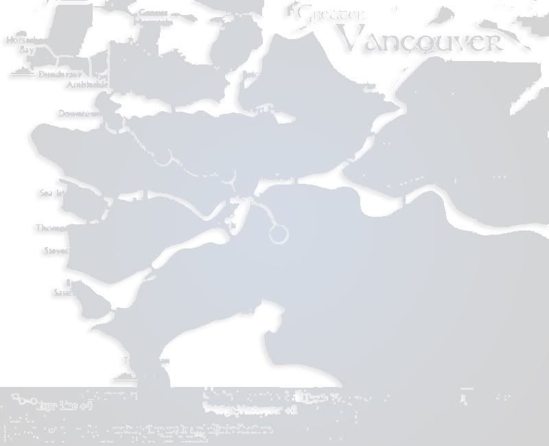
Here's the latest.
And it's better that Richmond and Westminster, which are on opposite sides of the river, share a colour, than Burnaby, Vancouver, and Tricities which are all together.
Here's the latest.
- Click image to enlarge.

- Click image to enlarge.

Last edited by shakeycat on Fri Aug 14, 2009 7:44 pm, edited 4 times in total.
Current Map Project: Tokyo
Re: Vancouver Map [D, GP, GR] (Aug4 - p21)
sorry porkenbeans your versions with your colour are not colour blind friendly
all the colours are different for me on this map and I'm as colour blind as they get
how much MORe ON the fence can you get if someone doesn't want a change on there own art
and it does not affects gameplay or legibility in anyway just except the fact and bow out
all the colours are different for me on this map and I'm as colour blind as they get
how much MORe ON the fence can you get if someone doesn't want a change on there own art
and it does not affects gameplay or legibility in anyway just except the fact and bow out