MrBenn wrote:...
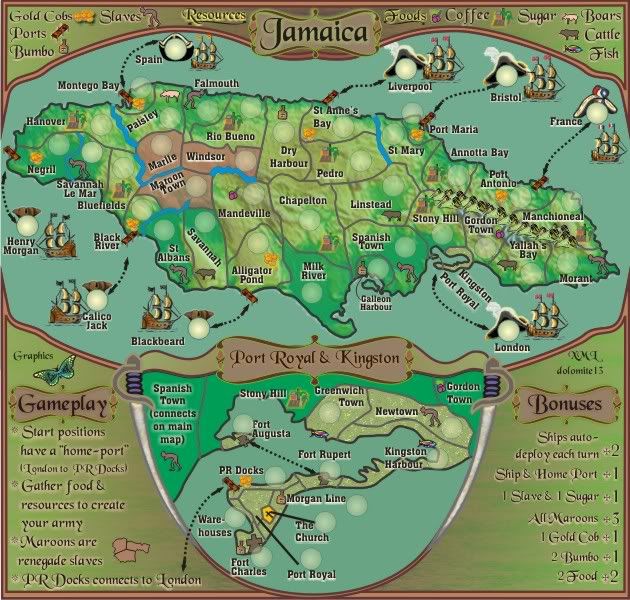
1. There's nothing to say that the rivers are impassable (which I assume they are?). In some places, the river isn't very easy to see (Negrill/Savannah Le Mar ; Black River /St Albans) and it isn't immediately obvious what does/doesn't connect at the Hanover/Marlie/Bluefields border -- it's reminiscent of some of the borders on the new France map which are awkward to see on the small map.
Impassables now in legend, with rivers colours changed and Negril River widened for clarity.
2. The text on the legend is slightly difficult to read with the white highlight/glow.... I don;t know if it's the highlight or the flourishing font?
Could be a combination of both. I don't want to change the font as i think it goes well with this historical era. Could be your eyes.

Anyway, i've lightened the glow to a soft yellow to give a Jamaican Lime look.
3. The inset.... this is probably the biggest bone of contention in my eyes - it is painfully unclear from the main map where the borders go. The labels of 'Kingston' and 'Port Royal' don't appear anywhere on the inset [ just seen them on the title/banner bit

], so I'm not sure if they're territories or what...
I think the border are painfully clear given that there are various notations and double-up of terts names in both areas.
The representations on the main map are labelled Port Royal (and i added PR) and Kingston.
The labels of Port Royal and Kingston are mentioned in the inset, Kingston Harbour is one, and Port Royal is another.
If someone can't make the assoication there given that the whole inset is labelled Port Royal and Kingston, they dont' deserve to be playing any games on this site.

You've written that "Spanish Town connects on the main map, but it doesn't border any of the territories that will have armies on the inset, so it seems unnecessary.
I think it is further clarification of what is what in that region and absolutely necessary. It reinforces that Spanish Town connects to Stony Hills on the main map.
The church is yellow. No real problem with that, except you can guarantee that people will think it's a golden corn on the cob or something

OK, i've changed it to white so it doesn't have colour association.
4. The "Gameplay" legend doesn't seem to really make too much sense to me....
Changed...
a. The starting positions thing - what do you mean by that? Do you mean to say that each ship can attack a specific port? Or are you just trying to clarify the 'home port' designation? It might be easier to make the 'ship +home port' bonus into 'ship + any port(s)' for +1
Each ship can only attack its homeport, thus the notation in the legend and the lines on the map. Ship + any port would almost be like re-inserting the lines around the map that were removed some time ago for gameplay reasons. Sorry,

I have to give preference to those who've been with the map.
b. "Gather food and resources to create your army" - this would probably make more sense by the list of bonuses, although is a good general indication of the gameplay style.
Yes, gameplay style, but i've altered it slightly.
c. "Maroons are renegade slaves". The maroon territories look more pink than maroon... does this mean that those territories have slave bonuses? (In addition to the bonus fro holding all of them?) Is this a purely historical footnote?
PInkish, Mmmm. either you or me is going colourblind. It looks brown to me. Because they are labelled Maroons ( a historical name) i have attached the word to the legend note. Colouring those terts "maroon" would be an eye-sore on the map.
d. The PR Docks/London connection is mentioned twice on the legend. The attack route to the legend text also feels a little sloppy - and makes it look like you couldn;t decide what to do with the arrow/explanation

Removed from legend.
5. In actual fact, I wonder if it might be easier if you were to move the map inset to the extreme right of the map, to enable you to bring all the instructive text (legend lists) into one place. You may find it easier to add some kind of call-out box to help highlight what goes where?
Surely you jest MrBenn?


This inset has been in place for some time after previous versions were rejected. Sorry, but it stays where it is otherwise I would have to re-design the whole thing, and you really don't want me to doing that do you?

Not at this stage. Mr Benn.
6. Did somebody mention mountains? I'm sure they did

We all know that mountains are one of the hardest things to get right, and I'm not quite convinced these are there yet either...
Mmmm. I'll work on them for next version 20....i wanted to make them more like the Jamaican mountains anyway, not like all the mountains that everyone else has on their maps.
7. Why haven;t you added the symbols next to the bonus guide? You've got plenty of space there

OK, I'll give that a go.
8. I know we discussed the colour-scheme previously... the map doesn't cry out modern-Jamaica, but that's because it isn't... The scheme works, although I get a little niggle that makes me want the whole frame to appear gilt in some way... It feels like it should be hung up in a mahogany frame with golden/brass plates golden plates riveted onto it...
Yes the colour scheme was what i asked you to comment on.....
I think placing everything in a gilded frame would distract from the map itself. The island is only small, and there is a lot of real estate for legend, and i think the combination of colours that i have now allows one to overview that island without being distracted by the legend and frame.
That's just my random/idle musings.

Thanks for those musings, i hope you like the changed made from them.

Version 19

- Click image to enlarge.


 ], so I'm not sure if they're territories or what...


