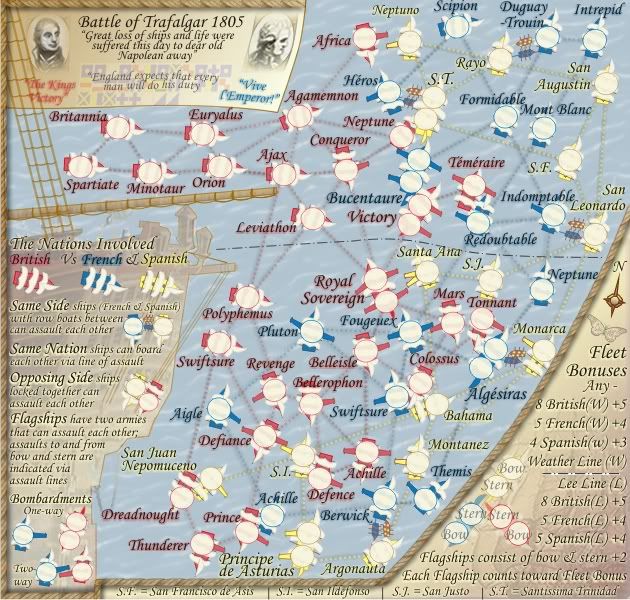
cairnswk wrote:Now what are you talking about the capital ships legend, which part for you looks like rubbish. Please be explicit.
The names of the capital ships on the map - they look horrid - really jarring to the eyes...
C.
Moderator: Cartographers
cairnswk wrote:Now what are you talking about the capital ships legend, which part for you looks like rubbish. Please be explicit.


yeti_c wrote:cairnswk wrote:Now what are you talking about the capital ships legend, which part for you looks like rubbish. Please be explicit.
The names of the capital ships on the map - they look horrid - really jarring to the eyes...
C.


TaCktiX wrote:Doncha mean "Indomitable" instead of "Indomptable"?


Incandenza wrote:Two things: the Royal Sovereign appears to have been reoriented from previous maps, and the cannon don't pop out nearly well enough, especially on the Spanish ships. They need to be longer and probably darker.


captainwalrus wrote:why did you re-do everything? The top cannon on Royal sovereign, where doe it point?


captainwalrus wrote:..The top cannon on Royal sovereign, where doe it point?


oaktown wrote:Posting the 888s was a good call... my concern with the three digit counts (or two digit counts with color indicators which I use) is that the cannons become obscured. Thunderer's gun is especially bad since it is also running into Principe de Asturias - with the army count there's little left of it.
On some cannons it woudln't hurt to make them one pixel longer... the guns on Victory for example. Other spots can be improved with some cannon angles, such as the lower right cannon on Royal Sovereign which could be angled up and out of the path of the army count.
Tonnant and Algesiras is a weird spot - it looks like they can board each other, and it looks like Tonnant can bombard Algesiras as well. Wait, unless Tonnant and Monarca can bombard each other through Algesiras.


Incandenza wrote:You're going to punch me, but now the cannon are too long, they're cartoonish and goofy-looking. Call me crazy, but visually I thought the cannon you had before completely reworking the map were just fine.


Incandenza wrote:You're going to punch me, but now the cannon are too long, they're cartoonish and goofy-looking. Call me crazy, but visually I thought the cannon you had before completely reworking the map were just fine.
the.killing.44 wrote:Incandenza wrote:You're going to punch me, but now the cannon are too long, they're cartoonish and goofy-looking. Call me crazy, but visually I thought the cannon you had before completely reworking the map were just fine.
Agreed — they don't seem as cannon-ish now, but rather more like indicators, or pointers? EDIT: …rather than being both.
.44


yeti_c wrote:I like the new look - things look a lot fresher...
I wonder - would you be able to show us a version with Gun Metal Cannons now to see if they look better or not?
C.


cairnswk wrote:yeti_c wrote:I like the new look - things look a lot fresher...
I wonder - would you be able to show us a version with Gun Metal Cannons now to see if they look better or not?
C.
I know you're only stirring....C, i'd like to keep those canons the way they are.
EDIT: I had thought about your request to change the canon to gun-metal, and i have to offer you this....you logic about who ever heard of pink canons was way off the mark i'm afraid, I could retaliate with who ever heard of red yellow and blue vessels.
Please....


yeti_c wrote:...
No I wasn't stirring - I'm providing useful criticism (or attempting to) on your potential map.
Fair enough - I just think it would look better - especially now that they're bigger - and you could at least show a couple to see if you prefered it?...
PS - also just to point out - your "yellow" cannons are not consistent now - some are brown some are yellow.
C.
cairnswk wrote:....


cairnswk wrote:C, i had already gone down that road. Sometimes you should trust my judgement and listen, and note i said sometimes. I'm sorry you wasted your time but being stubborn seems a trait we both have. I appreciate your "useful criticism" but sometimes enough push is enough.
I think the example you tried was admirable, and you have posted it to gain some possible support, but it doesn't change my mind. The canons will remain the colour of the terts they are attached to.
cairnswk wrote:And if you look below, which was posted just before your challenge, you might notice that i have changed the brown canon to yellow, having already realized my error.


mibi wrote:....
Either way, your talent is entirely wasted here.


Users browsing this forum: No registered users