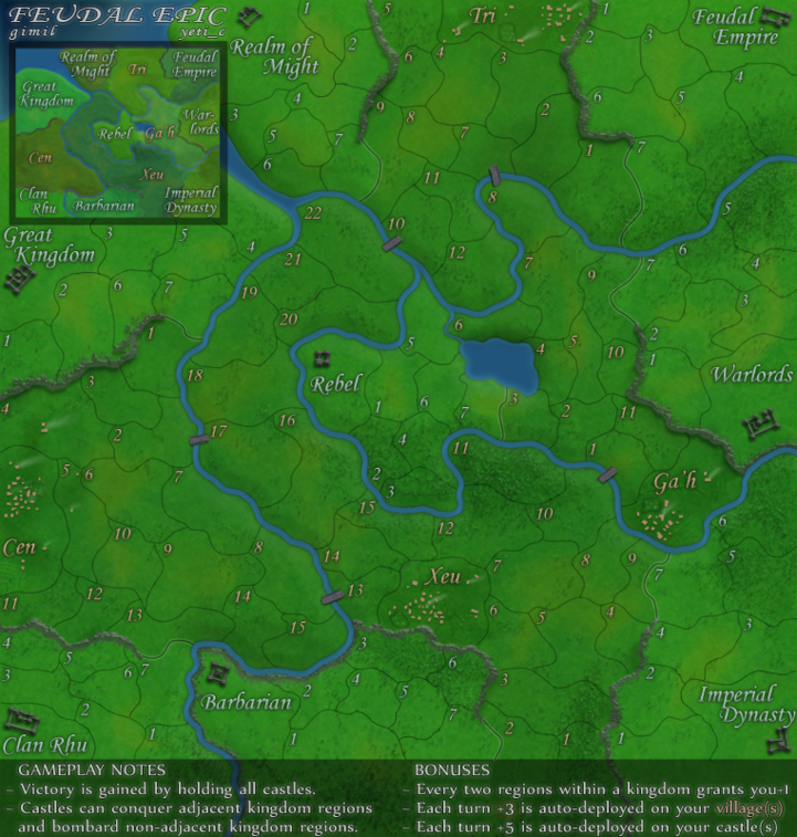
I'd still like to see the legend at the top, so as to prevent scrolling the map necessarily. It's not a major thing, but is one of the stupid things that bugs me
Speaking of the legend (and on a more serious note), the text looks blurry on the small map, and the castle-bombard rule is unclear - it sounds like the castles can bombard ANY non-adjacent territory..
Where you've got Villages on the legend, you could put that in gold to cross-reference that the villages are gold, and the castles are silver. You could also reflect the same colours on the minimap??
It would be nice to see some more consistency in the placement of territory labels/numbers. You've also used different font sizes for some areas?
The final thing is that I'm not a big fan of the glow you've used to mark the borders of different regions. This is only a personal preference, but I think I'd prefer a thicker line?
While you get those things done, I'll see if I can find some ink for a stamp