this is probably too late in the process to suggest such a big change, and also it would go against the whole idea of the chinese checkers theme, but what if you were to remove some random attack paths across the board? this would make each area little bit different and not so repetetive.
for example, remove C->B, C->E, and C->F so you have to get to A before you can attack C.
im not really campaigning for this actively or passionately, i just wanted to point it out in case someone thinks it would help.
Chinese Checkers [Quenched] May '07 re-opener?
Moderator: Cartographers
Forum rules
Please read the Community Guidelines before posting.
Please read the Community Guidelines before posting.
nah no wayadam3b58 wrote:this is probably too late in the process to suggest such a big change, and also it would go against the whole idea of the chinese checkers theme, but what if you were to remove some random attack paths across the board? this would make each area little bit different and not so repetetive.
for example, remove C->B, C->E, and C->F so you have to get to A before you can attack C.
im not really campaigning for this actively or passionately, i just wanted to point it out in case someone thinks it would help.


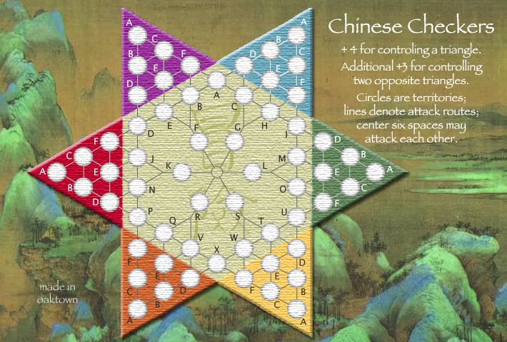
Yeah, I read him right. The lines were lightened once before because the original grey was impossible to see. If I go with darker lines in blue, it wouldn't work with the white lettering, and dark letters and lines look too heavy at the top of the board, since the lines and letters in purple are lighter.Wisse wrote:he didn't mean the font, he meant the lines, i can't see them goodAndyDufresne wrote:perhaps look into darker lines in the blue triangle, as they are almost too light. Maybe keep looking for a good tone that works in all, or two moderately different tones to use in the continents.
Also:
- added explanation in the legend. Good? Bad?
- fixed some bad lines in green.
As for removing lines, any removal would seem random. On a typical hex-map over a landscape you'd have natural boundaries - rivers, hills, etc. Here it would be pulling attack lines just for the hell of it.
Sully... cool circles. Add some color and that can be the map you play when you're trippin' on acid and listening to pink floyd. You know, purple hippos and such.


the lines in blue look a lot better as the lightest shade, i think the bd-be connection might be a little off. the lines also seem a little thicker than the rest of the board but that may be an illusion due to the different shades.
maybe lighten the connecting lines in orange?
the center circle is good.
too much explanation in the legend, especially "circles are territories". i personally think the "lines are attack routes" is selfexplanitory as well but if others then leave it.
and i dont know if anyone else is having this problem, but i almost think the texture is too heavy, especially in the army circles. i agree that there needs to be some kind of texture, and that the circles need to match, but i keep going slightly crosseyed when i look at it. is there any way to experiment with other textures, maybe a more wood-plank look, or even a lighter (as opposed to heavy, not as opposed to dark) version of the current texture?
i cant wait to play it oaktown
Do you need an excuse to have a war? I mean, who for? Can't you just say "You got lots of cash and land, but I've got a big sword, so divy up right now, chop chop."
Terry Pratchet
Terry Pratchet
-
Guiscard
- Posts: 4103
- Joined: Fri Dec 08, 2006 7:27 pm
- Location: In the bar... With my head on the bar
Looks god to me. The centre looks fine. Not even sure the exlanation in the legend is needed really but you can't go wrong by including it. Maybe in a smaller font though? The big block of text looks a bit confusing at present, and the bonuses are the more important part.
qwert wrote:Can i ask you something?What is porpose for you to open these Political topic in ConquerClub? Why you mix politic with Risk? Why you not open topic like HOT AND SEXY,or something like that.
The BD-BE line runs under the circle E into BF, so both should look off. And all are the same thickness as the rest of the board, it's just a greater contrast.Enigma wrote:i think the bd-be connection might be a little off. the lines also seem a little thicker than the rest of the board but that may be an illusion due to the different shades.
Orange is a problem... the lines were darker and looked to heavy, though nobody complained about it. I'll try lighter, and if that doesn't work go back to darker.Enigma wrote:maybe lighten the connecting lines in orange?
Whew!Enigma wrote:the center circle is good.
I think so too, but better safe than sorry, right? On most maps, other than space, lines denote borders and the circles are only army circles within the territory. Once you start playing this map it will become quite obvious that this layout is different, but it can't hurt to overstate the obvious.Enigma wrote:too much explanation in the legend, especially "circles are territories". i personally think the "lines are attack routes" is selfexplanitory as well but if others then leave it.
I like the texture, but I'll hold out to see what others have to say about it.Enigma wrote:and i dont know if anyone else is having this problem, but i almost think the texture is too heavy, especially in the army circles.
Cool... I can't wait to be done with it!Enigma wrote:i cant wait to play it oaktown
another round... addressing latest concerns.
-white texture slightly lighter, to facilitate ease of reading army counts
-went back to the darker lines in orange, which don't bother me nearly so much now that I've seen the alternative
-broke up text, so game notes don't interfere with bonus info
-made the whole thing slightly larger to make the legend easier to work out, but it is still well under the guidelines for the large map
Today is rare in that I have time to sit and play with this, so I'm going to hope that most concerns have been addressed and recreate a small map.
and a small map
Tell me if you like my approach to the small map - I'm literally cutting corners to keep the playing area as large as possible. I'm afraid that if I went much smaller the army circles would be too small. As it is the width is 600 (limit for small maps) and the height is 412 - larger than I'd like, but still smaller than many maps out there.
wisse is right, the text on the lower part of the legend isn't great, but that's easy to mess with later.

game play
I didn't vote in the original poll, and I say make continents +3... you think +4 works only because you were the first to hold a triangle in our play test. The random start is likely to give someone a corner quick and a large bonus just amplifies it. Heck I'd play with +2, but I know I won't win that argument!
I say round the corners on the small board (sorry to recommend more work). It will look vastly better.
What happened to the little circle in the center to show attacks can go in any direction? Did I miss the part where that was voted off the map?
Other than that, it's ready to go!
I say round the corners on the small board (sorry to recommend more work). It will look vastly better.
What happened to the little circle in the center to show attacks can go in any direction? Did I miss the part where that was voted off the map?
Other than that, it's ready to go!
Re: game play
whooops!! here it is, with an outline on the text to increase readbility.EvilOtto wrote:What happened to the little circle in the center to show attacks can go in any direction? Did I miss the part where that was voted off the map?
I knew some jackass would suggest rounded corners... at first I decided it wasn't worth figuring out the anchor points in photoshop, but here it is. I almost like it better than the pointed original, except it makes it leaves no room for the "A".
3 vs. 4 armies per territory... true, four seemed generous in our brief play test, but we didn't play long enough to see what happens when the others turn on the leader. I'm still torn.
With 60 territories the per turn bonuses are going to be high already - in a four player game you start with five armies per turn, five players start with four. That can be an argument both ways: only giving three hardly seems worth it if you already get five, but then again since you get a lot of armies to start with whoever goes first will have a fat advantage and be able to gobble up a triangle and take control of the game quickly.
The vote went two to one for the larger bonus. Would love more input.
Still do to: roughen up the color between the center hex and the triangles on the small map.
Poll Options Here!
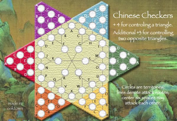
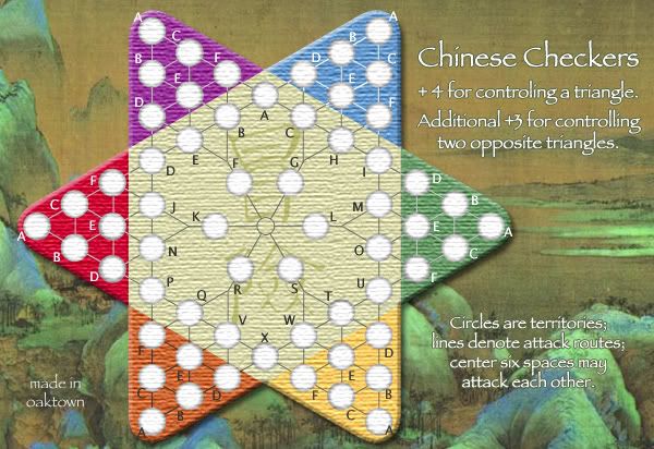
This is to see what we should go with: pointed corners, rounded corners, or a combination of the two. It's nice to have both maps identical, but I made the small map with rounded corners to conserve space - otherwise the army circles become a bit small. And I'm aware that there are fixes to make in some versions, like the fact that I mis-spelled "controlling" on some versions - fixes will be made after we have a winner.
1. Large map with points:
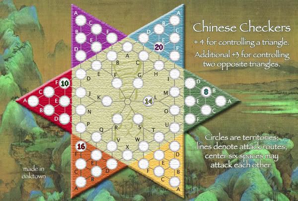
2. Small map with points (added some army counts):
3. Large map, rounded corners:
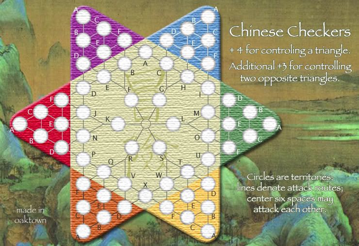
4. Small map, rounded corners:
5. Small map, cropped corners (i know, still missing center circle):
Personally, the more I look at them, the more I think the rounded circles look stupid.
This is to see what we should go with: pointed corners, rounded corners, or a combination of the two. It's nice to have both maps identical, but I made the small map with rounded corners to conserve space - otherwise the army circles become a bit small. And I'm aware that there are fixes to make in some versions, like the fact that I mis-spelled "controlling" on some versions - fixes will be made after we have a winner.
1. Large map with points:
2. Small map with points (added some army counts):
3. Large map, rounded corners:
4. Small map, rounded corners:
5. Small map, cropped corners (i know, still missing center circle):
Personally, the more I look at them, the more I think the rounded circles look stupid.
Last edited by oaktown on Thu Feb 01, 2007 12:00 pm, edited 5 times in total.
-
bonobo`s son
- Posts: 420
- Joined: Thu Jan 04, 2007 11:27 am
- Location: Amsterdam - Artis


colors and corners
I think if the red triangle was more dull it would stand out less from the orange. That would be bad. I think it works as is.Marvaddin wrote:Can you try something about this?Marvaddin wrote:Does someone else think the red and the purple triangles are too bright?
Of these images, the points look best and the cropped corners look worst. The rounded ones are in the middle somewhere... but they would be better if they were less rounded. The distance from the army circles to the edge should be constant (right now the border gets thinner as it curves around the "A").
But image 2 looks totally playable, so I think it makes sense to stick with that.
Re: colors and corners
I tend to agree... I played with a lot of colors, and brought in folks with better color vision than my own, before settling on these.EvilOtto wrote:I think if the red triangle was more dull it would stand out less from the orange. That would be bad. I think it works as is.
Th poll respondents seem to agree; and I thought I was being very clever cropping the corners to create more space. It also occurs to me that the cropped and rounded shapes are technically no longer 'triangles' so somebody could take exception to the legend. And you're right about the rounding of the tips - I see now that I didn't match the radius of the army circles, but I don't think that's why I don't like them. I think I miss the symmetry of the triangles.EvilOtto wrote:Of these images, the points look best and the cropped corners look worst... image 2 looks totally playable, so I think it makes sense to stick with that.
Last edited by oaktown on Fri Feb 02, 2007 12:35 pm, edited 1 time in total.
thank you for lightening the texture on the army cirlces, whatever you did made a huge difference, even if it was a tiny change.
i thought id hate the rounded edges, but when i looked at them they seemed to address a concern that was brought up earlier, that the map didnt blend into its background. i think the rounded edges mimic the curve of the background hills. however i like both so if people decide they hate them im not against the pointed edges.
i thought id hate the rounded edges, but when i looked at them they seemed to address a concern that was brought up earlier, that the map didnt blend into its background. i think the rounded edges mimic the curve of the background hills. however i like both so if people decide they hate them im not against the pointed edges.
Do you need an excuse to have a war? I mean, who for? Can't you just say "You got lots of cash and land, but I've got a big sword, so divy up right now, chop chop."
Terry Pratchet
Terry Pratchet
-
bonobo`s son
- Posts: 420
- Joined: Thu Jan 04, 2007 11:27 am
- Location: Amsterdam - Artis
-
sully800

- Posts: 4978
- Joined: Wed Jun 14, 2006 5:45 pm
- Gender: Male
- Location: Bethlehem, Pennsylvania
I think the rounded edges fit with the map better....they make everything appear a bit more peaceful and easy. I also like the fact that it saves a bit of vertical space.
But there is something about the rounded edges that looks 'off'. I think it might be the fact that they are rounded too much, and I would also like to see a version were you match the radius of the circle with the rounded points...I think it will look a lot better like that.
But there is something about the rounded edges that looks 'off'. I think it might be the fact that they are rounded too much, and I would also like to see a version were you match the radius of the circle with the rounded points...I think it will look a lot better like that.