Feudal Epic, L&S, Pg. 49 [D, Gp, Gr]
Moderator: Cartographers
Re: Feudal Epic *The sequal to Feudal War!* Pg. 25 [I, Gp]
Castle names defo need to be more prominent. More so than the villages
"There is a forgotten, nay almost forbidden word, which means more to me than any other. That word is ENGLAND."
-

 General Mayhem
- Posts: 197
- Joined: Fri Mar 17, 2006 6:29 am
- Location: Leeds, England, UK


Re: Feudal Epic *The sequal to Feudal War!* Pg. 25 [I, Gp]
I addressed all issues in this update expect benn wish to move the legends to the top. The reason for this is it was already discussed earlier in development and deemed to be small enough not to cause a problem with scrolling. Also to move it to the top will require me to redraw the top of the map so that the land peeks through the transparent background of the legends. Alot of work for not alot of gain.
Update:
-Lightened kingdom land to stand out a little better than the non kingdom land
-Changed kingdom terr names to a silvery grey colour
-Increased the size of castle names to have the same emphasis as villages
Update:
-Lightened kingdom land to stand out a little better than the non kingdom land
-Changed kingdom terr names to a silvery grey colour
-Increased the size of castle names to have the same emphasis as villages
What do you know about map making, bitch?
Top Score:2403
natty_dread wrote:I was wrong
Top Score:2403
-

 gimil
gimil
- Posts: 8599
- Joined: Sat Mar 03, 2007 12:42 pm
- Location: United Kingdom (Scotland)


Re: Feudal Epic *The sequal to Feudal War!* Pg. 25 [I, Gp]
gimil wrote:Lightened kingdom land to stand out a little better than the non kingdom land
-Changed kingdom terr names to a silvery grey colour
-Increased the size of castle names to have the same emphasis as villages
All good changes... in fact, I think you should push the silver a little further to make them stand out even more.
For the most part the gameplay looks solid at this point. You have done a brilliant job of making each Kingdom's border the same distance to the nearest town, but the advantage may still be with the kingdom that has the quickest access to its own border. Realm of Might is closer to the village than is Feudal Empire, for example. Maybe this won't be a problem.
I feel for Feudal Empire - seems more isolated than other realms. He is the furthest from a village and the furthest from a bridge.
text: how about "Castles can conquer adjacent territories and bombard non-adjacent territories with their kingdom." You've got the space, may as well make things obvious. In general the legend is poorly laid-out right now... looks sloppy. But the map looks fab.

-

 oaktown
- Posts: 4451
- Joined: Sun Dec 03, 2006 9:24 pm
- Location: majorcommand


Re: Feudal Epic Pg. 26 [I, Gp]
OK oaktown how is this?
UPDATE
-all castles are now the same distant from a village.
-moved the tri 12-gah 8 bridge so that it is closer to Feudal Empire
-Increased the intensity of the silver terr names
-Rearranged the tweaked the legends.
UPDATE
-all castles are now the same distant from a village.
-moved the tri 12-gah 8 bridge so that it is closer to Feudal Empire
-Increased the intensity of the silver terr names
-Rearranged the tweaked the legends.
What do you know about map making, bitch?
Top Score:2403
natty_dread wrote:I was wrong
Top Score:2403
-

 gimil
gimil
- Posts: 8599
- Joined: Sat Mar 03, 2007 12:42 pm
- Location: United Kingdom (Scotland)


Re: Feudal Epic Pg. 26 [I, Gp]
get this map done!!!!!!!!! lol im waiting
-
 tdans
tdans
- Posts: 1593
- Joined: Thu Sep 11, 2008 11:49 am
- Location: TX


Re: Feudal Epic Pg. 26 [I, Gp]
better. the other thing I was going to suggest was making the walls stand out a bit more. And the water looks pretty murky... who'd want to drink that? 

-

 oaktown
- Posts: 4451
- Joined: Sun Dec 03, 2006 9:24 pm
- Location: majorcommand


Re: Feudal Epic Pg. 26 [I, Gp]
oaktown wrote:better. the other thing I was going to suggest was making the walls stand out a bit more. And the water looks pretty murky... who'd want to drink that?
The silver is superb now, excellent job. I also like Oaktown's ideas above as well.
--Andy
-

 AndyDufresne
- Posts: 24935
- Joined: Fri Mar 03, 2006 8:22 pm
- Location: A Banana Palm in Zihuatanejo


Re: Feudal Epic Pg. 26 [I, Gp]
Had a discussion before about hte river colour. Mibi felt this colour was to med like. But after looking at it again I prefer this to the dark one. While it is not completly realisitic, it looks good. I also thickened a few cliffs but if I do much more they won't look very good.
What do you know about map making, bitch?
Top Score:2403
natty_dread wrote:I was wrong
Top Score:2403
-

 gimil
gimil
- Posts: 8599
- Joined: Sat Mar 03, 2007 12:42 pm
- Location: United Kingdom (Scotland)


Re: Feudal Epic Pg. 26 [I, Gp]
yeti_c wrote:You need to finish the legend text...
C.
Cheers, Don't know where I am going to put it tho now that I think about it!
What do you know about map making, bitch?
Top Score:2403
natty_dread wrote:I was wrong
Top Score:2403
-

 gimil
gimil
- Posts: 8599
- Joined: Sat Mar 03, 2007 12:42 pm
- Location: United Kingdom (Scotland)


Re: Feudal Epic Pg. 26 [I, Gp]
My issue with the cliffs (which looks to me like walls) is that you seem to be doing a sunlight/shadow thing with them and its not quite there. Each wall - unless it runs perfectly parallel with the directions from which the sun is shining - should have a bright side and a dark side. Right now they lack that contrast... the wall south of Xeu is too light on the shadow side and the rest are too dark on the sunny side.
I assume your light source is due north? Since most feudal kingdoms would be in the northern hemisphere (Europe or Asia) this is a head-scratcher. If you had a south-eastern light source fewer cliffs would run parallel to the light source and thus you could heighten the effect across the map.
I assume your light source is due north? Since most feudal kingdoms would be in the northern hemisphere (Europe or Asia) this is a head-scratcher. If you had a south-eastern light source fewer cliffs would run parallel to the light source and thus you could heighten the effect across the map.

-

 oaktown
- Posts: 4451
- Joined: Sun Dec 03, 2006 9:24 pm
- Location: majorcommand


Re: Feudal Epic Pg. 26 [I, Gp]
well, i like this map a lot
but i also think its basically another feudal war for the sake of having one, you know what i mean?
besides the structure of the map i dont see any major differences
same bonus structure
same general look
same general strategy
etc.
i think in order to make this significantly different you should try something totally different
so just some random thought (improv-ed so nothing amazing) worth considering,
*making it a desert land scape so you can give it the oasis decay in important areas. that way you make a feudal map but its also a hybrid with another new and good map, oasis
*An epic requires more than the usual, add territs with dragons, mercenaries, wizards, oracles, etc. each with a special power. Once again a hybrid idea which was based tho not the same as the map in the foundry, Monsters.
*Widen the rivers and use them as fast routes among territs, so you can quickly move across the map in these from ports. This is like the AOR map except you need to actually conquer the river territs, which can reset to 1 neutral or something
*Make it so anyone named A.Sub automatically wins
*significantly increase the bonus for territs owned in a castle's land, and/or make it so that a village does the same thing by making it a farm land. Own the farmer's village and for every 2 farmlands you own you get something. And you may even want to try and experiment with making a few of them auto deploys
basically the point of this posts is to make this map into something other than another feudal. Maps should be different in some way, have a new gimmick, be based on a new place or even just the revamps have a brand new look.
-

 a.sub
a.sub
- Posts: 1834
- Joined: Thu Jun 14, 2007 2:07 am


Re: Feudal Epic Pg. 26 [I, Gp]
a.sub wrote:well, i like this map a lot
but i also think its basically another feudal war for the sake of having one, you know what i mean?
besides the structure of the map i dont see any major differences
same bonus structure
same general look
same general strategy
etc.
Well, yeah, that is sorts the point. Feudal for 8 players (currently impossible) and with more terts. But beyond that, with more terts, more players, and more castles/villages, the strategies do change, as does reading through the fog and the like. And I for one think that's exactly the way it should me...
.44
-

 the.killing.44
- Posts: 4724
- Joined: Thu Oct 23, 2008 7:43 pm
- Location: now tell me what got two gums and knows how to spit rhymes


Re: Feudal Epic Pg. 26 [I, Gp]
Thanks for your input a.sub. While you make a good point, like killing.44 said the point of this map is to give an 8 player variation to many peoples favourite map. We can perhaps see hybrid feudal wars in the future, but not for this map.
What do you know about map making, bitch?
Top Score:2403
natty_dread wrote:I was wrong
Top Score:2403
-

 gimil
gimil
- Posts: 8599
- Joined: Sat Mar 03, 2007 12:42 pm
- Location: United Kingdom (Scotland)


Re: Feudal Epic Pg. 26 [I, Gp]
Love the map... My one suggestion is the +1 kinda looks like a - at first glance...
maybe augment the vertical line of the plus sign a little more and it would be fine...
Pimphawks70
maybe augment the vertical line of the plus sign a little more and it would be fine...
Pimphawks70

-

 pimphawks70
- Posts: 1102
- Joined: Fri Aug 31, 2007 10:21 am


Re: Feudal Epic, L&S, Pg. 27 [I, Gp]
How do these cliffs work for you oaktown?
Last edited by gimil on Wed Jun 24, 2009 9:41 am, edited 1 time in total.
What do you know about map making, bitch?
Top Score:2403
natty_dread wrote:I was wrong
Top Score:2403
-

 gimil
gimil
- Posts: 8599
- Joined: Sat Mar 03, 2007 12:42 pm
- Location: United Kingdom (Scotland)


Re: Feudal Epic Pg. 27 [I, Gp]
Not bad at all, gimil
-

 Kotaro
- Posts: 3406
- Joined: Sat Mar 03, 2007 2:31 pm
- Location: TheJonah: You`re a fucking ruthless, little cunt!


Re: Feudal Epic Pg. 27 [I, Gp]
i think the graphics look a bit bland, like its all green
but at the same time i also think once the petty colors come in (army numbers) it will be better
is there one with numbers up that i missed :s
but at the same time i also think once the petty colors come in (army numbers) it will be better
is there one with numbers up that i missed :s
-

 a.sub
a.sub
- Posts: 1834
- Joined: Thu Jun 14, 2007 2:07 am


Re: Feudal Epic Pg. 26 [I, Gp]
a.sub wrote:i think in order to make this significantly different you should try something totally different
so just some random thought (improv-ed so nothing amazing) worth considering,
*making it a desert land scape so you can give it the oasis decay in important areas. that way you make a feudal map but its also a hybrid with another new and good map, oasis
u mean, a bit like the one below?
viewtopic.php?f=242&t=39965&hilit=famine
nice catch on feudal empire, oak. gimil, can u put up a map on page 1 that includes starting neutrals, so that we can see how any changes affect gameplay?
if the imperial dynasty cliffs are extended north slightly, then it'll help clarity, even though i personally don't doubt that there's a barrier between imperial 4 and xeu 10. i like the new colour of the water and the deeper blue for the middle of the lake.
ian.
-

 iancanton
- Foundry Foreman

- Posts: 2431
- Joined: Fri Jun 01, 2007 5:40 am
- Location: europe


Re: Feudal Epic Pg. 27 [I, Gp]
The cliffs don't quite look right yet... consider trying to add some shadow to the land on the lower side...
These images might give you a bit of inspiration

These images might give you a bit of inspiration


PB: 2661 | He's blue... If he were green he would die | No mod would be stupid enough to do that
-

 MrBenn
- Posts: 6880
- Joined: Wed Nov 21, 2007 9:32 am
- Location: Off Duty


Re: Feudal Epic Pg. 27 [I, Gp]
Here is more defined shadows benn. I hope your happy with these.
This is the map with neutrals. The only thing that will change from the gameplay stamp is tri 12 & 7 swaping neutral values, which will have no impact of overall gameplay.
This is the map with neutrals. The only thing that will change from the gameplay stamp is tri 12 & 7 swaping neutral values, which will have no impact of overall gameplay.
What do you know about map making, bitch?
Top Score:2403
natty_dread wrote:I was wrong
Top Score:2403
-

 gimil
gimil
- Posts: 8599
- Joined: Sat Mar 03, 2007 12:42 pm
- Location: United Kingdom (Scotland)


Re: Feudal Epic Pg. 26 [I, Gp]
iancanton wrote:
nice catch on feudal empire, oak.
woah woah woah, time out flag on the field, penalty on the offense. Since when is this called Feudal Empire? NuuuuU!!
-

 Kotaro
- Posts: 3406
- Joined: Sat Mar 03, 2007 2:31 pm
- Location: TheJonah: You`re a fucking ruthless, little cunt!


Re: Feudal Epic Pg. 27 [I, Gp]
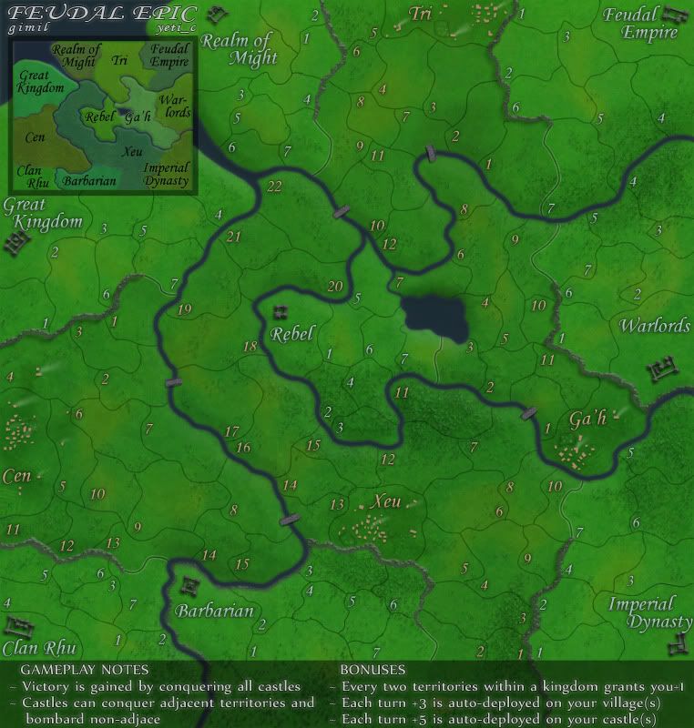
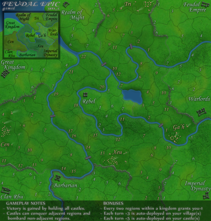
With no more concerns being brought up here is the large and small. Waiting on graphics stamp.
What do you know about map making, bitch?
Top Score:2403
natty_dread wrote:I was wrong
Top Score:2403
-

 gimil
gimil
- Posts: 8599
- Joined: Sat Mar 03, 2007 12:42 pm
- Location: United Kingdom (Scotland)


Re: Feudal Epic, L&S, Pg. 27 [I, Gp]
yeti_c wrote:My name seems illegible on both maps?!
C.
Perhaps your blind? Or drunk? What exactly is illegible about it?
What do you know about map making, bitch?
Top Score:2403
natty_dread wrote:I was wrong
Top Score:2403
-

 gimil
gimil
- Posts: 8599
- Joined: Sat Mar 03, 2007 12:42 pm
- Location: United Kingdom (Scotland)


Who is online
Users browsing this forum: No registered users


