[Abandoned] - Iron Curtain
Moderator: Cartographers
Re: IRON CURTAIN [I] - new carto | pg.17 titles...
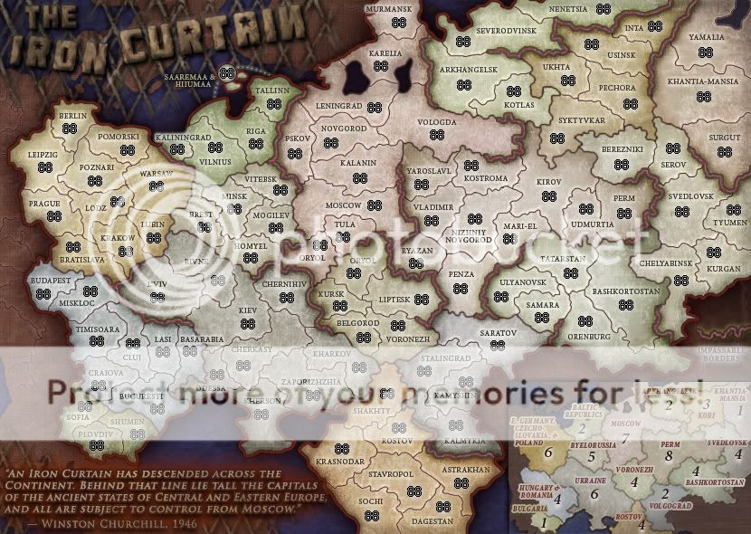
Yeah I don't mind it either RJ, but that isn't in the .psd. Nor is the curtain or any other fence but the one I posted in the first post. I've also updated the minimap to the current map colors. Here's another step in a direction:
Do you think the wall should extend behind the map and show around it, or stop before the map starts, like I've shown? I've also been discussion having the wall crumble off on a side, but I dunno because of size issues.
.44
Do you think the wall should extend behind the map and show around it, or stop before the map starts, like I've shown? I've also been discussion having the wall crumble off on a side, but I dunno because of size issues.
.44
-

 the.killing.44
- Posts: 4724
- Joined: Thu Oct 23, 2008 7:43 pm
- Location: now tell me what got two gums and knows how to spit rhymes


Re: IRON CURTAIN [I] » p.18 wall title
by the way, i like this map
glad its back to production
glad its back to production
-
 whitestazn88
- Posts: 3128
- Joined: Mon Feb 05, 2007 2:59 pm
- Location: behind you


Re: IRON CURTAIN [I] » p.18 wall title
So, do I need to get this outta drafts again although it already has [I]?
.44
P.S. I wantz moar commentz
MrBenn wrote:After discussion with RjBeals, this map has been moved into temporary retirement.
When you're ready to get going again, let one of the CAs know and we'll throw you back into the Foundry
Mr B
.44
P.S. I wantz moar commentz
-

 the.killing.44
- Posts: 4724
- Joined: Thu Oct 23, 2008 7:43 pm
- Location: now tell me what got two gums and knows how to spit rhymes


Re: IRON CURTAIN [I] » p.18 wall title
Damn! Killing , Can't you work on a map with easier names? 
The map is wonderful.
It's clear it's a RJ map at the first look.
About the map placement, i think that Mr.Benn did a good choice.
The map had the idea stamp, but you're not RJ....(like bryguy with Spaceness map....same map but different mapmaker).
Anyway i don't think this map will be in the drafting room for a long time...
thenobodies80
The map is wonderful.
It's clear it's a RJ map at the first look.
- Can you add/explain in some way the impassables? And (personal opinion) i 'don't like the impassable colors...
- I think some colors aren't so colorblind friendly (i'm not colorblind so i can't confirm you at 100%):
Bashkortostan and svedlovsk are similar for example. (try a test with vischeck - Volgorad has not the same color in the minimap and in the main map
- The wall is a good option for title and mapmaker names, but the title could be done better, the last one is floating on the wall ( i know you can
 )
)
About the map placement, i think that Mr.Benn did a good choice.
The map had the idea stamp, but you're not RJ....(like bryguy with Spaceness map....same map but different mapmaker).
Anyway i don't think this map will be in the drafting room for a long time...
thenobodies80
-

 thenobodies80
- Posts: 5400
- Joined: Wed Sep 05, 2007 4:30 am
- Location: Milan


Re: IRON CURTAIN [I] » p.18 wall title
For the record, I didn't revive the map thread... it had already been done by the time I went to do it 

PB: 2661 | He's blue... If he were green he would die | No mod would be stupid enough to do that
-

 MrBenn
- Posts: 6880
- Joined: Wed Nov 21, 2007 9:32 am
- Location: Off Duty


Re: IRON CURTAIN [I] » p.18 wall title
idea
couldn't be the wall a bit higher and the minimap engraved in it?
couldn't be the wall a bit higher and the minimap engraved in it?
De gueules à la tour d'argent ouverte, crénelée de trois pièces, sommée d'un donjon ajouré, crénelé de deux pièces
Gules an open tower silver, crenellated three parts, topped by a apertured turret, crenellated two parts
Gules an open tower silver, crenellated three parts, topped by a apertured turret, crenellated two parts
-

 pamoa
pamoa
- Posts: 1242
- Joined: Sat Sep 01, 2007 3:18 am
- Location: Confederatio Helvetica


Re: IRON CURTAIN [I] » p.18 wall title
I think the wall is a good idea, I just don't like how it contrasts with the dark colors that border the rest of the map. Could you make the wall a bit grayer or maybe add some graffiti to it?
-

 Mr. Squirrel
- Posts: 157
- Joined: Fri Nov 02, 2007 3:18 pm
- Location: up a tree


Re: IRON CURTAIN [I] » p.18 wall title
I prefer the concrete style wall in the background, and will now move you to the right place... Welcome to the Foundry Proper 

PB: 2661 | He's blue... If he were green he would die | No mod would be stupid enough to do that
-

 MrBenn
- Posts: 6880
- Joined: Wed Nov 21, 2007 9:32 am
- Location: Off Duty


Re: IRON CURTAIN [I] » p.19
thenobodies80 wrote:Damn! Killing , Can't you work on a map with easier names?
Can you add/explain in some way the impassables? And (personal opinion) i 'don't like the impassable colors...
Added. I like the color. A grungy red suits the dark Soviet theme IMO.
I think some colors aren't so colorblind friendly (i'm not colorblind so i can't confirm you at 100%):


There's two, as the third was literally exactly the same as the second (try it yourself if you don't believe me). they seem fine except Perm is a bit like Baskhortostan. Any colorblind people want to add some input?
Volgorad has not the same color in the minimap and in the main map
Well if you hid the lighting effects it would, but burnt
The wall is a good option for title and mapmaker names, but the title could be done better, the last one is floating on the wall ( i know you can)
I fussed around a bit …
pamoa wrote:couldn't be the wall a bit higher and the minimap engraved in it?
In theory that's genius, but when I tried it out two things happen: a) it's colorful and doesn't fit the gray wall; and b) i set it to gray and the colorful purpose is negated. So I left it as is.
Mr. Squirrel wrote:I think the wall is a good idea, I just don't like how it contrasts with the dark colors that border the rest of the map. Could you make the wall a bit grayer or maybe add some graffiti to it?
Darkened.
May 23rd updates
- Updated wall & title (and decorations/names)
- Changed minimap colors to real ones (included updating Volgorad
- Changed minimap font to Bold Italic & increased size
- Added impassable note.
- Title thoughts?
- Is the note visible enough?
- Random note: should "Volgorad" be "Volgograd" like I'm thinking?
-

 the.killing.44
- Posts: 4724
- Joined: Thu Oct 23, 2008 7:43 pm
- Location: now tell me what got two gums and knows how to spit rhymes


Re: IRON CURTAIN [I] » p.19
I liked the original title a lot more with the fence.
-

 The Neon Peon
- Posts: 2342
- Joined: Sat Jun 14, 2008 12:49 pm


Re: IRON CURTAIN [I] » p.19
The Neon Peon wrote:I liked the original title a lot more with the fence.
Quite honestly so did I. Do people like the big 3D hammer & sickel, or should I get it to look like it's part of the fence?
.44
-

 the.killing.44
- Posts: 4724
- Joined: Thu Oct 23, 2008 7:43 pm
- Location: now tell me what got two gums and knows how to spit rhymes


Re: IRON CURTAIN [I] » p.19
(FYI) When i started this map, with all the different bonus regions, i never intended each region to be a uniquely different color. Bit of 44 wants to keep/change colors - it's his call.

-

 RjBeals
- Posts: 2506
- Joined: Mon Nov 20, 2006 5:17 pm
- Location: South Carolina, USA


Re: IRON CURTAIN [I] » p.19
I like this map, it's nicely big!
I would like the bonuses to be bigger, but I bet that has been carefully discussed already, in the 18 pages of this thread
look forward to playing this!
I would like the bonuses to be bigger, but I bet that has been carefully discussed already, in the 18 pages of this thread
look forward to playing this!
-

 karelpietertje
- Posts: 801
- Joined: Mon Sep 03, 2007 1:43 pm


Re: IRON CURTAIN [I] » p.19
Volgograd would be the proper term. Consider Petrograd (Leningrad at this point, they renamed St. Petersburg three or four times) and Stalingrad. This is Soviet Russia!
-
 TaCktiX
- Posts: 2392
- Joined: Mon Dec 17, 2007 8:24 pm
- Location: Rapid City, SD


Re: IRON CURTAIN [I] » p.18
I'm glad to see this continued. This is the first map I ever looked at, I forget why, but I saw it someone's sig before I new anything about the forum and I loved it. I didn't know where it went, since it was a few months afterwards that I actualy started to post in the foundery. It looks really good, we need more big terrirory maps. The Rostov bonus seems a bit heavy, considering that everything else seems to be a bit light.
-
 captainwalrus
- Posts: 1018
- Joined: Sun Nov 11, 2007 3:19 pm
- Location: Finnmark


Re: IRON CURTAIN [I] » p.18
v post below v
-

 the.killing.44
- Posts: 4724
- Joined: Thu Oct 23, 2008 7:43 pm
- Location: now tell me what got two gums and knows how to spit rhymes


Re: IRON CURTAIN [I] » p.18
the.killing.44 wrote:Okay tried to recreate one of RJ's old ones for Rev. 11.
REV. 11
May 26th Updates
- Attempt at title … not 100% there
- Swapped quote with title location-wise
- Small things
I'll post about that gameplay stuff later. Plus I have something I wrote up about the titles. I'll also get to work on the small to check things out.
.44
-

 the.killing.44
- Posts: 4724
- Joined: Thu Oct 23, 2008 7:43 pm
- Location: now tell me what got two gums and knows how to spit rhymes


Re: IRON CURTAIN [I] » p.18
there are at least three things about this map that aren't representative of the eastern bloc.
the geography is all over the place. various countries have been lumped together into one bonus zone for no particular reason other than that they're small and adjacent (for example east germany, poland and czechoslovakia), while other regions have been put into a different bonus zone from every other region of their country (for example basarabia). some regions have been named after cities, others after districts or republics, with numerous misspellings.
the eastern regions have been subdivided too many times into increasingly-obscure areas that are too small, so there's no sense of moving from the relatively industrialised west to the vast open expanses that characterise the russian steppe as we advance eastward. the impassables are like the ones in brazil: not real in any sense and therefore just as awkward to represent.
the pastel colours feel at odds with the harshness of the communist regime. i had always imagined such a map to be coloured in the mould of eastern front.
this could almost be a map of anywhere. this one doesn't compare with charleston, rj!
ian.
-

 iancanton
- Foundry Foreman

- Posts: 2432
- Joined: Fri Jun 01, 2007 5:40 am
- Location: europe


Re: IRON CURTAIN [I] » p.18
iancanton wrote:
this could almost be a map of anywhere. this one doesn't compare with charleston, rj!
ian.
That's why I abandoned it Ian.

-

 RjBeals
- Posts: 2506
- Joined: Mon Nov 20, 2006 5:17 pm
- Location: South Carolina, USA


Re: IRON CURTAIN [I] » p.18
that makes sense! good luck to .44 in fashioning a forge-worthy map from the ashes!
ian.
ian.
-

 iancanton
- Foundry Foreman

- Posts: 2432
- Joined: Fri Jun 01, 2007 5:40 am
- Location: europe


Re: IRON CURTAIN [I] » p.18
By all means, if you have suggestions for the names, bonus regions, etc. — go ahead. I'm not the one for those, and I'm curious to the misspellings. The colors, yeah I see that. But by "Eastern Front" you surely don't mean qwert's map, do you?
Colors, I'm thinking more reds, browns, and grays (and ones that span that color range) — less to no greens and blues.
Impassables, yes I know. Once again, is there a better way to do it? tbh, I'd rather not draw mountains on here, although rivers wouldn't be a bad thing. There's just something that isn't for the realistic land features in my mind.
If you have suggestions for the above things, I'd like to know them. Bonus regions and names of territories are all up as always. RJ used to have subregions defined by different borders, but those were just confusing in my mind. Basarabia is Moldovia, but putting that into a different region would be wrong. Would you like to see it put in the minimap? Would you like those country lines put back?
Also, instead of just saying that I misspelled things please tell me what is misspelled
Thanks,
.44
-

 the.killing.44
- Posts: 4724
- Joined: Thu Oct 23, 2008 7:43 pm
- Location: now tell me what got two gums and knows how to spit rhymes


Re: IRON CURTAIN [I] » p.18
I feel like Moscow is an important territory, from reading the Quote, so i think that it would be cool if you did something special, like a +1 or something
sailorseal wrote:My big boy banana was out the whole time
AndyDufresne wrote:Forever linked at the hip's-banana! (That sounds strange, don't quote me.)AndyDufresne wrote:Many Happy Bananas to everyone, lets party...with Bananas.
--Andy
-
 LED ZEPPELINER
- Posts: 1088
- Joined: Tue Nov 25, 2008 10:09 pm


Re: IRON CURTAIN [I] » p.18
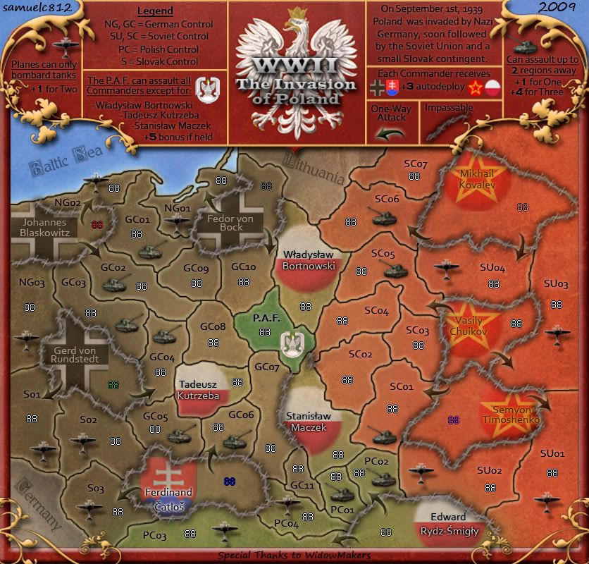
I would guess people would expect to see the poland map when they hear "iron curtain"..
and the barbed wire is a good idea for impassibles. But don't copy this map if you do that.
and the barbed wire is a good idea for impassibles. But don't copy this map if you do that.

-

 RjBeals
- Posts: 2506
- Joined: Mon Nov 20, 2006 5:17 pm
- Location: South Carolina, USA


Re: IRON CURTAIN [I] » p.18
shouldn't you add Joseph Goebbels feb 1945 to the iron curtain quote ? 

And perhaps change title to "Behind the Iron Curtain" (sounds more ominous and actually more correct, because you show ALL the regions from berlin to the urals).
And perhaps change title to "Behind the Iron Curtain" (sounds more ominous and actually more correct, because you show ALL the regions from berlin to the urals).
Barbarus hic ego sum, quia non intellegor ulli.
-

 lt_oddball
- Posts: 364
- Joined: Mon Mar 05, 2007 11:17 am
- Location: Fortress Europe


Who is online
Users browsing this forum: No registered users


