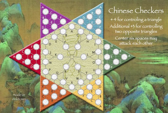
What's new:
- Hollow center circle. I think it works.
- Letters in center, yellow, and orange are dark grey, not black.
- Lighter attack lines in orange.
- Minor adjustments to some letter locations.
AndyDufresne wrote:perhaps look into darker lines in the blue triangle, as they are almost too light. Maybe keep looking for a good tone that works in all, or two moderately different tones to use in the continents.
When you say too light, you mean they're hard to read, or wrong artistically? I started with the same grey as the center, but they were unrecognizable against the blue. Any darker they're too heavy. I'd have to go lighter to make them more visible.
AndyDufresne wrote:Also, the triangles touch corner, but aren't borders. I think people will understand they aren't borders, but might just extend the central zone slightly in between all triangles to give them a buffer zone.
It would throw off the symetry - right now it's two overlapping triangles, like a star of david; in order for the triangles to not touch at all I'd have to make the triangles smaller or the hexagon bigger, which throws off the overall shape. I'm going to trust people to figure out that they're working on a hex grid style map, and that the lines are attack lines.
Alternatively, I could simply state in the legend that the lines represent attack lines between spaces.
I don't want to rework the small map until major issues are settled on this one.


