Testosterone VS Estrogen (v18)
Moderator: Cartographers
Forum rules
Please read the Community Guidelines before posting.
Please read the Community Guidelines before posting.
- mattosaurus
- Posts: 73
- Joined: Thu Feb 26, 2009 1:38 pm
- Gender: Male
- Location: North Carolina
Re: Testosterone VS Estrogen
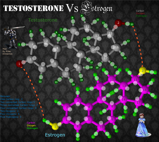
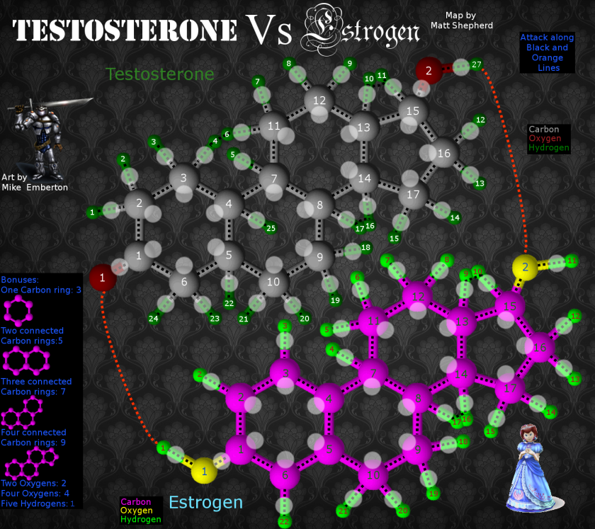
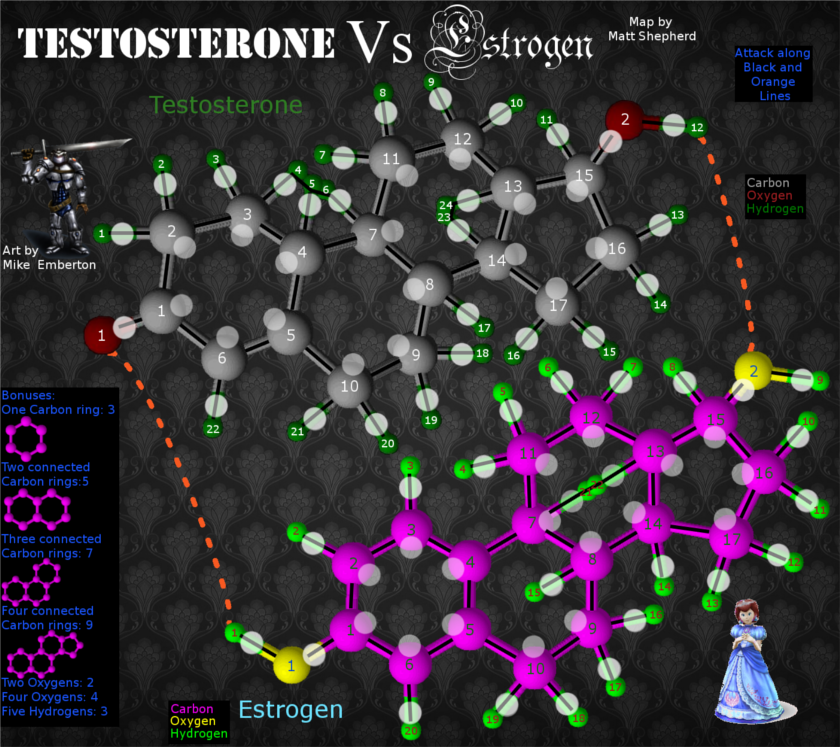
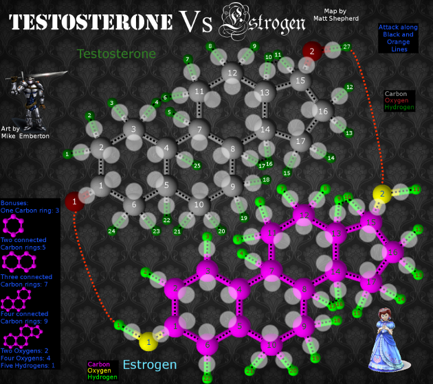
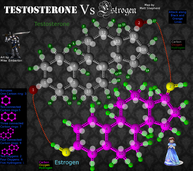
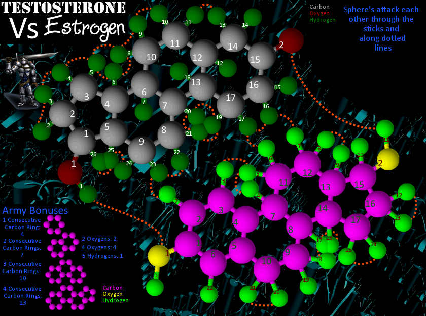
Here's a draft of the large size. I am communicating with the artist to get the rights for the the man with the sword, and have gotten another princess for the frame. They are now the correct sizes too.
Here's the large one:
And here's the small one:
Here's the large one:
And here's the small one:
Last edited by mattosaurus on Thu Jun 18, 2009 1:58 pm, edited 1 time in total.
Re: Testosterone VS Estrogen
this is a neat idea but i'm very confused about the bonuses
have you thought about what kind of bonus you would receive at your start drop ie player one gets 3H and starts
its going to make the game very one sided and this works many different way does it have to be 5 of the estrogen H for bonus or a combination of both works either way i cant imagine it being fun for the person that does not go first in 1v1 and 2v2
- mattosaurus
- Posts: 73
- Joined: Thu Feb 26, 2009 1:38 pm
- Gender: Male
- Location: North Carolina
Re: Testosterone VS Estrogen
I am completely open to ways to adjust the play of the game and how the bonuses will be awarded, but I didn't really understand what you were referring to when you were talking about Hydrogen and everything. Could you state it a bit more clearly so I can take your ideas into account and make this a great map for all to enjoy? Thanks Danyael. Also, anyone who reads this who has an idea about how to make gameplay better, just post it and I will work any good suggestions into the play of the map.Danyael wrote:this is a neat idea but i'm very confused about the bonuses
have you thought about what kind of bonus you would receive at your start drop ie player one gets 3H and starts
its going to make the game very one sided and this works many different way does it have to be 5 of the estrogen H for bonus or a combination of both works either way i cant imagine it being fun for the person that does not go first in 1v1 and 2v2
Re: Testosterone VS Estrogen
do you need to hold 5 hydrogens on only estrogen or testosterone just 5 hydrogens (which can be ie 3 from testostrone & 2 from estrogen) to recieve the bonus
same goes with oxygen?
this causes who goes first to get a big chance of getting multiple bonus to start which can that evolve in to a highly one sided battle with in the first couple rounds
i hope that explains it better
same goes with oxygen?
this causes who goes first to get a big chance of getting multiple bonus to start which can that evolve in to a highly one sided battle with in the first couple rounds
i hope that explains it better
Re: Testosterone VS Estrogen
your images are 2.5 megs. That's ridiculous. And how much of this is original art?

-
WidowMakers
- Posts: 2774
- Joined: Mon Nov 20, 2006 9:25 am
- Gender: Male
- Location: Detroit, MI
Re: Testosterone VS Estrogen
This reminds me of my horrible DNA map. Theme not looks
http://www.conquerclub.com/forum/viewto ... 24#p258924
http://www.conquerclub.com/forum/viewto ... 24#p258924

- mattosaurus
- Posts: 73
- Joined: Thu Feb 26, 2009 1:38 pm
- Gender: Male
- Location: North Carolina
Re: Testosterone VS Estrogen
Actually, most of it is original art. I personally developed the molecule images, drew them myself in a freeware program, and put everything together. The picture of the guy with the sword was done by a little known 19 year old artist who has agreed to let me use it, and I designed most of the princess myself as well, although I admit, I did steal the original dress design, but then again, so do the top designers. The only thing not really the original is the background which could be redone if necessary, and I only put it together in less than a couple of days. And also, there is no size limit on the image file, just the dimensions as far as I've been told, but if it bothers people, I can deal with that too. Are there any ideas for making it better, not just rants? I have done pretty much everything myself, and I've never done anything this major before, so some help would be nice.RjBeals wrote:your images are 2.5 megs. That's ridiculous. And how much of this is original art?
Re: Testosterone VS Estrogen
You've come a long way my friend.WidowMakers wrote:This reminds me of my horrible DNA map. Theme not looks
http://www.conquerclub.com/forum/viewto ... 24#p258924

- mattosaurus
- Posts: 73
- Joined: Thu Feb 26, 2009 1:38 pm
- Gender: Male
- Location: North Carolina
Re: Testosterone VS Estrogen
Yes, that helps a lot. Any ideas on how I could have sufficient bonuses and yet not have that problem? These are just my preliminary ideas. I think the main problems with the map are now playing issues, which is the whole point. I think a lot of us want a molecule map to succeed, and if this isn't the one to do it, then by all means, suggest another one, but I've been going through all of them, and the main complaints in the past have been visual ones, which I think we can overcome. All the people in favor of them just get chickened out by people who wouldn't understand trying to make disparaging comments. So lets band together instead of tearing each other down, and maybe someone will be able to get one into beta's where we'll known how well gameplay works instead of judging it right off the bat.Danyael wrote:do you need to hold 5 hydrogens on only estrogen or testosterone just 5 hydrogens (which can be ie 3 from testostrone & 2 from estrogen) to recieve the bonus
same goes with oxygen?
this causes who goes first to get a big chance of getting multiple bonus to start which can that evolve in to a highly one sided battle with in the first couple rounds
i hope that explains it better
-
tlane
- Posts: 309
- Joined: Wed Oct 22, 2008 7:11 pm
- Gender: Male
- Location: NYC - sint maarten(sometimes)
Re: Testosterone VS Estrogen
This map is looking nice, good job so far matto.
First of all you should update your first post,the first post should have all the information about what is currently happening with the map, including a picture of the newest update(if you don't know how to edit a post, there is a 'edit' button in the top right of every post you have made).
Now, to the point.
Here are some suggestions:
1. There is some random black dot next to the army circle on "Estrogen, carbon 13"
2. Think of that, maybe you have said it, but how are you going to each territory exactly. I see the numbers, and names of molecules(Carbon, Oxygen, and Hydrogen), but you should still clear this up a bit.
3. For the bonuses: They may be a bit confusing to some people, to fix this, you may want to put a picture of each bonus. For example, you would put a picture of a carbon ring - for "one carbon ring: 3", and a picture of an oxygen molecule for....
4. You may also want to put all the text, like the bonuses and the different colored "carbon, oxygen, hydrogen", in some sort of box, like a map key.
The background should be fine.
looking nice
tlane
First of all you should update your first post,the first post should have all the information about what is currently happening with the map, including a picture of the newest update(if you don't know how to edit a post, there is a 'edit' button in the top right of every post you have made).
Now, to the point.
Here are some suggestions:
1. There is some random black dot next to the army circle on "Estrogen, carbon 13"
2. Think of that, maybe you have said it, but how are you going to each territory exactly. I see the numbers, and names of molecules(Carbon, Oxygen, and Hydrogen), but you should still clear this up a bit.
3. For the bonuses: They may be a bit confusing to some people, to fix this, you may want to put a picture of each bonus. For example, you would put a picture of a carbon ring - for "one carbon ring: 3", and a picture of an oxygen molecule for....
4. You may also want to put all the text, like the bonuses and the different colored "carbon, oxygen, hydrogen", in some sort of box, like a map key.
mattosaurus wrote: The only thing not really the original is the background which could be redone if necessary, and I only put it together in less than a couple of days.
The background should be fine.
looking nice
tlane
Re: Testosterone VS Estrogen
Finally a Testosterone VS Estrogen map. I have been waiting for this since I got bored with classic.
- mattosaurus
- Posts: 73
- Joined: Thu Feb 26, 2009 1:38 pm
- Gender: Male
- Location: North Carolina
Re: Testosterone VS Estrogen
Here's a couple of ideas, either dashed attack lines, or solid attack lines.
Dashed: Solid:
Dashed: Solid:
Last edited by mattosaurus on Thu Jun 18, 2009 1:59 pm, edited 1 time in total.
- luxCRUSADER
- Posts: 89
- Joined: Wed Feb 11, 2009 10:47 pm
- Gender: Male
- Location: Toronto, Canada
- Contact:
Re: Testosterone VS Estrogen(Version 7)
Wow !!! I really like this alot- I hope to play on it soon 
luxCRUSADER
luxCRUSADER
- mattosaurus
- Posts: 73
- Joined: Thu Feb 26, 2009 1:38 pm
- Gender: Male
- Location: North Carolina
Re: Testosterone VS Estrogen(Version 8)
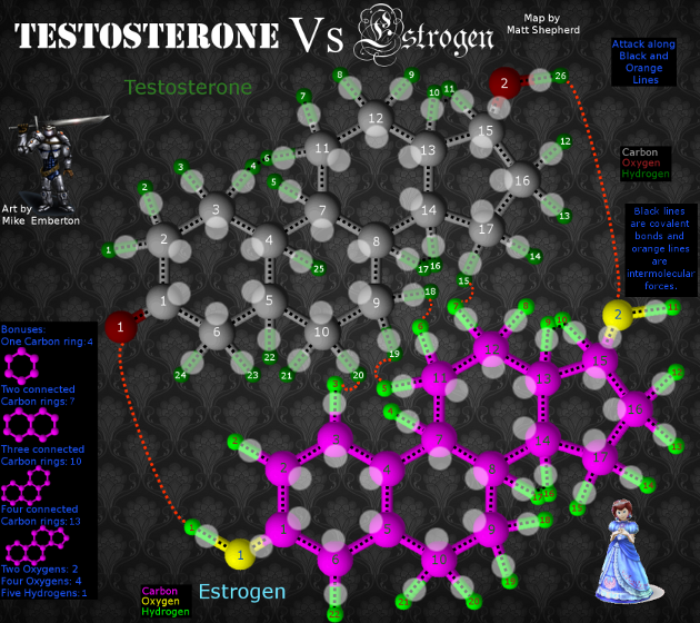
Here's a look at version 7:
Small:
Large:
Small:
Large:
Check out my map in the making: Testosterone VS Estrogen
http://www.conquerclub.com/forum/viewto ... 41&t=85196
http://www.conquerclub.com/forum/viewto ... 41&t=85196
-
33.maverick.33
- Posts: 1
- Joined: Mon May 04, 2009 11:07 am
Re: Testosterone VS Estrogen(Version 8)
This map looks really interesting. It's definetly original and would make for some great play.
- mattosaurus
- Posts: 73
- Joined: Thu Feb 26, 2009 1:38 pm
- Gender: Male
- Location: North Carolina
Re: Testosterone VS Estrogen(Version 8)
XML work is coming along well. I'll get it up as soon as I figure out how.
Check out my map in the making: Testosterone VS Estrogen
http://www.conquerclub.com/forum/viewto ... 41&t=85196
http://www.conquerclub.com/forum/viewto ... 41&t=85196
- mattosaurus
- Posts: 73
- Joined: Thu Feb 26, 2009 1:38 pm
- Gender: Male
- Location: North Carolina
Re: Testosterone VS Estrogen(XML version)
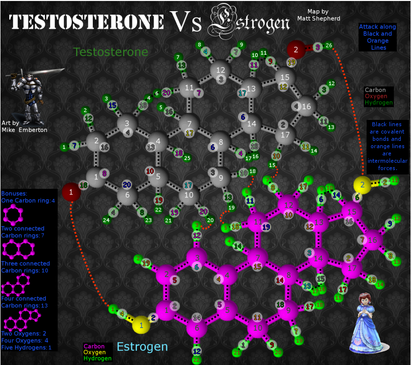
So here are the updated Maps
Small:
Large:
Small:
Large:
Check out my map in the making: Testosterone VS Estrogen
http://www.conquerclub.com/forum/viewto ... 41&t=85196
http://www.conquerclub.com/forum/viewto ... 41&t=85196
Re: Testosterone VS Estrogen(XML version)
Hi Matt,
I haven't spent enough time to completely wrap my noodle around the gamplay, but I have some general comments.
For starters, it's a little confusing to have army circles attached to the territory circles - I'd like to see you explore ways to get the army circles on the molecules themselves yet still attach a territory name.
It would be interesting to count up how many territories only have one outlet, because I'm afraid that having so many dead ends and bottlenecks will lead to a lot of stalemates on this map.
Graphically, the man and woman and very cutesy-role playing game, the molecules are very 3-D digital design, the background is very art nouveau, and the title goes from military to gothic. I think you need to find one artistic style and go with it.

- mattosaurus
- Posts: 73
- Joined: Thu Feb 26, 2009 1:38 pm
- Gender: Male
- Location: North Carolina
Re: Testosterone VS Estrogen(XML version)
Well, I think I agree on the army circle thing and will work on that. At least the title I was going for the contrast between male and female, which is the point of the map, but maybe the background does need some changing. I'll take a look and see what I can find. Thanks for the advice.oaktown wrote: For starters, it's a little confusing to have army circles attached to the territory circles - I'd like to see you explore ways to get the army circles on the molecules themselves yet still attach a territory name.
It would be interesting to count up how many territories only have one outlet, because I'm afraid that having so many dead ends and bottlenecks will lead to a lot of stalemates on this map.
Graphically, the man and woman and very cutesy-role playing game, the molecules are very 3-D digital design, the background is very art nouveau, and the title goes from military to gothic. I think you need to find one artistic style and go with it.
Check out my map in the making: Testosterone VS Estrogen
http://www.conquerclub.com/forum/viewto ... 41&t=85196
http://www.conquerclub.com/forum/viewto ... 41&t=85196
Re: Testosterone VS Estrogen(XML version)
I get what you were after, but there's nothing feminine about that font. It's decorative, yes, but the gothic serifs are actually very masculine in my opinion. There are better options that would work with the military font in that they would both be more contemporary...mattosaurus wrote:At least the title I was going for the contrast between male and female, which is the point of the map...
http://www.fontspace.com/category/cute,girly
Maybe that's what bugs me - the elements aren't from the same era. You've got a quasi-futuristic knight in armor, a 1990s-looking 3-D representation of molecules, a mid 20th century stencil font, a 13th century gothic font, an early 20th century background, and a fairy tale princess.
And if you're going to go 3-D with the molecules, it looks odd to have nothing else on the map 3D.

- mattosaurus
- Posts: 73
- Joined: Thu Feb 26, 2009 1:38 pm
- Gender: Male
- Location: North Carolina
Re: Testosterone VS Estrogen(New Design with poll)
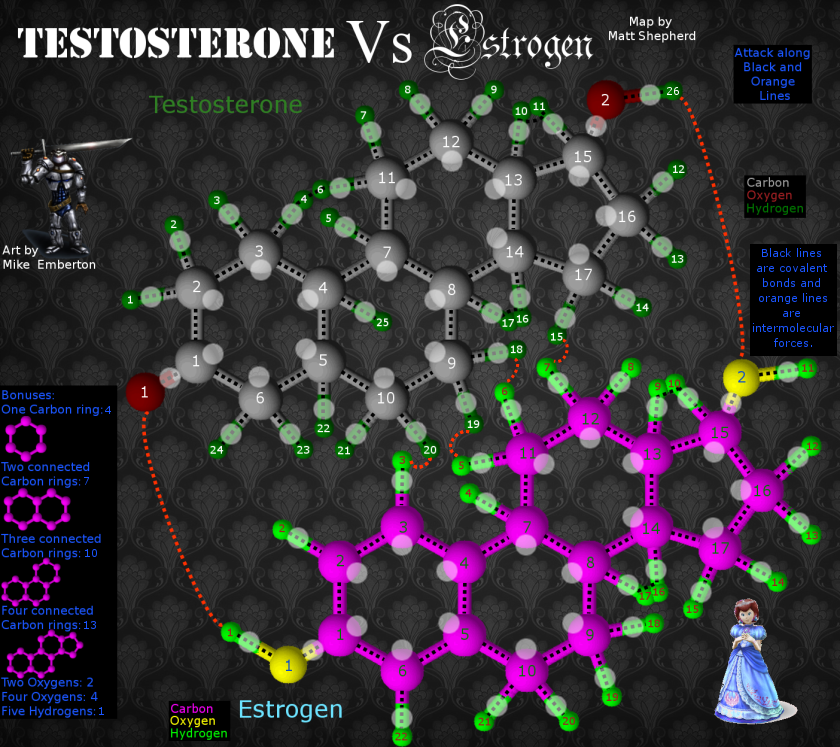
Here's another update to the map:
I got the territory part of the XML complete and checked it with the tester and it showed up great. Now on to the continents and such.
Here's the large map with XML:
I made the army circles 22 pixels across on both large and small to accommodate the numbers better when I move into XML stage.
I added a bit of scientific information for fun. I love learning something when I want to, and its off to the side and barely noticeable, so as not to interfere with gameplay.
I also added a few other attack points between the two molecules, which may make gameplay better.
I changed the bonuses to ones which I think are a bit more fair.
Old Info: 86 Territories
The long orange lines between the molecules are hydrogen bonds. The short ones are hydrophobic interactions and the black lines are covalent bonds.
Let me know if anything needs improving. I am working hard on keeping any updates and taking any advice into account.
Check out my map in the making: Testosterone VS Estrogen
http://www.conquerclub.com/forum/viewto ... 41&t=85196
http://www.conquerclub.com/forum/viewto ... 41&t=85196
- gonffthethief
- Posts: 4
- Joined: Tue Apr 28, 2009 4:19 pm
Re: Testosterone VS Estrogen(XML version)
oaktown wrote:I get what you were after, but there's nothing feminine about that font. It's decorative, yes, but the gothic serifs are actually very masculine in my opinion. There are better options that would work with the military font in that they would both be more contemporary...mattosaurus wrote:At least the title I was going for the contrast between male and female, which is the point of the map...
http://www.fontspace.com/category/cute,girly
Maybe that's what bugs me - the elements aren't from the same era. You've got a quasi-futuristic knight in armor, a 1990s-looking 3-D representation of molecules, a mid 20th century stencil font, a 13th century gothic font, an early 20th century background, and a fairy tale princess.
And if you're going to go 3-D with the molecules, it looks odd to have nothing else on the map 3D.
Well I'm a girl and I think the Gothic text is great-- it's lighter, curvier, and more organic. In essence, more feminine-- while the one for testosterone is bold and solid. If you think Gothic is really masculine, perhaps you should go back and study your Abbé Suger and his theory of lux continua.
If you want to talk art and history and combining stark contrasting elements, think of the Palazzo Medici Riccardi in Florence. The bottom has a very solid with thick masonry that presents a very masculine feel while the piano nobile is lighter and more feminine, while the residence floor has the lightest masonry and thin arches. It uses many styles from contemporary to antiquity, yet you don't hear people complaining about Michelozzo's design...
In fact, take the High Renaissance. Can you say combining antiquity and contemporary? It's the epitome of that.
And having the molecules being the most 3-D is what makes the molecule stand out. The game is about the molecules. They shouldn't blend in with everything else in my opinion.
Art-nouveau? Organic themes have been seen since the beginning of art. There has always been an organic quality to art throughout history. I find it makes a great aesthetic contrast between the linear qualities of the molecules.
By the way, almost every girl at some point wanted to be a fairy tale princess. Why do you think Disney princess movies sell so well?
And obviously guys like the whole soldier/ warrior conquer deal, judging by the name of the website...
Re: [Poll]Testosterone VS Estrogen(New Design)
[Moved]
It would appear that development of this map has stalled. If the mapmaker wants to continue with the map, then one of the Foundry Moderators will be able to help put the thread back into the Foundry system, after an update has been made.
It would appear that development of this map has stalled. If the mapmaker wants to continue with the map, then one of the Foundry Moderators will be able to help put the thread back into the Foundry system, after an update has been made.

PB: 2661 | He's blue... If he were green he would die | No mod would be stupid enough to do that
- mattosaurus
- Posts: 73
- Joined: Thu Feb 26, 2009 1:38 pm
- Gender: Male
- Location: North Carolina
Re:Testosterone VS Estrogen(New Design)
OK, so now we have two very different versions of the map that needs to be voted on. Based on the last comment, I've changed a lot of things around, starting basically from scratch. Now in this poll we're going for basic design, as neither map is completely finished. Also, there are two version of the new map: with army circles and without. So vote away!
Last edited by mattosaurus on Mon Jun 22, 2009 2:44 pm, edited 1 time in total.
Re: Testosterone VS Estrogen (V9)
[moved] back to the drafting room.
Of the three images, I prefer the top two (what are the differences between them?); although the concept of the map really doesn't have a great deal of appeal for me.
The image feels incredibly busy, and the colour-scheme distracts from the playable area... It's good to see that you've put a bit of thought into attack routes between the two halves of the map - your primary focus should be on gaining support from the wider community, and putting your thoughts into how the gameplay will pan out (with a view to ensuring balanced gameplay).

PB: 2661 | He's blue... If he were green he would die | No mod would be stupid enough to do that


