Map-Maker: Danyael
Map Title: Goblin Tribes
Continents: 4 tribal zones
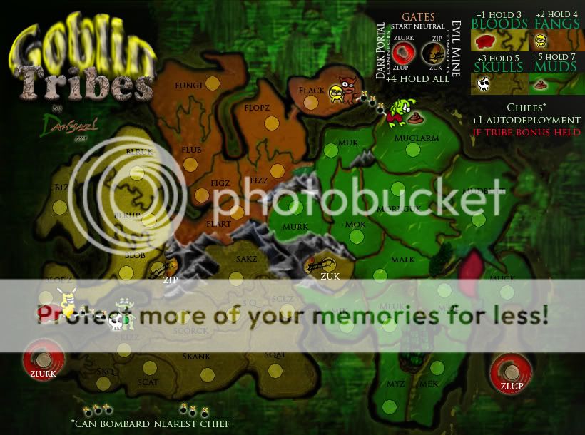
Regions: 50 regions 8 start neutral(Chiefs and Gates)


Gameplay:
Features:
One Way Assaults
Double Dipping
Build Your Own Bonus systems
4 goblin tribes fighting to dominate the goblin grotto within the forest of faces
- tribes are the fangs, skulls, muds, and bloods
2 types of gates
start neutral (2)
- evil mine and dark portal
-same type connects
-hold all four for +4 bonus
-are not part of the tribe territs
4 chiefs territs
-chiefs start as 3 neutral
-marked with crown army indicator
-chiefs can bombard other chiefs and assault the territory there crown army number indicator sits in
-hold chief and receive +1 for every 3 of there tribal territories held
secret one way paths
Hobgoblin hut on fungi can one way myz's and bug's mushroom patches
Version 19
CHANGES
changed wording in chief portion of legend
WORKING ON
improving gate legend
- Are the different colours for different types of gates improving clarity or not?
- Will be enlarging size of mine icon and blending both portal and mine icons better with the text.
- Are the colours used for the Evil Mine and Dark Portals ok??
TO DO
- Move MUD icons slightly lower on a few of the regions.
- Update Small Map
VERSION 18
Starting territ amounts
2 and 3 players - 14 territories (14 neutrals in 2 player, none in 3 player)
4 players - 10 territories (2 neutrals)
5 players - 8 territories (2 neutrals)
6 players - 7 territories (no neutrals)
7 players - 6 territories (no neutrals)
8 players - 5 territories (2 neutrals)
Tribe Bonuses
fangs = 3
bloods = 5
skulls = 5
muds = 6
Gate Bonus
hold all = 4
Previous Versions
version 1 and original post


