Not much feedback here these days... but that may be expected after two years

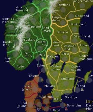
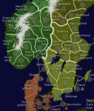
I've made another update. Nothing gameplay changing but I thought readability needed to improve on the small map, so I restored the font width (space between letters). This caused some minor collisions with borders that couldn't be fixed by rearranging, but that will be fixed next version by redrawing borders to fit better. The change was definetely worth it, the text is much easier to read now.
Have experimented further with colored borders but I'm doubtful... did a bit of shadow on the borders for now instead. Will do similar shadowing for the text next version, which should both make things look better and make the text even easier to read. Another thing I'm not happy with is the army circles, which have to be visually improved, or removed.
The only idea I have for possible gameplay changes is removing a few areas in sweden and/or norway. But I can't see much improvement doing so, not that it's worth diverting from reality for. I may be wrong of course

Edit: I've realized the number of defensible territories for certain bonus areas must go down. That may require removing a few areas, but I think it could be done simply by rearranging the borders somewhat and adding a few more water impassables.
I don't need a 500px image in my signature because I don't have anything to compensate for.


