
- Click image to enlarge.
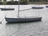
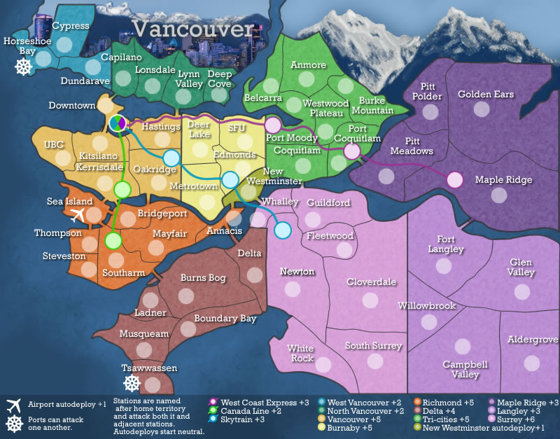
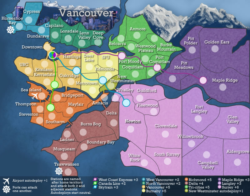
Wow.. a purple map. I like the colors you've chosen. Soft, pastel feel - my style. And lots of bonus regions. This should make for many a good battle.
Here's some of my critiques:
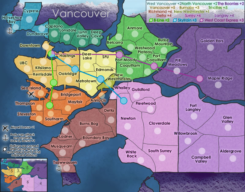
* The territory font you've chosen is okay. It's very plain. That's good, it's better than something that you can't read. But in this case, it looks preschool. I would suggest bringing the point size down just a bit. Maybe try a few other font styles in the same family as the plain san-serif family. And personally, I think the outer glow on those territ names is too bright. Also - your army circles look pixilated. See below.
* Your borders still don't look that good. It looks like it took you about 5 minutes to draw every border on the map. There are jagged places. They are all just black. Are those real region borders? If so are they really that straight? Maybe you could put a little more curve in them, so they don't look like a kids puzzle. Also, if they are not "true" region borders, maybe you could adjust some a bit to allow room for the full territory names and army circles. ?
* The title needs some work. Again, personal taste, but I don't care for the mountain range masked into the non-playing territory lands. I would prefer all the non-play lands be a neutral gray/beige type color, then just have a very nice "Vancouver" title on top. See how you did those beveled mountains in the south part? Maybe have that same type look in the north part also?
* In your mini-map, take out the territory borders. You don't need them. Just keep the main bonus region borders. Like see in your minimap how the dark purple "The Boonies" doesn't have the inner territ borders? Thats how the whole map should be.
* the explanation text above the minimap (Airports, Ports, Stations...) is almost unreadable. The black font with the hard white stroke looks really really bad. You need to redo that somehow. Howabout just white text, with no stroke.
* I would say loose the land bridge style you have, and go for a real bridge graphic. And maybe add some curves to those railway lines. Curve them around the territ names, and army circles. Put some layer efx on them also. Looks like you drew them in Paint as they are now. Very pixilated and straight.
Overall - the map looks fun, and I would love to play it. You just need to work on the visuals. Don't give up. There's plenty of tutorials around here and the web for ideas.


