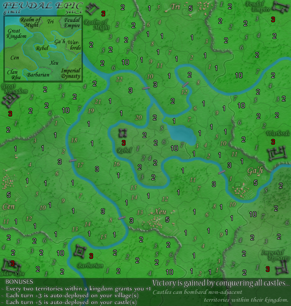
gimil wrote:cairnswk wrote:edbeard wrote:.... I really need to focus to see the numbers
perhaps with the gold/yellow made the shadow darker so the numbers come out crisper
with the greens I think a different colour and/or larger text would help a lot
I agree....the numbers are very blurry for these old eyes.
I am also in agreement, unfortunatly I can't find a better colour to fit with the map.
It may be an aliasing issue with the text. If you are using photoshop pay attention to the alias setting. Sharp and Strong may provide better results.


 )
) 


