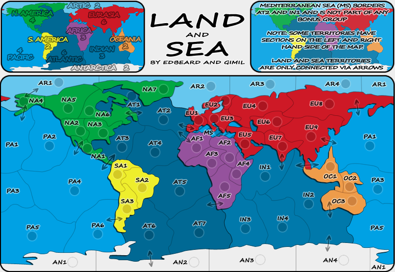
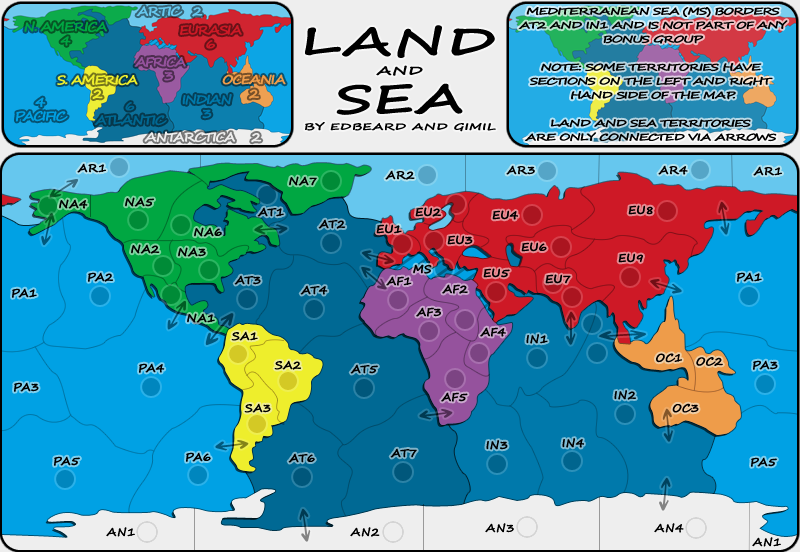
ZeakCytho wrote:Sorry Gimil, but I'm gonna hop on the bandwagon and ask that you reduce the opacity in the top right box, at least. It's a bit hard to read the text over it.
Otherwise, this is looking really nice. Good work Ed and Gimil
I am thinking of a way to fix this issue zeak. Unfortuantly opacity isn't the way to go. I gave it a try and it makes the map look lop sided and it appears t be to pale to work which the rest of the maps colour scheme.