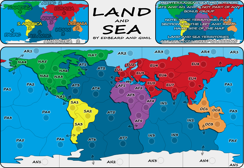
(NA2-NA3, AN2-AN3, and Alaska for example)
I didn't see anything else like those but another set of eyes over every border is a good idea
also, anybody, remember to look over my list. that's exactly how they'll appear in the XML. that part will not change. The names I gave to areas (eg: the Colombia part of SA1 could change to another country or name of the region) are up for debate though. Please make suggestions about the naming I did of regions if you care about it.
NA1 (Central America)
NA2 (Western US)
NA3 (Eastern US)
NA4 (Alaska)
NA5 (Western Canada)
NA6 (Eastern Canada)
NA7 (Greenland)
EU1 (Western Europe)
EU2 (Northern Europe)
EU3 (Eastern Europe)
EU4 (Western Russia)
EU5 (Middle East)
EU6 (Kazakhstan)
EU7 (India)
EU8 (Eastern Russia)
EU9 (China)
AF1 (West Africa)
AF2 (Egypt)
AF3 (Central Africa)
AF4 (Horn of Africa)
AF5 (Southern Africa)
SA1 (Colombia)
SA2 (Brazil)
SA3 (Argentina)
OC1 (Indonesia)
OC2 (Micronesia)
OC3 (Australia)
AN1 (Chile Claim)
AN2 (Argentina Claim)
AN3 (Norway Claim)
AN4 (Australia Claim)
AR1 (Chukchi Sea)
AR2 (Barents Sea)
AR3 (Kara Sea)
AR4 (Laptev Sea)
AT1 (Hudson Bay)
AT2 (North Atlantic)
AT3 (Caribbean Sea)
AT4 (Mid Atlantic )
AT5 (Central Atlantic)
AT6 (Southwest Atlantic)
AT7 (Southeast Atlantic)
PA1 (North Pacific)
PA2 (Gulf of Alaska)
PA3 (Coral Sea)
PA4 (Central Pacific)
PA5 (Southwest Pacific)
PA6 (Southeast Pacific)
IN1 (Arabian Sea)
IN2 (East Indian)
IN3 (West Indian)
IN4 (Southern Ocean)