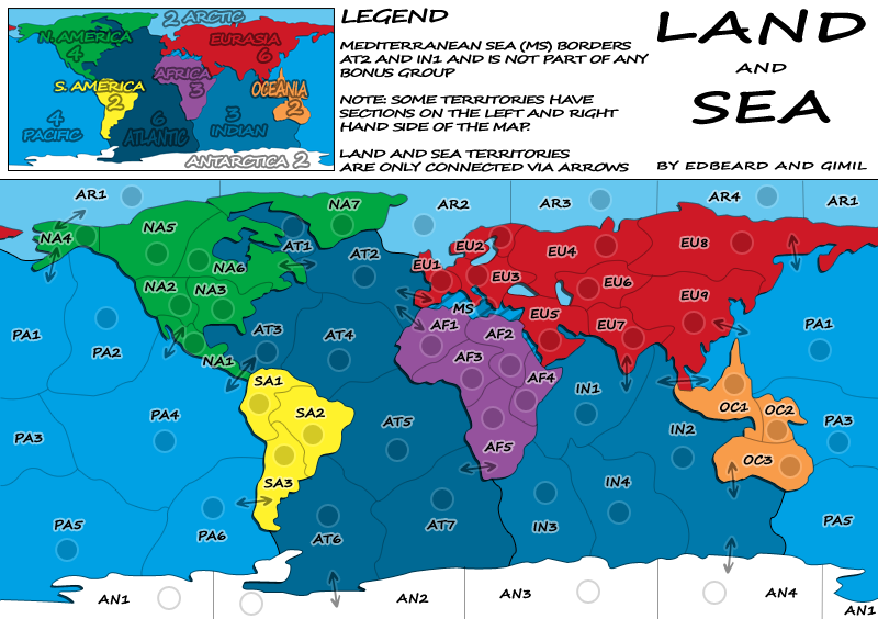
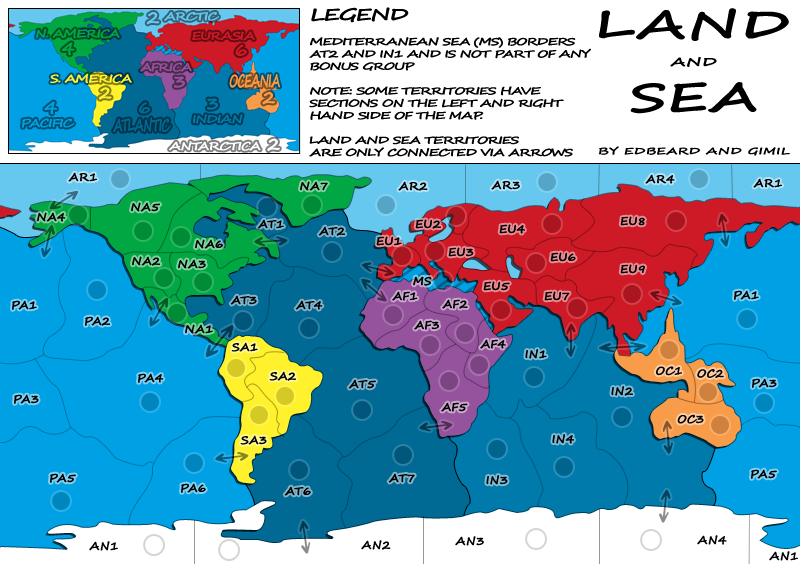
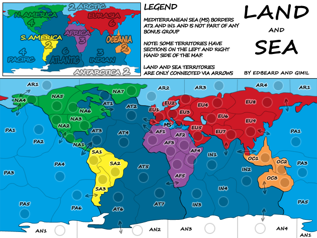
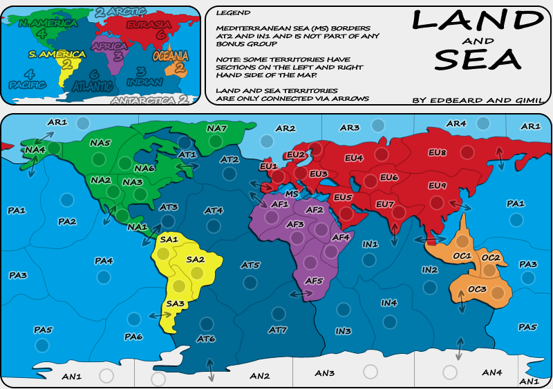
Conquer Club

Land and Sea [Quenched]

Care to peruse completed maps? Take a stroll through the Atlas.

Moderator: Cartographers

Forum rules
Please read the Community Guidelines before posting.

Re: Land And Sea v10p13 S&L

Postby gimil on Thu Jan 22, 2009 7:48 pm

cairnswk wrote:
pepperonibread wrote:Have curved arrows been suggested yet? The straight ones seem a bit out of place to me.
And any chance of giving some additional flair to this map? Things honestly seem a bit bland in the current state. I know you want to keep with a simple style, but I'd guess that just one or two subtle changes could do a lot of good. The S. America and NYC maps are two good examples of this: Relatively plain and "flat" maps, they nevertheless work very well graphically. For SA it's the color scheme and textures that does it, for NYC the criss-crossing subways and interesting title.
It doesn't have to be eye-popping, just eye-catching... I believe in you gimil :D

^^ Second that. :) Onya Pepp.


Can you guys suggest something then? Here is a little secret about me, I am not as invisonist or imaginative as many map makers on here. Sometimes I find it a little difficult think up something when you say 'add a little flare', it sounds good an all but I not as good at 'thinking outside the box as others' ;).

Help me and I will give you what you want!
What do you know about map making, bitch?

natty_dread wrote:I was wrong


Top Score:2403
User avatar
Corporal 1st Class gimil
 
Posts: 8599
Joined: Sat Mar 03, 2007 12:42 pm
Location: United Kingdom (Scotland)

Re: Land And Sea v10p13 S&L

Postby edbeard on Thu Jan 22, 2009 8:02 pm

your wrong opinion :D


if I look for something on the drop down. I tend to look for the first letter then the second then the third etc. not for the entire string at the end of each entry. that's the big thing you're missing. here's the list I just put together. Thoughts?


NA1 (Central America)
NA2 (Western US)
NA3 (Eastern US)
NA4 (Alaska)
NA5 (Western Canada)
NA6 (Eastern Canada)
NA7 (Greenland)

EU1 (Western Europe)
EU2 (Northern Europe)
EU3 (Eastern Europe)
EU4 (Western Russia)
EU5 (Middle East)
EU6 (Kazakhstan)
EU7 (India)
EU8 (Eastern Russia)
EU9 (China)

AF1 (West Africa)
AF2 (Egypt)
AF3 (Central Africa)
AF4 (Horn of Africa)
AF5 (Southern Africa)

SA1 (Colombia)
SA2 (Brazil)
SA3 (Argentina)

OC1 (Indonesia)
OC2 (Micronesia)
OC3 (Australia)

AN1 (Chile Claim)
AN2 (Argentina Claim)
AN3 (Norway Claim)
AN4 (Australia Claim)

AR1 (Chukchi Sea)
AR2 (Barents Sea)
AR3 (Kara Sea)
AR4 (Laptev Sea)

AT1 (Hudson Bay)
AT2 (North Atlantic)
AT3 (Caribbean Sea)
AT4 (Mid Atlantic )
AT5 (Central Atlantic)
AT6 (Southwest Atlantic)
AT7 (Southeast Atlantic)

PA1 (North Pacific)
PA2 (Gulf of Alaska)
PA3 (Coral Sea)
PA4 (Central Pacific)
PA5 (Southwest Pacific)
PA6 (Southeast Pacific)

IN1 (Arabian Sea)
IN2 (East Indian)
IN3 (West Indian)
IN4 (Southern Ocean)
User avatar
Lieutenant edbeard
 
Posts: 2501
Joined: Thu Mar 29, 2007 12:41 am

Re: Land And Sea v10p13 S&L

Postby edbeard on Thu Jan 22, 2009 8:14 pm

Click image to enlarge.
image


sorry I don't see how curved arrows are going to satisfy your thoughts on this map. I'm happy with how things look. gimil is apparently too otherwise he wouldn't have made it. a few of you really don't like the arrows in any form for some reason and would prefer to do it in a different way. One major problem with not doing it this way is it goes against the simplicity of the map itself.

gimil can try curved arrows if he wants but it seems like this is going to be a never ending cycle of trying to redo this small part of the map. Remember that first and foremost graphics are used to translate the gameplay of the map into a visual form. This has been accomplished quite well on this map with a few legend notes as needed. gimil has the look he likes and I like it too. I realise people are trying to help not hinder but I don't see what else can be added to the map to satisfy you. Look at the voting of the revamps. simple/less cluttered maps are the ones that are preferred. any little bits of flair we add would either seem meaningless and forced or overwhelming to the simple style we've got.


I say bring on the graphic stamp
User avatar
Lieutenant edbeard
 
Posts: 2501
Joined: Thu Mar 29, 2007 12:41 am

Re: Land And Sea v10p13 S&L

Postby cairnswk on Thu Jan 22, 2009 8:53 pm

edbeard wrote:I say bring on the graphic stamp

I say it would be a sad day for CC Foundry if this map in it's present form get a graphics stamp. :(
Image
* Pearl Harbour * Waterloo * Forbidden City * Jamaica * Pot Mosbi
User avatar
Private cairnswk
 
Posts: 11510
Joined: Sat Feb 03, 2007 8:32 pm
Location: Australia

Re: Land And Sea v10p13 S&L

Postby edbeard on Thu Jan 22, 2009 8:56 pm

cairnswk wrote:
edbeard wrote:I say bring on the graphic stamp

I say it would be a sad day for CC Foundry if this map in it's present form get a graphics stamp. :(


wow. I think you're crazy to have that view. perhaps you're blinded by dislike towards me and my past "complaining" in your threads.
User avatar
Lieutenant edbeard
 
Posts: 2501
Joined: Thu Mar 29, 2007 12:41 am

Re: Land And Sea v10p13 S&L

Postby LED ZEPPELINER on Thu Jan 22, 2009 9:20 pm

cairnswk wrote:
edbeard wrote:I say bring on the graphic stamp

I say it would be a sad day for CC Foundry if this map in it's present form get a graphics stamp. :(

i disagree, i say bring it on. IMO these are just the right graphics for this map well done
sailorseal wrote:My big boy banana was out the whole time :D
AndyDufresne wrote:
AndyDufresne wrote:Many Happy Bananas to everyone, lets party...with Bananas.
--Andy
Forever linked at the hip's-banana! (That sounds strange, don't quote me.)
Sergeant LED ZEPPELINER
 
Posts: 1088
Joined: Tue Nov 25, 2008 10:09 pm

Re: Land And Sea v10p13 S&L

Postby cairnswk on Thu Jan 22, 2009 9:23 pm

edbeard wrote:
cairnswk wrote:
edbeard wrote:I say bring on the graphic stamp

I say it would be a sad day for CC Foundry if this map in it's present form get a graphics stamp. :(


wow. I think you're crazy to have that view. perhaps you're blinded by dislike towards me and my past "complaining" in your threads.


edbeard, i guess you still very disappointed at me with that remark :( but, If i was still bitter and twisted about all that stuff i wouldn't be in here trying to get gimil to advance this map and "take is somwhere". I really wouldn't give two hoots; perhaps unfortunately for you i do care.
I appreciate that you put a lot of effort into the gameplay comments; the map has been out there in the community for some time now, and you've got tons of feedback returned on the gameplay. That's great. :)
But you've not really satisfied a call from several commenters about the arrows and from others about the theme.
The title area still looks as flat as a tack, and i appreciate you want to keep it minimalist looking, but even if Gimil put a 15px border around the map to extend it to 830px at large size in modernist style, it would start to "take this map somewhere" rather than it be simply a modernist version of World 2.1 with sea territories thrown in.
i know we've all got a great propensity as artist to be very stubborn sometimes, and i am no different, and we're all never gonna see eye-to-eye 100% of the time, but i think you could do a lot better with this graphically, and thus i made that comment.
See the difference a simple border makes. It moves that map from being flat to beginning to have some character. Now obviously this border probably wouldn't be the correct one, but it's only one idea that gimil asked us for.
Click image to enlarge.
image
Image
* Pearl Harbour * Waterloo * Forbidden City * Jamaica * Pot Mosbi
User avatar
Private cairnswk
 
Posts: 11510
Joined: Sat Feb 03, 2007 8:32 pm
Location: Australia

Re: Land And Sea v10p13 S&L

Postby edbeard on Thu Jan 22, 2009 10:48 pm

cairnswk wrote:But you've not really satisfied a call from several commenters about the arrows and from others about the theme.


this is where you're wrong/biased. you don't like the arrows and nothing I can say will convince you. I've provided perfect reasoning for why arrows are the best option. you and others just choose to ignore it and basically the only response you give is "I don't like them." Don't confuse that with me not fulfilling a requirement. Just because I'm not budging and you're not liking it doesn't mean I'm wrong.


cairnswk wrote:The title area still looks as flat as a tack, and i appreciate you want to keep it minimalist looking, but even if Gimil put a 15px border around the map to extend it to 830px at large size in modernist style, it would start to "take this map somewhere" rather than it be simply a modernist version of World 2.1 with sea territories thrown in.
i know we've all got a great propensity as artist to be very stubborn sometimes, and i am no different, and we're all never gonna see eye-to-eye 100% of the time, but i think you could do a lot better with this graphically, and thus i made that comment.
See the difference a simple border makes. It moves that map from being flat to beginning to have some character. Now obviously this border probably wouldn't be the correct one, but it's only one idea that gimil asked us for.


you're asking for us to totally change the graphical theme. we're taking a minimalist view but you're ignoring a lot of what I've said. The masses have been voting for the simpler maps. A lot of the time we see complaints about maps being too busy. Simplicity is not bad. I'm not saying every map should be like this. It's part of a widespread group of maps.

Calling this map "World 2.1 with sea territories thrown in" is very ignorant. This map is bringing a new viewpoint to the world map. It's doing so in a way that is simple. You don't like it but many people out there will appreciate a map that is easy on the eyes.

I personally don't see how the border you've put is a "good start". I think it makes things look worse. We have different opinions on this subject. Mine is the one which is staying (unless gimil wants to make big changes) and you having a different opinion is not a reason why we have to change anything.

the views of people posting in the foundry are unfortunately making gimil unsure about what he's done. I think it's an excellent job at a simple map and it's fine if he wants to do something different with the graphics but I don't want him to change things unless HE wants to not because a few people are campaigning against the graphics because they are simple in nature. It's not a bad thing but you're making it out to be just that. In a way it feels like people are continuing to post about the same thing because they hope if they keep talking it'll force some change. Unlike times when I've kept up on an issue, I've given reasons for what we do with sound logic. This is enough. If you keep bringing up things that have been answered to satisfaction, your comments will be ignored. I'm not going to explain why arrows are the best option again. It's been done. As have other things.
User avatar
Lieutenant edbeard
 
Posts: 2501
Joined: Thu Mar 29, 2007 12:41 am

Re: Land And Sea v10p13 S&L

Postby InkL0sed on Fri Jan 23, 2009 12:13 am

gimil wrote:
cairnswk wrote:
pepperonibread wrote:Have curved arrows been suggested yet? The straight ones seem a bit out of place to me.
And any chance of giving some additional flair to this map? Things honestly seem a bit bland in the current state. I know you want to keep with a simple style, but I'd guess that just one or two subtle changes could do a lot of good. The S. America and NYC maps are two good examples of this: Relatively plain and "flat" maps, they nevertheless work very well graphically. For SA it's the color scheme and textures that does it, for NYC the criss-crossing subways and interesting title.
It doesn't have to be eye-popping, just eye-catching... I believe in you gimil :D

^^ Second that. :) Onya Pepp.


Can you guys suggest something then? Here is a little secret about me, I am not as invisonist or imaginative as many map makers on here. Sometimes I find it a little difficult think up something when you say 'add a little flare', it sounds good an all but I not as good at 'thinking outside the box as others' ;).

Help me and I will give you what you want!


For the title, why don't you have some land underneath "Land", with a transition to sea/water under "Sea". Maybe with a beach under "and", though that would depend on how you do it.
User avatar
Lieutenant InkL0sed
 
Posts: 2370
Joined: Sat Jun 23, 2007 4:06 pm
Location: underwater

Re: Land And Sea v11p18

Postby gimil on Fri Jan 23, 2009 7:27 pm

Sorry cairns but a border isn't going to work. Anything textured will move away from what we want in this map and anything plain will pretty much be a solid coour round the map which doesn't work (tried it before). I am starting to think that the simplicity argument we have going on here is a matter of personal taste rather than concern. Sme like it, some want something that may move away from my original aim and image.

I am going out of town for a few days so edbeard will have the PSD file and pretty much taking over the graphics, until I return at least.

Here is the latest map with the atlantic colour on the minimaps fixed.

Click image to enlarge.
image


Click image to enlarge.
image
What do you know about map making, bitch?

natty_dread wrote:I was wrong


Top Score:2403
User avatar
Corporal 1st Class gimil
 
Posts: 8599
Joined: Sat Mar 03, 2007 12:42 pm
Location: United Kingdom (Scotland)

Re: Land And Sea v12p19 S&L

Postby oaktown on Sat Jan 24, 2009 1:14 pm

I can see that you guys have already been having it out about the graphics stamp, but I am going to resist the temptation to try to break up this little playground scuffle and just tell you what I think.

I love the idea of creating a map with a minimalist approach. Sometimes our maps get overburdened with design elements in our effort to out-do ourselves and each other. So I give huge kudos for the idea.

However, the execution is still missing something. Just because art is minimalist does not mean that it is without a consistent and identifiable style. Some elements of this map don't quite work together, in my opinion. The type effects, for example: straight black text in the legend, balloon-like outlined text in the mini-map, and white-outlines in the main map with the exception of the antarctic where the outline is lost. The legend looks like a first draft - no thought seems to have put into how the pieces work together, with "LAND" almost colliding with the legend info, a big, awkward gap before the signature, and nothing lining up horizontally. But what I think troubles me the most stylistically are the lines on the map itself: thin, nearly transparent territory borders that contrast with solid, black text; and along the south and north edges of the map all borders are straight, vertical lines, while the rest of the map employs soft, waving lines with almost no right angles. If the look is supposed to be more flowing and organic, I would say remove ALL right angles from the image, including those in the box around the mini-map. And to complete the effect you could put rounded edge on the map itself with a transparent background to snip the corners off of the map.

I know that folks are probably going to throw their shoes at me for this one, but I think that a good example of a "minimalist" map that maintains a consistent point of view is the Classic: Art map. Sure, it was thrown together in a few hours, but everything from the background to the border to the legend to the signature have a nod to its cubist roots.

Don't get me wrong, there are some elements that absolutely work here stylistically. I love the color choice, and the army circles are fantastic - they work very well with the white stroke on the text. The font choice itself is consistent with the flowing lines of the borders. Even the arrows are working more for me now than they were before... I might give them a bit more bend - though not sharply curved as suggested above - just so they work better with the bends of the border lines, but the effects fit the map.

Beyond that, there are some little technical things that need addressing: some borders don't end in the right place (NA2-NA3, AN2-AN3, and Alaska for example). The bottom lines of text in the legend could line up with each other and the mini-map. And since you have to have arrows of varying sizes for the different connections, it would look better if they were just lengthened rather than actually sized up - the different sizes of arrowheads look funny.

MS may still be problematic - what about taking a bit more liberty with geography and giving it a few more pixels horizontally? Africa certainly has room to move down without having an impact on any other territory.
User avatar
Captain oaktown
 
Posts: 4451
Joined: Sun Dec 03, 2006 9:24 pm
Location: majorcommand

Re: Land And Sea v12p19 S&L

Postby edbeard on Sat Jan 24, 2009 4:29 pm

obviously we'll fix the lines on the map. thanks for pointing those out. I'll look for more.

MS is as well done as can be on the map itself. It's got a visual cue in the striped colours. It's got a mention in the legend. If people screw that up then that's on them. You can only help people so much.

as for some other things, I'll wait for gimil to come back and respond though I don't see how curved lines for the mini-map is going to make any difference at all. I don't agree with all the things you said about the legend. I don't agree with your thoughts on the arrows either. that's just a few things. pretty much I disagree with your whole post. But, we'll wait for gimil to come back and I can discuss things with him.
User avatar
Lieutenant edbeard
 
Posts: 2501
Joined: Thu Mar 29, 2007 12:41 am

Re: Land And Sea v12p19 S&L

Postby oaktown on Sat Jan 24, 2009 8:39 pm

We can agree to disagree, edbeard, but if some new mapmaker posted a map draft with a legend/title box that was nothing more than a white box with poorly laid-out black text we would never let that pass.

I'll wait to hear what gimil has to say before I respond any further.
User avatar
Captain oaktown
 
Posts: 4451
Joined: Sun Dec 03, 2006 9:24 pm
Location: majorcommand

Re: Land And Sea v12p19 S&L

Postby edbeard on Sat Jan 24, 2009 8:48 pm

this is where things have gone south in the foundry

I don't see how anyone with true sense would say this legend is not passable whereas ones on maps like

Africa, Classic, Archipelago, Caribbean Islands, Australia, France, Iceland, Portugal etc

are passable. you might not like the text type in the mini-map but what do those have that these don't?


calling the text "poorly laid-out"? you cannot be serious. this is getting out of control.
User avatar
Lieutenant edbeard
 
Posts: 2501
Joined: Thu Mar 29, 2007 12:41 am

Re: Land And Sea v12p19 S&L

Postby oaktown on Sun Jan 25, 2009 2:27 am

edbeard wrote:this is where things have gone south in the foundry

you're right, things have gone south here. I am handing the graphics stamp off to cairnswk.
User avatar
Captain oaktown
 
Posts: 4451
Joined: Sun Dec 03, 2006 9:24 pm
Location: majorcommand

Re: Land And Sea v12p19 S&L

Postby edbeard on Sun Jan 25, 2009 4:04 am

DiM impression: :roll:

I realise you were stepping in and being helpful since gimil can't stamp his own map but apparently I can't be contrary without you taking offense. You haven't provided me with arguments with reasoning and logic but instead ones filled with opinion. These are not things which should hold maps back. If I agree with your opinion and change the map, I'll get stamped. If I disagree then you leave and have someone else manage the stamp. You say you're on board with the Minimalist approach but it feels just like when people say they understand that a revamp only affects graphics but they still don't want it simply because it'll ruin their game and the map won't play the same again. I would implore you to take a hard look at your volunteering here. In the past, you have done a great job here but now whenever I disagree with you and include any language that is slightly "colourful", you get offended. It's a shitty job you have with little reward and maybe you've run the course. But obviously you should only do what you want to do not because I've said something. If it's just me you can't work reasonably with then don't fret since I won't be working on maps in the future except the Pirate one with WM.
User avatar
Lieutenant edbeard
 
Posts: 2501
Joined: Thu Mar 29, 2007 12:41 am

Re: Land And Sea v12p19 S&L

Postby gimil on Sun Jan 25, 2009 12:02 pm

I know I said I would be gone but I am just ing checking in for an hour. (I really will be gone soon;))

The idea of curving off the map corners has put a really good vision in my head that will not (I think) take away from the simplicity of the map. What I am thinking is, rounded corners of the map and minimap with a very thin (maybe beveled) 2-3px black border. with the space next to the minimap I can rearrange the legends so have the same black (round cornered) border around the legends and title.

Basically we will have three round cornered boxes.

-One for the main map
-One for the minimap
-One of the legends and title.

win?
What do you know about map making, bitch?

natty_dread wrote:I was wrong


Top Score:2403
User avatar
Corporal 1st Class gimil
 
Posts: 8599
Joined: Sat Mar 03, 2007 12:42 pm
Location: United Kingdom (Scotland)

Re: Land And Sea v12p19 S&L

Postby cairnswk on Sun Jan 25, 2009 12:48 pm

gimil wrote:I know I said I would be gone but I am just ing checking in for an hour. (I really will be gone soon;))

The idea of curving off the map corners has put a really good vision in my head that will not (I think) take away from the simplicity of the map. What I am thinking is, rounded corners of the map and minimap with a very thin (maybe beveled) 2-3px black border. with the space next to the minimap I can rearrange the legends so have the same black (round cornered) border around the legends and title.

Basically we will have three round cornered boxes.

-One for the main map
-One for the minimap
-One of the legends and title.

win?


Gimil, that might be a plan. :) See how it looks.

In preparation for your graphics stamp, can you look at a few small things below (and apologies if some of this has been covered previously):
1. Oceania and Atlantic are different sizes in the mini-map, looks as though some mix-up has occurred in the font size of numbers and names.
2. Do you need the word "Legend". If not, then perhaps space that left text out accordingly.
3. And see what the title looks like if it is more centered in that area of real estate that is occupies....it's really annoying me at present for some reason....
4. the dark lines between AT7 & IN3 and IN2 & PA5 have chunky black bits at the apex of the curves on the large map...is this possible to look at defining those lines better to remove the thick bits
5. While i still don't like the arrows, they are much better in this form that previously, however, can you look at some of the placement/direction you've got them at...move EU4 to PA1 up a fraction, rotate NA6 to AT2 a fraction down on the right so it clashes less with the name AT!
6. can you centre AT6 and its circle a little better
7. and generally have look at the proximity of the names and circles across the map, there seems to be some large variations happening there.
Image
* Pearl Harbour * Waterloo * Forbidden City * Jamaica * Pot Mosbi
User avatar
Private cairnswk
 
Posts: 11510
Joined: Sat Feb 03, 2007 8:32 pm
Location: Australia

Re: Land And Sea v12p19 S&L

Postby gimil on Thu Jan 29, 2009 1:40 pm

Here is a very rough idea of what I am heading for. I may go with antoher two boxes up top, one for the title and one ofr the legends text. If everyone happy to head in this direction before I make a major update?

Click image to enlarge.
image
What do you know about map making, bitch?

natty_dread wrote:I was wrong


Top Score:2403
User avatar
Corporal 1st Class gimil
 
Posts: 8599
Joined: Sat Mar 03, 2007 12:42 pm
Location: United Kingdom (Scotland)

Re: Land And Sea v12p19 S&L

Postby cairnswk on Thu Jan 29, 2009 1:56 pm

gimil wrote:Here is a very rough idea of what I am heading for. I may go with antoher two boxes up top, one for the title and one ofr the legends text. If everyone happy to head in this direction before I make a major update?
...

Yes. This is already an improvement. :) I feel as though you might take this somewhere.
Image
* Pearl Harbour * Waterloo * Forbidden City * Jamaica * Pot Mosbi
User avatar
Private cairnswk
 
Posts: 11510
Joined: Sat Feb 03, 2007 8:32 pm
Location: Australia

Re: Land And Sea v12p19 S&L

Postby gimil on Thu Jan 29, 2009 1:59 pm

cairnswk wrote:
gimil wrote:Here is a very rough idea of what I am heading for. I may go with antoher two boxes up top, one for the title and one ofr the legends text. If everyone happy to head in this direction before I make a major update?
...

Yes. This is already an improvement. :) I feel as though you might take this somewhere.


Ok, I am just going to work on the large for now until I am stamped. Then I will put resize for the small. It is much easier this may with the amount of work I am going to be doing on it tonight.
What do you know about map making, bitch?

natty_dread wrote:I was wrong


Top Score:2403
User avatar
Corporal 1st Class gimil
 
Posts: 8599
Joined: Sat Mar 03, 2007 12:42 pm
Location: United Kingdom (Scotland)

Re: Land And Sea v12p19 S&L

Postby edbeard on Thu Jan 29, 2009 3:31 pm

pretty sure you need both versions for a stamp.
User avatar
Lieutenant edbeard
 
Posts: 2501
Joined: Thu Mar 29, 2007 12:41 am

Re: Land And Sea v12p19 S&L

Postby gimil on Thu Jan 29, 2009 3:40 pm

edbeard wrote:pretty sure you need both versions for a stamp.


I have never been anal about have both versions for a stamp.
What do you know about map making, bitch?

natty_dread wrote:I was wrong


Top Score:2403
User avatar
Corporal 1st Class gimil
 
Posts: 8599
Joined: Sat Mar 03, 2007 12:42 pm
Location: United Kingdom (Scotland)

Re: Land And Sea v12p19 S&L

Postby gimil on Fri Jan 30, 2009 7:01 pm

Lets try this:

Click image to enlarge.
image
What do you know about map making, bitch?

natty_dread wrote:I was wrong


Top Score:2403
User avatar
Corporal 1st Class gimil
 
Posts: 8599
Joined: Sat Mar 03, 2007 12:42 pm
Location: United Kingdom (Scotland)

Re: Land And Sea v12p19 S&L

Postby cairnswk on Fri Jan 30, 2009 7:53 pm

Gimil, for me...
1. can you bring the title down into the middle of the white real estate, and perhaps bring the sigs up underneath that....i think it might looked better centered.
2. you'll need to put a transparency or similar over the right side map as it gets confused with the text...i can't read it without having to really hone in on it....the map underneath is too strong
3. S. America and N.America in mini-map....is there a space in there after das punkt on S. America and not N.America
4. there are some harsh peaks at the top corners of your rounded edges, can you blur these or similar to remove that peak
5. can you check the names in mini-map, some seem to have bolder edges than others, or is that because of the colour?

I think this is looking much better IMHO, it gives the title a finish that wasn't there before and keeps with your wanting that minimalist edge.
That's all i can see for now. :)
Image
* Pearl Harbour * Waterloo * Forbidden City * Jamaica * Pot Mosbi
User avatar
Private cairnswk
 
Posts: 11510
Joined: Sat Feb 03, 2007 8:32 pm
Location: Australia

PreviousNext

Return to The Atlas

Who is online

Users browsing this forum: No registered users