I don't know if you have stated it before, but could you enlighten me as to why? Its eaiser to make the changes if we know what your reserves are.cairnswk wrote:I am requesting that also.gimil wrote:Someone else did as well! I can't remeber who.edbeard wrote:you were the one saying we needed new arrows not me
Land and Sea [Quenched]
Moderator: Cartographers
Forum rules
Please read the Community Guidelines before posting.
Please read the Community Guidelines before posting.
-
gimil

- Posts: 8599
- Joined: Sat Mar 03, 2007 12:42 pm
- Gender: Male
- Location: United Kingdom (Scotland)
Re: Land And Sea v10p13 S&L
What do you know about map making, bitch?
Top Score:2403natty_dread wrote:I was wrong

Re: Land And Sea v10p13 S&L
Reserves....do you mean reasons?gimil wrote:I don't know if you have stated it before, but could you enlighten me as to why? Its eaiser to make the changes if we know what your reserves are.cairnswk wrote:I am requesting that also.gimil wrote:Someone else did as well! I can't remeber who.edbeard wrote:you were the one saying we needed new arrows not me
The arrows are too stark and contrasting and stick out like sore thumbs like pieces of sticky tape holding the map together.
I know you can do better gimil.

* Pearl Harbour * Waterloo * Forbidden City * Jamaica * Pot Mosbi
-
gimil
- Posts: 8599
- Joined: Sat Mar 03, 2007 12:42 pm
- Gender: Male
- Location: United Kingdom (Scotland)
Re: Land And Sea v10p13 S&L
Haha cairns. Ok let me think of something.cairnswk wrote:Reserves....do you mean reasons?gimil wrote:I don't know if you have stated it before, but could you enlighten me as to why? Its eaiser to make the changes if we know what your reserves are.cairnswk wrote:I am requesting that also.gimil wrote:Someone else did as well! I can't remeber who.edbeard wrote:you were the one saying we needed new arrows not me
The arrows are too stark and contrasting and stick out like sore thumbs like pieces of sticky tape holding the map together.
I know you can do better gimil.
What do you know about map making, bitch?
Top Score:2403natty_dread wrote:I was wrong

Re: Land And Sea v10p13 S&L
if they "stick out too much" which I don't think they do, the opacity can be lowered.
maybe the arrows can be changed to just be a black stroke so the background is visible and only the outside lines of the arrow is visible. though, I think this might look horrible.
docks are a horrible idea because they'd require a lot more explanation and they'd be less intuitive
eg: docks only allow connection where the dock symbol touches a sea territory. that explains it perfectly but still it's not as easy to understand as an arrow
arrows are good because everyone knows what an arrow means. plus we need arrows for the "jump" connections anyway so why complicate things with more symbols?
-
gimil
- Posts: 8599
- Joined: Sat Mar 03, 2007 12:42 pm
- Gender: Male
- Location: United Kingdom (Scotland)
Re: Land And Sea v10p13 S&L
Someone suggested dotted lines where land and sea connect. I thought of a way to do it but it will be really tricky and I am not sure how good it would look.edbeard wrote:if they "stick out too much" which I don't think they do, the opacity can be lowered.
maybe the arrows can be changed to just be a black stroke so the background is visible and only the outside lines of the arrow is visible. though, I think this might look horrible.
docks are a horrible idea because they'd require a lot more explanation and they'd be less intuitive eg: docks only allow connection where the dock symbol touches a sea territory.
arrows are good because everyone knows what an arrow means. plus we need arrows for the "jump" connections anyway so why complicate things with more symbols?
I really like the idea of having a little transparency on the arrows to show a little of the colour underneath with a solid black stroke. Anyone else like it?
What do you know about map making, bitch?
Top Score:2403natty_dread wrote:I was wrong

Re: Land And Sea v10p13 S&L
The SA 3 arrow could you move it a bit more downwards. since most of the arrows on the map is pointing downward expect places were thats not possible it will look better. Like this: /
did you get what i mean?
did you get what i mean?


Re: Land And Sea v10p13 S&L
edbeard
i have to say that i think this map looks rather ugly, purely because of the projection used, which stretches the polar regions to about ten times their real size relative to the central areas. there are several other map projections that can give a much more pleasing result for antarctica (see the dropdown box in the link below for some nice examples such as the mollweide or baar equal area projections, among others).
http://www.btinternet.com/~se16/js/mapproj.htm
have u given any thought to using a projection that reduces the distortion suffered by the polar regions, then merging the arctic and antarctic regions to one neutral territory each (like the mediterranean)? the size of the map then becomes near-classic, with the polar regions being barriers to protect bonuses from attack, at least till someone chooses to "break the ice", after which they turn into convenient connecting routes between oceans.
there is no gameplay distinction between land and sea territories, which is a little odd, considering the title (but this doesn't necessarily make the gameplay any worse).
ian.
Re: Land And Sea v10p13 S&L
thanks for the post.
I looked at quite a few maps before starting on this and I understood that this map has a particularly large distortion but that's just makes the map unique. all the other world maps have almost the same look on this point and this one will be different.
I really don't get your statement about the title. Land and Sea just refers to being able to play on both types of territories where no previous world maps allow this. I don't see why anyone would look at the title and say, "ok what are the distinctions in gameplay going to be for these types of territories." that's just an unusual thought on your part.
-
gimil
- Posts: 8599
- Joined: Sat Mar 03, 2007 12:42 pm
- Gender: Male
- Location: United Kingdom (Scotland)
Re: Land And Sea v10p13 S&L
I reduced the opacity on the arrows to 45% and im my opinion I am more than happy with them. Some other random words:
-Cairns, North America terr names haven't been reorganised in your favour because it would put NA1, PA1 and AR1 onto borders with each other. Which should be avoided to reduce the likelyness of deploy/attack mistakes.
-The idea behind the map is to have it looking vibrant, clean, crisp and unique. That is why there are no textures or images or anything like that. I would like to keep it like this for the image I have of the map when I started designing it.
- Click image to enlarge.
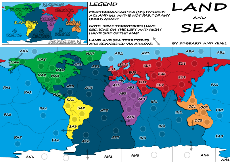
- Click image to enlarge.
What do you know about map making, bitch?
Top Score:2403natty_dread wrote:I was wrong

Re: Land And Sea v9p11 S&L
I just don't like the arrows, they don't feel right. They seem kind of thrown onto the map, like they don't belong.edbeard wrote:well obviously they CAN but is there a need to do that? you haven't really said why you don't like it. I personally think it fits well with the whole look and I haven't seen gimil say anything contrary about that medium for the land/sea connections so where is our motivation? honestly, I can't really think of a better way to do it that works with how the rest of the map looks. But, if gimil wants to do something else it's his area to do so.InkL0sed wrote:Can't the land/sea connections be shown with something other than an arrow?
Maybe you could use an anchor or something. Anything to make the connections feel more natural.
Re: Land And Sea v10p13 S&L
no. I think we've covered this enough.

Re: Land And Sea v10p13 S&L
Personally, I feel that dashed borders where crossovers are allowed would be best. However, if this is infeasible (or, at least, very difficult and time consuming), then arrows are the next best thing. I do, however, think the current arrows are not prominent enough. The opacity should be increased or they should be made wider.
Also (and this is 100% personal taste, so you can disregard it), I'm not a big fan of the drop shadow on the land continents. You could probably ditch it altogether, but a stroke might work better if you want a more significant border between land and sea.
Also (and this is 100% personal taste, so you can disregard it), I'm not a big fan of the drop shadow on the land continents. You could probably ditch it altogether, but a stroke might work better if you want a more significant border between land and sea.
Re: Land And Sea v10p13 S&L
as I've said about the arrows, you're not going to find a better way to indicate "this attacks here". it's so vastly superior in that aspect that I could stand alone just on that point but if you think about finding something else that fits with the simple look and how much it's going to improve the overall look, I'd say that the improvement provided by the "something else" would be minimal at best if not just a side-to-side move.
a slight (very slight) increase in opacity might be good. I don't think people are going to look at a territory and not notice the arrow there.
at this point we need to find someone to be the graphics stamper since gimil can't stamp his own map. gimil himself might be out of town (or going soon) so if he's still around either he can increase the arrow opacity before he heads off or he can send me the psd file.
also somehow the word "only" got dropped from the "land and sea territories are only connected by arrows" (or whatever it is) sentence. we'll put that back in
I notice gimil is here but i'll be back in 45 or so to see what he says
-
gimil
- Posts: 8599
- Joined: Sat Mar 03, 2007 12:42 pm
- Gender: Male
- Location: United Kingdom (Scotland)
Re: Land And Sea v10p13 S&L
I can increase the opactiy of the arrows. I will update it in the morning.
I am not going back to uni (and the possibility of no internet access) until sometime in febuary. I am confident that we can get this stamped and onto edbeards table for the final part of the process.
I am not going back to uni (and the possibility of no internet access) until sometime in febuary. I am confident that we can get this stamped and onto edbeards table for the final part of the process.
What do you know about map making, bitch?
Top Score:2403natty_dread wrote:I was wrong
-
gimil
- Posts: 8599
- Joined: Sat Mar 03, 2007 12:42 pm
- Gender: Male
- Location: United Kingdom (Scotland)
Re: Land And Sea v10p13 S&L
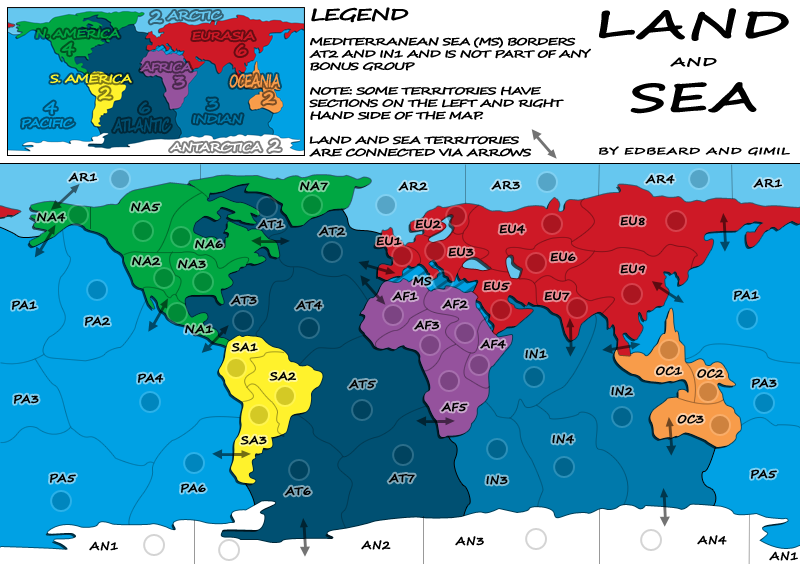
- Click image to enlarge.

- Click image to enlarge.
What do you know about map making, bitch?
Top Score:2403natty_dread wrote:I was wrong
Re: Land And Sea v10p13 S&L
still need to put the only back in the sentence
should read
"Land and Sea Territories are only connected via arrows"
should read
"Land and Sea Territories are only connected via arrows"
Re: Land And Sea v10p13 S&L
1. OK...re organising tert names....i didn't think that would be a problem, but was looking more for consistency and flow on tert coded names although i see you have reasoned that back on P10gimil wrote:I reduced the opacity on the arrows to 45% and im my opinion I am more than happy with them. Some other random words:
-Cairns, North America terr names haven't been reorganised in your favour because it would put NA1, PA1 and AR1 onto borders with each other. Which should be avoided to reduce the likelyness of deploy/attack mistakes.
-The idea behind the map is to have it looking vibrant, clean, crisp and unique. That is why there are no textures or images or anything like that. I would like to keep it like this for the image I have of the map when I started designing it.
....
2. Vibrant, clean, crisp it is tending towards...but unique?...well that is questionable IMHO
InkL0sed wrote:I just don't like the arrows, they don't feel right. They seem kind of thrown onto the map, like they don't belong.edbeard wrote:well obviously they CAN but is there a need to do that? you haven't really said why you don't like it. I personally think it fits well with the whole look and I haven't seen gimil say anything contrary about that medium for the land/sea connections so where is our motivation? honestly, I can't really think of a better way to do it that works with how the rest of the map looks. But, if gimil wants to do something else it's his area to do so.InkL0sed wrote:Can't the land/sea connections be shown with something other than an arrow?
Maybe you could use an anchor or something. Anything to make the connections feel more natural.
3. I'm sorry guys but this may be very much to the point....I am still not liking the arrows as i see others also are not. i'd like to see a poll done on this about the arrows, and if it comes out in your favour for arrows then i will shut my mouth about them and accept what the foundry has to say.edbeard wrote:no. I think we've covered this enough.
I don't think edbeards response has enough teeth either. If gimil hasn't said anything to the contrary then perhaps he is not trying hard hard enough and merely trying to push this map out before he goes back to uni...and sorry gimil, but when i see this
i can think of nothing other than a push and you should know better than that.I am confident that we can get this stamped
Where is your motivation edbeard? The motivation should be that you can deliver something that is unique and not this one below:
P4
Other requests have come from (apart from myself)edbeard wrote: like I said, I'm just using the arrows for gameplay discussion but a good suggestion to keep in mind for whoever does the graphics.
P5
P13[quote="inkLosed]Can't the land/sea connections be shown with something other than an arrow?[/quote]natewolfman wrote: you should turn the arrows into ports i think... when i see arrows i usually think passage way over mountains or over the river or something... but making them look like ports would seem more natural to this map i think
P13
P13gimil wrote:edbeard do we really need new arrows? I can't think of anything better than what we have.
P14gimil wrote:you were the one saying we needed new arrows not me
P14edbeard wrote:if we don't see a reason to do it we're not going to just do it to do it. right now we have no reason to do it other than InkL0sed asked about it which to me isn't a great reason to do so when like I've said neither of us see a reason to do it and can't think of an alternative that would look good with the rest of the map
P14edbeard wrote:if they "stick out too much" which I don't think they do, the opacity can be lowered.
maybe the arrows can be changed to just be a black stroke so the background is visible and only the outside lines of the arrow is visible. though, I think this might look horrible.
docks are a horrible idea because they'd require a lot more explanation and they'd be less intuitive
eg: docks only allow connection where the dock symbol touches a sea territory. that explains it perfectly but still it's not as easy to understand as an arrow
arrows are good because everyone knows what an arrow means. plus we need arrows for the "jump" connections anyway so why complicate things with more symbols?
P14gimil wrote:Someone suggested dotted lines where land and sea connect. I thought of a way to do it but it will be really tricky and I am not sure how good it would look.
I really like the idea of having a little transparency on the arrows to show a little of the colour underneath with a solid black stroke. Anyone else like it?
The arrows haven't really been advanced any, have they? They're still there in that draft format, a little changed in opacity...so i say time either for something better, or at least a poll to determine if they stay as is.inkLosed wrote: I just don't like the arrows, they don't feel right. They seem kind of thrown onto the map, like they don't belong.
Maybe you could use an anchor or something. Anything to make the connections feel more natural.
If you want something unique gimil, then give this map some unique graphics to make it stand out in a simplistic but stylish manner. I've said before you can do better and you offered you would see what you could do, but changing opacity doesn't cut mustard for me.
* Pearl Harbour * Waterloo * Forbidden City * Jamaica * Pot Mosbi
Re: Land And Sea v10p13 S&L
like I've said we've covered this already
you will not find a better way to explain graphically that certain territories connect than arrows. you will not find something simple that will fit in with the map that is better than arrows.
anything else would require more explanation whereas arrows don't really need them. anything else would not be as simple/clean looking which is why the arrows fit so well with the look of the whole map. furthermore, arrows ARE required in a couple spots since we have a couple territory connections that jump over land. If we have arrows for those (which are needed), why will we have a second designation that will just clutter the look of the map?
gimil is the graphics man so in the end it's up to him if he wants to do anything more with them but unless he does, this talk is over (or will be ignored since it's been covered).

Re: Land And Sea v10p13 S&L
I like the map very much ed. 
I think it will make a very good map.
Just a question ( I didn't had time to read all the thread) why did you put the arrow, why not just having all bordering states with an access to the sea?
I think it will make a very good map.
Just a question ( I didn't had time to read all the thread) why did you put the arrow, why not just having all bordering states with an access to the sea?
De gueules à la tour d'argent ouverte, crénelée de trois pièces, sommée d'un donjon ajouré, crénelé de deux pièces
Gules an open tower silver, crenellated three parts, topped by a apertured turret, crenellated two parts
Gules an open tower silver, crenellated three parts, topped by a apertured turret, crenellated two parts
-
the.killing.44

- Posts: 4724
- Joined: Thu Oct 23, 2008 7:43 pm
- Gender: Male
- Location: now tell me what got two gums and knows how to spit rhymes
- Contact:
Re: Land And Sea v10p13 S&L
IMO it would make the game a chaotic mess of unholdable bonuses.pamoa wrote:Just a question ( I didn't had time to read all the thread) why did you put the arrow, why not just having all bordering states with an access to the sea?
.44
Re: Land And Sea v10p13 S&L
thisthe.killing.44 wrote:IMO it would make the game a chaotic mess of unholdable bonuses.pamoa wrote:Just a question ( I didn't had time to read all the thread) why did you put the arrow, why not just having all bordering states with an access to the sea?
.44
someone had an interesting idea that you could only fort from land to sea and I would HATE that idea for this map but if the XML comes through on that idea, it would be a good gimmick/focus of another map.
Re: Land And Sea v10p13 S&L
About graphics, I do not really like the plain graphic choice but that's only my opinion and it's doesn't matter if you do it coherently.
The white background in the text box is in concurrence with the white Antarctica continent. You should invert it white writing on black background.
You used a handwriting font all over your map but your arrows have a rigid drawing. You should try some handwriting arrows.
It also should be like country names with a white border to be more readable as it is a major gameplay features.
I think you should find an other symbol for the interconnecting seas ( PA1-IN2 / PA4-AT3).
In both maps the border between AT1 and AT2 is not very clear which is a problem to determine where the arrow from NA6 is going.
Remove the hatching in Mediterranean sea, it blurs reading.
For me the Atlantic ocean is too dark, it look like a continent. Put the Indian ocean colour in Atlantic and the same colour of Arctic ocean in the Indian one as the are not in contact.
Again I do like the theme of this map, good work.
De gueules à la tour d'argent ouverte, crénelée de trois pièces, sommée d'un donjon ajouré, crénelé de deux pièces
Gules an open tower silver, crenellated three parts, topped by a apertured turret, crenellated two parts
Gules an open tower silver, crenellated three parts, topped by a apertured turret, crenellated two parts
-
gimil
- Posts: 8599
- Joined: Sat Mar 03, 2007 12:42 pm
- Gender: Male
- Location: United Kingdom (Scotland)
Re: Land And Sea v10p13 S&L
pamoa wrote: The white background in the text box is in concurrence with the white Antarctica continent. You should invert it white writing on black background.
I don't like this idea, I know black will be far to overpowering to look at.
You used a handwriting font all over your map but your arrows have a rigid drawing. You should try some handwriting arrows.
It also should be like country names with a white border to be more readable as it is a major gameplay features.
I think this is hte best suggested made for the arrows in the whole thread, I will do it pamoa. nice work
I think you should find an other symbol for the interconnecting seas ( PA1-IN2 / PA4-AT3).
In both maps the border between AT1 and AT2 is not very clear which is a problem to determine where the arrow from NA6 is going.
Any suggestions?
Remove the hatching in Mediterranean sea, it blurs reading.
I may do this for ya, but I would have to put something else in just so people know by looking it is not part of a continent, or at least there is something that shows the med is different.
For me the Atlantic ocean is too dark, it look like a continent. Put the Indian ocean colour in Atlantic and the same colour of Arctic ocean in the Indian one as the are not in contact.
I will see what I can do here.
What do you know about map making, bitch?
Top Score:2403natty_dread wrote:I was wrong
Re: Land And Sea v10p13 S&L
The white background in the text box is in concurrence with the white Antarctica continent. You should invert it white writing on black background.
I don't like this idea, I know black will be far to overpowering to look at.
At least try a grey bg for the box or use the Atlantic blue...I think you should find an other symbol for the interconnecting seas ( PA1-IN2 / PA4-AT3).
In both maps the border between AT1 and AT2 is not very clear which is a problem to determine where the arrow from NA6 is going.
Any suggestions?
Maybe a double arrow with a tilded and dotted line ( ~ )
De gueules à la tour d'argent ouverte, crénelée de trois pièces, sommée d'un donjon ajouré, crénelé de deux pièces
Gules an open tower silver, crenellated three parts, topped by a apertured turret, crenellated two parts
Gules an open tower silver, crenellated three parts, topped by a apertured turret, crenellated two parts
Re: Land And Sea v10p13 S&L
Gimil and edbeard....
an idea to remove the arrows altogether and have something like this....with appropriate notations in the legend of course.

an idea to remove the arrows altogether and have something like this....with appropriate notations in the legend of course.
* Pearl Harbour * Waterloo * Forbidden City * Jamaica * Pot Mosbi