MrBenn wrote:There is a nice clean look to this... Here's my thoughts, in no particular order...
1. The title/legend takes about 1/3 of the map area - it feels unnecessarily large, and makes the whole map feel a bit too cramped.
I don't think there's anything we can do about this
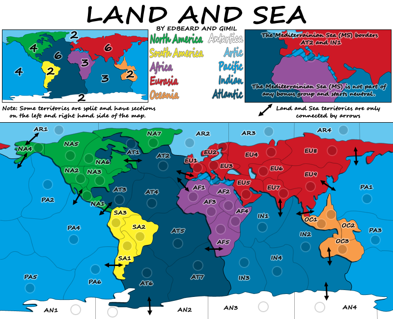
2. If you're going to use the letter codes for territory names, I would suggest at the very least trying to get the region names on the map - like oaktown did on Berlin.
as I said in my last post, I did try but it didn't work out
3. I think that the wraparound at the edges is still quite confusing - While I know that PA1 borders PA2, that isn't clear, and the single explanatory line doesn;t really help either.
How about changing the font like you said and putting the name of the territory on both sections?
4. I know that the idea is to only be able to cross from land into sea at the intersections, but again, this isn't made clear from the map.
We'll change the font but I'm not sure anything more is needed. I'll leave this up to gimil though. It's like seeing a sign that says "No parking on Sundays." The arrows going from Land-To-Sea make the idea clear. And, the note says, "Land and Sea territories are only connected by arrows." I challenge you to find words that are as succinct and as clear as those. Perhaps you just meant the script font hides the note too much
The last two points aren't really helped by the scripty font, which I have never found particularly legible. For the borders, you could have a thicker border along the coast, and either a dotted or thinner border along the intersections?
Inklosed, It is not missing. It is on the inset in the legend. I forgot to remind gimil to remove it from the map area on the large map which is probably part of the source of your confusion. I thought it'd be too busy to have it in that area on the small map. I think if you look at that area on the small map you'll agree.
When army numbers show up on the map, it'll become more noticeable. When players look at the map and see that area and see that on the legend they'll know what is up. Unless they skim over it but this is something we cannot control. The lined area of the Mediterranean calls attention that this is not a normal area of the map. We've used visual cues and words to explain the situation. I think that's enough. I am not saying that we have the right font for the text yet and also I think tinkering with the visual cues is possible if people have suggestions for that.