Conquer Club

Forbidden City [Quenched]

Care to peruse completed maps? Take a stroll through the Atlas.

Moderator: Cartographers

Forum rules
Please read the Community Guidelines before posting.

Re: Forbidden City V24(P17) (Classic) [I] - w/armies

Postby Androidz on Wed Aug 06, 2008 6:28 am

cairnswk wrote:
whitestazn88 wrote:wow, i think my eyes are going crazy, but the whole peasants area seems to be lighter now... and it doesn't match the one in the legend.

but maybe that's just me

Well probably yes and no...
the reason i beleive it doesn't appear as the same color, is because the center colour is the same, but on the lettering the black border is closer together giving the appearance of a different shade of green. Illusional -> Dilusional


Yes and thats why you should make it ligheter so we think it is the same colour;)
Image
User avatar
Private Androidz
 
Posts: 1046
Joined: Mon Dec 03, 2007 11:03 am

Re: Forbidden City V24(P17) (Classic) [I] - w/armies

Postby whitestazn88 on Wed Aug 06, 2008 12:32 pm

ok, thanks for clearing that up cairns. looking forward to the next update
Lieutenant whitestazn88
 
Posts: 3128
Joined: Mon Feb 05, 2007 2:59 pm
Location: behind you

Re: Forbidden City V24(P17) (Classic) [I] - w/armies

Postby cairnswk on Wed Aug 06, 2008 3:15 pm

Androidz wrote:
cairnswk wrote:
whitestazn88 wrote:wow, i think my eyes are going crazy, but the whole peasants area seems to be lighter now... and it doesn't match the one in the legend.

but maybe that's just me

Well probably yes and no...
the reason i beleive it doesn't appear as the same color, is because the center colour is the same, but on the lettering the black border is closer together giving the appearance of a different shade of green. Illusional -> Dilusional


Yes and thats why you should make it ligheter so we think it is the same colour;)


Androidz, you're being a pain in the ass. :o

There are three green continents on this map.
* Gardens - both of which are named "Garden"
* Foreigners which are in very distinctive dark green
* Peasants, in a lighter green one territory of which is marked "Peasants"

I am happy with the colour presented for The Peasants, and it is very close whether illusional or not to the stated territories.

These colours have already been adjusted twice and I believe are good. :)
Image
* Pearl Harbour * Waterloo * Forbidden City * Jamaica * Pot Mosbi
User avatar
Private cairnswk
 
Posts: 11510
Joined: Sat Feb 03, 2007 8:32 pm
Location: Australia

Re: Forbidden City V24(P17) (Classic) [I] - w/armies

Postby cairnswk on Wed Aug 06, 2008 3:16 pm

whitestazn88 wrote:ok, thanks for clearing that up cairns. looking forward to the next update

Do you really have any problem with the Peasant colour, whitestazn88??
Image
* Pearl Harbour * Waterloo * Forbidden City * Jamaica * Pot Mosbi
User avatar
Private cairnswk
 
Posts: 11510
Joined: Sat Feb 03, 2007 8:32 pm
Location: Australia

Re: Forbidden City V24(P17) (Classic) [I] - w/armies

Postby Androidz on Wed Aug 06, 2008 3:28 pm

cairnswk wrote:
Androidz wrote:
cairnswk wrote:
whitestazn88 wrote:wow, i think my eyes are going crazy, but the whole peasants area seems to be lighter now... and it doesn't match the one in the legend.

but maybe that's just me

Well probably yes and no...
the reason i beleive it doesn't appear as the same color, is because the center colour is the same, but on the lettering the black border is closer together giving the appearance of a different shade of green. Illusional -> Dilusional


Yes and thats why you should make it ligheter so we think it is the same colour;)


Androidz, you're being a pain in the ass. :o

There are three green continents on this map.
* Gardens - both of which are named "Garden"
* Foreigners which are in very distinctive dark green
* Peasants, in a lighter green one territory of which is marked "Peasants"

I am happy with the colour presented for The Peasants, and it is very close whether illusional or not to the stated territories.

These colours have already been adjusted twice and I believe are good. :)


Your the one being the pain right now. i Never said use the same green you know theres other colours than green in this world.

But what im saying now is to make the the colours on the map same colours on legend. Exsample:

palaces colour dont match up with that on the legend its much ligheter on the map. And alot of darker in the legend.


EDIT:

Can somebody try to transelate what im trying to say my english is quite bad and i think that is the main reason cairnswk missunderstands me:(
Image
User avatar
Private Androidz
 
Posts: 1046
Joined: Mon Dec 03, 2007 11:03 am

Re: Forbidden City V24(P17) (Classic) [I] - w/armies

Postby cairnswk on Wed Aug 06, 2008 3:46 pm

Androidz wrote:....

EDIT:

Can somebody try to transelate what im trying to say my english is quite bad and i think that is the main reason cairnswk missunderstands me:(


I don't need someone to translate. I understand what you are saying.
And i am saying that I am happy with the colours, and if others were unhappy with the colours they would be saying so like you.
The colours on the legend in comparison with the colours on the map are good.
Image
* Pearl Harbour * Waterloo * Forbidden City * Jamaica * Pot Mosbi
User avatar
Private cairnswk
 
Posts: 11510
Joined: Sat Feb 03, 2007 8:32 pm
Location: Australia

Re: Forbidden City V24(P17) (Classic) [I] - w/armies

Postby Androidz on Wed Aug 06, 2008 3:58 pm

cairnswk wrote:
Androidz wrote:....

EDIT:

Can somebody try to transelate what im trying to say my english is quite bad and i think that is the main reason cairnswk missunderstands me:(


I don't need someone to translate. I understand what you are saying.
And i am saying that I am happy with the colours, and if others were unhappy with the colours they would be saying so like you.
The colours on the legend in comparison with the colours on the map are good.


You really think so? Tell me do you think The Gates and towers look like the colours in the legend?
I just stared on the legend and map 5 min im sure their not alike. But imgiveing up convinceing you about this matter, cause it is as you say if i'm the only thinking this i must be wrong.

Sorry for takeing your time.

Androidz.
Image
User avatar
Private Androidz
 
Posts: 1046
Joined: Mon Dec 03, 2007 11:03 am

Re: Forbidden City V24(P17) (Classic) [I] - w/armies

Postby cairnswk on Thu Aug 07, 2008 6:54 pm

Androidz wrote:
cairnswk wrote:
Androidz wrote:....

EDIT:

Can somebody try to transelate what im trying to say my english is quite bad and i think that is the main reason cairnswk missunderstands me:(


I don't need someone to translate. I understand what you are saying.
And i am saying that I am happy with the colours, and if others were unhappy with the colours they would be saying so like you.
The colours on the legend in comparison with the colours on the map are good.


You really think so? Tell me do you think The Gates and towers look like the colours in the legend?
I just stared on the legend and map 5 min im sure their not alike. But imgiveing up convinceing you about this matter, cause it is as you say if i'm the only thinking this i must be wrong.

Sorry for takeing your time.

Androidz.

Do be sorry for taking my time when you don't bother to read back through the thread to ask why the colours might not be quite the same as in the legend.
In the example you gave above for the gates and towers, someone had already mentioned that they couldn't read the writing because of the dark colour in the legend, so i lightened it to make it legible. That's why there is a colour difference there.

As for this continual barrage about the colours...i have already stated that they are good, I am happy with them, they may not be exactly the same as on the map but they are in close proximity to corresponding colours required, and the fact that you can identify them on the map is more than what is required. Evidently you have no problem in that department, so i really don't see what the issue is. Sometimes it is not always good to be so correct. If we had the luck of larger size on our side, then i would be happy to obligue, but i would rather sacrifice a little colour than sacrifice legibility. ;)
Image
* Pearl Harbour * Waterloo * Forbidden City * Jamaica * Pot Mosbi
User avatar
Private cairnswk
 
Posts: 11510
Joined: Sat Feb 03, 2007 8:32 pm
Location: Australia

Re: Forbidden City V25(P19) (Classic) [I] - inner walls

Postby cairnswk on Fri Aug 08, 2008 6:34 pm

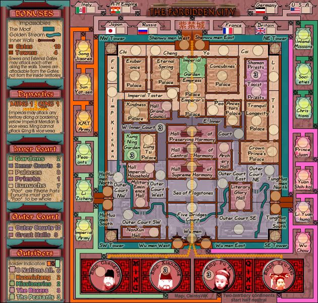
VErsion 25

Changes:
1. Addition of poles to buildings....there are heaps of them around this city
2. Some changes to territory names in the Outer Court...a tidy
3. Minor movement of territory areas because of pole additions
4. Change of colour for inner walls

Image
Image
* Pearl Harbour * Waterloo * Forbidden City * Jamaica * Pot Mosbi
User avatar
Private cairnswk
 
Posts: 11510
Joined: Sat Feb 03, 2007 8:32 pm
Location: Australia

Re: Forbidden City V25(P19) (Classic) [I] - inner walls

Postby whitestazn88 on Fri Aug 08, 2008 9:03 pm

the color is fine.

its kinda weird to me though, that the name of the continent is also the name of one of the territs in the continent.... maybe change that...
Lieutenant whitestazn88
 
Posts: 3128
Joined: Mon Feb 05, 2007 2:59 pm
Location: behind you

Re: Forbidden City V25(P19) (Classic) [I] - inner walls

Postby cairnswk on Sat Aug 09, 2008 1:01 am

whitestazn88 wrote:the color is fine.

Thanks Goodness. Pleased to hear that. ;)

its kinda weird to me though, that the name of the continent is also the name of one of the territs in the continent.... maybe change that...

That i can do.
Image
* Pearl Harbour * Waterloo * Forbidden City * Jamaica * Pot Mosbi
User avatar
Private cairnswk
 
Posts: 11510
Joined: Sat Feb 03, 2007 8:32 pm
Location: Australia

Re: Forbidden City V25(P19) (Classic) [I] - inner walls

Postby Androidz on Sat Aug 09, 2008 6:01 am

It looks good...nicework
Image
User avatar
Private Androidz
 
Posts: 1046
Joined: Mon Dec 03, 2007 11:03 am

Re: Forbidden City V25(P19) (Classic) [I] - inner walls

Postby cairnswk on Sat Aug 09, 2008 10:09 am

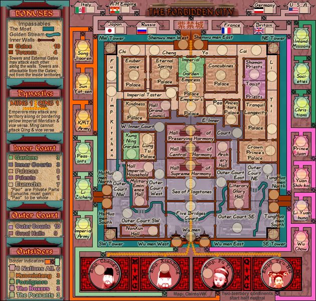
Current Version 25
Image
Image
* Pearl Harbour * Waterloo * Forbidden City * Jamaica * Pot Mosbi
User avatar
Private cairnswk
 
Posts: 11510
Joined: Sat Feb 03, 2007 8:32 pm
Location: Australia

Re: Forbidden City V25(P19) (Classic) [I] - inner walls

Postby whitestazn88 on Sat Aug 09, 2008 7:14 pm

when did the meridian line attack thing for the dynasties disappear?
Lieutenant whitestazn88
 
Posts: 3128
Joined: Mon Feb 05, 2007 2:59 pm
Location: behind you

Re: Forbidden City V25(P19) (Classic) [I] - inner walls

Postby cairnswk on Sat Aug 09, 2008 8:07 pm

whitestazn88 wrote:when did the meridian line attack thing for the dynasties disappear?

It was accidentally turned off... :oops:
Should be back now,,,please refresh your browser.
Image
* Pearl Harbour * Waterloo * Forbidden City * Jamaica * Pot Mosbi
User avatar
Private cairnswk
 
Posts: 11510
Joined: Sat Feb 03, 2007 8:32 pm
Location: Australia

Re: Forbidden City V24(P17) (Classic) [I] - w/armies

Postby iancanton on Mon Aug 11, 2008 2:57 am

oaktown wrote:oops, I went and stamped this with my appoval, but I forgot that I gave this one to iancanton to stamp. #-o My sincere apologies to ian.

Since he's been following this probably more closely than I, I'll leave it to him to give the final gameplay stamp of approval.

thanks, oaktown. i hadn't closely analysed the map for gameplay yet, since so many changes were still being made.

removing the word “inner” from the outer court names makes things less confusing than before.

the literary glory hall looks better now that it is squarer. any thoughts as to making it slightly wider still, so that the name fits completely within the territory?

imperial kitchen and imperial taster are a slightly different colour from the rest of the eunuchs. is this deliberate and are they part of the eunuch bonus? all of the eunuch territories represent people, except for imperial kitchen, which is a room. how about changing the latter to “cooks”? my personal preference is for all of the eunuchs' names to read horizontally, rather than some being horizontal and some vertical.

“emperors' palace” ought to be “emperor's palace” because there is only one emperor. similarly, “crown princes' palace” ought to be “crown prince's palace”.

ian. :)
User avatar
Brigadier iancanton
Foundry Foreman
Foundry Foreman
 
Posts: 2431
Joined: Fri Jun 01, 2007 5:40 am
Location: europe

Re: Forbidden City V25(P17) (Classic) [I] - small fixes.

Postby cairnswk on Mon Aug 11, 2008 6:30 am

iancanton wrote:...
removing the word “inner” from the outer court names makes things less confusing than before.

Good
the literary glory hall looks better now that it is squarer. any thoughts as to making it slightly wider still, so that the name fits completely within the territory?

Done.
imperial kitchen and imperial taster are a slightly different colour from the rest of the eunuchs. is this deliberate and are they part of the eunuch bonus? all of the eunuch territories represent people, except for imperial kitchen, which is a room. how about changing the latter to “cooks”? my personal preference is for all of the eunuchs' names to read horizontally, rather than some being horizontal and some vertical.

I;ve fixed the colours for those territories, but i'd prefer to leave the other names as they are.

“emperors' palace” ought to be “emperor's palace” because there is only one emperor. similarly, “crown princes' palace” ought to be “crown prince's palace”.

Done.
Thanks Ian. :)
Please refresh your browser, as Version 25 above has been updated with those fixes.
Image
Image
* Pearl Harbour * Waterloo * Forbidden City * Jamaica * Pot Mosbi
User avatar
Private cairnswk
 
Posts: 11510
Joined: Sat Feb 03, 2007 8:32 pm
Location: Australia

Re: Forbidden City V25 (P20) [I] - Further comments?

Postby cairnswk on Tue Aug 12, 2008 4:48 pm

Further comments anyone?
Image
* Pearl Harbour * Waterloo * Forbidden City * Jamaica * Pot Mosbi
User avatar
Private cairnswk
 
Posts: 11510
Joined: Sat Feb 03, 2007 8:32 pm
Location: Australia

Re: Forbidden City V25 (P20) [I] - Further comments?

Postby whitestazn88 on Wed Aug 13, 2008 12:40 am

only thing i got right now is to change the territ peasants or the continent peasants so that they aren't named the same thing
Lieutenant whitestazn88
 
Posts: 3128
Joined: Mon Feb 05, 2007 2:59 pm
Location: behind you

Re: Forbidden City V25 (P20) [I] - Further comments?

Postby TaCktiX on Wed Aug 13, 2008 10:18 pm

The half-neutral comment on the bottom is almost invisible, as is your map credit.

In the top left, The Moat is a little bit hard to distinguish from being "The Most". Changing the texture right around there to not be present on top of the "a" should make that a non-issue.

In regards to the Meridian attack, are all Meridian territories able to attack all the Emperors AND EACH OTHER, or simply the Emperors? It is possible to mis-construe the language to mean "all Meridian territories can attack each other, there is no sanctuary" if that's not the case.
User avatar
Corporal 1st Class TaCktiX
 
Posts: 2392
Joined: Mon Dec 17, 2007 8:24 pm
Location: Rapid City, SD

Re: Forbidden City V26 (P20) [I]

Postby cairnswk on Sat Aug 16, 2008 5:06 am

TaCktiX wrote:The half-neutral comment on the bottom is almost invisible, as is your map credit.

I'll fix that
In the top left, The Moat is a little bit hard to distinguish from being "The Most". Changing the texture right around there to not be present on top of the "a" should make that a non-issue.

I've changed the fonts in the legend in some areas, hopefully that iwll make those "a"s more legible.

In regards to the Meridian attack, are all Meridian territories able to attack all the Emperors AND EACH OTHER, or simply the Emperors? It is possible to mis-construe the language to mean "all Meridian territories can attack each other, there is no sanctuary" if that's not the case.

i don't think that needs changing. It says "Emperor's may attack any territory....& vice versa"
I think it would be evident from classic play that bordering territories can attack each other.
It doesn't say anything about territories on that Meridian being able to attack each other, so i think you should not assume that, other than bordering territories being able to attack each other as normal.

I'm waiting on Iancanton to examine gameplay on this...and if all is well, I won't be making other changes as I am pretty happy with this. :)

Image
Image
* Pearl Harbour * Waterloo * Forbidden City * Jamaica * Pot Mosbi
User avatar
Private cairnswk
 
Posts: 11510
Joined: Sat Feb 03, 2007 8:32 pm
Location: Australia

Re: Forbidden City V26 (P20) [I]

Postby iancanton on Sat Aug 16, 2008 11:35 am

cairnswk wrote:I'm waiting on Iancanton to examine gameplay

watch this space!

ian. :)
User avatar
Brigadier iancanton
Foundry Foreman
Foundry Foreman
 
Posts: 2431
Joined: Fri Jun 01, 2007 5:40 am
Location: europe

Re: Forbidden City V26 (P20) [I]

Postby whitestazn88 on Sat Aug 16, 2008 12:34 pm

cairns, you've still got a continent named peasants and a territory named peasants... and i don't like that
Lieutenant whitestazn88
 
Posts: 3128
Joined: Mon Feb 05, 2007 2:59 pm
Location: behind you

Re: Forbidden City V26 (P20) [I]

Postby cairnswk on Sat Aug 16, 2008 1:28 pm

whitestazn88 wrote:cairns, you've still got a continent named peasants and a territory named peasants... and i don't like that

i know you don't. you've reminded me about that twice now. But do be aware that just because you don't like something, doesn't mean i have to or want change something. I will ponder the situation.
Image
* Pearl Harbour * Waterloo * Forbidden City * Jamaica * Pot Mosbi
User avatar
Private cairnswk
 
Posts: 11510
Joined: Sat Feb 03, 2007 8:32 pm
Location: Australia

Re: Forbidden City V1b [starting preview]

Postby Blitzaholic on Sat Aug 16, 2008 11:40 pm

AndyDufresne wrote:
cairnswk wrote:One thing important to this gameplay, is that the Eunuchs will be required to gain their "pao" (or private parts usually kept in jars) for the taking of the Eunuch bonuses.

This may just have been one of oddest game play posts I've ever seen in the Foundry. :)


--Andy


very odd, hmmm, no offense but these twists could turn many away, many players just do not like reading so many things to figure things out, sometimes keeping it simple is great, i know you like the more complex although you think its not, many players say it is and when a map may be too time consuming to figure out, they give up on it, instant gratification is always good. I do like your idea though.


many luv the cairns map you did, styles and formats like that are really neat
Image
User avatar
General Blitzaholic
 
Posts: 23050
Joined: Wed Aug 09, 2006 11:57 pm
Location: Apocalyptic Area

PreviousNext

Return to The Atlas

Who is online

Users browsing this forum: No registered users