Forbidden City [Quenched]
Moderator: Cartographers
Re: Forbidden City V19(P12) (Classic) [I] - Comments?
i like the thing at the wu gate, makes things a litle more interesting.
as well as all of the other improvements made in the last few versions, i know i haven't commented on this one in a while, but its looking good
as well as all of the other improvements made in the last few versions, i know i haven't commented on this one in a while, but its looking good
-
 whitestazn88
- Posts: 3128
- Joined: Mon Feb 05, 2007 2:59 pm
- Location: behind you


Re: Forbidden City V19(P12) (Classic) [I] - Comments?
Consider breaking
Christ
-ians
across the syllables...
i.e.
Chris
-tians
C.
Christ
-ians
across the syllables...
i.e.
Chris
-tians
C.

Highest score : 2297
-

 yeti_c
- Posts: 9624
- Joined: Thu Jan 04, 2007 9:02 am


Re: Forbidden City V19(P12) (Classic) [I] - Comments?
yeti_c wrote:Consider breaking
Christ
-ians
across the syllables...
i.e.
Chris
-tians
C.
it can be argued that it can be broken either way and still be ok... because they're technically christ-ians because they believe in christ
-
 whitestazn88
- Posts: 3128
- Joined: Mon Feb 05, 2007 2:59 pm
- Location: behind you


Re: Forbidden City V19(P12) (Classic) [I] - Comments?
whitestazn88 wrote:yeti_c wrote:Consider breaking
Christ
-ians
across the syllables...
i.e.
Chris
-tians
C.
it can be argued that it can be broken either way and still be ok... because they're technically christ-ians because they believe in christ
Yeti_C, that's a dead give-away.
Good pickup whitestazn88

* Pearl Harbour * Waterloo * Forbidden City * Jamaica * Pot Mosbi
-

 cairnswk
- Posts: 11510
- Joined: Sat Feb 03, 2007 8:32 pm
- Location: Australia


Re: Forbidden City V19(P12) (Classic) [I] - Comments?
whitestazn88 wrote:yeti_c wrote:Consider breaking
Christ
-ians
across the syllables...
i.e.
Chris
-tians
C.
it can be argued that it can be broken either way and still be ok... because they're technically christ-ians because they believe in christ
No - because you don't say I'm a Christ-i-an do you?
You say you are a Chris-ti-an.
C.

Highest score : 2297
-

 yeti_c
- Posts: 9624
- Joined: Thu Jan 04, 2007 9:02 am


Re: Forbidden City V19(P12) (Classic) [I] - Comments?
i think it would be fine either way, and its ultimately up to cairns...
-
 whitestazn88
- Posts: 3128
- Joined: Mon Feb 05, 2007 2:59 pm
- Location: behind you


Re: Forbidden City V19(P12) (Classic) [I] - Comments?
whitestazn88 wrote:i think it would be fine either way, and its ultimately up to cairns...
Indeed... it was but a suggestion based on syllables.
C.

Highest score : 2297
-

 yeti_c
- Posts: 9624
- Joined: Thu Jan 04, 2007 9:02 am


Re: Forbidden City V19(P12) (Classic) [I] - Comments?
Version 20
Some of the changes in this are very sublte.
Main changes apply to the legend names and the re-instatement of the border around them instead of the drop shadow.
Some of the things TaCktiX asked for ahve been changed, but i am reluctant to implement too many more changes, not because i don't want to, but because i think less is more.
I looked at this after a couple of days away from it, and asked myself how much can my eyes take it. No more i say.
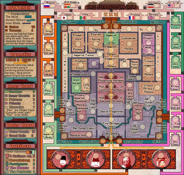
i think the requested changed in the ruLers legend area with the yellow meridian can't be impltmeneted to replicate the meridian line at the bottom of the map.It just wouldn't show up in the space provided. And I think that the meridian indicator in the legend is a guide only. While opne shouldn't rely on it, after one turn on the game, you'll quickly determine from xml that ming can't attack qing.

* Pearl Harbour * Waterloo * Forbidden City * Jamaica * Pot Mosbi
-

 cairnswk
- Posts: 11510
- Joined: Sat Feb 03, 2007 8:32 pm
- Location: Australia


Re: Forbidden City V20(P13) (Classic) [I] - Comments?
and yeti wins! lol
chris-tians it is
chris-tians it is
-
 whitestazn88
- Posts: 3128
- Joined: Mon Feb 05, 2007 2:59 pm
- Location: behind you


Re: Forbidden City V20(P13) (Classic) [I] - Comments?
my first look in a long time, and I'm not up with the discussion so forgive anything redundant... for starters I love the subject matter, and the map definitely has that Cairnswk look - in fact it may look a little too much like Chicago. 
colors give me fits. for most I can go by the "palace" or "priest" addition to the title, but things like the archery courts are a mystery to me. I'd rely on BOB to get me through this map.
the attack routes among the foreign powers leave me a bit muddled... the boxes are borders, which makes that long hallway part of Italy? So Japan has to go through Russia and then Italy to attack the Forbidden City?
I find the rulers a bit confusing as well. Two of them can attack each other, but they can't attack the other two, right? And I get that they can attack terits that are bisected by the yellow line, but I'm not sure what is bordering because my eyes lose the line at the top. Looks like they can attack Pu and Yo, but not the Shenwu gates?
Pao, Pu, Po... not as bad as Shaangxi and Shangxi in the China map (which I still screwed up yesterday) but it is ripe for mis-deployment.
colors give me fits. for most I can go by the "palace" or "priest" addition to the title, but things like the archery courts are a mystery to me. I'd rely on BOB to get me through this map.
the attack routes among the foreign powers leave me a bit muddled... the boxes are borders, which makes that long hallway part of Italy? So Japan has to go through Russia and then Italy to attack the Forbidden City?

I find the rulers a bit confusing as well. Two of them can attack each other, but they can't attack the other two, right? And I get that they can attack terits that are bisected by the yellow line, but I'm not sure what is bordering because my eyes lose the line at the top. Looks like they can attack Pu and Yo, but not the Shenwu gates?
Pao, Pu, Po... not as bad as Shaangxi and Shangxi in the China map (which I still screwed up yesterday) but it is ripe for mis-deployment.

-

 oaktown
- Posts: 4451
- Joined: Sun Dec 03, 2006 9:24 pm
- Location: majorcommand


Re: Forbidden City V20(P13) (Classic) [I] - Comments?
whitestazn88 wrote:and yeti wins! lol
chris-tians it is
C.

Highest score : 2297
-

 yeti_c
- Posts: 9624
- Joined: Thu Jan 04, 2007 9:02 am


Re: Forbidden City V20(P13) (Classic) [I] - Comments?
yeti_c wrote:whitestazn88 wrote:and yeti wins! lol
chris-tians it is

C.
Yes, he usually gets his way with me.

* Pearl Harbour * Waterloo * Forbidden City * Jamaica * Pot Mosbi
-

 cairnswk
- Posts: 11510
- Joined: Sat Feb 03, 2007 8:32 pm
- Location: Australia


Re: Forbidden City V20(P13) (Classic) [I] - Comments?
I wish the map was a bit darker, and the lanterns were "lit" a little more. They are my favorite part of this map, though i must admit I haven't taken the time to understand this map at all.
-

 mibi
mibi
- Posts: 3350
- Joined: Thu Mar 01, 2007 8:19 pm
- Location: The Great State of Vermont


Re: Forbidden City V21(P13) (Classic) [I] - Comments?
oaktown wrote:my first look in a long time, and I'm not up with the discussion so forgive anything redundant... for starters I love the subject matter, and the map definitely has that Cairnswk look - in fact it may look a little too much like Chicago.
Thanks oaktown, but i think if there was another way to represent walls and halls and streets, i would do it, but this place is pretty "set" on how one can represent it.
colors give me fits. for most I can go by the "palace" or "priest" addition to the title, but things like the archery courts are a mystery to me. I'd rely on BOB to get me through this map.
I'm happy to work with you to change those colours (within reason of overall design) to assist the colour blind, if you make suggestions that you can follow without having to use BOB.
the attack routes among the foreign powers leave me a bit muddled... the boxes are borders, which makes that long hallway part of Italy? So Japan has to go through Russia and then Italy to attack the Forbidden City?
That is correct.
I think for the overall correctness of the historical events, Japan didn't attack the Forbidden City when the Boxer Rebellion was on (which is that representation there) so Italy is ok to be attacking the gates as one of the powers. Sun Yatsen etc, had more a harch time with Japan towards later years with Japan.
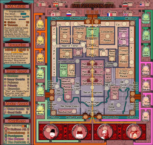
I have swapped Russia and Italy around, so that Japan now borders Russia
I find the rulers a bit confusing as well. Two of them can attack each other, but they can't attack the other two, right? And I get that they can attack terits that are bisected by the yellow line, but I'm not sure what is bordering because my eyes lose the line at the top. Looks like they can attack Pu and Yo, but not the Shenwu gates?
They can attack both Shenwu Gates as that Meridian line is "bordering the Shenwu Gates, as well as Pu and Yo.
Pao, Pu, Po... not as bad as Shaangxi and Shangxi in the China map (which I still screwed up yesterday) but it is ripe for mis-deployment.
Pao has to stay, but those names have changed along the top.
mibi wrote:I wish the map was a bit darker, and the lanterns were "lit" a little more. They are my favorite part of this map, though i must admit I haven't taken the time to understand this map at all.
Mibi thanks. I have made the background a much darker shade to give contrast to the outside terts, and made some inroad to to glowing the lanterns for you, but still have to further some.
Version 21

* Pearl Harbour * Waterloo * Forbidden City * Jamaica * Pot Mosbi
-

 cairnswk
- Posts: 11510
- Joined: Sat Feb 03, 2007 8:32 pm
- Location: Australia


Re: Forbidden City V21(P13) (Classic) [I] - Comments?
Now that Mibi mentioned it, I think more "lit" lanterns would be a good improvement.
-

 ZeakCytho
- Posts: 1251
- Joined: Wed Sep 12, 2007 4:36 pm


Re: Forbidden City V21(P13) (Classic) [I] - Comments?
The new background for the outside of the City is a step forward, but it almost obscures the borders of the 8 Nations Alliance due to color similarity. Perhaps changing the color of the bonus area, as I think the new background with its red-marble look is more fitting to the map. Or you could saturate the red-marble with more red.
In the nitpicky-as-hell column, I noticed on the legend that the top of the bonus boxes are pinned by downward-facing ones, and the bottom by side-facing ones. I think that them both being side-facing would work better, but you can toss said suggestion out like so much rubbish if you don't agree.
In the nitpicky-as-hell column, I noticed on the legend that the top of the bonus boxes are pinned by downward-facing ones, and the bottom by side-facing ones. I think that them both being side-facing would work better, but you can toss said suggestion out like so much rubbish if you don't agree.
-

 TaCktiX
- Posts: 2392
- Joined: Mon Dec 17, 2007 8:24 pm
- Location: Rapid City, SD


Re: Forbidden City V21(P13) (Classic) [I] - Comments?
colors... the territories that leave me wondering are as follows:
I get now that the center line hits the gates at the top - since I never trust color in dark spaces, I go by other cues as well, in this case the dotted lines on the outsides of that line. Since the dotted lines stop at the gates, I wasn't sure if they bordered the gates or not. And it still looks to me like the line changes color there, but maybe that's just me.
Think it might be wise to thicken up the borders around the towers, since they can't be attacked by neighboring territories.
Alright, carry on.
- Lung Tsi Pavilion: looks to me like the Palace color but I'm not sure, and since the others say "palace" I don't know what to make of this one.
West Garden: looks lighter than Inner Courts to me, yet darker than palaces. Oh, wait, it is a different color - that's the worst color for me... and are there only two gardens?
Archery Court is confusing - the territory says "Court" but the color says to me "Hall."
I get now that the center line hits the gates at the top - since I never trust color in dark spaces, I go by other cues as well, in this case the dotted lines on the outsides of that line. Since the dotted lines stop at the gates, I wasn't sure if they bordered the gates or not. And it still looks to me like the line changes color there, but maybe that's just me.
Think it might be wise to thicken up the borders around the towers, since they can't be attacked by neighboring territories.
Alright, carry on.

-

 oaktown
- Posts: 4451
- Joined: Sun Dec 03, 2006 9:24 pm
- Location: majorcommand


Re: Forbidden City V21(P13) (Classic) [I] - Comments?
Can I suggest you add a "Shengwu Gate" - like you have with the "Wu Gate" - as the Median into the top gate could be misconstrued...
Either that - or make it branch to the 2 army circles for the two gates there.
C.
Either that - or make it branch to the 2 army circles for the two gates there.
C.

Highest score : 2297
-

 yeti_c
- Posts: 9624
- Joined: Thu Jan 04, 2007 9:02 am


Re: Forbidden City V21(P13) (Classic) [I] - Comments?
yep, the changed based upon mibi's idea to make it darker looks really good
-
 whitestazn88
- Posts: 3128
- Joined: Mon Feb 05, 2007 2:59 pm
- Location: behind you


Re: Forbidden City V21(P13) (Classic) [I] - Comments?
whitestazn88 wrote:yep, the changed based upon mibi's idea to make it darker looks really good
Good.
yeti_c wrote:Can I suggest you add a "Shengwu Gate" - like you have with the "Wu Gate" - as the Median into the top gate could be misconstrued...
Either that - or make it branch to the 2 army circles for the two gates there.
C.
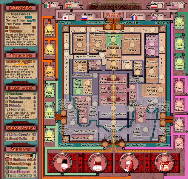
Don't like that suggestion, but have changed the Meridian line to show more correctly.
oaktown wrote:colors... the territories that leave me wondering are as follows:Lung Tsi Pavilion: looks to me like the Palace color but I'm not sure, and since the others say "palace" I don't know what to make of this one.
West Garden: looks lighter than Inner Courts to me, yet darker than palaces. Oh, wait, it is a different color - that's the worst color for me... and are there only two gardens?
Archery Court is confusing - the territory says "Court" but the color says to me "Hall."
Artistic License employed:
Lung Tsi Pavillion is now Lung Tsi Palace
Yes there are only two gardens and they are both named as Gardens
Archery Court is now Archery Hall
I get now that the center line hits the gates at the top - since I never trust color in dark spaces, I go by other cues as well, in this case the dotted lines on the outsides of that line. Since the dotted lines stop at the gates, I wasn't sure if they bordered the gates or not. And it still looks to me like the line changes color there, but maybe that's just me.
Meridian line changed to reflect more correctly the dashed border.
Think it might be wise to thicken up the borders around the towers, since they can't be attacked by neighboring territories.
Alright, carry on.
Done.
TaCktiX wrote:The new background for the outside of the City is a step forward, but it almost obscures the borders of the 8 Nations Alliance due to color similarity. Perhaps changing the color of the bonus area, as I think the new background with its red-marble look is more fitting to the map. Or you could saturate the red-marble with more red.
In the nitpicky-as-hell column, I noticed on the legend that the top of the bonus boxes are pinned by downward-facing ones, and the bottom by side-facing ones. I think that them both being side-facing would work better, but you can toss said suggestion out like so much rubbish if you don't agree.
8 Nations colour is changed.
Mmmmm...pinning...this is nit-picking as you called it
Version 22.

* Pearl Harbour * Waterloo * Forbidden City * Jamaica * Pot Mosbi
-

 cairnswk
- Posts: 11510
- Joined: Sat Feb 03, 2007 8:32 pm
- Location: Australia


Re: Forbidden City V22(P13) (Classic) [I] - Comments?
Here is some stupid toughts but i think maybe they will (im picky) make the look of map better:
Could you try to add tink black line around the flaggs to make them more visible?
Could you make the NW Tower start from the corner in the river. And NE Tower end in the corner of the other river?
And as i said before pliss change the coin icons, the one one icon Emperess tho hau make me throw up everytime i look at her...you dont want 1000conquerclub members throwing up do you??;)
Might just me be...
-

 Androidz
- Posts: 1046
- Joined: Mon Dec 03, 2007 11:03 am


Re: Forbidden City V22(P14) (Classic) [I] - Comments?
Androidz wrote:Here is some stupid toughts but i think maybe they will (im picky) make the look of map better:
Could you try to add tink black line around the flaggs to make them more visible?
Could you make the NW Tower start from the corner in the river. And NE Tower end in the corner of the other river?
And as i said before pliss change the coin icons, the one one icon Emperess tho hau make me throw up everytime i look at her...you dont want 1000conquerclub members throwing up do you??;)
Might just me be...
Thanks Androidz.
1. black tint around flags makes it look horrible, so i change the colour of 8 nations and make it lighter. please refresh your browser as this is done in current V22 image below.
2. Done
3. maybe just you, i really don't have a prob wth XiCi.

* Pearl Harbour * Waterloo * Forbidden City * Jamaica * Pot Mosbi
-

 cairnswk
- Posts: 11510
- Joined: Sat Feb 03, 2007 8:32 pm
- Location: Australia


Re: Forbidden City V22(P14) (Classic) [I] - Comments?
cairnswk wrote:Androidz wrote:Here is some stupid toughts but i think maybe they will (im picky) make the look of map better:
Could you try to add tink black line around the flaggs to make them more visible?
Could you make the NW Tower start from the corner in the river. And NE Tower end in the corner of the other river?
And as i said before pliss change the coin icons, the one one icon Emperess tho hau make me throw up everytime i look at her...you dont want 1000conquerclub members throwing up do you??;)
Might just me be...
Thanks Androidz.
1. black tint around flags makes it look horrible, so i change the colour of 8 nations and make it lighter. please refresh your browser as this is done in current V22 image below.
2. Done
3. maybe just you, i really don't have a prob wth XiCi.
1. Okey:D
2.good:D
3. maybe any more commenters about this?
i treid my best helping you map cairnswk im not good giveing suggestions:D
-

 Androidz
- Posts: 1046
- Joined: Mon Dec 03, 2007 11:03 am


Re: Forbidden City V22(P13) (Classic) [I] - Comments?
when did you change the color of the emperors box? after androidz comments? cuz if so, i think it looks better that way
-
 whitestazn88
- Posts: 3128
- Joined: Mon Feb 05, 2007 2:59 pm
- Location: behind you


Re: Forbidden City V22(P13) (Classic) [I] - Comments?
Okay, I've poked my nose into this thread from time to time, and the map is looking good.... but I still can't make heads or tails of how exactly the borders outside the palace work (and I like to consider myself a pretty bright guy). Can sun yat-sen attack japan? Can the catholics attack the christians?
Basically what I'm saying is that the current "border indicators" bit in the legend leaves an awful lot unexplained.
Of course, it's entirely possible that there's some basic thing that I'm not seeing, but I can say for sure that I will be using map inspect early and often for this one.
Basically what I'm saying is that the current "border indicators" bit in the legend leaves an awful lot unexplained.
Of course, it's entirely possible that there's some basic thing that I'm not seeing, but I can say for sure that I will be using map inspect early and often for this one.
THOTA: dingdingdingdingdingdingBOOM
Te Occidere Possunt Sed Te Edere Non Possunt Nefas Est
Te Occidere Possunt Sed Te Edere Non Possunt Nefas Est
-

 Incandenza
- Posts: 4949
- Joined: Thu Oct 19, 2006 5:34 pm
- Location: Playing Eschaton with a bucket of old tennis balls


Who is online
Users browsing this forum: No registered users

