oaktown wrote:My only outstanding gameplay concern is that the Fatherland bonus is too easy to miss... you could shorten the mini-map by a few pixels at the top and add the Fatherland info to the legend itself.
We have a friend staying with us for the next few days, but I'll see if I can get some time together to try and sort that bonus text out

gimil wrote:I think a different shade on blue will be in order, the current shade blends in to well with te sea.
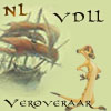
Im not to hot on the title either! Its 3D effect negaticvly stands out on on the map. Dotn get me wrong its a nice title, just not for this map.
i also like hte style of the mountians but feel they are a little to jagged and unclean atm.
Graphics wise I think the colour is the only stumbing block for the stamp now.
I'm going to put up a poll to see what people think of the mountains and the title to guage opinion before I spend time tweaking them around...