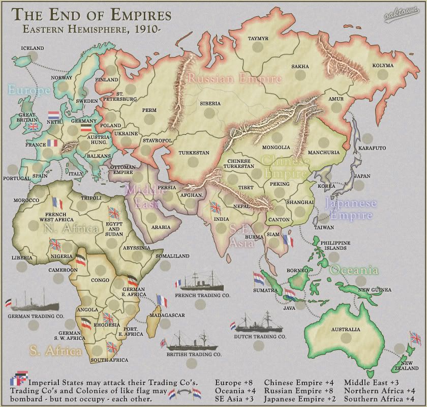
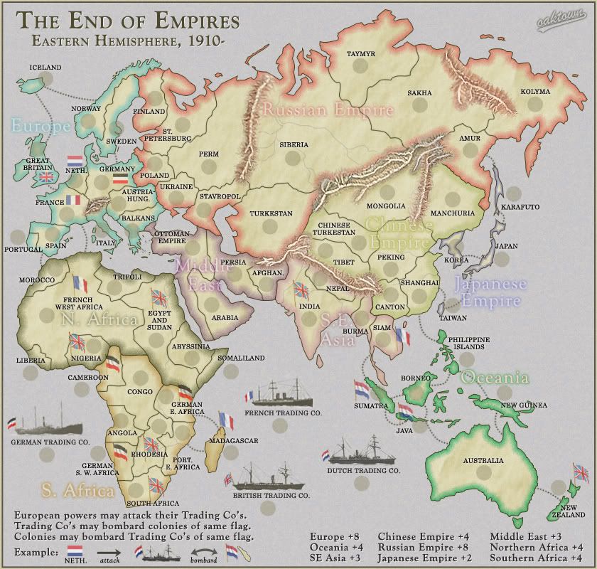
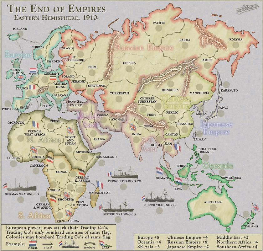
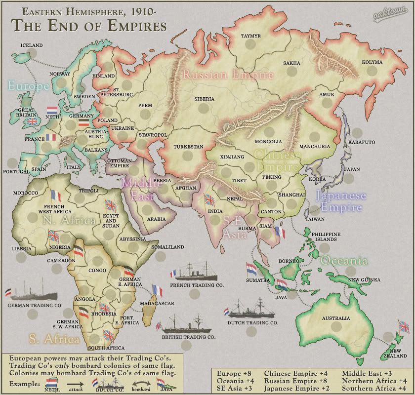
yeah, it works a lot better for me as well... I think the wider borders will look better as more changes occur.Ruben Cassar wrote:Like it or not, I'm able to differentiate between a region and another now while before I couldn't. So it's thumbs up for the new wider borders from my side. I understand that non colour blind people might prefer the older borders but for us colour blind players I think they are essential.
I should definitely drop one "The" - not sure which. I'll play.Ruben Cassar wrote:Btw Oak, you didn't tell me what you think about making the name "End of Empires" instead of "The End of Empires". I think it sounds better and has more of an impact, what do you think?
I can make it more legible, especially as I add more grunge.AndyBanana wrote:Are you going to make any slight alterations to the legend? I.E. maybe bolder text?
I've cranked the opacity down on all of the flags so that the background color bleeds through and the individual colors don't pop out so much. I definitely think they look better the more faded-looking they are, but if I fade them out too much I'm afraid somebody will confuse the two tri-color flags.AndyBanana wrote:Have you done anything to the flags? If not, are you going to?
Are there specific flags that are bothering you? Boats, Europeans, colonies?


