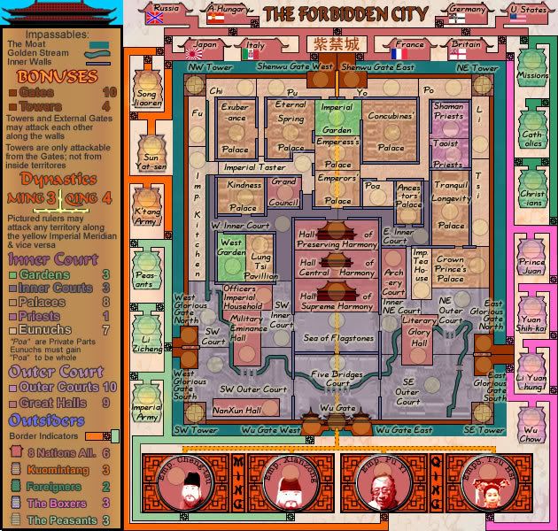
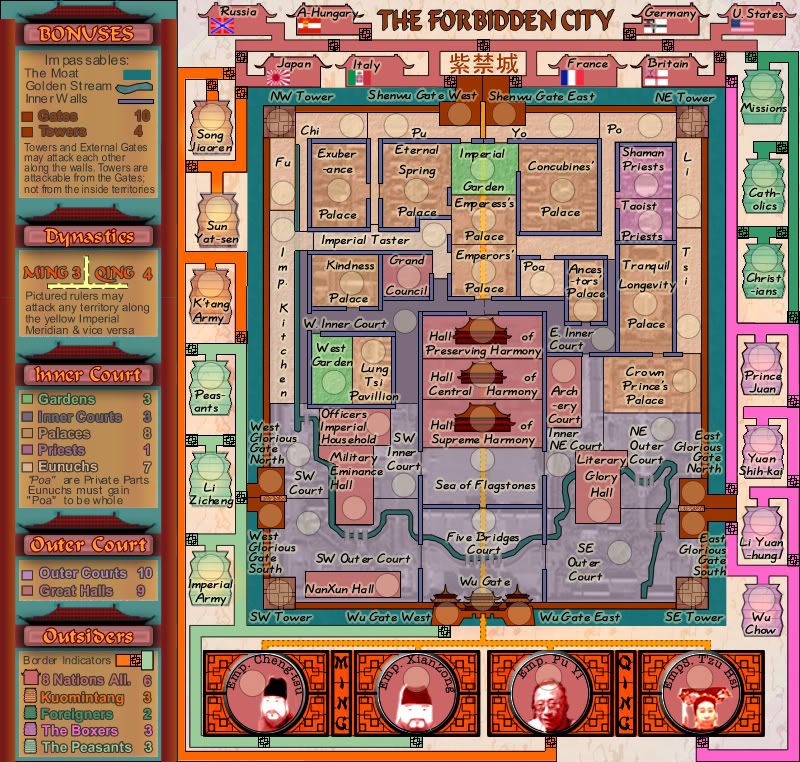
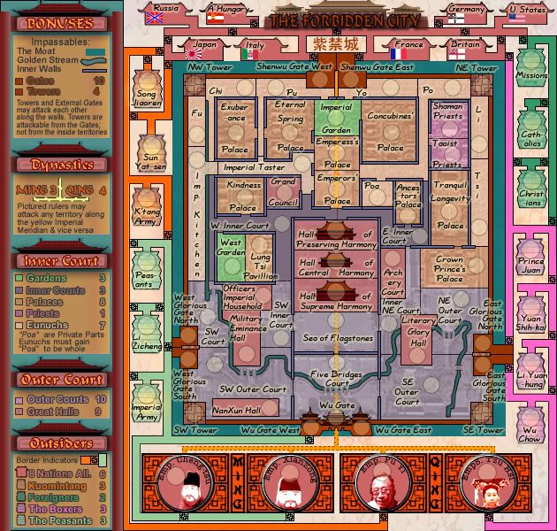
Optimus Prime wrote:cairnswk,
You've got a misspelling in your legend. It should be Priests and not Preists I do believe.
Yes. Didn't get to fix that one. thanks again.
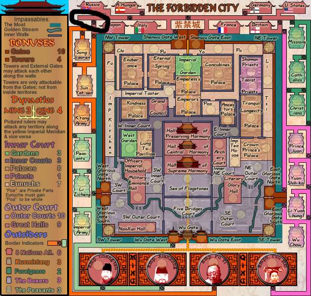
ZeakCytho wrote:Your border image is one pixel too far down between Yuan Shih-Kai and Li Yuan-hung.
Fixed
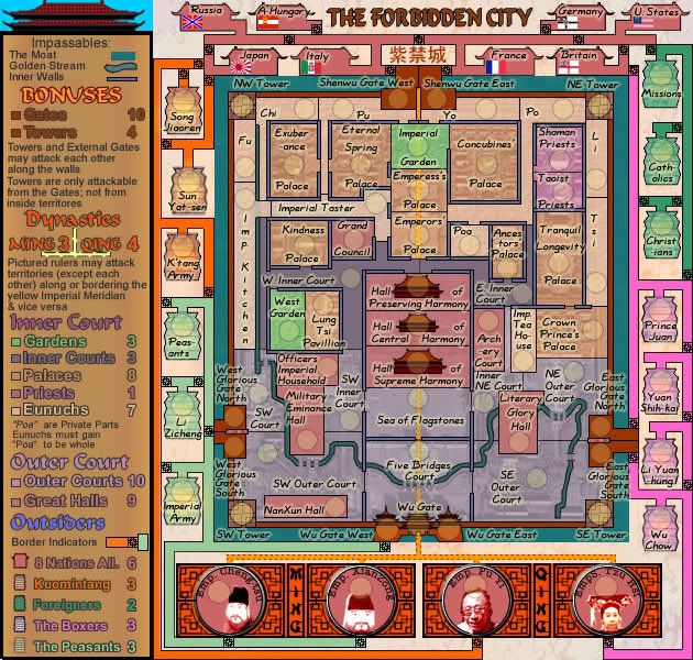
I agree that the "8 NationsAll." looks funny in the legend.
Fixed
I'd make the separation between the Ming and Qing emperors more apparent, also.
Done
Instead of having the separator be grey, have it be that creamy background color.
You mean the internal walls?
The wall...path...moat...not sure what it is, actually...the thing running through the southern part of the inner court that curves - it looks pretty pixely.
Oops. line properties got changed. Fixed.
The army circles on the NW and NE towers need to be centered properly.
Fixed.
Is there room in the houses of the foreign nations for army digits? I think you might need to make each a bit taller.
Yes there is room in there.
You might want to consider making the bonus for The Peasants and the Kuomintang +2 instead of +3...they're only 3 territories, and could be gotten on a drop with a bit of luck.
OK that will be re-considered, i have to re-calculate all the bonuses again anyways as i changed some attack routes in the design.
Just out of curiosity, what's the history behind the Eunuchs and Poa? It seems very...random.
No, not quite randon. Eunuchs were required to keep their "bits" inside a jar on the shelf of the house, so they could easily be found if the Eunuch died. They required their "bits" to be buried with them in order to make them whole.
Naturally i can't find a shelf in here that would be clear enough, so i placed it in the room between the Emperor and the Ancestors Palace, so that Po kind of became chief Eunuch to the Emperor and the Emperor was close at hand for their "bits".
It is definitely not randomly placed.

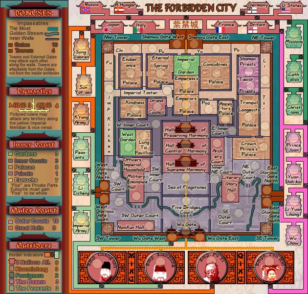
whitestazn88 wrote:that looks so much better the attack routes are clearly defined. i like the change in that category
Kewl

jakeo94 wrote:ambitios, well done, sligtly confusing, and with that many armys complete caoes
Yes Choatic, indeed, with so many people looking after one person.
Thanks Jakeo94

TaCktiX wrote:Cairns, you missed the Foreign Bank (8 NationsAll.) and the Dyslexic Monks (Preists). But that's okay, I miss random stuff just as much as the next guy. Also, Palace Concubines et al. looks like a bad Asian translation into English. Perhaps flip word order so it reads Concubines' Palace, Crown Prince's Palace, etc. Finally, don't forget to standardize attack route width on the outside.
Great work on the improvements thus far!
Good, all that being done!

