Conquer Club

Forbidden City [Quenched]

Care to peruse completed maps? Take a stroll through the Atlas.

Moderator: Cartographers

Forum rules
Please read the Community Guidelines before posting.

Re: Forbidden City V5(P5) - Bonuses discussions

Postby cairnswk on Thu Jul 03, 2008 3:36 pm

TaCktiX wrote:Graphically, I'm a bit bothered with the color palette. It seems too dried out, like you left this map out in the boiling Aussie sun for a couple days on accident. I'm aware that a burnt red and golden yellow are Forbidden City du jour, but is there anyway the colors could be less faded?

It would be helpful to know which colors in particular are bothering you? :)

Image
Image
* Pearl Harbour * Waterloo * Forbidden City * Jamaica * Pot Mosbi
User avatar
Private cairnswk
 
Posts: 11510
Joined: Sat Feb 03, 2007 8:32 pm
Location: Australia

Re: Forbidden City V5(P5) - Bonuses discussions

Postby cairnswk on Thu Jul 03, 2008 3:39 pm

qwert wrote:
Thanks for comment qwert. I think those things are fix now, yes?

Hmm,aim mean all text on main map,make to be same darken like around map. ;)
Also i think that for Russia,germany and other,to put outer glow.

Qwert, thanks again.
the countries all have glow of red, but that probably needs changing.
i think the font ist still not right for this map, so will experiment more.

Edit: Qwert, is this font better to read, it is uniformly bold all around the map

Image
Image
* Pearl Harbour * Waterloo * Forbidden City * Jamaica * Pot Mosbi
User avatar
Private cairnswk
 
Posts: 11510
Joined: Sat Feb 03, 2007 8:32 pm
Location: Australia

Re: Forbidden City V5(P5) - Bonuses discussions

Postby Qwert on Thu Jul 03, 2008 4:58 pm

I can read,but need to be more bold(what text font you use?),also one letter of Imperial kitchen(n) is in other terittory.Also bonus background colour,have not good influence on Bonus text,try to find some diferent colour who will give better look on Bonus box.
Image
NEW REVOLUTION-NEW RANKS PRESS THESE LINK viewtopic.php?f=471&t=47578&start=0
User avatar
Major Qwert
SoC Training Adviser
 
Posts: 9262
Joined: Tue Nov 07, 2006 5:07 pm
Location: VOJVODINA

Re: Forbidden City V5(P5) - Bonuses discussions

Postby TaCktiX on Fri Jul 04, 2008 12:00 am

All of the colors on the map seem more faded than they have to be. If you saturated the entire thing a little bit more, I think it'd look better.
User avatar
Corporal 1st Class TaCktiX
 
Posts: 2392
Joined: Mon Dec 17, 2007 8:24 pm
Location: Rapid City, SD

Re: Forbidden City V5(P5) - Bonuses discussions

Postby cairnswk on Fri Jul 04, 2008 3:14 pm

qwert wrote:I can read,but need to be more bold(what text font you use?)

only way to bold this is to double up the font graphic as it is already bold. That will have to wait until the final versions come out. Font used is called "short hand".

,also one letter of Imperial kitchen(n) is in other terittory.

fixed.

Also bonus background colour,have not good influence on Bonus text,try to find some diferent colour who will give better look on Bonus box.

still working on that. :)

TaCktiX wrote:All of the colors on the map seem more faded than they have to be. If you saturated the entire thing a little bit more, I think it'd look better.


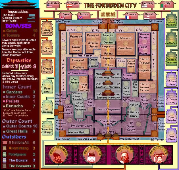
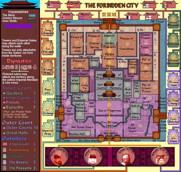
below are two versions.... one with a 25% saturation applied. definitely a difference but is it too much and will it be too much for players eyes.

Without saturation
Image

With saturation
Image
Image
* Pearl Harbour * Waterloo * Forbidden City * Jamaica * Pot Mosbi
User avatar
Private cairnswk
 
Posts: 11510
Joined: Sat Feb 03, 2007 8:32 pm
Location: Australia

Re: Forbidden City V5(P5) - Bonuses discussions

Postby TaCktiX on Sat Jul 05, 2008 12:14 pm

The sidebar legend gets a little bit too eye-popping with the saturation, but the rest of the map looks much better with it. I would daresay make it 40% saturation on the playable area.
User avatar
Corporal 1st Class TaCktiX
 
Posts: 2392
Joined: Mon Dec 17, 2007 8:24 pm
Location: Rapid City, SD

Re: Forbidden City V5(P5) - Bonuses discussions

Postby Kaplowitz on Sat Jul 05, 2008 1:05 pm

I can barely tell the difference :?
Image
User avatar
Private 1st Class Kaplowitz
 
Posts: 3088
Joined: Tue May 01, 2007 5:11 pm

Re: Forbidden City V5(P5) - Bonuses discussions

Postby ZeakCytho on Sat Jul 05, 2008 1:44 pm

The saturated version looks way better. I agree with Tack - maybe even saturate it more. But desaturate the legend area a bit if you do so.
User avatar
Captain ZeakCytho
 
Posts: 1251
Joined: Wed Sep 12, 2007 4:36 pm

Re: Forbidden City V8 - Colours and Borders

Postby cairnswk on Sat Jul 05, 2008 3:35 pm

TaCktiX wrote:The sidebar legend gets a little bit too eye-popping with the saturation, but the rest of the map looks much better with it. I would daresay make it 40% saturation on the playable area.

Kaplowitz wrote:I can barely tell the difference :?

ZeakCytho wrote:The saturated version looks way better. I agree with Tack - maybe even saturate it more. But desaturate the legend area a bit if you do so.

Thanks guys, appreciate your comments.

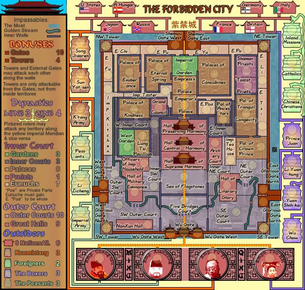
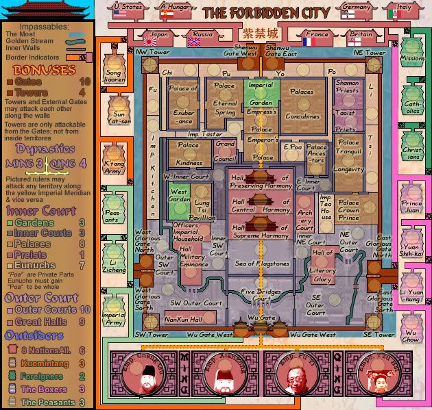
Here is Version 8.
Two questions:
1. Are the new colours easier on the eyes particularly in the legend?
2. Do the new connecting lines work for you and are you able to tell where they border each other?

Image
Image
* Pearl Harbour * Waterloo * Forbidden City * Jamaica * Pot Mosbi
User avatar
Private cairnswk
 
Posts: 11510
Joined: Sat Feb 03, 2007 8:32 pm
Location: Australia

Re: Forbidden City V5(P5) - Bonuses discussions

Postby ZeakCytho on Sat Jul 05, 2008 3:40 pm

The new legend colors are wonderful!

I think I get the attack lines now...tell me if I got it right: Chinese Christians can attack Inland Missions and Wu Chow. Yuan Shih-kai can attack Wu Chow. Wu Chow can attack Yuan Shih-kai, Emps. Tau Hsi, Li Yuan-hung, Prince Juan, and Chinese Christians.

If I got those right, I think I understand it now. If not, I'm totally lost.
User avatar
Captain ZeakCytho
 
Posts: 1251
Joined: Wed Sep 12, 2007 4:36 pm

Re: Forbidden City V5(P5) - Bonuses discussions

Postby cairnswk on Sat Jul 05, 2008 4:01 pm

ZeakCytho wrote:The new legend colors are wonderful!

Good!

I think I get the attack lines now...tell me if I got it right: Chinese Christians can attack Inland Missions and Wu Chow.

Yes

Yuan Shih-kai can attack Wu Chow.

Yes

Wu Chow can attack Yuan Shih-kai, Emps. Tau Hsi, Li Yuan-hung, Prince Juan, and Chinese Christians.

Yes

And Inland Missions can attack France, Chinese Christians and Catholics, but Catholics can only attack Inland Missions. :)


If I got those right, I think I understand it now. If not, I'm totally lost.

Looks like you're on the right track.
Image
* Pearl Harbour * Waterloo * Forbidden City * Jamaica * Pot Mosbi
User avatar
Private cairnswk
 
Posts: 11510
Joined: Sat Feb 03, 2007 8:32 pm
Location: Australia

Re: Forbidden City V8(P6) - Colors & Borders

Postby AndyDufresne on Sat Jul 05, 2008 9:36 pm

I like the new legend, leaps and bounds better. The light yellow delicious looking vanilla ice cream color I'm not sure about. But otherwise, I like the general look.


--Andy
User avatar
Corporal 1st Class AndyDufresne
 
Posts: 24935
Joined: Fri Mar 03, 2006 8:22 pm
Location: A Banana Palm in Zihuatanejo

Re: Forbidden City V8 - Colours and Borders

Postby Mr. Squirrel on Sat Jul 05, 2008 10:48 pm

cairnswk wrote:Do the new connecting lines work for you and are you able to tell where they border each other?

I understand them, but only after reading yours and Zeak's posts. Even then it took a minute of looking before I did understand them. I don't think that most people who play this map will understand it unless they read this forum.
User avatar
Lieutenant Mr. Squirrel
 
Posts: 157
Joined: Fri Nov 02, 2007 3:18 pm
Location: up a tree

Re: Forbidden City V9

Postby cairnswk on Sun Jul 06, 2008 4:15 pm

ZeakCytho wrote:The new legend colors are wonderful!
I think I get the attack lines now...tell me if I got it right: Chinese Christians can attack Inland Missions and Wu Chow. Yuan Shih-kai can attack Wu Chow. Wu Chow can attack Yuan Shih-kai, Emps. Tau Hsi, Li Yuan-hung, Prince Juan, and Chinese Christians.
If I got those right, I think I understand it now. If not, I'm totally lost.


Mr. Squirrel wrote:
cairnswk wrote:Do the new connecting lines work for you and are you able to tell where they border each other?

I understand them, but only after reading yours and Zeak's posts. Even then it took a minute of looking before I did understand them. I don't think that most people who play this map will understand it unless they read this forum.


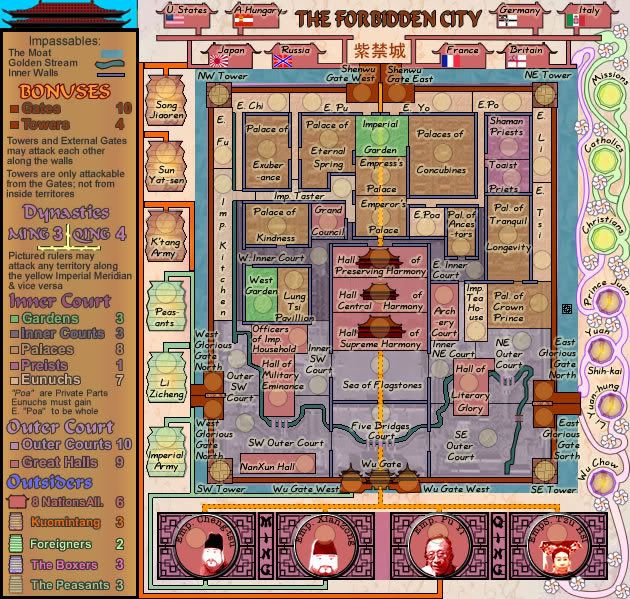
Does this Version 9 work any better for anybody - the right hand side, not the lanterns?

Image
Image
* Pearl Harbour * Waterloo * Forbidden City * Jamaica * Pot Mosbi
User avatar
Private cairnswk
 
Posts: 11510
Joined: Sat Feb 03, 2007 8:32 pm
Location: Australia

Re: Forbidden City V9(P6) - Side attack Paths/borders?

Postby TaCktiX on Sun Jul 06, 2008 5:25 pm

Overkill. That makes me think we're making Forbidden City: Hippie Edition. Go back to the old (version 8) style, and instead of straight lines to show borders, how about make them a little curvy like you have the lines themselves? Also, try to make the junction points a bit wider to make the curvyness more obvious.
User avatar
Corporal 1st Class TaCktiX
 
Posts: 2392
Joined: Mon Dec 17, 2007 8:24 pm
Location: Rapid City, SD

Re: Forbidden City V9(P6) - Side attack Paths/borders?

Postby cairnswk on Mon Jul 07, 2008 3:46 am

TaCktiX wrote:Overkill. That makes me think we're making Forbidden City: Hippie Edition.

Yes i thought someone would go there. However the design is acceptable for Chinese.

Go back to the old (version 8) style, and instead of straight lines to show borders, how about make them a little curvy like you have the lines themselves? Also, try to make the junction points a bit wider to make the curvyness more obvious.

OK will C what i can do, but i still think its all very unsatisfactory. :(

Image
Last edited by cairnswk on Mon Jul 07, 2008 12:45 pm, edited 1 time in total.
Image
* Pearl Harbour * Waterloo * Forbidden City * Jamaica * Pot Mosbi
User avatar
Private cairnswk
 
Posts: 11510
Joined: Sat Feb 03, 2007 8:32 pm
Location: Australia

Re: Forbidden City V9(P6) - Side attack Paths/borders?

Postby DiM on Mon Jul 07, 2008 5:37 am

i like the wavy paths with flowers. the idea is great. however i think it needs some refining. for example make the path continuous like a true vine that crawls to the top of the image. if you look at missions and go down the vine you'll see a line where it meets the main path. that line should not be there. you have such stops also at wu-chow and catholics.

also i'd like to see a bit more blending where the vine meets the gates and make the connection a bit wider and more visible.

BUT my main problem with the outside paths regardless if you use the flowers the lanterns or the dragons is that some people will not see all the connections and i'm not sure what can be done about this.

for example prince juan can attack france. not sure how many will notice that, or even more confusing, prince juan can attack catholics (if you go up the violet path through the nations path and then down the green path). this might cause a problem since most people might think catholics is safe because it is between christians and missions.

and my concern is that the confusion of the paths extends into the inner part of the map also. basically it's very easy to make mistakes and not realise what connects to what.
for example. Taoist Priests (it's taoist not toaist) at a first glance can attack directly to Emperor's palace. i can see a clear path between the 2 doors. but at a closer inspection i see that's not a path, that's actually a territory (E.Po)

honestly the map isn't complex at all. it's actually quite simple, no strange rules or bonuses, just a classic gameplay but on a very weird and confusing layout.

not sure if you're gonna like this part but here's what i would do. get rid of everything outside the city, lanterns nations emperors, etc.
increase the size of the city layout (cause now you have much more space) and make the map just with the inner city. no complicate ouside paths, more space to better design the city, and you still have enough terits to make an interesting battle.
“In the beginning God said, the four-dimensional divergence of an antisymmetric, second rank tensor equals zero, and there was light, and it was good. And on the seventh day he rested.”- Michio Kaku
User avatar
Major DiM
 
Posts: 10415
Joined: Wed Feb 14, 2007 6:20 pm
Location: making maps for scooby snacks

Re: Forbidden City V9(P6) - Side attack Paths/borders?

Postby Mr. Squirrel on Mon Jul 07, 2008 7:02 am

DiM wrote:not sure if you're gonna like this part but here's what i would do. get rid of everything outside the city, lanterns nations emperors, etc.
increase the size of the city layout (cause now you have much more space) and make the map just with the inner city. no complicate ouside paths, more space to better design the city, and you still have enough terits to make an interesting battle.


I agree with this. I never liked the outside elements, and I always wondered why you added them in the first place. Capturing the forbidden city alone would make for a great map.
User avatar
Lieutenant Mr. Squirrel
 
Posts: 157
Joined: Fri Nov 02, 2007 3:18 pm
Location: up a tree

Re: Forbidden City V9(P6) - Side attack Paths/borders?

Postby cairnswk on Mon Jul 07, 2008 1:14 pm

DiM wrote:....
not sure if you're gonna like this part but here's what i would do. get rid of everything outside the city, lanterns nations emperors, etc.
increase the size of the city layout (cause now you have much more space) and make the map just with the inner city. no complicate ouside paths, more space to better design the city, and you still have enough terits to make an interesting battle.


Mr. Squirrel wrote:
DiM wrote:not sure if you're gonna like this part but here's what i would do. get rid of everything outside the city, lanterns nations emperors, etc.
increase the size of the city layout (cause now you have much more space) and make the map just with the inner city. no complicate ouside paths, more space to better design the city, and you still have enough terits to make an interesting battle.


I agree with this. I never liked the outside elements, and I always wondered why you added them in the first place. Capturing the forbidden city alone would make for a great map.


Guys, i've read your comments and thanks for those. I had even thought of reducing the map size, doing this myself when challenging through the design of the pathways this last weekend.
However, at various stage throughout history, people have wanted to get inside the Forbidden City. Being the bastion of the Chinese throne over several hundred years, people have tried to get into it, the peasants and rival Emperors burnt down the gates in its early years. Most recently, after the advent of the Opium Wars in the 19th Century, the Foreign Nations wanted trading allowed - an Empirical edict that China was to remain Chinese was issued; last Century with the demise of the Boxer Rebellion which was supported by Prince Juan and tolerated although not politically outspoken for by the Dowager Empress Tsu-Hsi; and then the ultimate demise caused by the Nationalists, the Kuomintang and the Japanese, they've all tried to have a little piece of it. That was what made it Forbidden, the idea that it was reserved for someone special and that outsiders weren't allowed in. Given all that, I think it is entirely appropriate that there are outsiders trying to attack to get in an take over.

It's not that I don't like the suggestion DiM as I had considered doing this myself but to remove all of these outsiders I think you'd simply have a layout of a another castle without all the history that goes behind it to make it the intriguing Palace that it is.

And I also think that removal of those outsiders would be the easy way out, which I'm not in favour of.
What i have to do is find a way of showing these outsiders in design that is appropriate and more easily understood.

DiM, i hear also your concerns about the inner passageways etc and will try to address that although i have already opened that up compared to the starting version.

I am encouraged that someone sees the values in the flowers and vines? but that does require much more work if it stays....back to the drawing board for now i believe. :)

Thanks once again guys. Hope some others will drop in some comments.
Image
* Pearl Harbour * Waterloo * Forbidden City * Jamaica * Pot Mosbi
User avatar
Private cairnswk
 
Posts: 11510
Joined: Sat Feb 03, 2007 8:32 pm
Location: Australia

Re: Forbidden City V9(P6) - Side attack Paths/borders?

Postby TaCktiX on Mon Jul 07, 2008 4:07 pm

I think the problem with the outside connections is you're using the wrong type of flower. I see white petals and a yellow core and I think "Love is all you need" by the Beatles, being pumped out of a VW van. Perhaps something that is so distinctly Chinese that I don't think a war protest isn't on the horizon.

And I agree with DiM that you've got a major crampfest going on here. I wouldn't mind if you lowered the number of territories within the city to make it look tidier, but as it is I'm stuck thinking about the bad game design decision creating an overcrowded city with no indication of proper direction that was Guild Wars: Factions (yeah, I play other games too). The mini-pathways just to separate territories seems like a copout gameplay excuse, as well as being confusing.

Also, cut down on the naming. You have so many abbreviations everywhere it's just nuts. All the Eunuchs don't need E. next to their name, just let them be named and let the players make the assumption "hey, that Pao guy is a eunuch!" The use of "Of" is killing you as well. Taking a little bit of liberty (e.g., Crown Prince Palace) will help with the crampedness factor.

Finally, the border between W. Inner Court and E. Inner Court is indistinct if present at all. Is it the Meridian? If so, I would suggest making that a little bit more prominent.
User avatar
Corporal 1st Class TaCktiX
 
Posts: 2392
Joined: Mon Dec 17, 2007 8:24 pm
Location: Rapid City, SD

Re: Forbidden City V9(P6) - Side attack Paths/borders?

Postby cairnswk on Mon Jul 07, 2008 4:43 pm

TaCktiX wrote:...
And I agree with DiM that you've got a major crampfest going on here. I wouldn't mind if you lowered the number of territories within the city to make it look tidier, but as it is I'm stuck thinking about the bad game design decision creating an overcrowded city with no indication of proper direction that was Guild Wars: Factions (yeah, I play other games too). The mini-pathways just to separate territories seems like a copout gameplay excuse, as well as being confusing.

Thanks for comments TaCtiX...I will answer other stuff later....but
To start with I'm not trying to re-create something like Guild Wars. I'm trying to create something simple that most people can understand so let's keep any complications out of this and stick to classic play. I don't appreciate your critisism of copouts. Bad word to use on me. :evil:
Confusing can be handled, but to say to me that it's a copout at this stage of the design...i think you'd better give me some time to work on this eh?

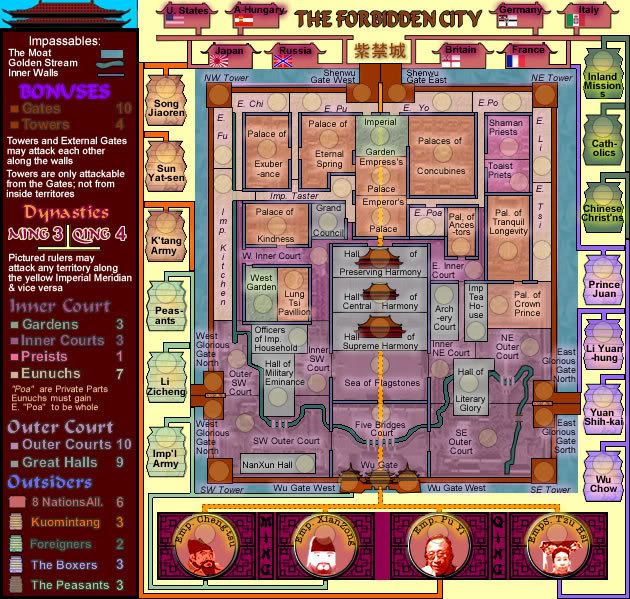
Now. Version 10 is below, and I have reverted to the lanterns, but with border indicators and wider paths that people can follow and understand.

Image
Image
* Pearl Harbour * Waterloo * Forbidden City * Jamaica * Pot Mosbi
User avatar
Private cairnswk
 
Posts: 11510
Joined: Sat Feb 03, 2007 8:32 pm
Location: Australia

Re: Forbidden City V10(P7) - Decision -> Lanterns stick!

Postby Mr. Squirrel on Mon Jul 07, 2008 4:53 pm

cairnswk wrote:However, at various stage throughout history, people have wanted to get inside the Forbidden City. Being the bastion of the Chinese throne over several hundred years, people have tried to get into it, the peasants and rival Emperors burnt down the gates in its early years. Most recently, after the advent of the Opium Wars in the 19th Century, the Foreign Nations wanted trading allowed - an Empirical edict that China was to remain Chinese was issued; last Century with the demise of the Boxer Rebellion which was supported by Prince Juan and tolerated although not politically outspoken for by the Dowager Empress Tsu-Hsi; and then the ultimate demise caused by the Nationalists, the Kuomintang and the Japanese, they've all tried to have a little piece of it. That was what made it Forbidden, the idea that it was reserved for someone special and that outsiders weren't allowed in. Given all that, I think it is entirely appropriate that there are outsiders trying to attack to get in an take over.


I understand that you are trying show the historic background to the city, but I dislike the way you are doing it. Why don't you focus on one instance of rebellion against the emperor? Have a battlefield outside the city with a certain rebellion leader (don't know chinese history well) leading the forces outside. I just think that all these long connections and territory lines look bad.
User avatar
Lieutenant Mr. Squirrel
 
Posts: 157
Joined: Fri Nov 02, 2007 3:18 pm
Location: up a tree

Re: Forbidden City V10(P7) - Decision -> Lanterns stick!

Postby TaCktiX on Mon Jul 07, 2008 4:58 pm

Sorry about the harsh language, I was writing a mile a minute and got a little too into it. As for the comparison to Guild Wars, here's a picture of a map of what I'm talking about:
Click image to enlarge.
image


THAT is confusing, and I promise that unless you've been through that place 6 or 7 times, you will get lost at least once (I've been there dozens of times, and I STILL get lost).

The new border indicators work perfectly, though the inconsistency of the border width is a bit jarring. Perhaps standardize it to the same width/length everywhere?

A couple spelling corrections:
- Bonus sidebar: Priests instead of Preists
- NationsAll sounds like a foreign bank, perhaps a space there?

Finally, I'm still uncertain of where the W. and E. Inner Court border is.
User avatar
Corporal 1st Class TaCktiX
 
Posts: 2392
Joined: Mon Dec 17, 2007 8:24 pm
Location: Rapid City, SD

Re: Forbidden City V10(P7) - Decision -> Lanterns stick!

Postby cairnswk on Tue Jul 08, 2008 3:25 am

Mr. Squirrel wrote:I understand that you are trying show the historic background to the city, but I dislike the way you are doing it. Why don't you focus on one instance of rebellion against the emperor? Have a battlefield outside the city with a certain rebellion leader (don't know chinese history well) leading the forces outside. I just think that all these long connections and territory lines look bad.

Appreciate your thoughts Mr Squirrel. As always there may be someone who doesn't like what i do, however, the objective of this map was always going to be to show the inside of the City as attacks, and have some attackers from the outside. What your ideas encompass can be done on another map.
Image
* Pearl Harbour * Waterloo * Forbidden City * Jamaica * Pot Mosbi
User avatar
Private cairnswk
 
Posts: 11510
Joined: Sat Feb 03, 2007 8:32 pm
Location: Australia

Re: Forbidden City V10(P7) - Decision -> Lanterns stick!

Postby cairnswk on Tue Jul 08, 2008 3:30 am

TaCktiX wrote:.....
The new border indicators work perfectly, though the inconsistency of the border width is a bit jarring. Perhaps standardize it to the same width/length everywhere?

A couple spelling corrections:
- Bonus sidebar: Priests instead of Preists
- NationsAll sounds like a foreign bank, perhaps a space there?

Finally, I'm still uncertain of where the W. and E. Inner Court border is.

1. Border tardiness can be rectified.
2. spelling can be rectified
3. Inner court border need emphasizing as do other sections.

I'm sure you be knowing your way around easily after I'm finished, and remember, I have a reputation to live up to...a maker of hard/complicated maps ( well most of the time) :)
Image
* Pearl Harbour * Waterloo * Forbidden City * Jamaica * Pot Mosbi
User avatar
Private cairnswk
 
Posts: 11510
Joined: Sat Feb 03, 2007 8:32 pm
Location: Australia

PreviousNext

Return to The Atlas

Who is online

Users browsing this forum: No registered users