Got your PM about mountains, but it's easier just to say it here since I was going to comment anyway.
Whatever you did to the legend and the title and the board-slabs, undo it immediately. It looks like shit now, but it was great before. You know, when it was kind of whittled-wood-looking, like someone carved it with a pocket-knife. I liked that. Change it back.

The sea looks really bad. Awful. It's even a bad colour now. The brighter one was much better.
I think the secret that you haven't learned yet is this:
Bevel = Bad
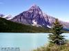
And about mountains: Nice mountains can be achieved easily by finding two contrasting colours of the same general shade, one dark and one light. Pick a large fuzzy airbrush (at least 30 pixels) and paint a strip of the dark, then
on the same layer paint another strip of the light one next to it. Then resize the brush to be at most 1/5th of you original large brush and draw in subsidiary peaks and mountain jags. Be sure to use the dark colour in the light area and the light colour in the dark area for contrast. Now apply a plastic wrap filter and play with the detail, smoothness, and highlight strength. Add an underlayer to blend them into the map and vips! Mountains. If you want sharper mountains, add a few sharpen masks afterwards, but do not achieve it by having higher highlight strength in the plastic wrap as it will just look slimy then.