oaktown wrote:Any more jokes about my drawings and I'll tell you all what you can stick up your krakens...
Now I see a camel
Moderator: Cartographers
![]() by gimil on Tue May 13, 2008 3:26 am
by gimil on Tue May 13, 2008 3:26 am
oaktown wrote:Any more jokes about my drawings and I'll tell you all what you can stick up your krakens...
natty_dread wrote:I was wrong


![]() by yeti_c on Tue May 13, 2008 3:31 am
by yeti_c on Tue May 13, 2008 3:31 am
gimil wrote:oaktown wrote:Any more jokes about my drawings and I'll tell you all what you can stick up your krakens...
Now I see a camel


![]() by jiminski on Tue May 13, 2008 10:14 am
by jiminski on Tue May 13, 2008 10:14 am


![]() by oaktown on Thu May 15, 2008 12:56 am
by oaktown on Thu May 15, 2008 12:56 am


![]() by fireedud on Thu May 15, 2008 8:04 pm
by fireedud on Thu May 15, 2008 8:04 pm
t-o-m wrote:quench time?


![]() by yeti_c on Fri May 16, 2008 1:23 am
by yeti_c on Fri May 16, 2008 1:23 am
ZeakCytho wrote:QUENCH!
![]() by mibi on Fri May 16, 2008 9:38 pm
by mibi on Fri May 16, 2008 9:38 pm


![]() by t-o-m on Sat May 17, 2008 7:04 am
by t-o-m on Sat May 17, 2008 7:04 am
fireedud wrote:t-o-m wrote:quench time?


![]() by oaktown on Sat May 17, 2008 10:52 am
by oaktown on Sat May 17, 2008 10:52 am
mibi wrote:should the title text and bottom text curve around the globe? seems a bit more natural to me, as you have a visual tangent going on currently and its not so hot.
![]() by RjBeals on Sat May 17, 2008 11:02 am
by RjBeals on Sat May 17, 2008 11:02 am


![]() by Kaplowitz on Sat May 17, 2008 11:03 am
by Kaplowitz on Sat May 17, 2008 11:03 am


![]() by Sir. Ricco on Sat May 17, 2008 11:10 am
by Sir. Ricco on Sat May 17, 2008 11:10 am
ZeakCytho wrote:QUENCH!


![]() by yeti_c on Sat May 17, 2008 11:56 am
by yeti_c on Sat May 17, 2008 11:56 am
![]() by Ruben Cassar on Sat May 17, 2008 11:59 am
by Ruben Cassar on Sat May 17, 2008 11:59 am


![]() by Incandenza on Sat May 17, 2008 12:06 pm
by Incandenza on Sat May 17, 2008 12:06 pm


![]() by oaktown on Sat May 17, 2008 12:56 pm
by oaktown on Sat May 17, 2008 12:56 pm
Ruben Cassar wrote:The curved one is better but I don't like the text bumping with the graphics.

![]() by t-o-m on Sat May 17, 2008 5:12 pm
by t-o-m on Sat May 17, 2008 5:12 pm
Sir. Ricco wrote:ZeakCytho wrote:QUENCH!
![]() by ZeakCytho on Sat May 17, 2008 5:16 pm
by ZeakCytho on Sat May 17, 2008 5:16 pm


![]() by oaktown on Sat May 17, 2008 5:37 pm
by oaktown on Sat May 17, 2008 5:37 pm
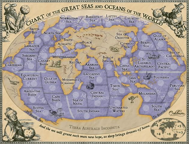
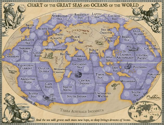
ZeakCytho wrote:Actually, I have one more nitpick. In the 16th century, the coast of Europe was pretty well documented in maps. Could you change the shape of the coasts of western Europe to be a bit more accurate?
![]() by mibi on Sun May 18, 2008 12:16 am
by mibi on Sun May 18, 2008 12:16 am

![]() by oaktown on Sun May 18, 2008 2:08 am
by oaktown on Sun May 18, 2008 2:08 am
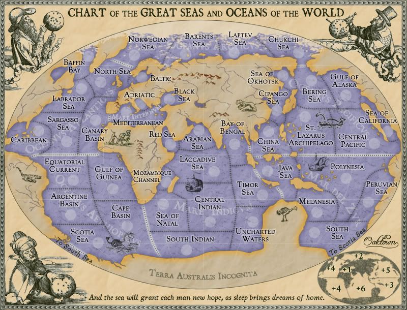
mibi wrote:Bosporus is out of proportion.
![]() by Qwert on Mon May 19, 2008 6:02 pm
by Qwert on Mon May 19, 2008 6:02 pm


![]() by yeti_c on Tue May 20, 2008 3:08 am
by yeti_c on Tue May 20, 2008 3:08 am
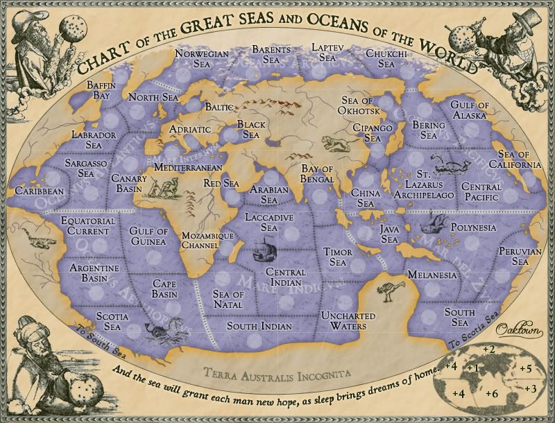
qwert wrote:Hmm,i think that you dont need these + in Bonus legend. If i know all maps dont have these addition to bonus number. Just left Numbers without +.
Users browsing this forum: No registered users
|
|||||||
| Conquer Club is not associated with RISK online in any way. Copyright © 2006-2025 by Big Wham LLC | |||||||
