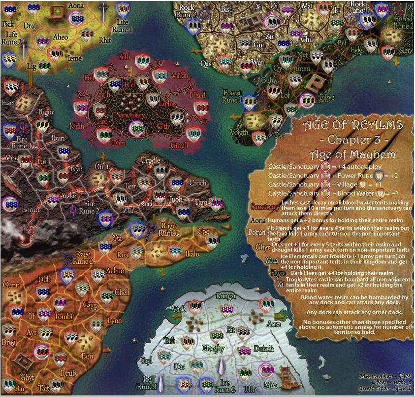
Age of Realms: Mayhem [Quenched]
Moderator: Cartographers
Forum rules
Please read the Community Guidelines before posting.
Please read the Community Guidelines before posting.
- gimil
- Posts: 8599
- Joined: Sat Mar 03, 2007 12:42 pm
- Gender: Male
- Location: United Kingdom (Scotland)
Re: AoR:Age of Mayhem - V13 S+L+XML+test - pg1+37 [Final Forge]
There is still alot uncentered. I was going to list them buts there is a fair few. . .
What do you know about map making, bitch?
Top Score:2403natty_dread wrote:I was wrong
Re: AoR:Age of Mayhem - V13 S+L+XML+test - pg1+37 [Final Forge]
sorry, nitpicking here
i know that somebody keeps mentioning that some are out of place (for army centering) and i just noticed a bunch that look out of place
borun, rongar, ghyr, ice rune 2, and maybe some other
edit: gimil u fastposter u...
i know that somebody keeps mentioning that some are out of place (for army centering) and i just noticed a bunch that look out of place
borun, rongar, ghyr, ice rune 2, and maybe some other
edit: gimil u fastposter u...
- DiM
- Posts: 10415
- Joined: Wed Feb 14, 2007 6:20 pm
- Gender: Male
- Location: making maps for scooby snacks
Re: AoR:Age of Mayhem - V13 S+L+XML+test - pg1+37 [Final Forge]
please post which ones and on what version (small large) so i can modify them
“In the beginning God said, the four-dimensional divergence of an antisymmetric, second rank tensor equals zero, and there was light, and it was good. And on the seventh day he rested.”- Michio Kaku
-
Shino Tenshi
- Posts: 166
- Joined: Sat Sep 01, 2007 1:35 pm
- Location: nostalgically reading the chat in game#14480932
Re: AoR:Age of Mayhem - V13 S+L+XML+test - pg1+36 [Final Forge]
Somebody has clearly not played the other two mapskiller_ace3 wrote:change the idea!!! its retarded ta have the same map just with different graphics...
- rocky mountain
- Posts: 415
- Joined: Thu Jul 12, 2007 7:08 pm
Re: AoR:Age of Mayhem - V13 S+L+XML+test - pg1+37 [Final Forge]
i really like the other two maps, and can't wait to play this one!
the gameplay is very unique (despite what killer_ace3 says)
will it be able to be quenched soon?
the gameplay is very unique (despite what killer_ace3 says)
will it be able to be quenched soon?
Re: AoR:Age of Mayhem - V13 S+L+XML+test - pg1+37 [Final Forge]
depends on andy....rocky mountain wrote:i really like the other two maps, and can't wait to play this one!
the gameplay is very unique (despite what killer_ace3 says)
will it be able to be quenched soon?
- AndyDufresne
- Posts: 24932
- Joined: Fri Mar 03, 2006 8:22 pm
- Location: A Banana Palm in Zihuatanejo
- Contact:
Re: AoR:Age of Mayhem - V13 S+L+XML+test - pg1+37 [Final Forge]
Right now we're waiting to see if we can get all the XML coordinates centered. Whenever you've got that DiM, post updated screenshots, along with text links to the XML and large and small map!
--Andy
--Andy
- DiM
- Posts: 10415
- Joined: Wed Feb 14, 2007 6:20 pm
- Gender: Male
- Location: making maps for scooby snacks
Re: AoR:Age of Mayhem - V13 S+L+XML+test - pg1+37 [Final Forge]
AndyDufresne wrote:Right now we're waiting to see if we can get all the XML coordinates centered. Whenever you've got that DiM, post updated screenshots, along with text links to the XML and large and small map!
--Andy
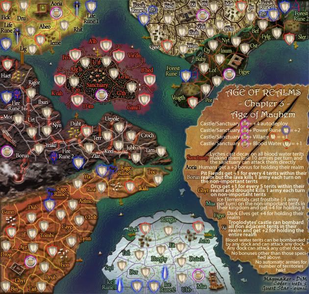
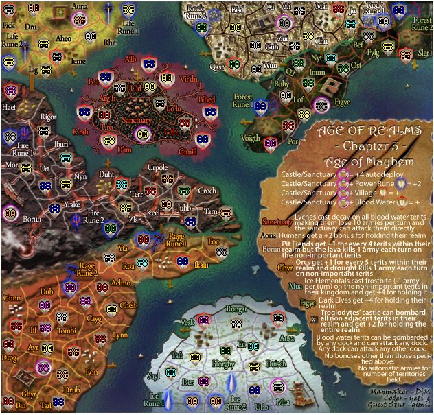
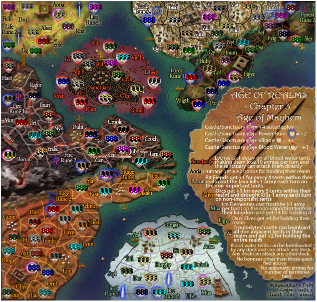
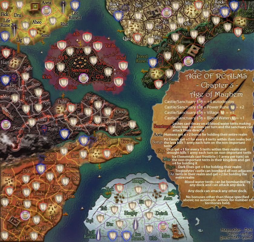
here you go andy. i hope everything is fixed now:
small
http://i178.photobucket.com/albums/w250 ... lcop-4.jpg small army test (88&888) large
http://i178.photobucket.com/albums/w250 ... 1co-11.jpg large army test (88&888)
xml:
http://www.sendspace.com/file/b9p8i7
“In the beginning God said, the four-dimensional divergence of an antisymmetric, second rank tensor equals zero, and there was light, and it was good. And on the seventh day he rested.”- Michio Kaku
Re: AoR:Age of Mayhem - V13 S+L+XML+test - pg1+37 [Final Forge]
Is it just me or are some of the names a bit hard to read on the ice continent? Esp on the small map
I am looking at your main images btw and not the ones with xml
sorry to come at you with this late
I am looking at your main images btw and not the ones with xml
sorry to come at you with this late
- DiM
- Posts: 10415
- Joined: Wed Feb 14, 2007 6:20 pm
- Gender: Male
- Location: making maps for scooby snacks
Re: AoR:Age of Mayhem - V13 S+L+XML+test - pg1+37 [Final Forge]
edbeard wrote:Is it just me or are some of the names a bit hard to read on the ice continent? Esp on the small map
I am looking at your main images btw and not the ones with xml
sorry to come at you with this late
since you're the only one that brought this up in so many pages i think it is you.
it's the same font the same style as the other names on the map. just the colour is different and i believe the colour difference between the ice and the text is pretty visible.
plus the names are the same as the previous versions
Last edited by DiM on Tue May 06, 2008 4:33 pm, edited 1 time in total.
“In the beginning God said, the four-dimensional divergence of an antisymmetric, second rank tensor equals zero, and there was light, and it was good. And on the seventh day he rested.”- Michio Kaku
- AndyDufresne
- Posts: 24932
- Joined: Fri Mar 03, 2006 8:22 pm
- Location: A Banana Palm in Zihuatanejo
- Contact:
Re: AoR:Age of Mayhem - V13 S+L+XML+test - pg1+37 [Final Forge]
I don't think it's the Ice continent...but I do have some difficulty for XI? Or whatever the continent is at the top of the map with white lettering...I think it's the shadow on the text. But it's minor. 
--Andy
--Andy
Re: AoR:Age of Mayhem - V13 S+L+XML+test - pg1+37 [Final Forge]
well I guess there's only one thing left to do
you have MY permission, Andy.

you have MY permission, Andy.
- DiM
- Posts: 10415
- Joined: Wed Feb 14, 2007 6:20 pm
- Gender: Male
- Location: making maps for scooby snacks
Re: AoR:Age of Mayhem - V13 S+L+XML+test - pg1+37 [Final Forge]
AndyDufresne wrote:I don't think it's the Ice continent...but I do have some difficulty for XI? Or whatever the continent is at the top of the map with white lettering...I think it's the shadow on the text. But it's minor.
--Andy
not you too
you're killing me here.
the gradient on the troglodytes continent was changed from left<>right in large map to top<>bottom on the small map precisely because people had trouble seeing the text. after the change it was all fine.
“In the beginning God said, the four-dimensional divergence of an antisymmetric, second rank tensor equals zero, and there was light, and it was good. And on the seventh day he rested.”- Michio Kaku
- AndyDufresne
- Posts: 24932
- Joined: Fri Mar 03, 2006 8:22 pm
- Location: A Banana Palm in Zihuatanejo
- Contact:
Re: AoR:Age of Mayhem - V13 S+L+XML+test - pg1+37 [Final Forge]
The gradient is fine, you just have to look closer at the names.  Is there a previous version with no gradient you have?
--Andy
--Andy
- DiM
- Posts: 10415
- Joined: Wed Feb 14, 2007 6:20 pm
- Gender: Male
- Location: making maps for scooby snacks
Re: AoR:Age of Mayhem - V13 S+L+XML+test - pg1+37 [Final Forge]
i don't have a previous version with no gradient as it was used starting with v2 and the text in v1 was much worse.AndyDufresne wrote:The gradient is fine, you just have to look closer at the names.Is there a previous version with no gradient you have?
--Andy
“In the beginning God said, the four-dimensional divergence of an antisymmetric, second rank tensor equals zero, and there was light, and it was good. And on the seventh day he rested.”- Michio Kaku
- AndyDufresne
- Posts: 24932
- Joined: Fri Mar 03, 2006 8:22 pm
- Location: A Banana Palm in Zihuatanejo
- Contact:
Re: AoR:Age of Mayhem - V13 S+L+XML+test - pg1+37 [Final Forge]
Well if I am the only one having a little trouble, it can't be a major thing. 
--Andy
--Andy
- DiM
- Posts: 10415
- Joined: Wed Feb 14, 2007 6:20 pm
- Gender: Male
- Location: making maps for scooby snacks
Re: AoR:Age of Mayhem - V13 S+L+XML+test - pg1+37 [Final Forge]
i sure hope not.AndyDufresne wrote:Well if I am the only one having a little trouble, it can't be a major thing.
--Andy
anybody who says otherwise will be prosecuted to the full extent of the law and beyond
“In the beginning God said, the four-dimensional divergence of an antisymmetric, second rank tensor equals zero, and there was light, and it was good. And on the seventh day he rested.”- Michio Kaku
Re: AoR:Age of Mayhem - V13 S+L+XML+test - pg1+37 [Final Forge]
wow thats hard to read, i think i had to squint a little to read that!DiM wrote:anybody who says otherwise will be prosecuted to the full extent of the law and beyond
quench time, you cant leave lil old DiM alone up here in the final forge stickies can you?
lol i can do the small dont too!
- rocky mountain
- Posts: 415
- Joined: Thu Jul 12, 2007 7:08 pm
Re: AoR:Age of Mayhem - V13 S+L+XML+test - pg1+37 [Final Forge]
someone quench this! i wanna play!
- Incandenza
- Posts: 4949
- Joined: Thu Oct 19, 2006 5:34 pm
- Gender: Male
- Location: Playing Eschaton with a bucket of old tennis balls
Re: AoR:Age of Mayhem - V13 S+L+XML+test - pg1+37 [Final Forge]
The only terit on the ice continent that's particularly hard to read is Eit. The troglodytes don't look too bad.
But the bad news is that there are still a few coordinates that look to be a pixel off on the small map (I haven't checked the large map, as to be honest I never use 'em):
Borun: borun, keel
XI: zui (but it's really hard to tell as the shield blends in so well to the background), bisd (ditto), qasr, ju, and both rock runes
Figye: figye, both forest runes, por
Ghyr: ghyr, lynn, eon, bin, roa
Mua: ice rune 2, der, ubb, duisch
There may be one or two more, and one or two of the above might be a case of my eyes deceiving me, so I'd be obliged if someone else can put their eyes on the aforementioned.
I'm not trying to be a dick... just a bit OCD.
THOTA: dingdingdingdingdingdingBOOM
Te Occidere Possunt Sed Te Edere Non Possunt Nefas Est
Te Occidere Possunt Sed Te Edere Non Possunt Nefas Est
- DiM
- Posts: 10415
- Joined: Wed Feb 14, 2007 6:20 pm
- Gender: Male
- Location: making maps for scooby snacks
Re: AoR:Age of Mayhem - V13 S+L+XML+test - pg1+37 [Final Forge]
thanks i will check them now and solve them.
PS: this will be the last map where i use army circles. i hate them


PS: this will be the last map where i use army circles. i hate them
“In the beginning God said, the four-dimensional divergence of an antisymmetric, second rank tensor equals zero, and there was light, and it was good. And on the seventh day he rested.”- Michio Kaku
- DiM
- Posts: 10415
- Joined: Wed Feb 14, 2007 6:20 pm
- Gender: Male
- Location: making maps for scooby snacks
Re: AoR:Age of Mayhem - V13 S+L+XML+test - pg1+37 [Final Forge]
i truly hope everything is fixed now:
edit// removed images to save space
edit// removed images to save space
Last edited by DiM on Wed May 07, 2008 2:24 am, edited 1 time in total.
“In the beginning God said, the four-dimensional divergence of an antisymmetric, second rank tensor equals zero, and there was light, and it was good. And on the seventh day he rested.”- Michio Kaku
- Incandenza
- Posts: 4949
- Joined: Thu Oct 19, 2006 5:34 pm
- Gender: Male
- Location: Playing Eschaton with a bucket of old tennis balls
Re: AoR:Age of Mayhem - V13 S+L+XML+test - pg1+37 [Final Forge]
Now you're really going to hate me.
Borun and Ghyr castles still look like they could go one pixel down and to the right. And Por now looks like it's one pixel too far right (instead of one pixel too far left).
But here's the thing: I'm seeing this by squinting my eyes and looking from like six inches away from my screen. So at this point, if you're good with it, not a problem.
THOTA: dingdingdingdingdingdingBOOM
Te Occidere Possunt Sed Te Edere Non Possunt Nefas Est
Te Occidere Possunt Sed Te Edere Non Possunt Nefas Est
- DiM
- Posts: 10415
- Joined: Wed Feb 14, 2007 6:20 pm
- Gender: Male
- Location: making maps for scooby snacks
Re: AoR:Age of Mayhem - V13 S+L+XML+test - pg1+37 [Final Forge]
por was moved just 1 px to the right so if i move it 1px to the left it is back at the old positionIncandenza wrote:Now you're really going to hate me.
Borun and Ghyr castles still look like they could go one pixel down and to the right. And Por now looks like it's one pixel too far right (instead of one pixel too far left).
But here's the thing: I'm seeing this by squinting my eyes and looking from like six inches away from my screen. So at this point, if you're good with it, not a problem.
i'll check borun and ghyr now.
“In the beginning God said, the four-dimensional divergence of an antisymmetric, second rank tensor equals zero, and there was light, and it was good. And on the seventh day he rested.”- Michio Kaku
- DiM
- Posts: 10415
- Joined: Wed Feb 14, 2007 6:20 pm
- Gender: Male
- Location: making maps for scooby snacks
Re: AoR:Age of Mayhem - V13 S+L+XML+test - pg1+37 [Final Forge]
edit// removed images see below
Last edited by DiM on Wed May 07, 2008 11:42 am, edited 1 time in total.
“In the beginning God said, the four-dimensional divergence of an antisymmetric, second rank tensor equals zero, and there was light, and it was good. And on the seventh day he rested.”- Michio Kaku


