I think you said you're not putting continent names on the map?
that'd be a first I think so I dunno. need some justification for it I think (and also approval from CAs).
Egypt: Upper [Quenched]
Moderator: Cartographers
Re: EGYPT UPPER V7 (P5) [I] - Comments please!
![]() by edbeard on Sat Apr 26, 2008 7:39 pm
by edbeard on Sat Apr 26, 2008 7:39 pm
-

 edbeard
- Posts: 2501
- Joined: Thu Mar 29, 2007 12:41 am


Re: EGYPT UPPER V7 (P5) [I] - Comments please!
![]() by cairnswk on Sat Apr 26, 2008 8:42 pm
by cairnswk on Sat Apr 26, 2008 8:42 pm
edbeard wrote:I think you said you're not putting continent names on the map?
that'd be a first I think so I dunno. need some justification for it I think (and also approval from CAs).
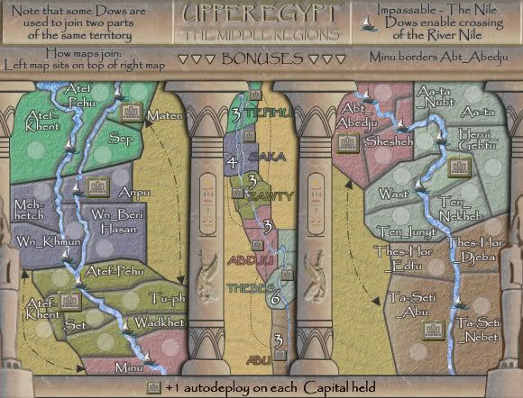
Yes i'm in two minds about that....there are no large continent type regions in ancient egypt, and the ones that i'd have to use wo-uld be those of the main city in that region i.e. see v 14 of the lower egypt map. i was going to use the greek names for these cities and that was dissed, then i decided to use the egyptian names, and no it is seems it has been suggested that there is no need for the continent names when using a mini-map, however upon further thought one still has to have continent names for the xml....so.....i guess i'll have to put them back in.

* Pearl Harbour * Waterloo * Forbidden City * Jamaica * Pot Mosbi
-

cairnswk
- Posts: 11510
- Joined: Sat Feb 03, 2007 8:32 pm
- Location: Australia


Re: EGYPT UPPER V7 (P5) [I] - Comments please!
![]() by Ogrecrusher on Sun Apr 27, 2008 3:58 am
by Ogrecrusher on Sun Apr 27, 2008 3:58 am
Looks like brutal bottleneck there! Should make for interesing gameplay!
-
Ogrecrusher
- Posts: 250
- Joined: Thu Aug 16, 2007 2:55 pm


Re: EGYPT UPPER V7 (P5) [I] - Comments please!
![]() by cairnswk on Sun Apr 27, 2008 4:28 am
by cairnswk on Sun Apr 27, 2008 4:28 am
Ogrecrusher wrote:Looks like brutal bottleneck there! Should make for interesing gameplay!
Ogrecrusher....great to hear from you again....yes there is a bottleneck right up there, particularly on the map join...but nothing i can do about it...that's the geography of the Nile
Below is Version 8 large and small.
I have placed names on the continents in the mini-map even though i said i wouldn't, it is necessary for the xml anyways.
Fonts and Capital bonuses have been aligned with the Lower Egypt map.
- Click image to enlarge.
* Pearl Harbour * Waterloo * Forbidden City * Jamaica * Pot Mosbi
-
cairnswk
- Posts: 11510
- Joined: Sat Feb 03, 2007 8:32 pm
- Location: Australia
Re: EGYPT UPPER V8 (P6) [I] - Comments please!
![]() by bryguy on Sun Apr 27, 2008 8:23 am
by bryguy on Sun Apr 27, 2008 8:23 am
Congratz on foundry 
just a few questions tho
1) Whats with the _ on some of the places?
2) Why isnt this quenched?
ok so i only really had 1 question...
just a few questions tho
1) Whats with the _ on some of the places?
2) Why isnt this quenched?
ok so i only really had 1 question...
-
bryguy
- Posts: 4381
- Joined: Tue Aug 07, 2007 8:50 am
- Location: Lost in a Jigsaw


Re: EGYPT UPPER V8 (P6) [I] - Comments please!
![]() by cairnswk on Sun Apr 27, 2008 10:46 am
by cairnswk on Sun Apr 27, 2008 10:46 am
bryguy wrote:Congratz on foundry
just a few questions tho
1) Whats with the _ on some of the places?
2) Why isnt this quenched?
ok so i only really had 1 question...
for the undercore please read the top of the previous page
* Pearl Harbour * Waterloo * Forbidden City * Jamaica * Pot Mosbi
-
cairnswk
- Posts: 11510
- Joined: Sat Feb 03, 2007 8:32 pm
- Location: Australia
Re: EGYPT UPPER V8 (P6) [I] - Comments please!
![]() by sam_levi_11 on Tue Apr 29, 2008 11:12 am
by sam_levi_11 on Tue Apr 29, 2008 11:12 am
as muctwo sides bit i cant think of another way of doing it
-

sam_levi_11
- Posts: 2872
- Joined: Mon Dec 11, 2006 2:48 pm


Re: EGYPT UPPER V8 (P6) [I] - Comments please!
![]() by cairnswk on Tue Apr 29, 2008 2:27 pm
by cairnswk on Tue Apr 29, 2008 2:27 pm
sam_levi_11 wrote:as muctwo sides bit i cant think of another way of doing it
hey sam...welcome back...haven't seen you in a while.
Yes, i couldn't think of another way of doing it using a simple character.
* Pearl Harbour * Waterloo * Forbidden City * Jamaica * Pot Mosbi
-
cairnswk
- Posts: 11510
- Joined: Sat Feb 03, 2007 8:32 pm
- Location: Australia
Re: EGYPT UPPER V8 (P6) [I] - Comments please!
![]() by sam_levi_11 on Tue Apr 29, 2008 3:04 pm
by sam_levi_11 on Tue Apr 29, 2008 3:04 pm
cairnswk wrote:sam_levi_11 wrote:as muctwo sides bit i cant think of another way of doing it
hey sam...welcome back...haven't seen you in a while.
Yes, i couldn't think of another way of doing it using a simple character.
lol iv been bak almost 2 months after 5 months off. anyway sorry for mistake earlier, basically could u not rotate the image and have it diagonally.
-
sam_levi_11
- Posts: 2872
- Joined: Mon Dec 11, 2006 2:48 pm
Re: EGYPT UPPER V8 (P6) [I] - Comments please!
![]() by cairnswk on Tue Apr 29, 2008 3:56 pm
by cairnswk on Tue Apr 29, 2008 3:56 pm
sam_levi_11 wrote:cairnswk wrote:sam_levi_11 wrote:as muctwo sides bit i cant think of another way of doing it
hey sam...welcome back...haven't seen you in a while.
Yes, i couldn't think of another way of doing it using a simple character.
lol iv been bak almost 2 months after 5 months off. anyway sorry for mistake earlier, basically could u not rotate the image and have it diagonally.
first time i've ssen u in the the threads for a while.
rotate - no...it wouldn't look the same...and besides this will simply present a new challenge....if i can cope with the map being split...everyone else can also.
* Pearl Harbour * Waterloo * Forbidden City * Jamaica * Pot Mosbi
-
cairnswk
- Posts: 11510
- Joined: Sat Feb 03, 2007 8:32 pm
- Location: Australia
Re: EGYPT UPPER V8 (P6) [I] - Comments please!
![]() by Kaplowitz on Tue Apr 29, 2008 5:41 pm
by Kaplowitz on Tue Apr 29, 2008 5:41 pm
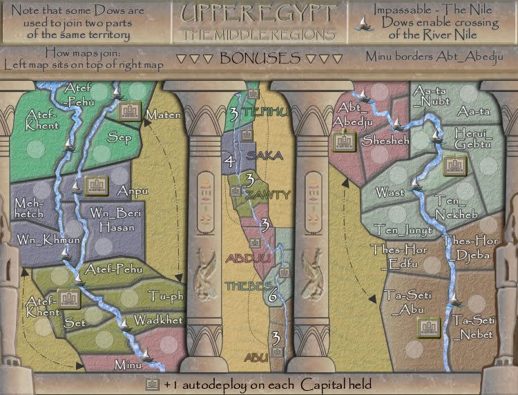
The river looks weird in Abt_Abedju

-

Kaplowitz
- Posts: 3088
- Joined: Tue May 01, 2007 5:11 pm


Re: EGYPT UPPER V8 (P6) [I] - Comments please!
![]() by ZeakCytho on Tue Apr 29, 2008 5:56 pm
by ZeakCytho on Tue Apr 29, 2008 5:56 pm
I don't like the underscores very much. I found the colons perfectly readable, but since others didn't, that's out too. Is there anything else you could do? Parenthesis or square brackets around the second part, maybe? Or a tilde (~) or vertical bar (|)?
-

ZeakCytho
- Posts: 1251
- Joined: Wed Sep 12, 2007 4:36 pm


Re: EGYPT UPPER V8 (P6) [I] - Comments please!
![]() by gimil on Tue Apr 29, 2008 7:39 pm
by gimil on Tue Apr 29, 2008 7:39 pm
I find the continent names and "the middle regions" in the title difficult to read. Either making them more bold of making the stroke stronger would do the trick I think.
What do you know about map making, bitch?
Top Score:2403
natty_dread wrote:I was wrong
Top Score:2403
-

gimil
- Posts: 8599
- Joined: Sat Mar 03, 2007 12:42 pm
- Location: United Kingdom (Scotland)


Re: EGYPT UPPER V8 (P6) [I] - Comments please!
![]() by AndyDufresne on Tue Apr 29, 2008 8:50 pm
by AndyDufresne on Tue Apr 29, 2008 8:50 pm
This series of Egyptian maps looks promising as usual.
Specifically regarding this map, I like the colors...though the two different sandlike colors on the map throw me off a little.
The organization is also something to get use to...Perhaps you could offset the center a little more...maybe make the bonus map continents almost like raised above the surrounding ground between the pillars...perhaps shadow them a little. I'm not sure.
May look into differentiating the the foreground objects a little more...
I don't think anything above made sense. Forgive me!
--Andy
-

AndyDufresne
- Posts: 24935
- Joined: Fri Mar 03, 2006 8:22 pm
- Location: A Banana Palm in Zihuatanejo


Re: EGYPT UPPER V8 (P6) [I] - Comments please!
![]() by cairnswk on Thu May 01, 2008 12:09 pm
by cairnswk on Thu May 01, 2008 12:09 pm
AndyDufresne wrote:This series of Egyptian maps looks promising as usual.
Specifically regarding this map, I like the colors...though the two different sandlike colors on the map throw me off a little.
The organization is also something to get use to...Perhaps you could offset the center a little more...maybe make the bonus map continents almost like raised above the surrounding ground between the pillars...perhaps shadow them a little. I'm not sure.
May look into differentiating the the foreground objects a little more...
I don't think anything above made sense. Forgive me!
--Andy
Made perfect sense to me Andy.....you want something in this area to be changed!
* Pearl Harbour * Waterloo * Forbidden City * Jamaica * Pot Mosbi
-
cairnswk
- Posts: 11510
- Joined: Sat Feb 03, 2007 8:32 pm
- Location: Australia
Re: EGYPT UPPER V8 (P6) [I] - Comments please!
![]() by cairnswk on Thu May 01, 2008 12:12 pm
by cairnswk on Thu May 01, 2008 12:12 pm
Kaplowitz wrote:The river looks weird in Abt_Abedju
Yes that happens in other terts also....where there is a territory that crosses the river, you might notice that there is no thick outline to the territory edge, but where there are two different territories on each side of the river, there are two distinct territory outline edges.
* Pearl Harbour * Waterloo * Forbidden City * Jamaica * Pot Mosbi
-
cairnswk
- Posts: 11510
- Joined: Sat Feb 03, 2007 8:32 pm
- Location: Australia
Re: EGYPT UPPER V8 (P6) [I] - Comments please!
![]() by cairnswk on Thu May 01, 2008 12:13 pm
by cairnswk on Thu May 01, 2008 12:13 pm
ZeakCytho wrote:I don't like the underscores very much. I found the colons perfectly readable, but since others didn't, that's out too. Is there anything else you could do? Parenthesis or square brackets around the second part, maybe? Or a tilde (~) or vertical bar (|)?
I'll look into it further Zeak...perhaps i can create something there that wouldn't look out of place.
* Pearl Harbour * Waterloo * Forbidden City * Jamaica * Pot Mosbi
-
cairnswk
- Posts: 11510
- Joined: Sat Feb 03, 2007 8:32 pm
- Location: Australia
Re: EGYPT UPPER V8 (P6) [I] - Comments please!
![]() by cairnswk on Thu May 01, 2008 12:14 pm
by cairnswk on Thu May 01, 2008 12:14 pm
gimil wrote:I find the continent names and "the middle regions" in the title difficult to read. Either making them more bold of making the stroke stronger would do the trick I think.
I'll attend that for you Bud.
* Pearl Harbour * Waterloo * Forbidden City * Jamaica * Pot Mosbi
-
cairnswk
- Posts: 11510
- Joined: Sat Feb 03, 2007 8:32 pm
- Location: Australia
Re: EGYPT UPPER V8 (P6) [I] - Comments please!
![]() by yeti_c on Thu May 01, 2008 1:58 pm
by yeti_c on Thu May 01, 2008 1:58 pm
Hey Cairns - not looked in on this for a while...
Looking good - like the new 2 columns with minimap in the middle idea - great work.
Not sure I like the _ 's though... I saw that : 's were not very visible...
But could you simply make the Colon a bigger point size and bold rather than the underscore?
C.
Looking good - like the new 2 columns with minimap in the middle idea - great work.
Not sure I like the _ 's though... I saw that : 's were not very visible...
But could you simply make the Colon a bigger point size and bold rather than the underscore?
C.

Highest score : 2297
-

yeti_c
- Posts: 9624
- Joined: Thu Jan 04, 2007 9:02 am


Re: EGYPT UPPER V8 (P6) [I] - Comments please!
![]() by cairnswk on Thu May 01, 2008 4:05 pm
by cairnswk on Thu May 01, 2008 4:05 pm
yeti_c wrote:Hey Cairns - not looked in on this for a while...
Looking good - like the new 2 columns with minimap in the middle idea - great work.
Not sure I like the _ 's though... I saw that : 's were not very visible...
But could you simply make the Colon a bigger point size and bold rather than the underscore?
C.
Mmmm....this is a difficult font C. but i'll try that. might work but stretch the words apart.
* Pearl Harbour * Waterloo * Forbidden City * Jamaica * Pot Mosbi
-
cairnswk
- Posts: 11510
- Joined: Sat Feb 03, 2007 8:32 pm
- Location: Australia
Re: EGYPT UPPER V8 (P6) [I] - Comments please!
![]() by yeti_c on Fri May 02, 2008 2:46 am
by yeti_c on Fri May 02, 2008 2:46 am
cairnswk wrote:yeti_c wrote:Hey Cairns - not looked in on this for a while...
Looking good - like the new 2 columns with minimap in the middle idea - great work.
Not sure I like the _ 's though... I saw that : 's were not very visible...
But could you simply make the Colon a bigger point size and bold rather than the underscore?
C.
Mmmm....this is a difficult font C. but i'll try that. might work but stretch the words apart.
Could always make it a different piece of text overlaid on top of the current text... I do think that Underscores really ruin the old world style... _'s to me remind me of Coding - which is modern technology... -> Perhaps find a hyroglyphic that could do the job if the font change doesn't work?
C.
Highest score : 2297
-
yeti_c
- Posts: 9624
- Joined: Thu Jan 04, 2007 9:02 am
Re: EGYPT UPPER V8 (P6) [I] - Comments please!
![]() by cairnswk on Fri May 02, 2008 7:04 am
by cairnswk on Fri May 02, 2008 7:04 am
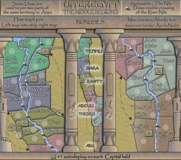
Version 9.
Changes:
1. Desert sand made the same colour - Andy
2. : the colon replces the _ underscore at size 18
3. attemtp to giv e the "wall" a bit of depth.
4. title darkened
5. some territory names changed - simplified
6. little outline given to mini map
Changes:
1. Desert sand made the same colour - Andy
2. : the colon replces the _ underscore at size 18
3. attemtp to giv e the "wall" a bit of depth.
4. title darkened
5. some territory names changed - simplified
6. little outline given to mini map
- Click image to enlarge.

* Pearl Harbour * Waterloo * Forbidden City * Jamaica * Pot Mosbi
-
cairnswk
- Posts: 11510
- Joined: Sat Feb 03, 2007 8:32 pm
- Location: Australia
Re: EGYPT UPPER V9 (P7) [I] - Comments please!
![]() by RjBeals on Fri May 02, 2008 11:53 am
by RjBeals on Fri May 02, 2008 11:53 am
Looks great cairns. This map should be moving on up soon!

-

RjBeals
- Posts: 2506
- Joined: Mon Nov 20, 2006 5:17 pm
- Location: South Carolina, USA


Re: EGYPT UPPER V9 (P7) [I] - Comments please!
![]() by bryguy on Fri May 02, 2008 12:00 pm
by bryguy on Fri May 02, 2008 12:00 pm
Nothin i can see wrong with it right now, and the :'s look great now
although (and im just spitballing an idea here) for the territories with capitals, could the army numbers be on the capital images?
although (and im just spitballing an idea here) for the territories with capitals, could the army numbers be on the capital images?
-
bryguy
- Posts: 4381
- Joined: Tue Aug 07, 2007 8:50 am
- Location: Lost in a Jigsaw
Re: EGYPT UPPER V9 (P7) [I] - Comments please!
![]() by cairnswk on Fri May 02, 2008 2:13 pm
by cairnswk on Fri May 02, 2008 2:13 pm
bryguy wrote:Nothin i can see wrong with it right now, and the :'s look great now
although (and im just spitballing an idea here) for the territories with capitals, could the army numbers be on the capital images?
No...that would create an inconsistency with the other maps.
* Pearl Harbour * Waterloo * Forbidden City * Jamaica * Pot Mosbi
-
cairnswk
- Posts: 11510
- Joined: Sat Feb 03, 2007 8:32 pm
- Location: Australia
Who is online
Users browsing this forum: No registered users
|
|||||||
| Conquer Club is not associated with RISK online in any way. Copyright © 2006-2025 by Big Wham LLC | |||||||