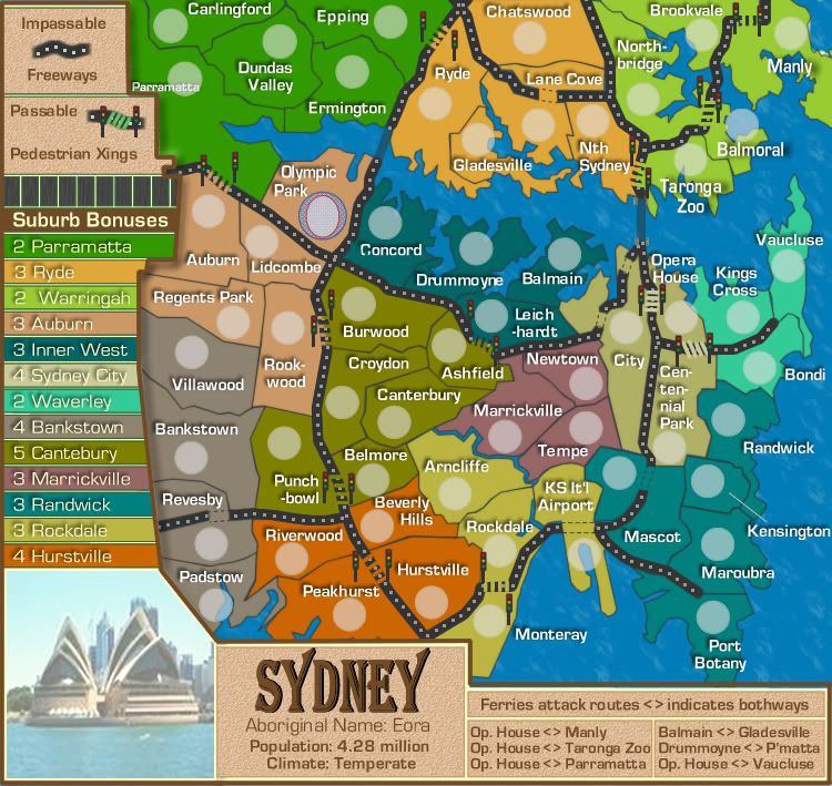
Sir. Ricco wrote:Ok, here some things I just like to bring up
1. Do you really need those Stop lights? They kind of crowd the map
Yes. I think they are needed to highlight the pedestrian xings
3. The ferry routes are just a little confusing. I get them, but I can see them becoming a problem to the...*Amen* noobs.
That should be attended to in V15 below
4. Inner West I think should be knocked down to 2 bonuses. With only two ways to get into it, it would be pretty easies to defend.
i haven't looked at that yet, but please remind me later....if i forget. Thanks for your comments.

RjBeals wrote:
1) The color bars where the bonus region names are along the left side - could you extend the right side of those bars so they fall underneath the bolder legend border? I also see something between those color bars bleeding through - not sure what it is though.
2) The water routes are a little confusing. since they are so close and all lead to opera house, they get jumbled up around there. What about lines instead of dots - like beveled/flowing lines?
3) I like the traffic lights. Keep them. But I think the road crossings could be a little better than current. Maybe make them slanted instead of horizontal?
4) Your territory font is perfect. What did you use anyway? I love it. Perfect size, perfect amount of drop shadow - well done.
5) Colors are perfect as well.
Thanks Rj...most of that attended to below in V15
gimil wrote:I agree with everything RJ says except I think the terr names could use the slightest bit of transparency.
Also the Olympic Park is missing a drop shadow.
Fixed in V15 below, thanks Gimil
bryguy wrote:u cant see the upper left corner of the 'H' in opera house cause the stop sign is on it, could u modify that so that u can?
some peoplemight thing that since the army circle is on the other side of a dotted line from the title of KS It'l Airport that it is part of another territory (just felt like pointing that out, it would probably not be that big a problem)
other than that the map looks great except for all the feiry lines converging on one spot (gets a little confusing)
keep up the good work cairns

All should be fixed in V15 below, thanks Bryguy
FreeMan10 wrote:Hey Cairns-
Looking pretty spiffy!
A couple of graphical notes-
1) the Balmoral/Taronga Zoo border runs over the 2nd A in Taronga.
2) I agree with RjB's note about the color bars for the legend - there seems to be uneven spacing between them, and some sort of white vertical stripe shows through on the right side of the bars.
3) Ryde's legend bar doesn't seem to merge well with the brown border.
4) the legend border at Parramatta overruns the text for Auburn
5) it seems odd that the legend has a brown border around the outside of it, while the rest of the actual map doesn't have any border at all. I'd say keep the brown line as a separator, but remove it from the outside border. That'll give you a few more pixels for the actual map.
6) It might make more sense to hyphenate Cen-tenn-i-al than Cent-enn-ial. Then again, that's coming from one who doesn't speak the Queen's English, so opinions may differ...
7) Maybe take the extra few pixels from #5 and stretch the Opera House/Centennial Park area to give yourself a smidge of breathing room there.
FreeMan
All that should be fixed in V15 below, thanks FreeMan
greenoaks wrote:would Centen-nial fit ?
Done greenoaks...thanks
RjBeals wrote:
Disagree. I like the way the entire legend area has the brown border. My vote is to keep it.
Me too!
V15 below.
Changes:
1. Tert names plaques in legend fixed.
2. Impassable/Passables moved to top of map above bonuses
3. Ferry lines removed and attack routes notated in the legend at bottom
4. KS I'tnl Airport changed placed wioth army shadow
5. Woollarha changed name to Kings Cross
6. Centennial Park re-hyphenated.
7. Other small tidy-ups

- Click image to enlarge.