Moderator: Cartographers
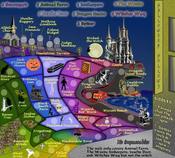
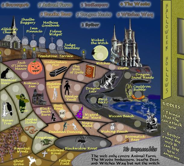
AndyDufresne wrote:For some reason I'd feel more attracted to this map if the grass was all earth tones...the color shift throws me off. But in turn that'll make it hard to show continents, but a thought nonetheless.
--Andy
OK can do, what about the font that is used in the title?edbeard wrote:....
I think the legend text could be a bit more readable. Maybe different font?
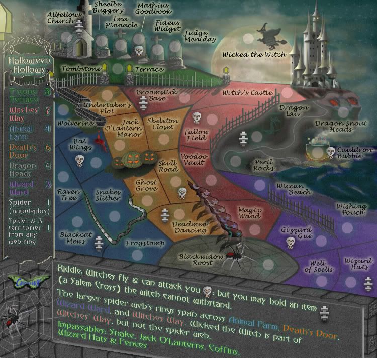
So the text under impassables and the riddles don't affect gameplay? I'm confused about that and you saying there are no unique features.
Unit_2 wrote:COLOR!
edbeard wrote:let me see if I've figured this out
Wicked - the Witch can attack any territory. The same with Bat Cave and Dragon Lair.
YesBlackwidow Roost can attack any of the territories that the web covers.
Seems simple enough. I worry a bit about the use of riddles instead of coming out and just saying what does what.
cairnswk wrote:Unit_2 wrote:COLOR!
Well unit_2 is back....welcome...now down to business!!!
When are you going to update the Development Atlas, please???
OK, putting one word in front of me unit_2 is a no-no...you know that.
I won't even go there and ask you to explain....you should know better.
Unit_2 wrote:cairnswk wrote:Unit_2 wrote:COLOR!
Well unit_2 is back....welcome...now down to business!!!
When are you going to update the Development Atlas, please???
OK, putting one word in front of me unit_2 is a no-no...you know that.
I won't even go there and ask you to explain....you should know better.
It is updated this week, Sunday it will be redone.
Please add color, lots of maps now days don't have color on them which I love.
Also how can you have a holloween map with no color?
The wicked/ witch thing is cool
mibi wrote:This map looks like an overcomplicated game of hopscotch that someone decided to use as a dartboard for Halloween related clipart. It's effortless in all the wrong ways and would better be served on the back of a poorly translated generic cereal box where confusion and staleness come with the territory. This map has no rhyme or reason, much like a poorly written haiku, only with a longer lifespan.
My advice would be to take this witches brew of Halloween themes back to the dollar store where its ingredients came from and invest your time and energy into something that doesn't involve the strategic placement of brightly colored stickers.
t-o-m wrote:the army circles are a bit big?
or is that just me?
mibi wrote:This map looks like an overcomplicated game of hopscotch that someone decided to use as a dartboard for Halloween related clipart. It's effortless in all the wrong ways and would better be served on the back of a poorly translated generic cereal box where confusion and staleness come with the territory. This map has no rhyme or reason, much like a poorly written haiku, only with a longer lifespan.
My advice would be to take this witches brew of Halloween themes back to the dollar store where its ingredients came from and invest your time and energy into something that doesn't involve the strategic placement of brightly colored stickers.
TaCktiX wrote:... I know the graphics just came out of the mothballed closet, but they need SERIOUS updating to fix the readability issues and general "uncleanliness" of the map as it looks right now...
cairnswk wrote:TaCktiX wrote:... I know the graphics just came out of the mothballed closet, but they need SERIOUS updating to fix the readability issues and general "uncleanliness" of the map as it looks right now...
Of course they do....but mibi is plain rude sometimes.
bryguy wrote:
Sure the graphix arent that appealing, but were empire builders graphix appealing at first? no, but people still liked it (or semi-liked it)
besides the fact that they liked it even more i think after the graphix re-do
heres what i can see that needs to be done:
1) Slightly brighter/more colors
2) to me some things look blurry, but that might be just me
3) Under 'riddles' maybe actually put those things in riddles? but easy to solve riddles
4) Some of the pictures of things on the territs dont look so good....
5) U say 'no impassables' yet to me it looks like there is an impassable wall at the graveyard.
all i can think of now
Users browsing this forum: No registered users