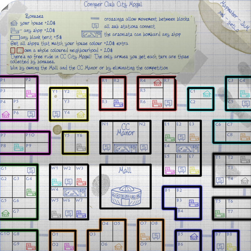
gimil wrote:Please use green
You know athestics beats realistic accuracy any time
Couldnt you try a lighter blue?
lighter blue will no longer have the blueprint feeling and it will also make certain colours very hard to see (cyan)
Moderator: Cartographers
gimil wrote:Please use green
You know athestics beats realistic accuracy any time
Couldnt you try a lighter blue?


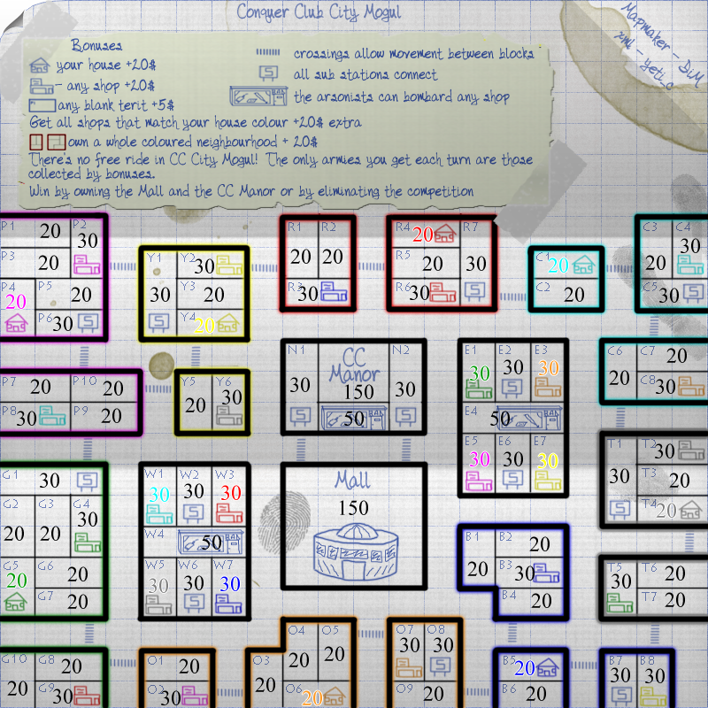
FreeMan10 wrote:I assume the big numbers in each territ are the starting army numbers. Can you specify that font to use? If so, I think that'd be great, it seems more readable than the standard font.


FreeMan10 wrote:bummer.


oaktown wrote:Here's a thought... each neighborhood gives the same bonus, yet they aren't equal in size and borders. For instance, the "G" neighborhood has one less border to hold than some because the subway station is also a cross-walk border territory. Same with "T" and "R" neighborhoods. Meanwhile the "C" block is bigger than "T," has three territories to defend, and none of the border terits border each other for support.


DiM wrote:for example C is bigger than Y and it's not fair to have the same bonus BUT C has 4 blank terits yielding an extra 20 troops while Y has just 2 blanks meaning just 10 extra.


oaktown wrote:DiM wrote:for example C is bigger than Y and it's not fair to have the same bonus BUT C has 4 blank terits yielding an extra 20 troops while Y has just 2 blanks meaning just 10 extra.
I'm not saying you need to change it, I just thought it was worth discussing. I was actually less concerned about the size of the neighborhoods than I am with the number of borders each has to hold, but again I'm alright with it as it is - it's more interesting to allow little differences in the starts. Ultimately the neighborhood bonuses may not as important as the individual territory bonuses anyway.
Honestly, I'm running out of reasons why I shouldn't stamp this, but I'm still uncomfortable with it because I just can't wrap my noodle around how it will play. I'd like to hear you all convince me that it's good to go!


fumandomuerte wrote:I think you should decrease the multiply from 5 to 1. It doesn't have any point to multiply the map in my opinion.
I'm fine with the rest, i guess.


DiM wrote:i see nobody is complaining about anything so i'll start the small version. or do i have to wait for stamps before starting small??
natty_dread wrote:I was wrong


gimil wrote:DiM wrote:i see nobody is complaining about anything so i'll start the small version. or do i have to wait for stamps before starting small??
What stamp are you talking about?


mibi wrote:you need to anti-alias the territory names or something... they are so emaciated and look out of place. try "strong" or just bold them or if you cant do that, just duplicate the layer a few times.


DiM wrote:mibi wrote:you need to anti-alias the territory names or something... they are so emaciated and look out of place. try "strong" or just bold them or if you cant do that, just duplicate the layer a few times.
i set the effect to none for the terit names on purpose to make them feel like the paper was scratched by a very sharp pen.


mibi wrote:DiM wrote:mibi wrote:you need to anti-alias the territory names or something... they are so emaciated and look out of place. try "strong" or just bold them or if you cant do that, just duplicate the layer a few times.
i set the effect to none for the terit names on purpose to make them feel like the paper was scratched by a very sharp pen.
scratched by a sharp pen? I dont get it.


natty_dread wrote:I was wrong


yeti_c wrote:Hmmm - yeah the letters in the map do look a bit pixelly!?
Not sure how you'd fix it with that font though!
C.


yeti_c wrote:DiM wrote:yeti_c wrote:Hmmm - yeah the letters in the map do look a bit pixelly!?
Not sure how you'd fix it with that font though!
C.
i fixed the pixelization. see post above with the edited image.
Look at the N's
C.


Users browsing this forum: No registered users