Why - people can choose 1v1's on many different maps?!hulmey wrote: Plus you also need to take into account the huge number of quick 1 vs 1 that people play nowadays!!!
C.
Moderator: Cartographers

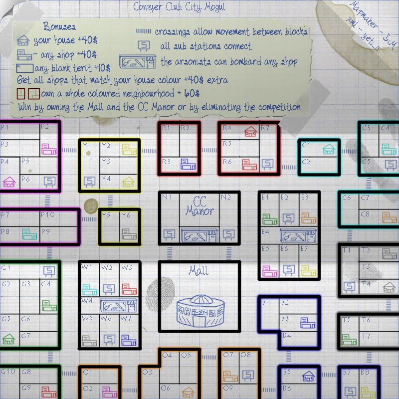
ugh v10 is blue not white. v11 is white.sanosuke wrote:DiM you know I love your maps, and this one looks very promising...the only problem I'm having is that for me cyan is difficult to see on v10. The very light blue on a white print (even the dark blue w/ v3 is a bit tough on the eyes). I know there's not much you can do with it, just stating the ONLY con I have with the map ^_^
Keep up the excellent work DiM!
lol. i gave up blue and switched to white to make everything more visible. then somebody suggested green. so far i still think white is the best but i'm waiting for feedback on the situation.yeti_c wrote:I would say that the house and shop icons are hard to see on the blue - I've not checked the white or green versions.
C.

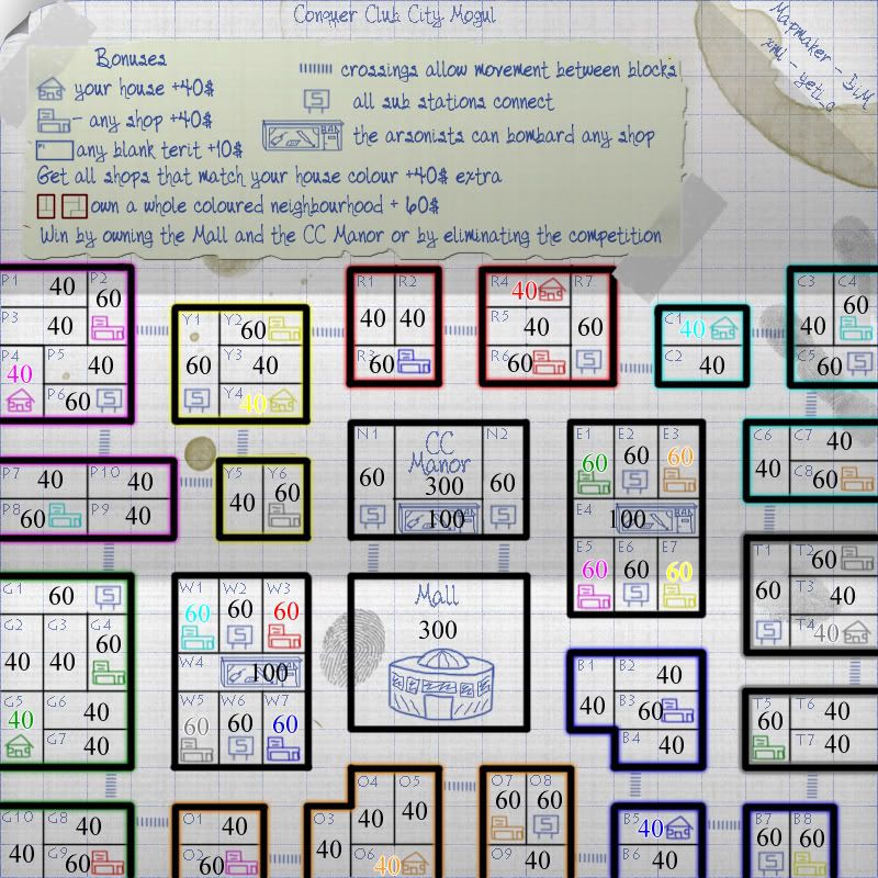
player 8 also has a black stroke (all army numbers have a black stroke) so in theory it should be visible.yeti_c wrote:White is better - but I'd move the smudge behind the top right Cyan house...
Also - the Middle left Cyan shop - is a bit tricky due to the bright white.
Otherwise it's fine... on a similar note - neutral (White) armies should show up fine as they have a black stroke - but player 8 might be tricky?
C.
But the Grey and Black are closer together - thus it will make it harder...DiM wrote:player 8 also has a black stroke (all army numbers have a black stroke) so in theory it should be visible.yeti_c wrote:White is better - but I'd move the smudge behind the top right Cyan house...
Also - the Middle left Cyan shop - is a bit tricky due to the bright white.
Otherwise it's fine... on a similar note - neutral (White) armies should show up fine as they have a black stroke - but player 8 might be tricky?
C.
as for the smudge i can move it around.

Aah if the numbers are going, then it would be fine..but during game play those numbers would have to be there right? Other than that, the houses were easy enough to see, it was just the numbers giving me trouble ^_^DiM wrote:ugh v10 is blue not white. v11 is white.sanosuke wrote:DiM you know I love your maps, and this one looks very promising...the only problem I'm having is that for me cyan is difficult to see on v10. The very light blue on a white print (even the dark blue w/ v3 is a bit tough on the eyes). I know there's not much you can do with it, just stating the ONLY con I have with the map ^_^
Keep up the excellent work DiM!
i can see it perfectly on white
perhaps look on page 13, somebody requested a light green version: http://www.conquerclub.com/forum/viewto ... &start=180
is that better?
and what exactly is hard to see? the cyan house and shop or the cyan numbers? if it's the numbers then don't worry they'll be gone. if it's the house then i guess i need to tweak it a bit and make it more visible.

those numbers are going to be replaced by the official army numbers.sanosuke wrote:Aah if the numbers are going, then it would be fine..but during game play those numbers would have to be there right? Other than that, the houses were easy enough to see, it was just the numbers giving me trouble ^_^DiM wrote:ugh v10 is blue not white. v11 is white.sanosuke wrote:DiM you know I love your maps, and this one looks very promising...the only problem I'm having is that for me cyan is difficult to see on v10. The very light blue on a white print (even the dark blue w/ v3 is a bit tough on the eyes). I know there's not much you can do with it, just stating the ONLY con I have with the map ^_^
Keep up the excellent work DiM!
i can see it perfectly on white
perhaps look on page 13, somebody requested a light green version: http://www.conquerclub.com/forum/viewto ... &start=180
is that better?
and what exactly is hard to see? the cyan house and shop or the cyan numbers? if it's the numbers then don't worry they'll be gone. if it's the house then i guess i need to tweak it a bit and make it more visible.


i don't think that's really a problem because while it may be easier to take it will also give out a lower bonus. remember that each emply terit gives a +10 so by holding all yellow you get 60 for a whole neighbourhood and 20 for 2 empty blocks. while pink will be harder to take but give 60 for a whole neighbourhood and another 60 for 6 empty blocks.whitestazn88 wrote:i feel like some blocks get an unfair advantage, like the all yellow block has only 6 territs to hold compared to others that have up to 10 territs.
glad it's easy to read. that's what i want.sanosuke wrote:Looks good DiM, much easier to see all of the colors now.
oh yeah, forgot to take that into account. with that in mind, i deem this map "Brilliant!"DiM wrote:i don't think that's really a problem because while it may be easier to take it will also give out a lower bonus. remember that each emply terit gives a +10 so by holding all yellow you get 60 for a whole neighbourhood and 20 for 2 empty blocks. while pink will be harder to take but give 60 for a whole neighbourhood and another 60 for 6 empty blocks.whitestazn88 wrote:i feel like some blocks get an unfair advantage, like the all yellow block has only 6 territs to hold compared to others that have up to 10 territs.
whitestazn88 wrote:oh yeah, forgot to take that into account. with that in mind, i deem this map "Brilliant!"DiM wrote:i don't think that's really a problem because while it may be easier to take it will also give out a lower bonus. remember that each emply terit gives a +10 so by holding all yellow you get 60 for a whole neighbourhood and 20 for 2 empty blocks. while pink will be harder to take but give 60 for a whole neighbourhood and another 60 for 6 empty blocks.whitestazn88 wrote:i feel like some blocks get an unfair advantage, like the all yellow block has only 6 territs to hold compared to others that have up to 10 territs.
DiM wrote:if it worksmrkipling wrote:the large number of armies is a genius idea

The problem with auto-attack that I was highlighting was that it IS all-or-nothing - and often it is worth continuing to attack ONLY if you have enough armies back to defend - a tactical option that auto-attack doesn't allow.sanosuke wrote:Well I'm totally ignorant of all xml language, so I won't even try to speak on that subject...I do have a question though:
Erm, ever since I got AJAX BOB I always auto attack (simple right click and you attack pretty much until one side is defeated). From what I was able to make sense out of your post benjikat, are you saying you have a less chance to attack by using auto attack? ie. 5v3 (this happens to me almost every roll) w/ auto attack, end result is now 1v3 (I never win at your "average" game like Classic or British Isles where your armies are all spread out because of this simple fact that 3v3 - 6v3 I almost always end up 1v3)
So if possible I'd like a clarification on that point by anyone who knows more than me lol