Conquer Club

[Abandoned] - Scandinavia

Abandoned and Vacationed maps. The final resting place, unless you recycle.

Moderator: Cartographers

Forum rules
Please read the Community Guidelines before posting.

[Abandoned] - Scandinavia

Postby CoolC on Sat Feb 02, 2008 11:29 am

Mod Note:Abandoned - If resurrected, this one must be checked again.

Image

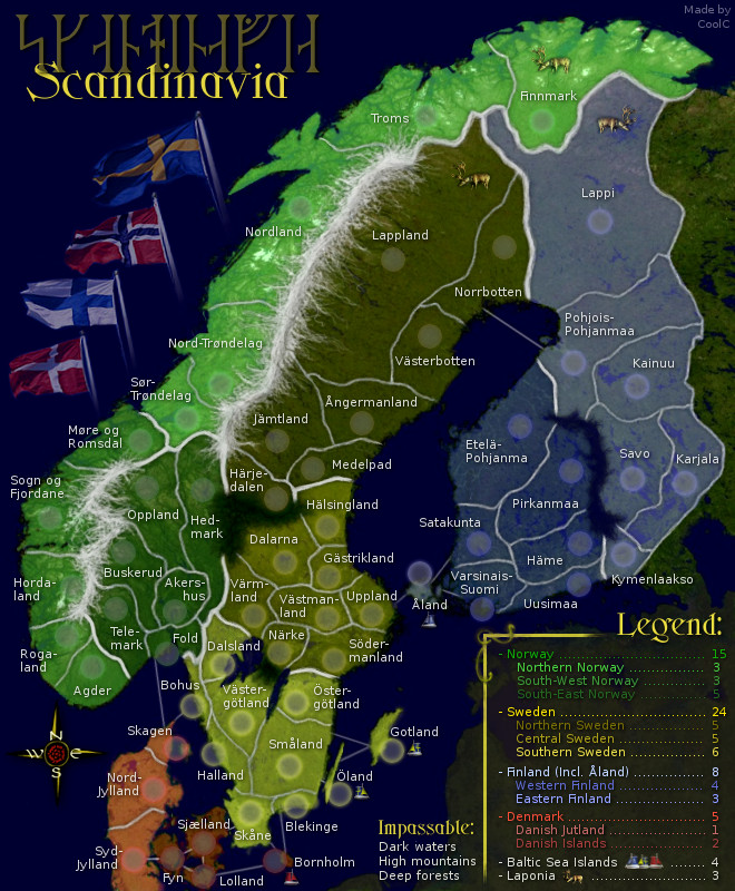
Hello everyone, I have created a map over the Nordics, what most people outside the region call Scandinavia (scandinavia is really just the mountain range). It was originally intended to be a pretty small map but instead went the opposite way since I wanted to include real regions and not made up fake ones. If you are wondering why Iceland is not included please see the discussion in the thread. I plan to finish this map myself (both graphics and XML) unless someone offer help.

Description:
Currently we have 4 main "continents" which is the Scandinavian countries:

- Sweden, with 3 subcontinents of 10, 8 and 7 countries (25 total)
- Norway, with 3 subcontinents of 6, 5 and 5 countries (16 total)
- Finland, with 2 subcontinents of 6 countries each, plus neutral Åland (13 total)
- Denmark, with 2 subcontinents of 4 and 3 countries (7 total)
- Grand Total: 61 countries, 10 subcontinents, 4 continents

Two countries are designated to always start neutral: Åland + Bornholm

Bonuses are per subcontinent and continent. The continent bonus is including the subcontinent ones so it's -not- the continent + subcontinent.... in other words it's working exactly the same as in World 2.1. There is also two competitive bonuses which include countries from several different continents (Baltic Sea Islands and Laponia).

Impassables are dark water (ocean and the large lakes in Sweden and Finland), high mountains (in South Norway and the northern border between Norway and Sweden) and deep forests (in Sweden only).

There are no special features besides mentioned neutrals, bonus areas and impassables.

Time plan:
This map was on hold for a very long time for different reasons. Now it's back in active development for the last spurt and my goal is to see it forged as soon as possible.

Future plans:
- Final visual improvements
- XML

Latest revision changes:
- Added compass rose instead of north-arrow
- redone/fixed some sea borders + minor stuff
- swapped norway/sweden in legend

Latest Revision 21

LARGE map
Click image to enlarge.
image


SMALL map
Click image to enlarge.
image


Previous revision changes:
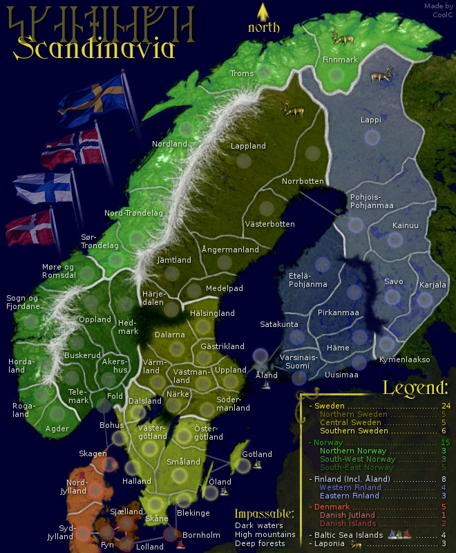
- Reverted back to legend instead of mini-map
- Changed coloring of Åland again, making it more similar to Finland
- Minor change to contrast

Previous Revision 20

LARGE map
Click image to enlarge.
image


SMALL map
Click image to enlarge.
image


Even older versions:
Revision 19 - Large
Revision 19 - Small
Revision 18 - Large
Revision 18 - Small
Revision 17 - Large
Revision 17 - Small
Revision 16 - Large
Revision 16 - Small
Revision 15 - Large
Revision 15 - Small
Revision 14 - Large
Revision 14 - Small
Revision 13 - Large
Revision 13 - Small
Revision 12 - Large
Revision 12 - Small
Revision 11 - Large
Revision 11 - Small
Revision 10 - Large
Revision 10 - Small
Revision 9 - Large
Revision 9 - Small
Revision 8 - Large
Revision 8 - Small
Revision 7 - Large w. brighter light
Revision 7 - Small w. brighter light
Revision 7 - Large w. traditional light
Revision 7 - Small w. traditional light
Revision 6 - Large
Revision 6 - Small
Revision 5 - Large
Revision 5 - Small
Revision 4 - Without Iceland
Revision 4 - With Iceland
Revision 3 - Large
Revision 3 - Small
Revision 2 - Large
Revision 1 - Large
Original version - Large
Original version - Small
Possible later winter version

Extras:
- The images used as a base are public domain satellite photos.
- The runes spell the same word as the latin letters.
- The areas used are real existing ones with only a few exceptions: I have mashed together some east/west, south/north "double areas" like for example West Fold and East Fold. I have removed Oslo area because of space limitations. I also added Skagen as an area to raise the number in Denmark a bit. The areas used for Norway are in use today as secondary communes also known as "Fylken" while the areas selected for Sweden and Finland are the historic "Landskap" because that's what most swedes associate themselves with, rather then the new areas called "Län". In Finland the Landskap still have some official use. For Denmark I had to use just the main islands, again because of space limitations.
Last edited by CoolC on Thu Sep 30, 2010 11:23 am, edited 42 times in total.
User avatar
Corporal CoolC
 
Posts: 105
Joined: Tue May 01, 2007 10:10 am

Postby Grooveman2007 on Sat Feb 02, 2008 11:32 am

The bonuses are way too big, make laponia and the islands a seperate color, don't do winter.
Private 1st Class Grooveman2007
 
Posts: 333
Joined: Wed Oct 31, 2007 7:08 pm
Location: Minnesota

Postby Kaplowitz on Sat Feb 02, 2008 11:34 am

split it up more.
Image
User avatar
Private 1st Class Kaplowitz
 
Posts: 3088
Joined: Tue May 01, 2007 5:11 pm

Postby CoolC on Sat Feb 02, 2008 11:41 am

Grooveman2007 wrote:The bonuses are way too big, make laponia and the islands a seperate color, don't do winter.


Can't make them a separate color because these areas are also part of each country. Maybe I could instead mark them with some icon or such? I made the bonus big because you have to control areas of three different countries but you may be right in that they are too big.

Oh yeah, btw... another planned thing is to include army shadows, forgot to mention that before...
User avatar
Corporal CoolC
 
Posts: 105
Joined: Tue May 01, 2007 10:10 am

Postby Emperor_Metalman on Sat Feb 02, 2008 12:19 pm

Good idea, but I suggest placing subcontinents like in world 2.1
Sergeant 1st Class Emperor_Metalman
 
Posts: 78
Joined: Fri May 25, 2007 5:45 pm

Postby lanyards on Sat Feb 02, 2008 1:22 pm

Shrink the map and combine some of the territories.

--lanyards
Image
WANT AN ADVANTAGE WHILE WORKING TOWARDS MEDALS?
https://www.conquerclub.com/forum/viewtopic.php?f=529&t=226714
User avatar
Major lanyards
 
Posts: 1378
Joined: Sat Feb 24, 2007 1:31 am
2

Postby gimil on Sat Feb 02, 2008 1:26 pm

If your going to make a big map you need to take into consideration wether or not it will fit into the allocated size limit. You should ensure that the map doesnt exceed 600x600 for your small. THat should be your starting point :)
What do you know about map making, bitch?

natty_dread wrote:I was wrong


Top Score:2403
User avatar
Corporal 1st Class gimil
 
Posts: 8599
Joined: Sat Mar 03, 2007 12:42 pm
Location: United Kingdom (Scotland)

Postby Coleman on Sat Feb 02, 2008 1:28 pm

Can't have a map that is 907 tall. Max height for large is 800 and max height for small is 600.

I actually like the massive continents and such, this would be a good 8 player game with classic style play. Which we need more of.
User avatar
Sergeant Coleman
 
Posts: 5402
Joined: Tue Jan 02, 2007 10:36 pm
Location: Midwest

Postby gimil on Sat Feb 02, 2008 1:32 pm

Coleman wrote:Can't have a map that is 907 tall. Max height for large is 800 and max height for small is 600.

I actually like the massive continents and such, this would be a good 8 player game with classic style play. Which we need more of.


I agree with the large continent idea, but theres a small continent in there which may lead to unbalanced gameplay since one person will be able to hold it with no one else able to get a bonus to conter it.
What do you know about map making, bitch?

natty_dread wrote:I was wrong


Top Score:2403
User avatar
Corporal 1st Class gimil
 
Posts: 8599
Joined: Sat Mar 03, 2007 12:42 pm
Location: United Kingdom (Scotland)

Postby Coleman on Sat Feb 02, 2008 1:33 pm

I was thinking Denmark could have more connections somehow, but my main concern at the moment before I give real feedback is that the map be 800 tall or 600 tall.
User avatar
Sergeant Coleman
 
Posts: 5402
Joined: Tue Jan 02, 2007 10:36 pm
Location: Midwest

Postby wcaclimbing on Sat Feb 02, 2008 1:35 pm

I like the winter version more.

If you could do the winter one, but split the big continents up into a few sub-continents to make bonuses easier, I think this could end up being a great map. :D
Image
User avatar
Private 1st Class wcaclimbing
 
Posts: 5598
Joined: Fri May 12, 2006 10:09 pm
Location: In your quantum box....Maybe.

Postby CoolC on Sat Feb 02, 2008 2:48 pm

The problem is that the map is very tall, so if I shrink it below the limit for height the width get too small really, making everything too tiny to fit in army numbers later... BUT I will do my best to create the next revision as small as possible. Question: Is the max height a hard number or is it possible to make some exception? I do notice several maps are outside the size limits.

I will also look into how the continents can be divided into sub-continents while still having quite large numbers for each...

Can I get some suggestions about connections? I was thinking of maybe connecting Skagen with both Norway and Sweden. Another idea is to make Finland attackable from Gotland, because right now you only need to defend 2 areas to hold Finland (which is why i made the bonus pretty low).

Is it enough to have Norrland and Jämtland partially blocked from attack from Norway? At the moment you have to defend 10 areas to hold Sweden, which is pretty damn hard...

Sorry wcaclimbing but as it looks now I think I finish the one I started first. However, if there is more interest I may very well do the winter version later, esp. if the first project is successful :)
I don't need a 500px image in my signature because I don't have anything to compensate for.
User avatar
Corporal CoolC
 
Posts: 105
Joined: Tue May 01, 2007 10:10 am

Postby gimil on Sat Feb 02, 2008 3:17 pm

CoolC wrote:The problem is that the map is very tall, so if I shrink it below the limit for height the width get too small really, making everything too tiny to fit in army numbers later... BUT I will do my best to create the next revision as small as possible. Question: Is the max height a hard number or is it possible to make some exception? I do notice several maps are outside the size limits.


Size size limit is as follows:
    1. SMALL MAP: WIDTH up to 600 px; HEIGHT 600 px
    2. LARGE MAP: WIDTH up to 800 px ; HEIGHT800 px. Keep in mind if the map is too high, players have to scroll down to attack.
    3. NOTE: A large map must be noticably larger than their small map, if you must have specifics 9% larger is required but 33.3% (1/3rd) is recommended.
* Extenuating Size Circumstances : If a map contains a large number of territories and additional pixels are required for design purpose, a small width and/or height area may be added to the maximum dimensions. Authorization for this addition must be sought from Andy Dufresne or the Cartography Assistant/s, with a good explanation of why the extra dimensions are needed.
    1. SMALL MAP: WIDTH not to exceed 630 px; HEIGHT not to exceed 600 px.
    2. LARGE MAP: WIDTH not to exceed 840 px; HEIGHT not to exceed 800 px.


Hope that helps you out. Since you wont be likely to fit all the terrs in, you should resize to 600x600 and fit as any terrs are you can, merge some if you have to. If you really need a little more space PM a carto (Coleman, oaktown, andydufresne or myself) and we'll look into give ing additional space :)
What do you know about map making, bitch?

natty_dread wrote:I was wrong


Top Score:2403
User avatar
Corporal 1st Class gimil
 
Posts: 8599
Joined: Sat Mar 03, 2007 12:42 pm
Location: United Kingdom (Scotland)

Postby Kaplowitz on Sat Feb 02, 2008 3:26 pm

you cna have it on an angle
Image
User avatar
Private 1st Class Kaplowitz
 
Posts: 3088
Joined: Tue May 01, 2007 5:11 pm

Postby Grooveman2007 on Sat Feb 02, 2008 3:46 pm

Emperor_Metalman wrote:Good idea, but I suggest placing subcontinents like in world 2.1


Make the subcontinents different shades of the same color so you don't split up the countries.
Private 1st Class Grooveman2007
 
Posts: 333
Joined: Wed Oct 31, 2007 7:08 pm
Location: Minnesota

Postby snufkin on Sat Feb 02, 2008 4:03 pm

dunno if it´s helpful but here´s my ABANDONED small version draft from last year:

Image

I think I based it too much on current regional borders - better to use some historical landscapes in some places. If you mix those wherever it looks more fitting for playability then I´m sure it´s possible to make a good map.
Personally I focused too much on regional borders as of 2007 before I started merging territories..

Good luck!
The comet cometh!
User avatar
Sergeant 1st Class snufkin
 
Posts: 206
Joined: Sun Apr 22, 2007 7:40 am
Location: borderland of Ranrike

Postby CoolC on Sun Feb 03, 2008 4:43 pm

Ok, now I've modified the first post to revision 1. This is more or less a total overhaul of the map...

- resized to within limits
- made some changes to the borders/no of countries
- border lines look better now also
- added subcontinents, with small identifiers instead of multiple colors
- added icon identifiers for special bonuses
- added army shadows (yes, they will be transparent later)
- remade the bonus legend
- improved the title...
- maybe something else?

What do ya think now?
Last edited by CoolC on Tue Feb 05, 2008 11:17 am, edited 1 time in total.
I don't need a 500px image in my signature because I don't have anything to compensate for.
User avatar
Corporal CoolC
 
Posts: 105
Joined: Tue May 01, 2007 10:10 am

Postby Coleman on Mon Feb 04, 2008 6:11 pm

That link isn't working
User avatar
Sergeant Coleman
 
Posts: 5402
Joined: Tue Jan 02, 2007 10:36 pm
Location: Midwest

Postby CoolC on Tue Feb 05, 2008 11:19 am

The links are working again. I accidentally let my domain expire so it went down. Very bad thing to do... clumsy me :roll:

I took the opportunity to make another small update, just cosmetic this time. Have toned down the color of area names, added some transparency to army shadows and spiffed it up with some flags :)
I don't need a 500px image in my signature because I don't have anything to compensate for.
User avatar
Corporal CoolC
 
Posts: 105
Joined: Tue May 01, 2007 10:10 am

Postby Emperor_Metalman on Wed Feb 06, 2008 8:34 pm

Good map, except for the fact that it is difficult to tell which country belongs to which subcontinent.
Sergeant 1st Class Emperor_Metalman
 
Posts: 78
Joined: Fri May 25, 2007 5:45 pm

Postby whitestazn88 on Wed Feb 06, 2008 10:23 pm

both look pretty sweet
Lieutenant whitestazn88
 
Posts: 3128
Joined: Mon Feb 05, 2007 2:59 pm
Location: behind you

Postby Coleman on Thu Feb 07, 2008 12:26 am

Now we are getting somewhere. Instead of s n e w i or however you are indicating things you should consider slightly different hues of the same color.

I think people can figure out north east west ect, and which ones are islands visually, so there is no need to get fancy with making sure people know which colors match with what.
User avatar
Sergeant Coleman
 
Posts: 5402
Joined: Tue Jan 02, 2007 10:36 pm
Location: Midwest

Postby PLAYER57832 on Thu Feb 07, 2008 11:17 am

Like the idea, but the dark colors will be hard to view, at least for us "old fogies". (MIdkermia is stretching, I find the new dungeon one impossible to read .. just to point to examples)

Shades of colors works well -- look at the world map as an example.

As for the numbers, look at how some of the more complex maps deal with labels (Pearl harbor, Waterloo).
Corporal PLAYER57832
 
Posts: 3085
Joined: Fri Sep 21, 2007 9:17 am
Location: Pennsylvania

Postby CoolC on Thu Feb 07, 2008 10:25 pm

I did the letters instead of shades because i thought it would be easier to see, better for colorblind people and more original... but as I remade it with shades I actually like it better :)

Also new for this revision is colors at the legend and small map version is back!
I don't need a 500px image in my signature because I don't have anything to compensate for.
User avatar
Corporal CoolC
 
Posts: 105
Joined: Tue May 01, 2007 10:10 am

Postby snufkin on Fri Feb 08, 2008 12:01 am

something to think about:
only english letters are possible in the xml so some names will have to be changed

Finland is not part of scandinavia.
scandinavia+finland="Norden" aka the "nordic countries" aka "fenno-scandinavia"

Iceland on the other hand often counts as part of scandinavia

so the name of the map is a bit misleading
The comet cometh!
User avatar
Sergeant 1st Class snufkin
 
Posts: 206
Joined: Sun Apr 22, 2007 7:40 am
Location: borderland of Ranrike

Next

Return to Recycling Box

Who is online

Users browsing this forum: No registered users