Rail Australia [Quenched]
Moderator: Cartographers
Forum rules
Please read the Community Guidelines before posting.
Please read the Community Guidelines before posting.
Perhaps the overlander rail lines could be done in a different STYLE of rail way (with the colours changing on a state basis)
Eg, you could have double lines along one, a double line/crossed train track, a triple line, a thin line...
Would make it easier to identify where that rail line goes to the next one, without adding in splotchy dots everywhere.
It's very hard at the moment to work out the overlander route, at easy first glance.
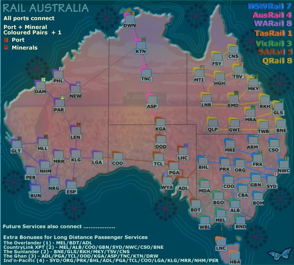
C...common....think of this as welcome return to classic with some linear bonuses included for long distance passenger trains....and i think they are good incentives.yeti_c wrote:Not sure I like the new gameplay with this one...
Prefer the "linear" continents.
C.

* Pearl Harbour * Waterloo * Forbidden City * Jamaica * Pot Mosbi
think he means the circle, to be more presice, the border of the circle (in the middle, can't miss it)cairnswk wrote:which parts unit_2...cause i don't know if you are joshing me or not!Unit_2 wrote:c'mon cairs... its looking good, but its alittle bright can you dim it alittle?
Emperor of the Benelux
Founder of the Commonwealth of Planets
Founder and CEO of JF
Founder of the Commonwealth of Planets
Founder and CEO of JF
OK...thanks for that Tieryn...another idea is always good for the mix...i was having trouble with what to do with these long trains services.Tieryn wrote:Perhaps the overlander rail lines could be done in a different STYLE of rail way (with the colours changing on a state basis)
Eg, you could have double lines along one, a double line/crossed train track, a triple line, a thin line...
Would make it easier to identify where that rail line goes to the next one, without adding in splotchy dots everywhere.
It's very hard at the moment to work out the overlander route, at easy first glance.

* Pearl Harbour * Waterloo * Forbidden City * Jamaica * Pot Mosbi
Sorry Skittles....Gosford, Hornsby, Hawkesbury River...i used to do that run all the time on the XPT when i worked on the NSWRail.Skittles! wrote:I am sad. No local train station for me.Too bad there's no room between Sydney and Newcastle, eh?
Looking good Cairns. This is going to be FUN!

* Pearl Harbour * Waterloo * Forbidden City * Jamaica * Pot Mosbi
I quite liked the red heart desert... it looks more realistic and gives a nice feel for the empty spaces in the centre. I find the v5 background a bit splotchy. Australia isn't USA, and the background shouldn't be aiming to give the same impression. It's a vastly different country, and I think it should feel different to look at.
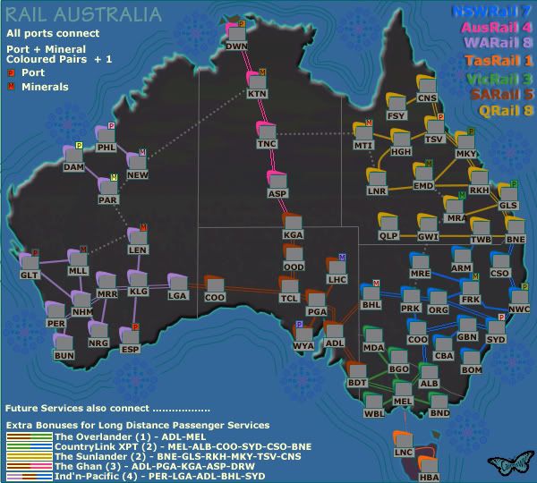
I like the idea of what you've done with the long distances, although I'd like to see them as better looking rail lines, and some spacings need fixing... Did you just change the style of the single lines to a double line? or did you re-draw single, thinner lines? Some connections don't look good, ie tnc/asp. I wouldn't want to run that line... they need to be parallel between stations, and preferably equidistant apart all the way across the map. Ones like Per-Coo-ADL looks okay, but Alb-Coo-GBN is ugly...
As a note on ports, rather than connecting all ports together (which I think opens the map up -too- much), I'd rather see ports connecting only to adjacent ports, with a ship setting out from one and coming into the next one, before progressing on... Otherwise holding port+mineral will be quite difficult.
Fair comment..it drew one from you!Tieryn wrote:I quite liked the red heart desert... it looks more realistic and gives a nice feel for the empty spaces in the centre. I find the v5 background a bit splotchy. Australia isn't USA, and the background shouldn't be aiming to give the same impression. It's a vastly different country, and I think it should feel different to look at.
I prefer the red heart also, but i still would like some people's feedback on this.
Code: Select all
I like the idea of what you've done with the long distances, although I'd like to see them as better looking rail lines, and some spacings need fixing... Did you just change the style of the single lines to a double line? or did you re-draw single, thinner lines? Some connections don't look good, ie tnc/asp. I wouldn't want to run that line... they need to be parallel between stations, and preferably equidistant apart all the way across the map. Ones like Per-Coo-ADL looks okay, but Alb-Coo-GBN is ugly...OK once again, fair comment and i understand...however the Mineral + port bonus can be increased to cover for holding such a large attak range from other ports.As a note on ports, rather than connecting all ports together (which I think opens the map up -too- much), I'd rather see ports connecting only to adjacent ports, with a ship setting out from one and coming into the next one, before progressing on... Otherwise holding port+mineral will be quite difficult.
More comment is needed from others as to this as well. please.

* Pearl Harbour * Waterloo * Forbidden City * Jamaica * Pot Mosbi
*nod* I figured as much. I like the way you've expressed them in the legend, it's easy to see which states they pass through/from. I'd like to see these as rail+sleeper type of ones that I have seen in some other map.Naturally the lines would be made more professional down the track with this map Tieryn,,,this is only something to guage what player might think about that style of line for the long distance trains.Code: Select all
I like the idea of what you've done with the long distances, although I'd like to see them as better looking rail lines, and some spacings need fixing... Did you just change the style of the single lines to a double line? or did you re-draw single, thinner lines? Some connections don't look good, ie tnc/asp. I wouldn't want to run that line... they need to be parallel between stations, and preferably equidistant apart all the way across the map. Ones like Per-Coo-ADL looks okay, but Alb-Coo-GBN is ugly...
If the stations inside the states are the single colour, and non-unique rail lines are that colour, I think you could possibly make the long-distance ones unique colours? even though they run through the states, the state bonuses are easily seen by the statelines + station colours... Not sure if this would look better/worse tho...
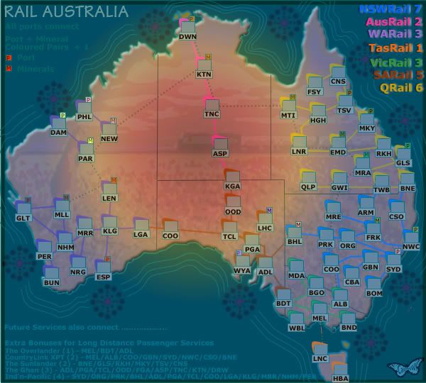
Version 6
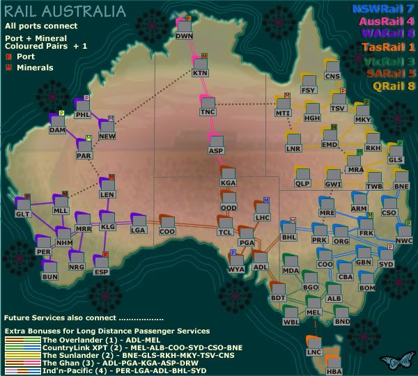
I heard Kaplowitz etc and tried to achieve V3 colours lightened. but along the way discovered this colour configuration, so though It was good and would put it up for consideration.
It achieves the reed heart, Tieryn's albert Roo, and puts that green timge around the edge of the contintent to represent somewhat the non desert areas.


* Pearl Harbour * Waterloo * Forbidden City * Jamaica * Pot Mosbi
- benny profane
- Posts: 248
- Joined: Sat Jun 16, 2007 4:00 pm
- Gender: Male
- Location: Brooklyn, NY
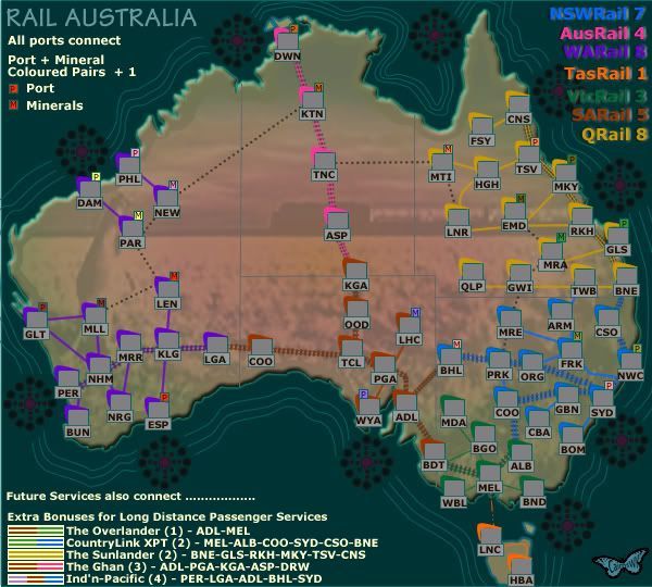
hey cairns, this looks great!
i much prefer the changes you made for version 7.
i only have one suggestion:
the color bars you use to represent the long distance lines in the legend are a great idea.
and while i know that space is very tight, is there any way you might be able to make them a *tiny* bit thicker?
it hurts the eyes a bit trying to distinguish them.
not a major problem, and if there isn't room, it's understandable.
otherwise, i agree that this should be moved to the foundry.


