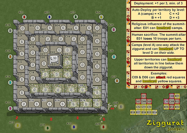
Ziggurat [24/Nov/2017] v14.3 (p7)
Moderator: Cartographers
 Ziggurat [24/Nov/2017] v14.3 (p7)
Stamps: Draft, Gameplay, Beta (images blocked)
Map Name: Ziggurat
Description: An ancient people erected this great Ziggurat to protect the altar which awakens fear in every heart. An army that would scale its heights faces four mighty ramparts, each dominating all approaches.
"With regard to ground of this nature, be before the enemy in occupying the raised and sunny spots, and carefully guard your line of supplies. Then you will be able to fight with advantage." Sun Tzu, The Art of War
Mapmaker(s): Jonofperu
Number of Territories: 65 (16 starting spots)
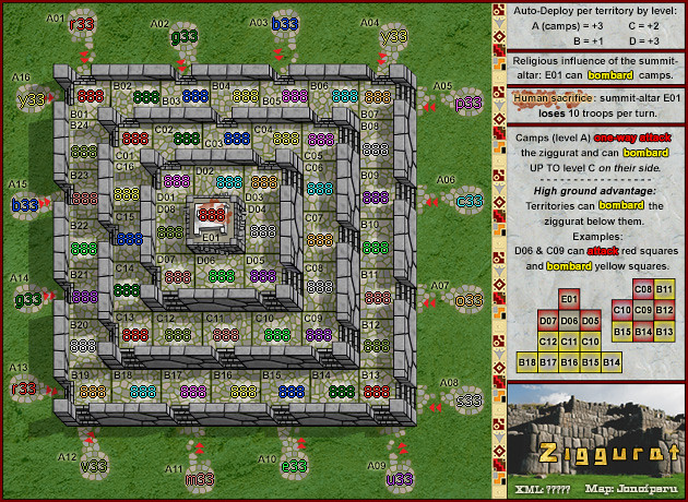
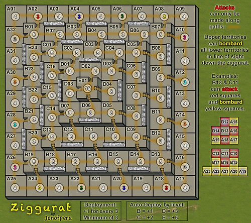
Special Features: Battle for HIGH GROUND! Auto-deploy bonuses which increase as players conquer higher ground; higher levels bombard all lower levels; starting spots with auto-deploy that one-way attack the pyramid and bombard the first 2 levels on their side. The summit E01 is the only territory that can kill starting spots.
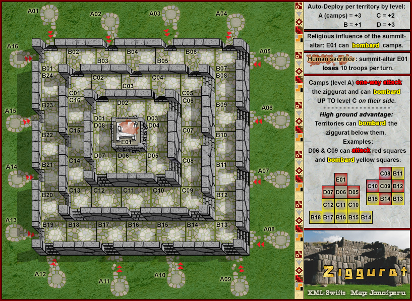
Map Image (v14.3):
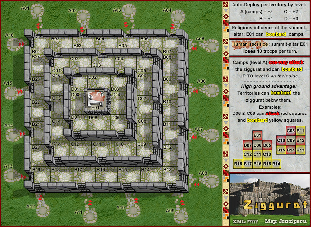
Small Size (630x460)
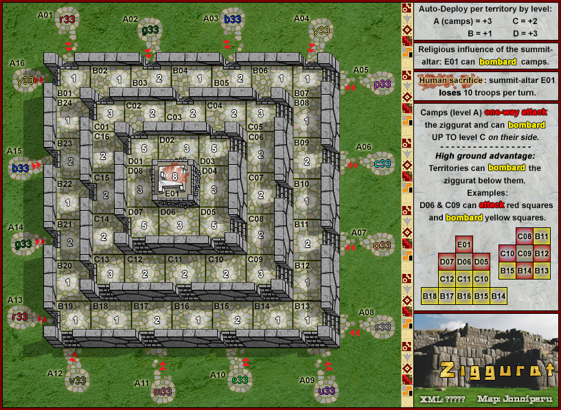
Starting Positions with Neutral values.
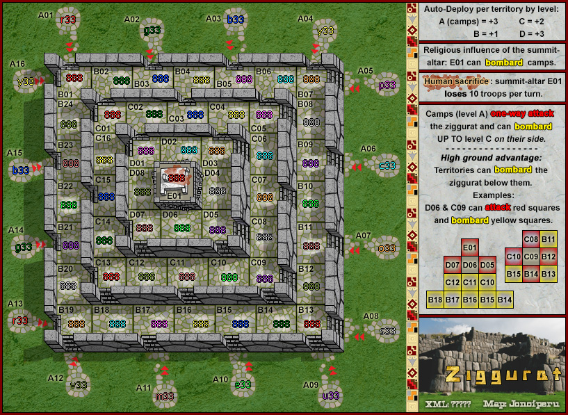
Starting Positions with 888s.
Small Size (630x460) v14 with color code lettered starting positions and 888s.
What Makes This Map Worthy of Being Made - The creation of Ziggurat:
The main reason for creating new maps aside from a change of scenery, is to provide new and interesting mechanics or strategy. There is a particular major factor in historical warfare that I haven’t seen represented. I may have just missed it and there are certainly similar concepts out there (King’s Court archers?), but I think we need a map that has it.
I got to thinking that I would like to create a map that reflects the advantage of taking the high ground. I thought of calling it, “King of the Mountain”, but that’s taken.
How then do you represent the advantage of high ground in a Risk game? We can't create a roll advantage (and probably wouldn’t want to), so it would have to come through in two things (at least these are what I’ve thought of so far).
1. On the high ground you are protected from attack while able to bombard or attack.
2. Extra bonuses / auto-deploy.
Any high ground should give an advantage, hence the auto-deploy bonuses on every territ rather than zone bonuses.
Last edited by jonofperu on Fri Nov 24, 2017 1:26 pm, edited 44 times in total.

-

 jonofperu
- Posts: 610
- Joined: Thu Jan 12, 2012 9:57 am
- Location: Peru


 2
2


 3
3
Re: Ziggurat (high ground)
This is a really cool idea. That is what I was thinking too "king of the hill" like you said though that is taken. Graphics do need work but that will come in time. I am a little confused about the bombard down and what can bombard what. What advantage is E01 going to have, is it going to be able to attack or bombard everything? A neat idea might be that you can only attack up and bombard down until you reach the top. I will leave the game play up to the professionals though.
For graphics it would be nice to see some texture on the pyramid. Is the brown line necessary, I think without it you would still be able to see where to attack. It would look cleaner without it also.
P.S. I don't know if you have worked in the foundry before but I like this as a first draft.
For graphics it would be nice to see some texture on the pyramid. Is the brown line necessary, I think without it you would still be able to see where to attack. It would look cleaner without it also.
P.S. I don't know if you have worked in the foundry before but I like this as a first draft.
-
 generalhead
- Posts: 806
- Joined: Mon Apr 26, 2010 10:09 pm


Re: Ziggurat (high ground)
This looks really fun...I think you should make the autodeploys a little heavier though...and maybe make the neutrals in between the starting spots much heavier.
I think you've got a good thing going here though. I'm excited to see where you go with this.
I think you've got a good thing going here though. I'm excited to see where you go with this.

Highest Score: 3047 - 2/11/13
-

 deantursx
- Posts: 1219
- Joined: Thu Apr 15, 2010 2:23 pm


Re: Ziggurat (high ground) [29/11] Pg1
jonofperu, firstly, welcome to the foundry, always nice to see a new face. Firstly the official stuff.  Have you read this? It will give you most of the info on map making but if you have a question, ask. I changed the title of your map to this (title - date - page number). You need to keep this up yourself. Name of map, date of last update, page of last update. This will allow me to know when you last updated the map and where players can find the latest update. Can you use the big image tags when you post an image. Lastly, keep all old drafts in [spoiler] tags.
Now for the map. First draft, not bad at all. Pretty nice looking.
Your map is symmetrical and this is going to be a big problem as it will lead to some boring games. Have a think about moving some stairs and walls around so players have to think about what they are going to do. You line of sight bombards is not going to work. Just looking at the text and examples, I am asking how can line of sight be in effect if their is a wall there. Have a think about the bombards going straight down in all directions. Easier to explain and easier to understand. You have 16 starting positions only on the "A" level, this is going to lead to round one eliminations in team games. not a good thing. You want players to go up, this will be a fine line between bonuses and neutrals. With the neutral values you have now, no one will go up. 1v1 games will never get played as you fight going around the base until you meet. No one will like this.
Suggestions. Have the bottom two layers deploy randomly. This will give more troops for players and solve round one eliminations. Move walls and stairs to be more random for different strategies to be found. Reward players for going up but not with auto deploys.
Just some random thoughts. Will have another look later and give some more.
koontz

-

 koontz1973
- Posts: 6960
- Joined: Thu Jan 01, 2009 10:57 am


Re: Ziggurat (high ground) [29/11] Pg1
Thanks for the warm welcome and great feedback. I'll try to address some issues with an update over the weekend. This just from my phone. May try to respond later from my computer. Im thinking swap neutrals & starting spots in A level to make it more likely people go up the pyramid. Increase neutrals to 5 on corners since they will be attackable from 2 fronts.
Working on a clearer legend and adding texture.
I really admire the work you guys have done in forge & hope to contribute
Working on a clearer legend and adding texture.
I really admire the work you guys have done in forge & hope to contribute

-

 jonofperu
- Posts: 610
- Joined: Thu Jan 12, 2012 9:57 am
- Location: Peru


 2
2


 3
3
Re: Ziggurat (high ground) [29/11] Pg1
Look forward to this. I'll post some more with one of your future updates.
--Andy
--Andy
-

 AndyDufresne
- Posts: 24935
- Joined: Fri Mar 03, 2006 8:22 pm
- Location: A Banana Palm in Zihuatanejo


Re: Ziggurat (high ground) [29/11] Pg1
OK here goes for an update. Thanks for all the feedback. Some really good ideas and observations from everyone.
Changes:
1. Shifted all starting spots around one space. This makes it more rewarding to attack the neutrals up the mountain than to attack the neutrals between starting spots (due to auto-deploy). I increased the neutrals on the B corners since they now can be attacked from two sides.
2. Increased neutrals between starting spots to 4. Not sure I want to go higher, but this further encourages fighting for high ground rather than attacking around the base.
3. I reduced the thickness of the paths. I think they might look better if combined with texture – the ideal would be to represent a worn path over stone (if my artistic ability ever gets me that far).
4. I've tried to clarify the bombardment mechanics, but I'm struggling with how to represent it. (could use some ideas please!)
The concept is that you can only attack (up and down) at every other space around each level.
However, once you gain the high ground you can bombard down where you can't attack. "line of sight" makes logical sense to me, but may not be a clear enough explanation. “Straight down in all directions” might be better, but I’m not convinced yet. The walls are intended to represent fortified positions which combined with high ground prevent attacks. Just think of a castle where parapets do not prevent sight or bombardment of those below.
The great advantage of moving up the pyramid is that the higher you go the greater the area you command.
E01 at the pinnacle can bombard the entire pyramid (except D2, D4, D6, D8) since the entire pyramid is below it.
On the symmetry of the map…
It is intentionally symmetrical. I’ve thought of using the same “high ground” concept in a more natural location/scenario, but I felt this map would be the “pure incarnation” of the concept. Granted, different personalities will like/dislike something that’s coldly geometric. But there are a bunch of symmetrical maps out there that I enjoy a lot, so I’ll assume that there should be enough interest in spite of that (Chinese Checkers, Circus Maximus, Conquer 4, Knights, US Senate). Personally I like the idea of a map that is perfectly balanced all the way around. If I create the other version I’ve referred to it will give people another way of playing the concept with the variability of terrain.
Potential changes:
Increase auto-deploy. Not sure, it’s going to be a delicate balance.
Other ideas (which I’m not convinced of yet, but they’re interesting)
1. Make attacks one-way up the mountain until you get to the top (or even then, maybe make it so you can only bombard down). I don’t particularly like this even though it’s a very interesting mechanic because it’s just not very realistic – why would you be able to attack up but not down?
2. Change to bonuses per territories controlled per level rather than auto-deploy. I feel like with bombardment maybe it makes high ground TOO valuable. One reason I like auto-deploys on this map is that they make each territory individually valuable. I feel that’s realistic. Holding high ground in one place gives you an advantage at that spot with no particular advantage somewhere else.
@ koontz1973
Thanks for formatting my post. I read everything (I think), but was bound to miss some things.
Still working on:
Texture – this one’s stretching my limited graphic design/artistic ability, but I know what I want to create, so we’ll see.
Last edited by jonofperu on Fri Nov 24, 2017 11:16 am, edited 3 times in total.

-

 jonofperu
- Posts: 610
- Joined: Thu Jan 12, 2012 9:57 am
- Location: Peru


 2
2


 3
3
Re: Ziggurat (high ground) [01/12] Pg1
Ah, and one more reason this map should be created...
We have no "Z" maps!
We have no "Z" maps!

-

 jonofperu
- Posts: 610
- Joined: Thu Jan 12, 2012 9:57 am
- Location: Peru


 2
2


 3
3
Re: Ziggurat (high ground) [01/12] Pg1
jonofperu, I still feel this needs to be broken up some for game play reasons alone. No matter where you start, you have 3 others territs that can have the exact same moves as you and then this come down to the luck of the dice. Breaking this up is going to be a must. You do have two choices here, move the steps to random places around the temple or make the temple older (ruined) and place some impassables at strategic positions.
On the map, you say you can bombard down in line of sight, but you also say that C10 can bombard downwards, even though you have a wall there. You cannot have it both ways. I suggest you word it so that the walled areas cannot bombard down at all, this will give safe zones to park a stack and stop confusion. Also, with the bombards, just go straight down only. C11 to B16 only. B17 to A22 only. Put a little wall at the corners so you stop the confusion their.
As for deployment, lose the neutrals. Way too high and too many. Allow players to randomly drop on the first 3 levels. D can go to 5 neutral and E can stay 15.
koontz
P.S. when you post a new draft, put it into first post as stated and also into the last post you made. This way, anyone who follows the map can see the latest draft when they come into the thread as well as read all information regarding the draft.

-

 koontz1973
- Posts: 6960
- Joined: Thu Jan 01, 2009 10:57 am


Re: Ziggurat (high ground) [01/12] Pg1
koontz1973 wrote:jonofperu, I still feel this needs to be broken up some for game play reasons alone. No matter where you start, you have 3 others territs that can have the exact same moves as you and then this come down to the luck of the dice. Breaking this up is going to be a must. You do have two choices here, move the steps to random places around the temple or make the temple older (ruined) and place some impassables at strategic positions.
On the map, you say you can bombard down in line of sight, but you also say that C10 can bombard downwards, even though you have a wall there. You cannot have it both ways. I suggest you word it so that the walled areas cannot bombard down at all, this will give safe zones to park a stack and stop confusion. Also, with the bombards, just go straight down only. C11 to B16 only. B17 to A22 only. Put a little wall at the corners so you stop the confusion their.
As for deployment, lose the neutrals. Way too high and too many. Allow players to randomly drop on the first 3 levels. D can go to 5 neutral and E can stay 15.
koontz
P.S. when you post a new draft, put it into first post as stated and also into the last post you made. This way, anyone who follows the map can see the latest draft when they come into the thread as well as read all information regarding the draft.
The walls are superfluous anyway. Since you have the stairs and the lines to show where attacks and movement is possible. You might as well just get rid of them.
-

 tokle
tokle
- Posts: 2910
- Joined: Tue Mar 17, 2009 11:11 am


Re: Ziggurat (high ground) [01/12] Pg1
tokle wrote:The walls are superfluous anyway. Since you have the stairs and the lines to show where attacks and movement is possible. You might as well just get rid of them.
I agree that if you are going for a pyramid look the walls really don't flow.
What is the point of the big brown line too, you can see where to attack without it.
It seems like you might have too many steps right now too. It might be good to eliminate some and move some around. especially on the corners.
I am excited to see this map progression.
-
 generalhead
- Posts: 806
- Joined: Mon Apr 26, 2010 10:09 pm


Re: Ziggurat (high ground) [03/12] Pg1
Posting a small update to the examples. Let me know if they are clearer.
I'm working on a fairly major graphics update which will remove the walls and paths as they are now. If I can get it to look like the picture in my head I think the concept will make more sense. I'll just drop a hint that this isn't exactly an aztec pyramid, but something of a cross between that and a fortress from another ancient civilization.
It will probably take a week or two considering my RL work load at the moment.
Last edited by jonofperu on Fri Nov 24, 2017 11:18 am, edited 1 time in total.

-

 jonofperu
- Posts: 610
- Joined: Thu Jan 12, 2012 9:57 am
- Location: Peru


 2
2


 3
3
Re: Ziggurat (high ground) [01/12] Pg1
I really like this concept! I think that this map would be a really cool map if it was made much bigger and was made into a 2nd battle royal map! I'm new to the Foundry Forum and have never made a map, so I don't really know what's possible and what's not, but that would be cool! 
-

 Domination_44
- Posts: 168
- Joined: Sun Apr 01, 2012 1:09 pm
- Location: Manitoba


Re: Ziggurat (high ground) [01/12] Pg1
Chipping away at an update. Don't worry, I'm sticking with this. I've just been swamped.

-

 jonofperu
- Posts: 610
- Joined: Thu Jan 12, 2012 9:57 am
- Location: Peru


 2
2


 3
3
Re: Ziggurat (high ground) [01/12] Pg1
Hey jonofperu, just wanted to say hi. Not to be a nag, just wondering how you are doing. If you need anything don't forget to ask.


-
 generalhead
- Posts: 806
- Joined: Mon Apr 26, 2010 10:09 pm


Re: Ziggurat (high ground) [01/12] Pg1
Thanks for all the support, feedback and patience guys...
Here's an update. It's definitely a draft - very unfinished. But I've tried to represent some graphical elements and gameplay concepts that I need feedback on.
Changes:
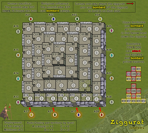
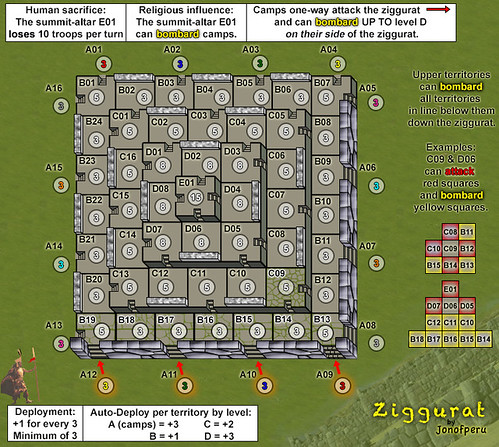
1. Eliminated level A and replaced it with camps as starting points which one-way assault the pyramid and cannot be attacked - only bombarded from the summit.
2. Gave the A level camps ability to bombard up to level D. That should help to break through the neutrals with the auto-deploy on camps. (the concept is slings, arrows, etc)
3. Reworked the graphics for stone walls and stairs on lower and right sides. Pay particular attention to the lower right corner. Worked on graphics for stone paths on each level with grass growing between the stones.
*Will apply these graphics to the rest of the ziggurat eventually.
Concept-theme issues:
1. This could be an Inca theme. I could name the camps around different Incas or notable warriors. Actually one of the inspirations of this map graphically is the Inca fortress of Sacsayhuaman (guess how the tour guides love to pronounce it!).
2. Or, since it is a kind of cross between Aztec and Inca architecture the theme could be "what if the ancient powers of the Americas had clashed..." Each side of the pyramid could be a different force: Inca, Aztec, Maya, Conquistadores. Would have to represent each graphically with their own weapons & dress, etc.
3. I'm thinking of creating an altar or temple to the sun on the summit with the idea that whoever controls it can bombard the camps - religious influence allows them to dominate the other powers... Not entirely clear on the plot yet.
Gameplay issues:
1. The core concept in this map is high-ground. The best way I've come up with to reflect the tactical advantage of high ground is the combination of bombardment and auto-deploy. There have been conflicting opinions on this one as well as on the neutrals up the pyramid.
2. What do you think of giving the camps bombardment UP the pyramid? Is seems a bit contrary to the original concept, but may provide balance and speed things up.
I probably need to clarify this in the map legend: A10 can bombard B13-19, C09-13, D05-07.
There are probably some other things I'm forgetting, but I want to get this update out there and hear the feedback. Please discuss/debate!
(And I forget who suggested some of the things I implemented in this update, but thank you!)
Last edited by jonofperu on Fri Nov 24, 2017 11:22 am, edited 1 time in total.

-

 jonofperu
- Posts: 610
- Joined: Thu Jan 12, 2012 9:57 am
- Location: Peru


 2
2


 3
3
Re: Ziggurat (high ground) [20/12] Pg2
i would get rid of the gray spots at the bottom of the stairs on the top and left sides and make them green instead. 
what if the ground camps could only bombard the d level, help to keep the enemy from reaching the summit. could make for an interesting play in trench setting.
what if the ground camps could only bombard the d level, help to keep the enemy from reaching the summit. could make for an interesting play in trench setting.
-

 nicarus
- Posts: 192
- Joined: Wed Apr 23, 2008 11:09 am
- Location: Northeastern, Missouri


Re: Ziggurat (high ground) [20/12] Pg2
I don't understand why Do6 can attack C11 and B16 if the wall is there.
are the walls only decorative?
I am not to sure about the concept of the camps being able to attack only D platform because of arrows. If they were shooting arrows they would be able to hit B C and D on their side.
Maybe we can think of something else.
This is an idea and might not be a good one but what if the from the summit there was another window with a hierarchy of Gods with each God being able to attack a different level down the pyramid. Then the highest one could attack the camps. Maybe from the camps they could either attack or bombard their perspective God. Just a crazy idea but it might give you something to think about.
The Christmas map might be something to look at to due to that is kind of like a pyramid map where you can attack up and then
attack back down on certain territories.
can you put a white background on your legends with the boxes for now they look a little bland and the green grass background is a little distracting.
-
 generalhead
- Posts: 806
- Joined: Mon Apr 26, 2010 10:09 pm


Re: Ziggurat (high ground) [20/12] Pg2
A quick minor update:
@nicarus
The grey spots are only there because I haven't applied the graphics update to the entire pyramid (due to how painstaking it is and I haven't yet had time).
Perhaps I should emphasize again that this is a very unfinished update, where I've tried some new things, but haven't applied them to the whole map yet. Partly I want to make sure of the gameplay/layout before perfecting the graphics.
@generalhead
Good catch on the D06 example. I had missed that - fixed now. The walls do not prevent bombarding down, but DO prevent attacks in either direction.
This is actually one of the reasons I'm uncertain about giving the camps bombardment UP the pyramid. The parapet walls should protect the people on the pyramid, while allowing them to fire down. Of course you can always shoot arrows at a castle, but your % of effectiveness is going to be way lower than the castle defenders shooting at you. No idea how to represent that though, so perhaps it's OK to let bombards go both ways.
I clarified the legend a bit. The idea is that the camps can bombard UP TO level D on their side, not ONLY level D. As I said in the previous post:
"A10 can bombard B13-19, C09-13, D05-07."
The idea of an inset for the summit with a hierarchy of gods or something is interesting, we'll see how it would play without it and maybe there is enough there as it is.
Added a white background to see what it looks like. I haven't worried too much about the overall look as that will have to be polished after getting the gameplay worked out.
New Topic:
I'm liking the idea of making it an ancient Peru map. Have Incas, Nazcas, Chimú, whatever pre-Inca civilizations around the pyramid.
Of course then I would have to change the name to Sacsayhuaman... which is cool, but I like Ziggurat.
Last edited by jonofperu on Fri Nov 24, 2017 11:27 am, edited 1 time in total.

-

 jonofperu
- Posts: 610
- Joined: Thu Jan 12, 2012 9:57 am
- Location: Peru


 2
2


 3
3
Re: Ziggurat (high ground) [20/12] Pg2
jonofperu, you do not really need the army circles. Turn that layer of incase you need them later. As for the camps around the outside, how about some tents or huts (what ever is suitable). I am liking the green on the slabs though. Any chance you can give the individual parts different greys.

-

 koontz1973
- Posts: 6960
- Joined: Thu Jan 01, 2009 10:57 am


Re: Ziggurat (high ground) [20/12] Pg2
I'll take a look at it without the circles.
I foresee a lot more graphics work creating the camps with figures, etc. Have to decide if it's Incas, Aztecs, who?
Good call on color variation for the stones. Can do.
I guess right now I'd like to know:
1. Will the gameplay will work as described now?
2. How do some of the graphical elements I've created look? (before applying them to the rest of the map)

-

 jonofperu
- Posts: 610
- Joined: Thu Jan 12, 2012 9:57 am
- Location: Peru


 2
2


 3
3
Re: Ziggurat (high ground) [20/12] Pg2
Gameplay, you will need to wait and discuss that with the GP boys, but right now, it seems to work. They will let you know bonuses, neutral values etc.
Graphics, so far so good. It seems to blend into each other nicely. Some things to consider though would be to reduce contrast on the map itself to fit better with the background. Stone is not shiny, but shiny enough to show the map of. jpegs are an easy option. The large image of the wall is fine, but remove the man unless you draw him yourself to fit the rest of the graphics. Give your legend a better background than white. And place all the elements of it together.
Graphics, so far so good. It seems to blend into each other nicely. Some things to consider though would be to reduce contrast on the map itself to fit better with the background. Stone is not shiny, but shiny enough to show the map of. jpegs are an easy option. The large image of the wall is fine, but remove the man unless you draw him yourself to fit the rest of the graphics. Give your legend a better background than white. And place all the elements of it together.

-

 koontz1973
- Posts: 6960
- Joined: Thu Jan 01, 2009 10:57 am


Re: Ziggurat (high ground) [31/12] V5 Pg2
Happy new year!
Whew! Got the update in before the year was over.
This map feels like I'm laying individual stones for an entire Inca fortress! haha
Version 5
Changes:
Designed stonework for levels (still need to apply it to the rest of the pyramid - very painstaking/time consuming.
Got rid of the circles (mostly, still have to apply to the rest)
Unified the legend
Some other graphics improvements/designs.
TO DO:
Graphics
Finish creating stonework on levels.
Create unique patters on stone walls (so far it's the same pattern copied on all the walls).
Draw "camps", etc. Possibly create bridges from camps to ziggurat.
Create figures, etc in camps... this could be a major time issue since I'm not really an artist.
Finish drawing unique symbols in the legend border.
Gameplay
Define levels of neutrals/autodeploy.
Confirm bombardment scheme for camps & summit.
Possibly implement multiple summit territories - could be an inset.
Last edited by jonofperu on Fri Nov 24, 2017 11:32 am, edited 1 time in total.

-

 jonofperu
- Posts: 610
- Joined: Thu Jan 12, 2012 9:57 am
- Location: Peru


 2
2


 3
3
Who is online
Users browsing this forum: No registered users

