Mapmaker(s):koontz1973
Number of Territories:120+
Special Features:None at the moment
What Makes This Map Worthy of Being Made:My first foray into fantasy map making and original.
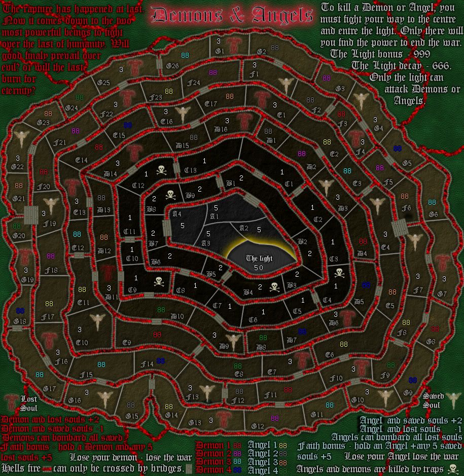
Map Image:
- Click image to enlarge.
Thoughts?
Moderator: Cartographers
![]() by koontz1973 on Sun Jan 29, 2012 5:24 am
by koontz1973 on Sun Jan 29, 2012 5:24 am


![]() by sannemanrobinson on Sun Jan 29, 2012 6:34 am
by sannemanrobinson on Sun Jan 29, 2012 6:34 am


![]() by natty dread on Sun Jan 29, 2012 7:47 am
by natty dread on Sun Jan 29, 2012 7:47 am


![]() by koontz1973 on Sun Jan 29, 2012 8:24 am
by koontz1973 on Sun Jan 29, 2012 8:24 am
![]() by thenobodies80 on Sun Jan 29, 2012 8:32 am
by thenobodies80 on Sun Jan 29, 2012 8:32 am


![]() by natty dread on Sun Jan 29, 2012 8:46 am
by natty dread on Sun Jan 29, 2012 8:46 am
![]() by koontz1973 on Sun Jan 29, 2012 9:03 am
by koontz1973 on Sun Jan 29, 2012 9:03 am
natty_dread wrote:No, seriously... take this the best possible way... but I think you can do a LOT better on the graphics.
The graphics are just all around garish. The elements on the map don't fit together at all. You have the red-blue background with a knobbly textured look, then you have the photorealistic icons that look so pasted on it hurts. On top of that, you have region borders that looks like whipped cream from a can that went seriously wrong at some point... and then, the pixelation.
There definitely is no way to make pixelation look good, unless it's a consistent thematic effect on your map, kind of like on Conquer man. Here... no.
The dissolve effect on the devil and the angel? Scrap that. There's no way you're going to make it look good. It looks like pixel porridge. The "passable" parts of the region borders... that doesn't work either. Look, I know it's fun to experiment, and also important - without experimentation you can't develop as a graphician. But this is one experiment that went horribly wrong. Why not just cut holes in them instead of... whatever that is you have now.
Now, I realize a lot of this may sound overly harsh and I truly apologize for it. I just think, someone like you who already has one map in beta and two others on their way there, you should be well capable of creating much better quality of work. I'm only saying this because I know you have the potential, and I want to see that potential realized. All the more so since I think, thematically, this map could work and you could create an interesting map out of this.
I also realize this is just a first draft, but I believe in pointing out problems early.
![]() by natty dread on Sun Jan 29, 2012 9:19 am
by natty dread on Sun Jan 29, 2012 9:19 am
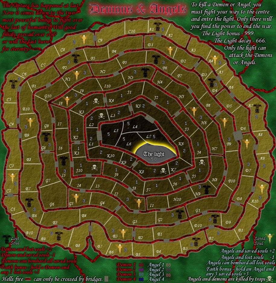
koontz1973 wrote:I know the colours are garish, I wanted that as a look.
koontz1973 wrote:God knows what a battleground between the devils and gods minions would look like so some ley way here can be granted.
koontz1973 wrote:For the colours, I chose red and blue as they naturally fit together but these can be refined. Any suggestions?
koontz1973 wrote:The angels and devil at the top I kind of like so will keep them for now. They are just pencil drawing on different layer modes to give the difference.
koontz1973 wrote:The walls, I mean, how do you draw something that does not exist. I understand the whipped cream reference even though the colour is bloody weird for cream but I wanted an organic feel to it. No straight lines, sort of like an alien hive. Strange but familiar somehow.
koontz1973 wrote:The icons are pasted effects. I said that previous post and asked for solutions.
![]() by Nesoi on Mon Jan 30, 2012 7:03 pm
by Nesoi on Mon Jan 30, 2012 7:03 pm
![]() by Gillipig on Tue Jan 31, 2012 4:46 am
by Gillipig on Tue Jan 31, 2012 4:46 am


![]() by koontz1973 on Tue Jan 31, 2012 7:48 am
by koontz1973 on Tue Jan 31, 2012 7:48 am
Gillipig wrote:I like the theme but I can't seem to find the starting pos.!
![]() by koontz1973 on Fri Feb 03, 2012 12:59 am
by koontz1973 on Fri Feb 03, 2012 12:59 am

![]() by koontz1973 on Sat Feb 04, 2012 5:21 am
by koontz1973 on Sat Feb 04, 2012 5:21 am
![]() by natty dread on Sat Feb 04, 2012 5:42 am
by natty dread on Sat Feb 04, 2012 5:42 am
![]() by koontz1973 on Sat Feb 04, 2012 8:22 am
by koontz1973 on Sat Feb 04, 2012 8:22 am
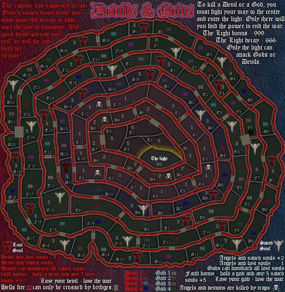
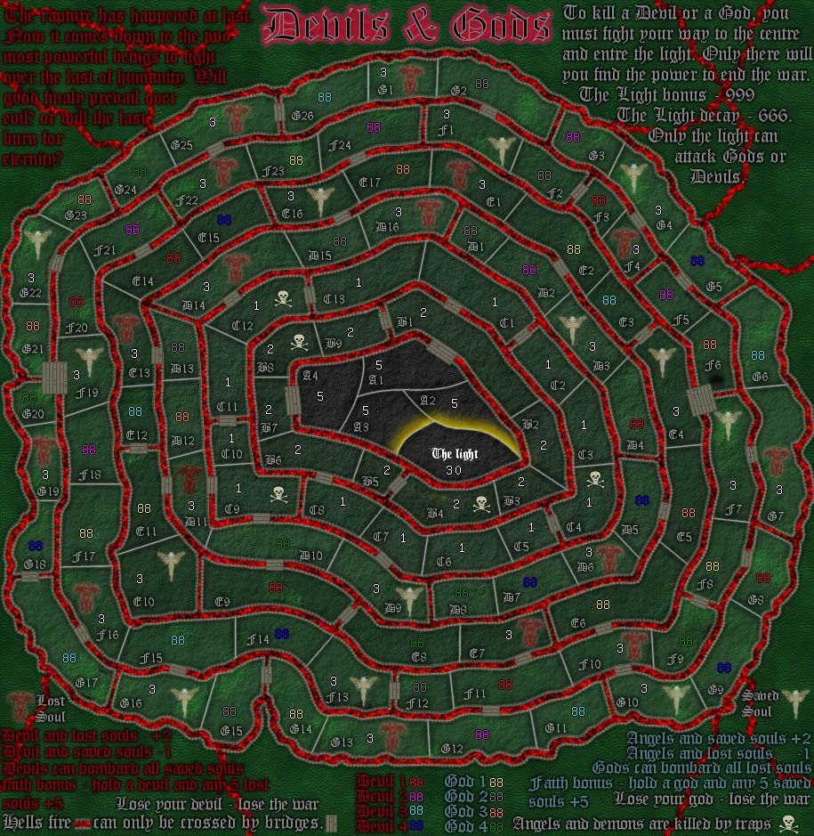
natty_dread wrote:Try something else than this glowy, gaudy look. Scrap the red/blue gradient and go for a dark, ominous look. Subtle, not flashy.
![]() by Extreme Ways on Sat Feb 04, 2012 6:10 pm
by Extreme Ways on Sat Feb 04, 2012 6:10 pm


 2
2
![]() by IcePack on Sat Feb 04, 2012 9:35 pm
by IcePack on Sat Feb 04, 2012 9:35 pm


![]() by koontz1973 on Sun Feb 05, 2012 12:21 am
by koontz1973 on Sun Feb 05, 2012 12:21 am
![]() by Victor Sullivan on Sun Feb 05, 2012 12:26 am
by Victor Sullivan on Sun Feb 05, 2012 12:26 am


![]() by koontz1973 on Sun Feb 05, 2012 12:39 am
by koontz1973 on Sun Feb 05, 2012 12:39 am
![]() by koontz1973 on Sun Feb 05, 2012 1:24 am
by koontz1973 on Sun Feb 05, 2012 1:24 am
![]() by natty dread on Sun Feb 05, 2012 2:20 am
by natty dread on Sun Feb 05, 2012 2:20 am
![]() by koontz1973 on Sun Feb 05, 2012 2:46 am
by koontz1973 on Sun Feb 05, 2012 2:46 am
natty_dread wrote:Try dark brown instead of green. Green & red still clash too much.
Maybe give it something like a rock texture.
![]() by koontz1973 on Sun Feb 05, 2012 5:03 am
by koontz1973 on Sun Feb 05, 2012 5:03 am
![]() by thenobodies80 on Sun Feb 05, 2012 10:32 am
by thenobodies80 on Sun Feb 05, 2012 10:32 am
Return to Melting Pot: Map Ideas
Users browsing this forum: No registered users
|
|||||||
| Conquer Club is not associated with RISK online in any way. Copyright © 2006-2025 by Big Wham LLC | |||||||