Polderand Map
Moderator: Cartographers
67 posts
• Page 1 of 3 • 1, 2, 3
Polderand Map
Map Name: Polderand
Mapmaker(s): BadgerJelly
Number of Territories: 50
Special Features: Set starting positions. Overlapping continents. Killer neutral.
What Makes This Map Worthy of Being Made: Its going to be an awesome Fantasy based battle! With set starting positions most times you play will be from a different position and with different challenges!
Map Images:
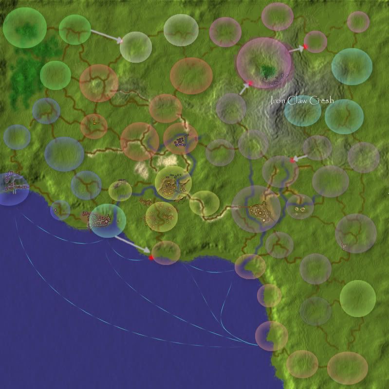
Needs more detail on the map but the basics are all in there.
Going to try and add some "city" icons of some sort ...
I have as much information as I know ... not had time to think about the special features I'll use.
The borders are all there.
I'm going to have set startingposition for sure but just tryingto figure things out better and decide whether any extra regions need to be added to improve the feel of the game play.
I have not put theme because I need to write out a little bit of history and play around with ways of showing this. I am thinking pretty much along the lines of having each starting position with auto-deploy and region bonuses to purely depend on the starting position you hold or holdin the future as you take over other players (maybe have it so once someones Capital is taken they are out of the game and all their armies turn Neautral??. I keep having ideas but need to sort through what is and isnt possible with XMLcoding.
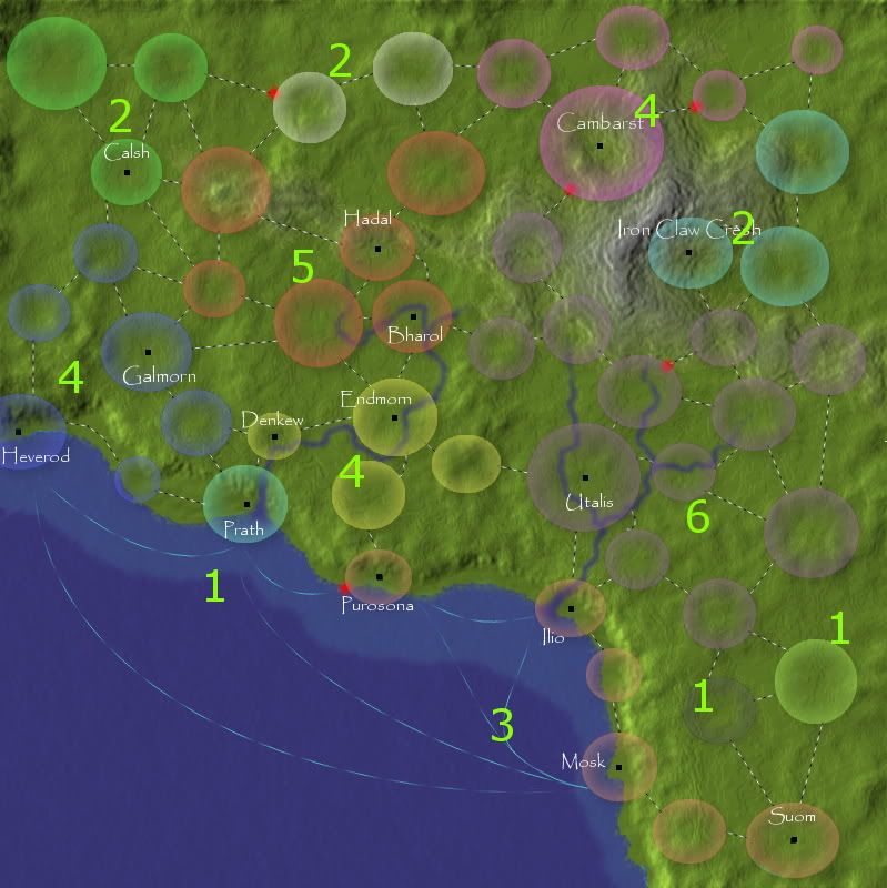
example : One region gives 1 player a 2 army bonus and another player 0 army bonuses and another 5!
This will lead to very interesting game play with some players maybe even exchanging regions to increase both of their reinforcments or stopping other getting to a large single bonus area ... I think this will be a very enjoyable and playable game with different starting positions on the map offering different styles of play each time.
This is also a map that could be adjusted and used over for different periods in the regions history by simply changing the look of the map by having a new XML code made.
The races/empires in the Polderand Region
- Humans Of Polderand : A relatively newly formed nation in Human history.
----- Prath = Capital of Polderand with main fleets and armies of Polderand.
----- Heverod = Superb shipwrights.
----- Utalis = New advanced city. Powerful armies and numerous inventers and explorers.
----- Endmorn = The work horse of Polderand with surrounding areas the main supply of all of Polderands food resources.
----- Hadal = The Mining city fortress.
More to come ...
Last edited by BadgerJelly on Tue Jan 10, 2012 7:01 am, edited 8 times in total.
-

 BadgerJelly
- Posts: 180
- Joined: Wed Dec 08, 2010 2:51 pm
Re: Polderand Map
Hey BadgerJelly 
Truthfully, I'm a bit confused as to what this map is supposed to depict, as well as what you wish to accomplish with the gameplay.
-Sully
Truthfully, I'm a bit confused as to what this map is supposed to depict, as well as what you wish to accomplish with the gameplay.
-Sully
Beckytheblondie: "Don't give us the dispatch, give us a mustache ride."
Scaling back on my CC involvement...
Scaling back on my CC involvement...
-

 Victor Sullivan
- Posts: 6010
- Joined: Mon Feb 08, 2010 8:17 pm
- Location: Columbus, OH


Re: Polderand Map
Looks like part of Africa.
And wtf is up with the name?
And wtf is up with the name?

Please don't invite me to any pickup games. I will decline the invite.
-
 QoH
QoH
- Posts: 1817
- Joined: Fri Aug 20, 2010 12:37 pm


Re: Polderand Map
Victor Sullivan wrote:Hey BadgerJelly
Truthfully, I'm a bit confused as to what this map is supposed to depict, as well as what you wish to accomplish with the gameplay.
-Sully
Its going to be part of a series of maps of a made up world.
This it just the bare bones and I will be adding more detail later amoungst other things ...
Any advice would be welcome as I'm new here. I understand the process of the Foundry but there are still some things I have yet to figure out.
-

 BadgerJelly
- Posts: 180
- Joined: Wed Dec 08, 2010 2:51 pm
Re: Polderand Map
Well, firstly, it shows that you're not used to adding text on your maps... Papyrus? Eww...
So, try finding some better fonts. Dafont.com has lots of good fonts, but make sure you only use fonts that are free for commercial use. They're marked as "free" or "public domain", but the ones marked "free for personal use" aren't usable.
Also, why are the territories bubbles of different sizes? It looks to me like they should be cities of some kind... so why not draw cities?

-

 natty dread
- Posts: 12877
- Joined: Fri Feb 08, 2008 8:58 pm
- Location: just plain fucked


Re: Polderand Map
natty_dread wrote:Well, firstly, it shows that you're not used to adding text on your maps... Papyrus? Eww...
So, try finding some better fonts. Dafont.com has lots of good fonts, but make sure you only use fonts that are free for commercial use. They're marked as "free" or "public domain", but the ones marked "free for personal use" aren't usable.
Also, why are the territories bubbles of different sizes? It looks to me like they should be cities of some kind... so why not draw cities?
I quite like the look of Papyrus
The territories are different sizes because on LG we can have reos by area ... it was just a side thought really. So important terrs Ijust made a bit bigger thats all. The entire look will be played around with. I am currently adding buildings but everything is from birdseye view and somethings I want to add may be difficult!
-

 BadgerJelly
- Posts: 180
- Joined: Wed Dec 08, 2010 2:51 pm
Re: Polderand Map
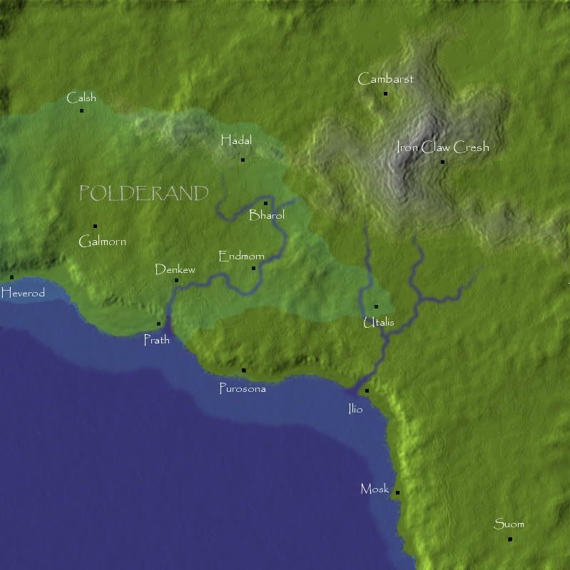
With all the shit stripped away this is what it looks like. I am going for a realistic look.
-

 BadgerJelly
- Posts: 180
- Joined: Wed Dec 08, 2010 2:51 pm
Re: Polderand Map
Victor Sullivan wrote:Hey BadgerJelly
Truthfully, I'm a bit confused as to what this map is supposed to depict, as well as what you wish to accomplish with the gameplay.
-Sully
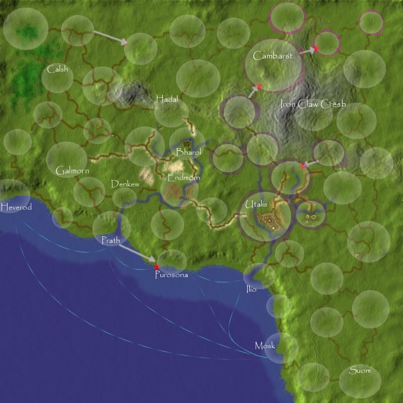
Hopefully this shows a bit better what I am working towards.
I want birds eye view. The world its set in I have PLENTY of background information on because its part of a book I am writing.
I am thinking about how I can use this to have special features ...
Do you think the territory circles would look better teh same size? I have done this because I want to keep as much of the map as visable as possible so the detail I will be putting in is clear
Also is borders the circles with colour a better look here than the first one do you think? Wasmaybe think of some kind of coloured border mottif to distinguish different Continent bonuses.
-

 BadgerJelly
- Posts: 180
- Joined: Wed Dec 08, 2010 2:51 pm
Re: Polderand Map
i'd get rid of those bubbles they really look out of place. the last map you drew is not too bad for a draft and the city of utalis also looks nice enough. and those red dots are not the best way to show 1 way borders, really.
-

 zimmah
- Posts: 1652
- Joined: Fri Jun 01, 2007 12:43 pm
- Location: VDLL


Re: Polderand Map
zimmah wrote:i'd get rid of those bubbles they really look out of place. the last map you drew is not too bad for a draft and the city of utalis also looks nice enough. and those red dots are not the best way to show 1 way borders, really.
Yeah I agree! Its hard to find a solution though.(btw the red dots are just there for now as are the arrows. Currently got a few games going on it the initial draft though was purely for play testing once I had the basic map set out.
I'll post the latest version tomorrow. What do you think of the general balance of the map at a glance? I'm not too sure about the 2 single continents bottom right. Then again they are far away enough from everything not to be overly powerful ... you have escalating continents here on CC as well as cards?
-

 BadgerJelly
- Posts: 180
- Joined: Wed Dec 08, 2010 2:51 pm
Re: Polderand Map
i don't recognise any continents and as long as they don't have any specific bonusses i can't tell if they're overpowered or not.
and define escalating continents
and define escalating continents
-

 zimmah
- Posts: 1652
- Joined: Fri Jun 01, 2007 12:43 pm
- Location: VDLL


Re: Polderand Map
zimmah wrote:i don't recognise any continents and as long as they don't have any specific bonusses i can't tell if they're overpowered or not.
and define escalating continents
Values are on original post in BIG green digits next to the colour coded continents.
Escalating continents is something where BOTH card values and coninent values increase. Continents quite quickly!
-

 BadgerJelly
- Posts: 180
- Joined: Wed Dec 08, 2010 2:51 pm
Re: Polderand Map
if you mean increase each turn you hold them, no, that would be conditional XML which is not available as of now. although it has been requested a thousand of times.
however you can get creative with continents that have overlapping borders or continents that become more valuable or less valuable whenever you hold something else alongside with it or you can have one bonus overwrite another one.
but bonus based on turns, nope. (sadly, as this will allow some interesting gameplay as well)
-

 zimmah
- Posts: 1652
- Joined: Fri Jun 01, 2007 12:43 pm
- Location: VDLL


Re: Polderand Map
You forgot to fill spomething out on the design briefL
What Makes This Map Worthy of Being Made:
What Makes This Map Worthy of Being Made:
Sketchblog [Update 07/25/11]: http://indyhelixsketch.blogspot.com/
Living in Japan [Update 07/17/11]: http://mirrorcountryih.blogspot.com/
Russian Revolution map for ConquerClub [07/20/11]: viewtopic.php?f=241&t=116575
Living in Japan [Update 07/17/11]: http://mirrorcountryih.blogspot.com/
Russian Revolution map for ConquerClub [07/20/11]: viewtopic.php?f=241&t=116575
-

 Industrial Helix
- Posts: 3462
- Joined: Mon Jul 14, 2008 6:49 pm
- Location: Ohio


Re: Polderand Map
Industrial Helix wrote:You forgot to fill spomething out on the design briefL
What Makes This Map Worthy of Being Made:
no, he was sincere, the map is unworthy
-

 zimmah
- Posts: 1652
- Joined: Fri Jun 01, 2007 12:43 pm
- Location: VDLL


Re: Polderand Map
Industrial Helix wrote:You forgot to fill spomething out on the design briefL
What Makes This Map Worthy of Being Made:
I didnt just seems pointless at the moment other than writing its going to be part of a set of themed maps based on my own world.
-

 BadgerJelly
- Posts: 180
- Joined: Wed Dec 08, 2010 2:51 pm
Re: Polderand Map
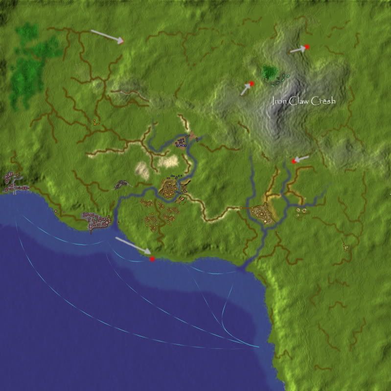
Latest image.
As you can see if I get rid of Circles then its pretty much hard to tell what connects to what.
-

 BadgerJelly
- Posts: 180
- Joined: Wed Dec 08, 2010 2:51 pm
Re: Polderand Map
zimmah wrote:and what if you just draw normal borders?
It will just look messy I think. Its not the most important thing at this stage tbh but its bugging me!
With the circles there is the added bonus of VERY clear connections between territories where "roads" lead in and out.
Keep in mind I am going to be using this on LG and colour coded continents are the order of the day there ... I could do things differently here but I like keeping the grass green on my maps and not red/blue/purple or whatever!
eg.vI could do something more like this for borders? :
-

 BadgerJelly
- Posts: 180
- Joined: Wed Dec 08, 2010 2:51 pm
Re: Polderand Map
BadgerJelly wrote:Keep in mind I am going to be using this on LG
Um, that's not a design priority when you're designing a map for CC.

-

 natty dread
- Posts: 12877
- Joined: Fri Feb 08, 2008 8:58 pm
- Location: just plain fucked


Re: Polderand Map
i don't see the point of this map.
there is no theme, no regions, no gameplay.
there is no theme, no regions, no gameplay.
-

 greenoaks
- Posts: 9977
- Joined: Mon Nov 12, 2007 12:47 am


Re: Polderand Map
natty_dread wrote:BadgerJelly wrote:Keep in mind I am going to be using this on LG
Um, that's not a design priority when you're designing a map for CC.
Being able to see clearly where continents are is not a priority?? Am I misunderstanding something here?
-

 BadgerJelly
- Posts: 180
- Joined: Wed Dec 08, 2010 2:51 pm
Re: Polderand Map
BadgerJelly wrote:natty_dread wrote:BadgerJelly wrote:Keep in mind I am going to be using this on LG
Um, that's not a design priority when you're designing a map for CC.
Being able to see clearly where continents are is not a priority?? Am I misunderstanding something here?
That's not what I said. You said you want to use this map on LG, but that's not something you should think about when you're making a map for CC.
You're either making the map for CC or your making it for LG, you can't really expect the same map to work for both sites.

-

 natty dread
- Posts: 12877
- Joined: Fri Feb 08, 2008 8:58 pm
- Location: just plain fucked


Re: Polderand Map
natty_dread wrote:BadgerJelly wrote:natty_dread wrote:BadgerJelly wrote:Keep in mind I am going to be using this on LG
Um, that's not a design priority when you're designing a map for CC.
Being able to see clearly where continents are is not a priority?? Am I misunderstanding something here?
That's not what I said. You said you want to use this map on LG, but that's not something you should think about when you're making a map for CC.
You're either making the map for CC or your making it for LG, you can't really expect the same map to work for both sites.
I AM using it on LG to play test because I cannot here. This map will look different on both sites but they will generally appear the same. The circles I am using here is mainly for LG convenience thats why I am asking for advice or other ways here.
Kind of sick of the "normal" representation borders and want something that interferes with the overasll look as little as possible.
-

 BadgerJelly
- Posts: 180
- Joined: Wed Dec 08, 2010 2:51 pm
Re: Polderand Map
BadgerJelly wrote:natty_dread wrote:BadgerJelly wrote:natty_dread wrote:BadgerJelly wrote:Keep in mind I am going to be using this on LG
Um, that's not a design priority when you're designing a map for CC.
Being able to see clearly where continents are is not a priority?? Am I misunderstanding something here?
That's not what I said. You said you want to use this map on LG, but that's not something you should think about when you're making a map for CC.
You're either making the map for CC or your making it for LG, you can't really expect the same map to work for both sites.
I AM using it on LG to play test because I cannot here. This map will look different on both sites but they will generally appear the same. The circles I am using here is mainly for LG convenience thats why I am asking for advice or other ways here.
Kind of sick of the "normal" representation borders and want something that interferes with the overasll look as little as possible.
yes but bubbles don't seem to fit the theme of a semi-realistic map. and they weren't all to clear either.
i support your enthusiasm and your urge to want to do new things, but keep in mind CC has way different standards then LG. and i don't know why normal borders shouldn't work.
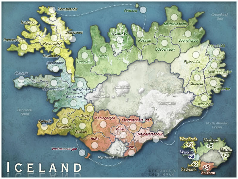
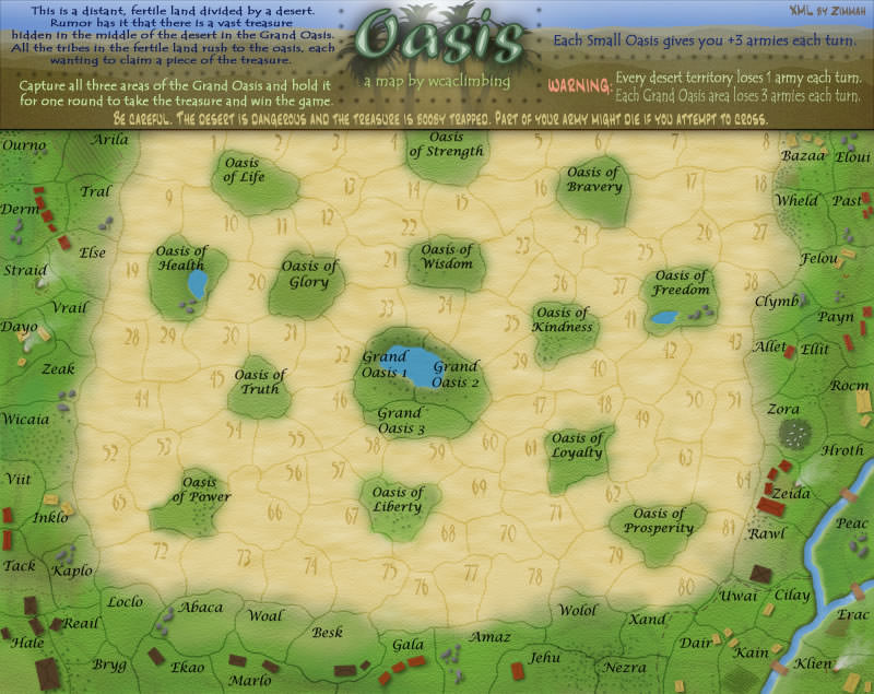
some good examples:
-

 zimmah
- Posts: 1652
- Joined: Fri Jun 01, 2007 12:43 pm
- Location: VDLL


67 posts
• Page 1 of 3 • 1, 2, 3
Return to Melting Pot: Map Ideas
Who is online
Users browsing this forum: No registered users

