Incandenza,
You are abdsolutely right, I am not. My apologies if I came across like that. You have offered invaluable advice recently and I very much count on your continued criticism and commentary both regarding gameplay (yes I love Peloponnesian War so if we can improve the gameplay here to bring it up to that level I would be thrilled!) and artistic direction.
A few quick notes on your other comments:
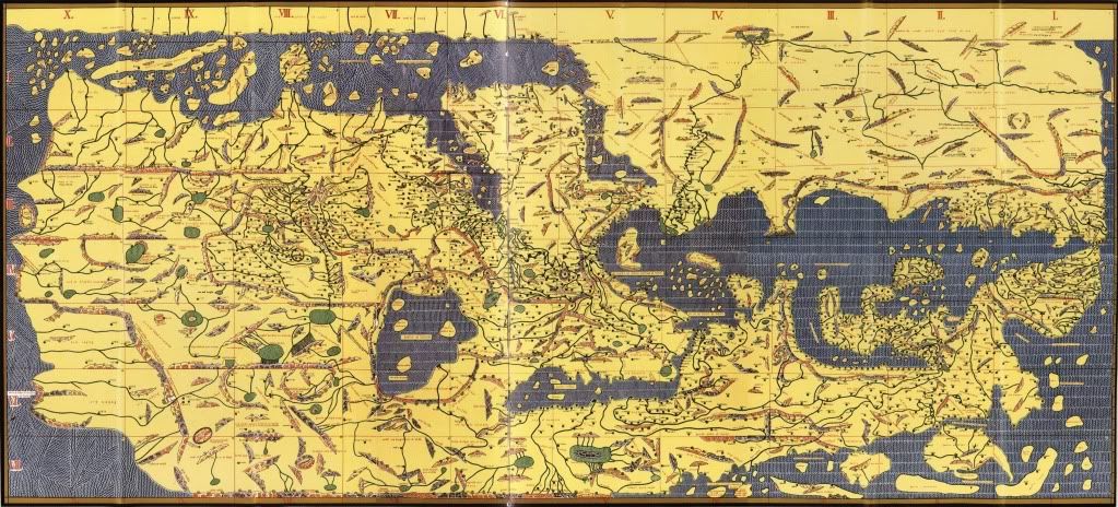
Yeah, I saw that map a month ago, the first time I tried to comment on this map. That needs to be in the first post. I know you're not a big fan of keeping the first post 100% up to date, but that's pretty much the absolute least you could do. Forcing people to hunt through the thread for essential information is not only rude, it's counter-productive.
This map was at the top of the thread. Then when we started working on the space view everyone kept asking us to update the top post even if we had not yet come up with a complete version thereof. So in order to keep people happy we did so, before inscribing the neutrals on it, because we were not yet ready to do so. So, we tried our best to strike a balance between timely and accurate, but clearly no one was happy. We also have limited time and we did the best we could. Please be more patient and we will try to be speedier.
I don't consider New World to be a suitable precedent. Despite it's popularity, the gameplay is rather unbalanced. I would not have stamped that map, had it been up to me. While the imbalance of New World isn't as much of an issue with no cards, said imbalance very much surges to the fore when it comes to card games.
Well i very much like New World and the fact that it has two totally differnt types of starting points. This means that players will need to use different strategies depending on where they are located. I tried to remedy some on the imbalances you mention by including both ports and battles which slow the game down and don't allow anyone to just sweep a position by intial concentration of forces in rounds 3 or 4. That simply would not work here. That being said, I am totally open to any suggestions, including the non-autodeploy on the religious site, if you think that would help the game-play. As long as we keep the two types of starting points I am totally open to any constructive suggestions regarding numbers of neutrals and game-play. I totally agree with you that it's worth taking the time to adjust and fine-tune a map to ensure the game-play is as balanced as possible. There is nothing I dislike more than a map where one player has an inbuilt disadvantage compared to others purely based on the drop. And I am certainly not in a hurry to get maps out of the Foundry in record times. Whatever it takes, it takes. The important part is to have a fun, playable, high-quality maps that adds to the variety of themes and plays CC already has. So I'm all for fine-tuning, as you say.
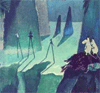
You'd be best served by committing wholeheartedly to the Islamic theme... if you want the upside-down world, fine, but having the map as a view from space is undercutting the Islamic theme. Many of the icons, especially the Asterix-style battle sites (where a simple crossed-swords icon would be immeasurably more appropriate), isn't helping matters. I guarantee that if you take the map back to its roots, and pork can produce something that looks like it might have been sketched in Baghdad by one of the sultan's courtiers in 950 AD, you will see a marked uptick in support for this promising map.
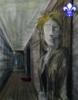
Yes well that's a problem; we're all human after all and Pork has put a huge amount of enthusiasm, time and effort into the space view. I'm sure you can see why going back to the original approach will be difficult. On the technical aspect, we are constrained by the fact that we are working with cities, not border-defined territories, and that we have 106 of them which must connect in specific ways to make the game-play work. That leaves relatively little room for coming up with detailed or complex city'battle illustrations. NW, Peloponnesian War and WWII all are based on territories and don't have to worry about different cities with different functions. Here, we do. We coded all cities' and battles' names to keep the map as legible as possible but we still need city and battle symbols that are as simple and clear as possible. I would love nothing better than a Dawn of Ages style map with hand-drawn symbols for cities and ports and religious sites and battles. I am not sure if that would work, space- and clarity-wise.
Botttom line, I am not against going back to an Islamic theme; but I am not persuaded that the more futuristic theme would not work. I think it has its advantages and, with the inclusion of 3 lines of text explaining story and context, it could be a lot of fun to play on.
Query: gameplay and balance, as well as map clarity, are objective matters reasonable people can reasonably agree on. Artistic direction is much more subjective. Let us assume (for discussion purposes) that we want to stick with our futuristic artistic direction and improve playability and clarity to levels everyone is satisfied with. Is Foundry policy that, as long as our artistic view does not correspond to the Foundry majority opinion, the map will linger in limbo? And if so, why? I don't mean to be overly argumentative or start a war over this, but I am not quite sure why we, as map developers, once we meet the objective criteria of the Foundry, would have to not just compromise, but completely alter our vision on the subjective part, which is artistic direction. This raises implications of "groupthink" which I am not ready to accept, especially given the limited number of Foundry contributors as a percentage of CC players. In effect, you are saying: "Trust us. We know what works, artistically. And unless you meet our idea of what works artistically, you are going nowehere with this map." I'm sure you can see the many problems raised by this approach.
Bottom line: I love this time-period, this game-play, this map. I want to make it work, and I appreciate the fact you think it is a promising map and that you have taken a lot of time and effort to help out. Both pork and I want to make this work and we are totally willing to learn out of this process. Let's all work together to improve this idea and make it play-worthy and artistically creative and interesting.
Again, I appreciate your comments and I know for sure this project is better off with your input. Thank you.
Raskholnikov