Conquer Club

Reconquista

Have an idea for a map? Discuss ideas and concepts here.

Moderator: Cartographers

Forum rules
Please read the Community Guidelines before posting.

Re: Reconquista

Postby porkenbeans on Tue May 04, 2010 1:19 pm

Industrial Helix wrote:Much clearer.

The wacky font needs to go, imo. It's neither Spanish/Moorish nor legible.

How many shields do you have? I count 14, will they be assigned as starting positions or starting neutrals?

Shielded territories one-way assault, correct? You should write one way cause assault means the other territories can attack back despite not sharing a border.

This is looking good gents, nice work!
Yes, 14 shields, and yes, they can one way attack all territs within their own kingdom. My idea was to have them evenly divided among the players, and the remaining starting out neutral.

About the font (Matisse ITC), I was looking for a font that resembles old hand writing. This one was the best one that I have for that. I would love to see some examples of other fonts along this vain. ...Anyone ?

Right now I am waiting to see Bast's update. He may have a better GP worked out, that will go to unclutter things. I am reminded of something that army of nobunaga said in another map thread- this map may be like a really really great movie that the director is forced to cut to get under 2 and a half hours in length.

In the meantime I will continue to play around with the graphics. Hopefully we will be able to sail through the GFX. Workshop when we get there. 8-)
Image
User avatar
Lieutenant porkenbeans
 
Posts: 2546
Joined: Mon Sep 10, 2007 4:06 pm

Re: Reconquista

Postby Industrial Helix on Wed May 05, 2010 8:46 am

Yeah, Matisse looks like a, well, Matisse painting. I'd suggest finding the font 1550 as I think that will work out best for this map. There's a number of old handwriting fonts mentioned in the 13 Colonies thread, I'd say go over there and check them out.

Wouldn't it be better to have 16 shields rather than 14? In an 8 player game you'd end up having 6 neutral shields.
Sketchblog [Update 07/25/11]: http://indyhelixsketch.blogspot.com/
Living in Japan [Update 07/17/11]: http://mirrorcountryih.blogspot.com/
Russian Revolution map for ConquerClub [07/20/11]: viewtopic.php?f=241&t=116575
User avatar
Cook Industrial Helix
 
Posts: 3462
Joined: Mon Jul 14, 2008 6:49 pm
Location: Ohio

Re: Reconquista

Postby porkenbeans on Wed May 05, 2010 11:46 am

Industrial Helix wrote:Yeah, Matisse looks like a, well, Matisse painting. I'd suggest finding the font 1550 as I think that will work out best for this map. There's a number of old handwriting fonts mentioned in the 13 Colonies thread, I'd say go over there and check them out.

Wouldn't it be better to have 16 shields rather than 14? In an 8 player game you'd end up having 6 neutral shields.
Cool I will check that out.

16 would be preferable, but that would mean splitting up and adding kingdoms. Bast would need to figure that one out. But, I do not think that he is to keen on this GP. we will have to wait to see how he decides to proceed. 8-)
Image
User avatar
Lieutenant porkenbeans
 
Posts: 2546
Joined: Mon Sep 10, 2007 4:06 pm

Re: Reconquista

Postby theBastard on Wed May 05, 2010 12:40 pm

sorry guys for my absention, my coffe shop goes down and I also have much other work...

pork, your idea does map much much easier, but is much much off my idea... :)
I want to have gameplay as was set from start, but easier. maybe not so full map...

this is very quick edit of map. forgot shields, we can do Kingdoms coloured (settlements) so shields are not needed. I draw only Taifa de Sevilla and Taifa de Cordoba (which makes higher bonus). and shield in legend will be coloured as Kingdoms/Taifas.

the land is still free - no mans land...

on the other things as religion, bonuses I will think when coloured settlements looks fine.
Click image to enlarge.
image
User avatar
Corporal 1st Class theBastard
 
Posts: 994
Joined: Sat Jan 09, 2010 9:05 am

Re: Reconquista

Postby porkenbeans on Wed May 05, 2010 3:54 pm

Hope the shop is up and running. Do not worry about this stuff too much. It is only recreation, and will be here when you have the extra time.

I will be happy to make another version with this GP. When it is done to your liking, we will have two finished options. I am sure that one will git the approval of the peanut gallery.

So, clarify exactly what you want to see.

1.) do you want the land all the same color, or ... ?

2.) So, I take it, you want the settlements to be color-coded ?

3.) What if I made all of the land for the Christians a slightly different shade of the same color for the Moors ? That way we do not need the religious icons.
Image
User avatar
Lieutenant porkenbeans
 
Posts: 2546
Joined: Mon Sep 10, 2007 4:06 pm

Re: Reconquista

Postby theBastard on Thu May 06, 2010 12:36 am

porkenbeans wrote:Hope the shop is up and running. Do not worry about this stuff too much. It is only recreation, and will be here when you have the extra time.


some CC members should come for coffe :lol: . thanks pork for support, yesterday I found one guy who will lease it from me, so now I must finished bargain and so on...

porkenbeans wrote:I will be happy to make another version with this GP. When it is done to your liking, we will have two finished options. I am sure that one will git the approval of the peanut gallery.


pork I think that at the frist we must spoke about GP and find one the best. do not spend much time and energy for new versions again and again.

porkenbeans wrote:1.) do you want the land all the same color, or ... ?


yes, the land should have the same colour. the land is "neutral" area...

porkenbeans wrote:2.) So, I take it, you want the settlements to be color-coded ?


yes, I think this should help the map is not so "full" and people do understand color - coded. and I think, the settlements should not be plastic, they must have borders as I show you. this help to understand where are borders and so on...

porkenbeans wrote:3.) What if I made all of the land for the Christians a slightly different shade of the same color for the Moors ? That way we do not need the religious icons.


no. the land must have the same colour. it is about unification of Iberia. I will think about religious icons, but without shields the icons will looks as extra bonuses in GP.
User avatar
Corporal 1st Class theBastard
 
Posts: 994
Joined: Sat Jan 09, 2010 9:05 am

Re: Reconquista

Postby porkenbeans on Mon May 10, 2010 7:16 pm

OK, so I am back to work on Recon.
While I work on it, I would like to offer some food for thought, that you or anyone else may want to consider.

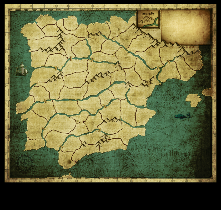
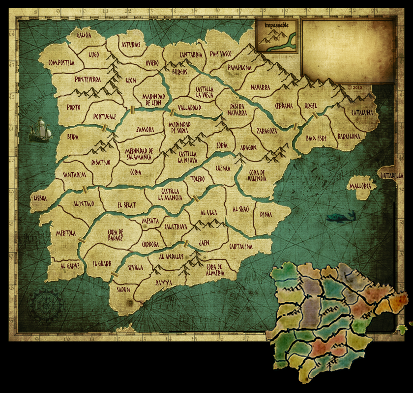
Below I have posted a couple of raw templates. Anyone that wishes, may use them to illustrate their ideas. I am NOT one that readily gets upset, if someone should take my art and change, add, or subtract from it.

The main thing holding this map up is, its "complexity" issue. It is very tough when it comes time for the movie to hit Editing. It is probably the toughest thing that a director has to do. He must take all of those months of researching and shooting, and then, cut out all but 3 1/2 hours to make the "Director's Cut". Then after that he must go and cut that down to 2 1/2 hours to make final cut.

A lot of tape has to hit the cutting room floor, to make a movie, that the public wants to see. Bast, yours would not be the first director's tears, to hit the cutting room floor. The fact as I see it is plainly this- the movie needs to loose some film. It must be simplified so that it does not feel like having to learn a new language to play it.

The icons, or should I say, the mass of icons, are just so numerous and varied. Yes, I am certain that once the player takes the sufficient amount of time, to learn the language, It would all make perfect sense. The problem is, and mr B. hinted at it in the thread about "Over Complicated" maps, that most people just want to come and see the movie. they are not interested in anything else, but, relaxing and having a good time. In other words, people like maps, that are as close as possible, to the simple, original gameplay, of Risk.

This map is certainly not ever going to be anything like Doodle, but it does need to take a step or two in that direction.

Anyways, That is the problem as I understand it. These templates can be used to hammer out a solution. Anyone that wants can simply run off a few copies, and use felt markers to make their doodles. We have got to solve this game play issue. Then when we hit the GFX workshop, we will already have a big jumpstart on the final graphics for this baby. I have many versions to pick and choose from.

IH, I provided a template w/out the text. I would love to see examples of some of those cool hand written fonts.

Click image to enlarge.
image
Click image to enlarge.
image
Image
User avatar
Lieutenant porkenbeans
 
Posts: 2546
Joined: Mon Sep 10, 2007 4:06 pm

Re: Reconquista

Postby Industrial Helix on Mon May 10, 2010 7:33 pm

Well, I think the gameplay ought to be a mix of territories: Churches/Mosques, land, towns and castles. Each with its own bonus system.

Castles: Autodeploy +2 (The main military powerhouses)
Towns: Auto deploy +1 (think like where you draft men)
Churche/mosques: +1 for each castle held with a church/mosque (think like they add religious fervor to troops)
Land: no bonus (like its battleground rather than something that yields troops)

Starting situation: Each player starts with one of two castles, a town or two. Land starts neutral 1. Church/Mosque starts neutral 8.

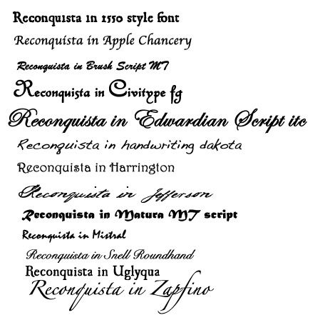
Here's the fonts I have on file, they are either standard to photoshop or free fonts (do a google search):

Click image to enlarge.
image


Personally, I like Harrington
Sketchblog [Update 07/25/11]: http://indyhelixsketch.blogspot.com/
Living in Japan [Update 07/17/11]: http://mirrorcountryih.blogspot.com/
Russian Revolution map for ConquerClub [07/20/11]: viewtopic.php?f=241&t=116575
User avatar
Cook Industrial Helix
 
Posts: 3462
Joined: Mon Jul 14, 2008 6:49 pm
Location: Ohio

Re: Reconquista

Postby porkenbeans on Mon May 10, 2010 9:59 pm

I kinda like that harington. Would love to see what that looks like on his map. I do not know how to put a new font, in my photoshop. I have the winrar whatever, but do not know how to operate it.
Image
User avatar
Lieutenant porkenbeans
 
Posts: 2546
Joined: Mon Sep 10, 2007 4:06 pm

Re: Reconquista

Postby army of nobunaga on Mon May 10, 2010 10:13 pm

pork it should be pretty easy, un rar the winrar and I think it self installs if i remember or there is a way in photo to add the new package after you winrar it.


I like this map.. lll be honest even though this is the thread that yeti told me I was a handicap person bigot. Im really not a big europe country map fan anymore, but this one has a lot of wideopen play with a LOT of barriers... it could be a 8man term esc warriors (me) dream. I am trying to imagine play, but its scope is too much , I wont know till I try it in beta. So I dont think I can add a lot to gameplay here. I will say im not a large fan of shields and combos and crap to get a bonus or win.

The rest looks good and promising
Maps Maps Maps!


Take part in this survey and possibly win an upgrade -->
https://docs.google.com/spreadsheet/embeddedform?formkey=dGg4a0VxUzJLb1NGNUFwZHBuOHRFZnc6MQ
User avatar
Cadet army of nobunaga
 
Posts: 1989
Joined: Sat Oct 13, 2007 10:06 pm
Location: www.facebook.com/armyofnobu and Houston.

Re: Reconquista

Postby natty dread on Tue May 11, 2010 4:17 am

Installing a font is easy. If you have winrar installed, when you download the .zip file your browser will automatically ask if you want to save the file or open it with winrar. Of course you click open with winrar.

When winrar opens, you click "extract to" and it gives you a window that asks for a file path. There you type C:\WINDOWS\FONTS and click ok.

After that all you need to do is restart photoshop and the font should be available to use.
Image
User avatar
Sergeant 1st Class natty dread
 
Posts: 12877
Joined: Fri Feb 08, 2008 8:58 pm
Location: just plain fucked

Re: Reconquista

Postby yeti_c on Tue May 11, 2010 12:24 pm

So - has this map gone backwards from the much easier to read effort with different colours - to the flat single colour?

C.
Image
Highest score : 2297
User avatar
Lieutenant yeti_c
 
Posts: 9624
Joined: Thu Jan 04, 2007 9:02 am

Re: Reconquista

Postby theBastard on Tue May 11, 2010 2:20 pm

IĀ“m back. ones more sorry for absence...

thanks to pork that he hold this map live and for his awesome work. pork I like the base of map. only font I do not like much :) ň
also thanks to others for interesting and help.

I did new version of gameplay. I reduced number of kingdoms/principalities, I kicked off religion (for now, when people want it no problem bring it back).

do not look at regional bonuses (they will be set up later). do not look at graphic errors, it is only first attempt of this GP.

one problem and question: when you can see there are few shields. they represent capitals of kingdoms/taifas/principalities. now there are 8 christian and 6 moorish. I think to do bonus as for example: bonus 1 for holding 3, 2 for 6, 3 for 10, 4 for 14.
but I also thought kick off 2 christian (galicia, asturia) so we will have 6 moors and 6 christians. than sort them in legend and do bonuses by combinations of them - so it will be as religious icons before...

so, what do you think? :D
Click image to enlarge.
image
User avatar
Corporal 1st Class theBastard
 
Posts: 994
Joined: Sat Jan 09, 2010 9:05 am

Re: Reconquista

Postby natty dread on Tue May 11, 2010 3:27 pm

I think this looks good... the bonuses will need some work, but the gameplay is very clear on this latest version.
Image
User avatar
Sergeant 1st Class natty dread
 
Posts: 12877
Joined: Fri Feb 08, 2008 8:58 pm
Location: just plain fucked

Re: Reconquista

Postby theBastard on Tue May 11, 2010 4:29 pm

thanks natty. what do you think about shield bonuses? because this is the biggest problem...
User avatar
Corporal 1st Class theBastard
 
Posts: 994
Joined: Sat Jan 09, 2010 9:05 am

Re: Reconquista

Postby porkenbeans on Tue May 11, 2010 4:44 pm

yeti_c wrote:So - has this map gone backwards from the much easier to read effort with different colours - to the flat single colour?

C.
I put up the single color version, so anyone that might have an erg, can have something to play with. I have posted my attempt at this GP problem with my last simplified version. Bast is working on a slimmed down version of his original idea. The last two templates are free to use, by those that want to contribute their ideas, toward the progression of this project. I have no qualms whatsoever, with someone messing with my artwork or the gameplay of this map. Anyone is welcomed, so feel free to use the provided templates as you wish. My hope is to come out at the end with a nice looking and easy to understand map. ;)

About the font thing, I spent all morning removing a virus, that I got, trying to download a free font of of the net.

Does anyone know a good place to get free fonts ?
Image
User avatar
Lieutenant porkenbeans
 
Posts: 2546
Joined: Mon Sep 10, 2007 4:06 pm

Re: Reconquista

Postby natty dread on Tue May 11, 2010 4:47 pm

I think the shields would work well as starting points...

Does anyone know a good place to get free fonts ?


www.dafont.com
Image
User avatar
Sergeant 1st Class natty dread
 
Posts: 12877
Joined: Fri Feb 08, 2008 8:58 pm
Location: just plain fucked

Re: Reconquista

Postby porkenbeans on Tue May 11, 2010 7:19 pm

natty_dread wrote:I think the shields would work well as starting points...

Does anyone know a good place to get free fonts ?


http://www.dafont.com
I saw a really nice font called Dali. I have tried, but I can not seem to get it to photoshop. :(
Image
User avatar
Lieutenant porkenbeans
 
Posts: 2546
Joined: Mon Sep 10, 2007 4:06 pm

Re: Reconquista

Postby MarshalNey on Wed May 12, 2010 12:04 am

theBastard wrote:one problem and question: when you can see there are few shields. they represent capitals of kingdoms/taifas/principalities. now there are 8 christian and 6 moorish. I think to do bonus as for example: bonus 1 for holding 3, 2 for 6, 3 for 10, 4 for 14.

Marshal Ney votes "thumbs down". :-|

The "capitals" scheme has been done in different maps (lately in Fractured America), and frankly I rarely see it come into play in any significant fashion. What's more, the bonus scheme on this map has enough layers that I think it would only detract from the gameplay.

theBastard wrote:but I also thought kick off 2 christian (galicia, asturia) so we will have 6 moors and 6 christians. than sort them in legend and do bonuses by combinations of them - so it will be as religious icons before...

Marshal Ney votes "thumbs up" :)

This suggestion, on the other hand, combines the central concept of religion with the political centers in a way that is elegant and visually compact. I think you should pursue this.

On the other hand, there's still at least one layer too many of bonuses I think.

I'm 95% certain that the "hold 3 settlements of a single color for +1 bonus" part should be axed. It's not central to the theme and there's plenty of candy on the map already.

Maybe, reducing the settlement autodeploys to just two different types (towns/castles) and then I'd say you could introduce the Christian/Moorish capital combos. Even then, the combo scheme should be simple, like "+2 for each pair of Christian/Moorish capitals". I don't think that there's any need for a negative bonus for similar pairs; the negative will simply be missing out on the bonus.
User avatar
Captain MarshalNey
 
Posts: 781
Joined: Mon Sep 28, 2009 9:02 pm
Location: St. Louis, MO

Re: Reconquista

Postby yeti_c on Wed May 12, 2010 12:49 am

A lot of your problem will come from recognising where these icons can attack from... often your icons bleed over borders and make it look like they will be attackable from other places that aren't the base country... but I guess that is something that Pork might be able to fix up...

I'm still of the opinion though that it would be better to have the regions highlighted in colours and have them as "continents" - and then have autodeploys on the settlements within those continents. Would be a lot simpler to understand and also - bonuses would be less cumulative.

If we're going for a "conquest" style map - then any gameplay discussion will need to not starts and neutral values.

C.
Image
Highest score : 2297
User avatar
Lieutenant yeti_c
 
Posts: 9624
Joined: Thu Jan 04, 2007 9:02 am

Re: Reconquista

Postby theBastard on Wed May 12, 2010 2:48 am

to marshall, I also more like idea about pairs of moorish/christian capitals and I go with this ;)

the +1 bonus for 3 the same coloured settlements represents medieval nobility system, and also replace principalities/taifas which I kicked off (galicia, asturia, catalunya, sevilla, denia).

as you can see now there are only two auto-deploy settlements (castles, cities), the towns gives only standard bonus +1 for 3.

to yeti, do not look at graphic now. I think that this problem should be easy resolved. I can not see any shield which bleed over borders, I think they are (with "their" capital) in one territory.

when I do territories (land) part of continents all my idea is off... the "nobody" land is something what I never saw. maybe should help when I explain in legend that land is not part of continent...?

thanks for help guys :)

Click image to enlarge.
image
User avatar
Corporal 1st Class theBastard
 
Posts: 994
Joined: Sat Jan 09, 2010 9:05 am

Re: Reconquista

Postby Evil DIMwit on Wed May 12, 2010 4:00 am

I like the new shield system, but you ought to differentiate the Christian and Moorish shields somehow. Perhaps give them different shapes? That's how Crusader Kings does it.
ImageImage
User avatar
Captain Evil DIMwit
 
Posts: 1616
Joined: Thu Mar 22, 2007 1:47 pm
Location: Philadelphia, NJ

Re: Reconquista

Postby theBastard on Wed May 12, 2010 4:21 am

Evil DIMwit wrote:I like the new shield system, but you ought to differentiate the Christian and Moorish shields somehow. Perhaps give them different shapes? That's how Crusader Kings does it.


thanks.
hm, shield is shield... what another shape you mean? maybe I can change shape of moorish shields, moors did not use "european" shape. but when you look at upper legend there is explained which ones are christian and which are moorish. it is not enough?
User avatar
Corporal 1st Class theBastard
 
Posts: 994
Joined: Sat Jan 09, 2010 9:05 am

Re: Reconquista

Postby Evil DIMwit on Wed May 12, 2010 4:27 am

It'd be easier on players if they could tell which is which by sight, rather than having to look back and forth between the map and the legend to find which row the shield is on.
ImageImage
User avatar
Captain Evil DIMwit
 
Posts: 1616
Joined: Thu Mar 22, 2007 1:47 pm
Location: Philadelphia, NJ

Re: Reconquista

Postby theBastard on Wed May 12, 2010 12:56 pm

I a little change shape of moorish coat of arms. so if another shape of moorish shields is needed we can go with this. moors used this shape and it is close to shields...

ok, guys what more is needed for finished gameplay settings? come on and lets finished this map, than I can work on Baltic Crusades.

pork, will you still add your awesome graphic art to this map?

Click image to enlarge.
image
User avatar
Corporal 1st Class theBastard
 
Posts: 994
Joined: Sat Jan 09, 2010 9:05 am

PreviousNext

Return to Melting Pot: Map Ideas

Who is online

Users browsing this forum: No registered users