Also, many of you complain about the redundancy of the territ names. My creativity only applies to art, so could anybody PM me (or sinc) some suggestions?
conquer crater (ARTIST NEEDED)
Moderator: Cartographers
Re: conquer crater V4 (pg. 1 and 8)
these are all extremely helpful suggestions. I'm new to cc and this is my first map, so your comments are a great help.  The next update will still be our zoomed in crater, but I there is continued support, I may put the city theme to effect in the update after that.
Also, many of you complain about the redundancy of the territ names. My creativity only applies to art, so could anybody PM me (or sinc) some suggestions?
Also, many of you complain about the redundancy of the territ names. My creativity only applies to art, so could anybody PM me (or sinc) some suggestions?
-
 izacque
- Posts: 34
- Joined: Wed Mar 04, 2009 10:23 pm
- Location: behind you.

Re: conquer crater V4.5 (pg. 1 and 8)
ok, here is the new update . izacque should have the next update done shortly which will make the legend easier to read for the red on metal
next update will include-
all metal text on legend
more pathwork
(possible) city border
next update will include-
all metal text on legend
more pathwork
(possible) city border
Woop Woop, i love conquer club, why'd i leave for a year?
Who LIkes finishing what they started?

Who LIkes finishing what they started?

-

 sinctheassasin
- Posts: 490
- Joined: Fri Feb 06, 2009 5:57 pm
- Location: probably in chat room, advertising conquer crater


Re: conquer crater V4.5 (pg. 1 and 8)
good idea with the bases for extra bonuses
still thinkthere boring
still thinkthere boring
-
 Fredstick
- Posts: 10
- Joined: Mon Feb 09, 2009 6:15 pm
Re: conquer crater V4.5 (pg. 1 and 8)
A step in the right direction, though I still think a pull out perspective would serve the idea better. Maybe even a couple of craters--instead of just one central one that fits too nicely in the map...this map lacks some "organic" or "natural" feeling I think---perfection, in the sense of how the map is now...I don't think is totally desireable---if any of that makes sense. 
--Andy
--Andy
-

 AndyDufresne
- Posts: 24935
- Joined: Fri Mar 03, 2006 8:22 pm
- Location: A Banana Palm in Zihuatanejo


Re: conquer crater V4.5 (pg. 1 and 8)
agreed, a step in the right direction... but it still looks like a crater on the moon with some space stations around it. Some serious devastation would be sweet.


-

 oaktown
- Posts: 4451
- Joined: Sun Dec 03, 2006 9:24 pm
- Location: majorcommand


Re: conquer crater V4.5 (pg. 1 and 8)
sounds like the zoomed-out perspective is getting good support. V5 will be a finished version of 4.5 and will appear next saturday. V6 will be zoomed out. then y'all will be able to choose your favorite version 
-
 izacque
- Posts: 34
- Joined: Wed Mar 04, 2009 10:23 pm
- Location: behind you.

Re: conquer crater V4.5 (pg. 1 and 8)
1) The land texture is good, but there are a couple of things that you seem to have forgotten, such as lighiting. If theres a shadow, there has to be a light source, in which case part of the crater would be lighter
2) Its not very realistic imo for an asteroid/comet to just hit the ground and stop... wouldn't it usually leave a path behind it, since most asteroids/comets would hit the curved planet we call earth at an angle?
3) As Oak said, destruction and mayhem would be nice If you add a path of destruction, maybe you could add like rubble and such?
lol Sorry if this confuses you at all, I'm using my Windows computer, and its fairly slow, as well as not having the best screen for view the map... may comment more later
2) Its not very realistic imo for an asteroid/comet to just hit the ground and stop... wouldn't it usually leave a path behind it, since most asteroids/comets would hit the curved planet we call earth at an angle?
3) As Oak said, destruction and mayhem would be nice
lol Sorry if this confuses you at all, I'm using my Windows computer, and its fairly slow, as well as not having the best screen for view the map... may comment more later
-
 bryguy
- Posts: 4381
- Joined: Tue Aug 07, 2007 8:50 am
- Location: Lost in a Jigsaw


Re: conquer crater V4.5 (pg. 1 and 8)
bryguy wrote:1) The land texture is good, but there are a couple of things that you seem to have forgotten, such as lighiting. If theres a shadow, there has to be a light source, in which case part of the crater would be lighter
If you look at the original texture that I created, there is a shadow. The light is coming from the top-left of the image.

It looks like in these newer updates that sinc has provided, they significantly lightened the terrain. Which makes the shadow much less noticable.
bryguy wrote:2) Its not very realistic imo for an asteroid/comet to just hit the ground and stop... wouldn't it usually leave a path behind it, since most asteroids/comets would hit the curved planet we call earth at an angle?
some website on the internet wrote:The short answer is that the energy involved in an impact is so huge that when the impactor hits the ground, it explodes like a bomb, rather than just denting the surface like a rock thrown into mud. Explosions are generally symmetric, so the resulting crater from most impacts is circular. Only very very shallow impacts form elliptical craters, but they do exist!
Basically, an asteroid impact behaves more like an explosion than an impact because of the huge energies involved.
Explosions are usually symmetric, which makes round craters to match that.
Longer/different shaped craters happen if the object is coming in from a <10 degree incline. That'll give you a more oblong crater. But generally, impact craters are circular.
bryguy wrote:3) As Oak said, destruction and mayhem would be niceIf you add a path of destruction, maybe you could add like rubble and such?
If the new artist wants to attempt this, I wish them good luck.
It will be pretty difficult to make destruction and mayhem fit with the graphics and look good.
I suggest that you put the terrain back to the original darkness that it had before. That'll fix bryguy's problem of it having no light source. And the new terrain you are using just looks washed out and kinda dull...

-

 wcaclimbing
- Posts: 5598
- Joined: Fri May 12, 2006 10:09 pm
- Location: In your quantum box....Maybe.


Re: conquer crater V4.5 (pg. 1 and 8)
yes. I'm at the library and you're absolutly right. the brightness button on my monitor is broken, so I've been seeing it wrong. from now on, I check what the map looks like at the library befor I send it to sinc for publication.
-
 izacque
- Posts: 34
- Joined: Wed Mar 04, 2009 10:23 pm
- Location: behind you.

Re: conquer crater V4.5 (pg. 1 and 8)
new update:
more names
better graphics
thanks to izacque for doing a wonderful job for the map!
more names
better graphics
thanks to izacque for doing a wonderful job for the map!
Woop Woop, i love conquer club, why'd i leave for a year?
Who LIkes finishing what they started?

Who LIkes finishing what they started?

-

 sinctheassasin
- Posts: 490
- Joined: Fri Feb 06, 2009 5:57 pm
- Location: probably in chat room, advertising conquer crater


Re: conquer crater V4.5 (pg. 1 and 8)
I agree — there's no sense of depth on the map, especially on the paths.
.44
.44
-

 the.killing.44
- Posts: 4724
- Joined: Thu Oct 23, 2008 7:43 pm
- Location: now tell me what got two gums and knows how to spit rhymes


Re: conquer crater V4.5 (pg. 1 and 8)
i kinda like where to are going with the building
i think it does not look that good yet
besides the busyness of the other ring the tanks and other things are floating they need depth
heres some images i hope it help no ways to accomplish better depth
your colour on the lower outer ring are all the same colour too my eyes and probably many others
as well using dark red in the middle disappears cannot see what the spot clockwise from ne
i`m sorry if this comes off harsh but i think these are major flaws with the over all look
-

 Danyael
- Posts: 352
- Joined: Fri Jul 04, 2008 4:26 pm
- Location: Winnipeg, Manitoba


Re: conquer crater V5 (pg. 1 and 10)
I have some complaints for this draft too unfortunatly 
don't worry, we'll fix it soon.
first off, i agree about the depth, the tanks look like they were glued on top of a picture of a crater. My idea to fix that was making some of the tanks that are closer to the center a little smaller so they appear farther away
I am losing sight of the crater, if we could maybe make the tanks a little less noticable, then the crater would be able to stand out.
the tanks and bases look kind of generic, if we could add little features unique to each color, it would look much better.
I was also thinking that different nations would have different battle plans for getting to the center, aka, troops jeeps, and tanks, not just the same for everyone.
ummm, not sure if we should have two airstrips right next to eachother and again, generic, need some sort of unique architecture (pyramids, cubes, dodechahedrons
  )
)
in responce to the people who think more players would just sweep up the outer ring, maybe we could have a demilitarized zone seperating the countries.
just some suggestions, tell me what you think
don't worry, we'll fix it soon.
first off, i agree about the depth, the tanks look like they were glued on top of a picture of a crater. My idea to fix that was making some of the tanks that are closer to the center a little smaller so they appear farther away
I am losing sight of the crater, if we could maybe make the tanks a little less noticable, then the crater would be able to stand out.
the tanks and bases look kind of generic, if we could add little features unique to each color, it would look much better.
I was also thinking that different nations would have different battle plans for getting to the center, aka, troops jeeps, and tanks, not just the same for everyone.
ummm, not sure if we should have two airstrips right next to eachother
in responce to the people who think more players would just sweep up the outer ring, maybe we could have a demilitarized zone seperating the countries.
just some suggestions, tell me what you think
Woop Woop, i love conquer club, why'd i leave for a year?
Who LIkes finishing what they started?

Who LIkes finishing what they started?

-

 sinctheassasin
- Posts: 490
- Joined: Fri Feb 06, 2009 5:57 pm
- Location: probably in chat room, advertising conquer crater


NEW MAP
Unfortunately,since sinc is away, this isn't on the first page. but here is my rendition of the pulled out perspective. I'm really excited to work with this because it'll be my own crater! I checked it in the library, and I think the brightness/ contrast is fine. feel free to critque! also, does anyone know of any free monitor lightening programs? It's a pain to keep checking the map at the library.
-
 izacque
- Posts: 34
- Joined: Wed Mar 04, 2009 10:23 pm
- Location: behind you.

Re: conquer crater V5 (pg. 1 and 10)
OK. It's me again........
The second image is really cool, but what are those orange things?
Is that something you added or is that inherent in the picture? To me, it looks a little too symmetrical, but also very very cool!!!
OK....
As far as the original map goes... *shrugs* I think in general you are too locked onto your original idea of the concentric rings and so on. You need to take a step back. Go to the drawing board and so on. Truly great ideas come from brainstorming, so write down some options even if they suck.
My major complaint overall is that the first version looks like you've got a CC map of Buck Rogers and you put it on top of a Crater.
Here's an idea that I'm not sure has been attempted before on a CC map.
What if everyone was in the middle of the crater and they were trying to get OUT???
-

 Hopscotcher
- Posts: 733
- Joined: Wed Oct 29, 2008 9:06 pm
- Location: Colorful Colorado


Re: conquer crater V5 (pg. 1 and 10)
Hopscotcher wrote:...What if everyone was in the middle of the crater and they were trying to get OUT???
well the point of this map is that a specific territ is so desired, but has no troop benefits. So there has to be one territ everyone is aiming for.
-
 izacque
- Posts: 34
- Joined: Wed Mar 04, 2009 10:23 pm
- Location: behind you.

Re: conquer crater V5 (pg. 1 and 10)
izacque wrote:Hopscotcher wrote:...What if everyone was in the middle of the crater and they were trying to get OUT???
well the point of this map is that a specific territ is so desired, but has no troop benefits. So there has to be one territ everyone is aiming for.
But the way most games like this are won are by eliminating players. AOR2. Sure.... sometimes someone takes the winner territory, but usually it's a storm into each other's territories. This map is going to be the same way unless you make that Territory EXTREMELY accessible.
And then there's Oasis. Three terts in the center equals a win. Sure. Sometimes, thats how people win, but again, it's almost always by eliminating players.
I think a trip to the drawing board would be very beneficial. You've got a solid idea. A crater is a cool thing to try and conquer. But how is this map going to differ from AOR2 and Oasis? What is going to make it original? that's my basic question.
-

 Hopscotcher
- Posts: 733
- Joined: Wed Oct 29, 2008 9:06 pm
- Location: Colorful Colorado


Re: conquer crater V5 (pg. 1 and 10)
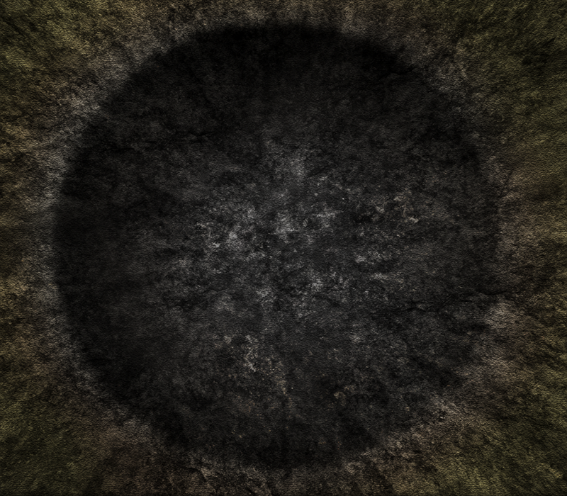
your crater kinda looks like a sphincter at the moment mainly do to where you black shading in the middle is
to give the crater proper relief do the relief shading on the outer circumference of the crater hole
i.e.

you see all the relief shading on the outer
and a overall shading in the lower part to give the right look
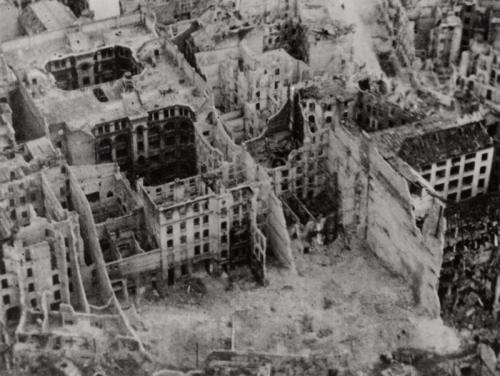
where did you get the sat images from
to give the crater proper relief do the relief shading on the outer circumference of the crater hole
i.e.

you see all the relief shading on the outer
and a overall shading in the lower part to give the right look
where did you get the sat images from
-

 Danyael
- Posts: 352
- Joined: Fri Jul 04, 2008 4:26 pm
- Location: Winnipeg, Manitoba


Re: conquer crater V5 (pg. 1 and 10)
oh! sat is google earth over some randome place in NYC.
So, here's the latest version. It's in BETA. the finished copy will have names , and a legend and some "beautification."
So, here's the latest version. It's in BETA. the finished copy will have names
-
 izacque
- Posts: 34
- Joined: Wed Mar 04, 2009 10:23 pm
- Location: behind you.

Re: conquer crater V5 (pg. 1 and 10)
the lack of comments is disheartening... 
-
 izacque
- Posts: 34
- Joined: Wed Mar 04, 2009 10:23 pm
- Location: behind you.

Re: conquer crater V5 (pg. 1 and 10)
this is, unfortunately, the last installment from me...
version 5.75
version 5.75
-
 izacque
- Posts: 34
- Joined: Wed Mar 04, 2009 10:23 pm
- Location: behind you.

Re: conquer crater V5 (pg. 1 and 10)
sadly, izacque has quit, 
on the brighter side, I am back from my 10 day vacation
well, the artist position is up for grabs again. I think it may be cursed
anyway, good work on the map while i was gone izacque, we will miss you.
on the brighter side, I am back from my 10 day vacation
well, the artist position is up for grabs again. I think it may be cursed
anyway, good work on the map while i was gone izacque, we will miss you.
Woop Woop, i love conquer club, why'd i leave for a year?
Who LIkes finishing what they started?

Who LIkes finishing what they started?

-

 sinctheassasin
- Posts: 490
- Joined: Fri Feb 06, 2009 5:57 pm
- Location: probably in chat room, advertising conquer crater


Re: conquer crater V6 ARTIST WANTED
ill do the artist job
V7 will be out later hopefully
V7 will be out later hopefully
-
 Fredstick
- Posts: 10
- Joined: Mon Feb 09, 2009 6:15 pm
Re: conquer crater V6 ARTIST WANTED
well, you are all we've got, ok!
well, I think we can all agree that the first job would be to...
make the crater look more natural with the city, like it actually happenned there. looks too much like the crater pic was glued on ( so far, depth has been our fatal flaw)
next, i think naming all of these should be a little more creative, and we should be naming them districts (like, historical, industrial etc. )
i personally prefer the zoomed in crater to this, but everybody says otherwise, so this will have to be
I also think that the crater itself lost its power in this new draft. I think we need to be more zoomed in, so that the crater takes up at least 55 percent of the entire map
Woop Woop, i love conquer club, why'd i leave for a year?
Who LIkes finishing what they started?

Who LIkes finishing what they started?

-

 sinctheassasin
- Posts: 490
- Joined: Fri Feb 06, 2009 5:57 pm
- Location: probably in chat room, advertising conquer crater


Return to Melting Pot: Map Ideas
Who is online
Users browsing this forum: No registered users


