Conquer Club

New World Map

Map suggestions, ideas and drafts... They all start life on the Drawing Board.

Moderator: Cartographers

Forum rules
Please read the Community Guidelines before posting.

New World Map

Postby ferranmclaren on Tue May 22, 2018 2:12 pm

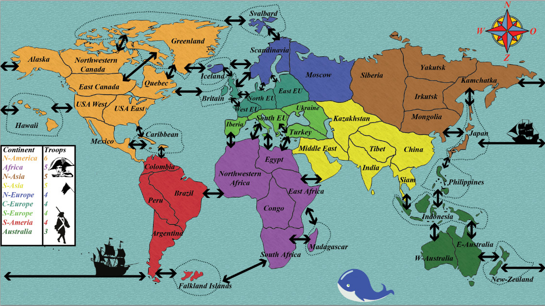
I made this map using Photoshop, everything can still be adjusted. I am hoping this map could be implemented into the game by someone else because I don't think I will be able to do this by myself.
I hope you all like my design and I hope that I have correctly put the links in this topic.


Map Name: Well I am open for good suggestions
Mapmaker(s): Me ferranmclaren
Number of Territories: 50
Special Features: None
What Makes This Map Worthy of Being Made: This map could fill the gap (being of a middle size) between the small world map: Classic and the large world map: World 2.1 , while also giving a new perspective of the layout of the continents with some interesting connections between provinces. The style of the map is based on elements of classical risk maps.

Map Image: https://imageshack.com/a/img921/6231/Xqz0O0.png
Image
User avatar
Corporal ferranmclaren
 
Posts: 6
Joined: Thu Jan 04, 2018 3:03 pm

Re: New World Map

Postby Dukasaur on Tue May 22, 2018 3:30 pm

ferranmclaren wrote:This map could fill the gap (being of a middle size) between the small world map: Classic and the large world map: World 2.1 ,

The Land and Sea map fills this gap nicely already. It's a world map intermediate in size between Classic and World 2.1.

Image

ferranmclaren wrote:I made this map using Photoshop, everything can still be adjusted. I am hoping this map could be implemented into the game by someone else because I don't think I will be able to do this by myself.

It's always possible to find someone to help. For starters, though, you need to be making your map in layers. A single-layered image won't work. I don't know if photoshop supports layers, you may need to start out in something like gimp or inkscape before you go too far. I would really suggest reading the Mapmaker Handbook.
Mapmaker Handbook


ferranmclaren wrote:The style of the map is based on elements of classical risk maps.

It looks very Risk-like, which is the third problem I see. I notice that Hasbro has just pulled its Scrabble and Monopoly licenses from Pogo, which could mean there is going to be a new push this summer for a Hasbro Online. This could be the worst possible time to be putting out anything even remotely Risk-flavoured.
“‎Life is a shipwreck, but we must not forget to sing in the lifeboats.”
― Voltaire
User avatar
Sergeant 1st Class Dukasaur
Community Coordinator
 
Posts: 27714
Joined: Sat Nov 20, 2010 4:49 pm
Location: Beautiful Niagara
32

Re: New World Map

Postby riskllama on Tue May 22, 2018 8:14 pm

i like it, ferran. much better than land & sea.
Image
User avatar
Lieutenant riskllama
 
Posts: 8907
Joined: Thu Jan 30, 2014 9:50 pm
Location: deep inside Queen Charlotte.

Re: New World Map

Postby ferranmclaren on Wed May 23, 2018 3:10 am

I didn't knew the land and sea map. Photoshop uses different layers atm the background is one layer all province names are other layers.
User avatar
Corporal ferranmclaren
 
Posts: 6
Joined: Thu Jan 04, 2018 3:03 pm


Return to Drafting Room

Who is online

Users browsing this forum: No registered users