Very good entries. So many people put so much work into these maps, it's a shame we can only push 1 through. But, at the very least, we have some map artists who are refining their skills, and will hopefully be eager to apply some of these new map styles to something fresh. I think I know who created about 2/3 of the maps, but I'll reserve my guesses until later.
A: I still love Pep's map.
B: Faded colors are nice, but I don't think it works for a Germany map. Personally I prefer darker colors. The subtle patterns and thick black borders are nice. Title is very plain, but I realize that could be improved in the final forge. Overall nice, but pastels do not work.
C: I dislike the drop shadow on the whole map. And I would prefer a coastline, rather than just a floating map on a texture. Good use of colors for a CC map, but again, does not feel German to me. Font is also sort of "teenage girl" looking.
D: A step in the right direction. Very COOL Mountains/Hills. Color choice is excellent. The river looks a bit splotchy. I think it would have looked better with the map extending the whole way across, instead of half way. It would have been mostly black, but I think half the ocean looks a bit strange. Font is good. I dislike the legend. It looks like a quick afterthought. Nice German feel to this map though.
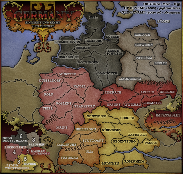
E: Very nice map here. True to the Hoff original. I think this is going to be a strong contender. This map screams Germany. I love the smoothness of the emblem, the Title font is plain, but works, and the minimap legend looks great also. On my laptop, the blacks at the top are a bit hard to differentiate, and perhaps a slightly better territ font could be chosen. Great map though.
F: Wow.. Excellent. Color choice is excellent. Font looks great. Mountains are non-obtrusive, and look great. Those inlays work perfect. And what a Title ! I think the community will love this map. I think this will surely end up in the final 2.
G: Nice, but missing some pizzazz. I think the muted colors are what I notice with this map, along with the mountains that resemble grass. Nice title though

I like the texture you used for the water, and the land.
H: The artist behind map H is getting really good with his style. The relief on the land is very cool. But I think I have more negative than positive feedback here. It is way too difficult to tell bonus regions apart. The font does not work. and besides the Germany map in the upper right, this map does resemble Germany. Even with Einstein in the VW. Colors do not work. The style used here looks like it might be more suited towards web 2.0 graphics. Lots of gradients and smoothness and such. Last thought is that it doesn't flow very well. Looks like items were just placed to fill in empty spaces. So - the "art" of this map is excellent, and one of the best submitted, but the style of the map just will not work. I think the community would not accept this to replace Hoffs/Pep's map.
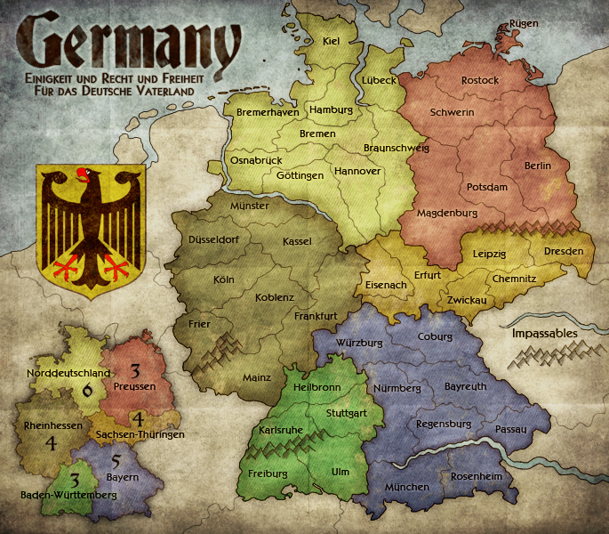
I: Very cool map. This artist looks like he has some experience. The title is simple, but extremely cool. Color choice is good, although I think that a deeper darker color choice might look nicer. Font is perfect. I think the grungy overlay is good, but might just be a tad bit too much. It's sort of overpowering. The mountains are great. and that light diagonal line is a nice touch. And the folds in the background - I'm surprised we haven't seen that yet on a map

Overall this map looks great, and I have a feeling it will be tough to beat.


