Page 1 of 15

NEW RANKS Sugestions. [Poll Added]

PostPosted: Fri Mar 28, 2008 12:09 pm
by Qwert
Well with new revolution, maybe its time for some add new ranks and new(more military) view of Ranks. They could look like shoulder rank insignia.
New adition option-switch to military branches- decide what rank you will be:
For example, you could have 4 switch option in your control panel:
1 option- stay old ranks
2 option- new army ranks
3 option- new navy ranks
4 option- new air ranks

I think that in beginning every new player start with old rank system, and after 5 games, he get additional options open, of course
premium get possibility that change between 3 path(army-navy-air), and Fremium can only have one option to change path (navy).

To be clear :
Premium have 4 branch rank option[old-new air-army-navy]
Fremium have 2 branch rank option[old- and 1 new ]


Image
Image
Image
Image
Image
Image
Image
Image

Re: Ranks

PostPosted: Fri Mar 28, 2008 12:31 pm
by Optimus Prime
I don't see any reason to add five or six new ranks into the system. Seems like overkill to me. The new system is just fine, everyone will stop complaining about it within a week or two.

Re: Ranks

PostPosted: Fri Mar 28, 2008 1:41 pm
by Qwert
Well these is only mine opinion.
Now you have -Lieutenant,Captain,Major,Colonel,brigadier,General and Fiel MArshall over 2000 players.
With these new Score counting you will get only 160 players with high ranks and you will Create hard to get General and Field Marshal rank(now you have one Field Marshal,5 generals,25 brigadier,82 colonel,over 400 major,over 500 Captain,and almost 1000 Lieutenant)and these number can be biger,but i repeat again that these is only mine opinion.

Re: Ranks

PostPosted: Fri Mar 28, 2008 2:01 pm
by gimil
Thats all very well an all, but why is it in foundry discussion?

Moving to the suggestions and bug reports if I dont hear a good reason.

Re: Ranks

PostPosted: Fri Mar 28, 2008 2:04 pm
by yeti_c
Or into the Scoring Adhoc... which is where I assume the new ranks have come from?

C.

Re: Ranks

PostPosted: Fri Mar 28, 2008 2:06 pm
by gimil
Cant move something out of the public eye without permission from you know who :)

Re: Ranks

PostPosted: Fri Mar 28, 2008 2:13 pm
by Qwert
Thats all very well an all, but why is it in foundry discussion?

Moving to the suggestions and bug reports if I dont hear a good reason.


Because these is Artistic view of ranking,and i dont know what these how any conection with bug report?

Re: Ranks

PostPosted: Fri Mar 28, 2008 2:18 pm
by gimil
Its a suggestion, so it should be in suggestion and bug reports. It has nothing to do with the foundry so should not be in foundry dicsussion. You in AADOMM so why dont you go there for a graphics discussion?

moving :)

Re: Ranks

PostPosted: Fri Mar 28, 2008 2:20 pm
by Qwert
AADOMM

What these present?

Re: Ranks

PostPosted: Fri Mar 28, 2008 2:22 pm
by cena-rules
even if we dont change the ranks then change the symbols

these rule

Re: Ranks

PostPosted: Fri Mar 28, 2008 2:23 pm
by yeti_c
qwert wrote:
AADOMM

What these present?


"An Animated Description Of Mr Maps"... it's a usergroup that you are a member of...

C.

Re: Ranks

PostPosted: Fri Mar 28, 2008 2:25 pm
by Qwert
even if we dont change the ranks then change the symbols

these rule

yep you right,with new fresh look of Site,he can refresh new look of ranks to. :wink:

Re: Ranks

PostPosted: Fri Mar 28, 2008 6:11 pm
by ^MsCarolyn^
This is def a different approach. I do like the idea of bringing in new ranks and keep the high ranks high :)


Caro

Re: NEW Ranks

PostPosted: Sat Mar 29, 2008 8:52 am
by Qwert
This is def a different approach. I do like the idea of bringing in new ranks and keep the high ranks high

Yes,present situation is not quit normal,you have 21000 player in scoreboard,and 10% have high ranks(2000 players with Lieutenant,Captain,Major,colonel,brigadier and MArshal ranks)

Re: NEW Ranks

PostPosted: Sat Mar 29, 2008 9:32 am
by Blitzaholic
qwert wrote:I just thinking,that its better to create some new Ranks,to prevent these inflation of high Ranks,because now you have so many High ranked players,and now its quit easy to get High rank.
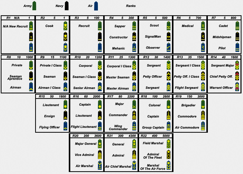
These is mine artistic view to new ranks definition. I hope that these will help Lack to implement some new ranks.
Image


I agree with you qwert on your names and a change, but the ranks I disagree a little, and I would suggest this and I think you are very close, but this may be more realistic, ok

Field Marshall 5000
General 4500
Brigadier 4000
Colonel 3700
Lieutenant Colonel 3500
Major 3200
Captain 3000
Lieutenant 2700
Warrant Officer 2500
Officer Candidate 2200
Sergant 1st Class 2000
Staff Sergant 1800
Corporal 1st Class 1600
Corporal 1400
Specialist 1200
Private 1st Class 1000
Private 800
Cadet 500
Cook 1
New Recruit ?


The reason being is once you get over 3000 score, especially 3500 score and higher it is extremely challenging to maintain and points are so difficult to come by, I think the gaps or separation should be a little closer and I would suggest what I typed in here may be a little more reasonable, but I do like your vision qwert. I would consider something on the lines I what i just mentioned and it is more reasonable, now in a year or 18 months from now, you all could re-examine this, but this would work and being challenging for many for the next year or more. I like the options of more lower ranks too because it is a lot of fun to attempt to shoot right up through them, and each one you hit and go higher feels very successful and quite an accomplishment for those that do. Respects, Blitz

Re: NEW Ranks

PostPosted: Sat Mar 29, 2008 10:00 am
by Shino Tenshi
It would be really nice to see something like this implemented. It makes little sense to bring the point requirements down when point inflation is already making it easier to get higher ranks.

A few of comments for feedback to the proposed system:

1) The specialist icon looks out of place, as otherwise there is a very visible sequence in the icons between cadet and sergeant first class. Is there another private or corporal rank that might be able to replace it?

2) The spread of points between private and private first class really should be 100. It makes the first sense of accomplishment (and first hooks of addiction to the site :D ) much more obtainable.

3) The spread of points higher up should be evened out a bit. Perhaps in 200, then 300, then 400, 500, and 1000 point increments as you go higher up. I think most people in the 2000+ range are active enough that 200 points can come and go within a few hours to a couple of days. Having increasingly large point spreads in the higher ranks makes sense.

4) Perhaps a good spread for would be cook 1, 800, 1000, 1100, 1200, 1300, 1400, 1500, 1600, 1800, 2000, 2300, 2600, 3000, 3400, 4000, 4600, 5300, 6000? Some reasoning for this spread (which has specialist removed to solve the icon being out of place) are that 1000 is the starting point, which should be private; 1800/2000 seems like a good point to start increasing the point spread to get into the beginning officer ranks; 6000 seems like a good unobtainable goal for now that should be obtainable within a year or two; and the increasing spread makes it harder for the lower rank officers to go up in rank, since 200 points really is too easy at that level, and makes it easier for the higher officer ranks so that the goals are at least obtainable with a lot of hard work.

5) I've often wondered about more ranks for the cadet and lower levels. I think it would be good to offer those that are below 1000 some rank options as well, instead of lumping all of the people with a score of 200, 500, and 799 into the same group. I'm sure that there are different ranks within army cadets that could be used? Perhaps something as simple as one, two, and three straight bars for the graphics? A point spread of 1, 500, 700, and 900 for cook, cadet 1, cadet 2, and cadet 3?


I think that about covers it. If the main reason why Lack hasn't put in more ranks is because he lacks the icons, then I think that the proposed icons look good, with the exception of specialist, which doesn't really match the colour scheme that the rest of the icons do. Some icons, I think, seem a bit wide or a bit too tall to fit into the space that's allotted for the icon, but that is something that is easily fixed.

I for one would really like to see something like this put into place. It would help make the lower ranked players happy by giving them easier to obtain ranks (100pts per rank) up until the officer ranks. It would also make the higher ranked players happy by allowing them to maintain an sense of accomplishment.
Re: NEW Ranks

PostPosted: Sat Mar 29, 2008 2:14 pm
by Qwert
blitz you forget Sergeant.I think that 5000 for Marshall its quit close for some player now,we must look up to future,because i belive that present number now(21000) will grow more and that why i take 6000 pt for Marshall,ofcourse from 1 to 6000 pt,we can sugested many other point option.

Reply to Shino tenshi
1)well i can try to create something what it better fit for these rank. I realy dont know other rank name bettwen Corporal and private first rank(In UK army bettwen OR-4 and OR-3 you dont have any rank,but in US army you have rank Specialist)
2)these is no problem,its can change
3)4)i will se how these look
5)I must say that i dont find any smaler rank then private.But maybe we can create some ranks,like Cook who are not army rank.Maybe "Night Guard"who can be above Cook and belove Cadet. Or "Driver" who can be above Cook and Belove Night Guard,or some other names.

I must say that i realy dont know present Icon dimension space,and i create Rank icons to be close to present rank icons. Like i say Specialist icon can be arange to fit with others ranks.

Re: NEW RANKS-page 1

PostPosted: Sat Mar 29, 2008 3:49 pm
by Ditocoaf
sigh...
the reason more people are in high ranks is because there are more people in CC.
the reason you're finding it easier to maintain a high rank is because you're getting better.
Almost a quarter of active players are chefs... so I wish people would stop talking about inflation already, as if having only an elite few able to succeed here is a good thing. People say that scores always tend to go up over time, but this can't be true, because every time you gain points, someone's losing them.

Re: NEW RANKS-page 1

PostPosted: Sat Mar 29, 2008 8:12 pm
by Herakilla
i am all for this idea, i feel i would actually start trying to get points if this was implemented

Re: NEW RANKS-page 1

PostPosted: Sat Mar 29, 2008 8:54 pm
by Tieryn
Ditocoaf wrote:sigh...
the reason more people are in high ranks is because there are more people in CC.
the reason you're finding it easier to maintain a high rank is because you're getting better.
Almost a quarter of active players are chefs... so I wish people would stop talking about inflation already, as if having only an elite few able to succeed here is a good thing. People say that scores always tend to go up over time, but this can't be true, because every time you gain points, someone's losing them.


Yes... but every time a new player signs up, that's 1000 more points added to the possible points pool.

This is without doubt going to lead to people having more points... but I don't necessarily think that's a bad thing. Having only just managed to get up to captain for the first time recently (with the points drop!), and still holding on to my lieutenant at the moment, I actually think it's a good reward for those of us who aren't hardcore addicts, but are strong casual addicts, to be able to hold a fairly respectable rank and maintain it. The very nature of an army (as the ranks are organised) is the more you have at the bottom, the more you -need- at the top... But yes, we don't want to get top heavy...

There needs to definitely be a stretch at the top, to accommodate future growth and give those up the top something to aim for, but I don't think that should come at the expense of those of us who hover around 1800-2200, and still think there should be an officer level around the 1800 mark.

That said, I really like the graphics, and the concept is sound, but the numbers will need a little examining.

Re: NEW RANKS-page 1

PostPosted: Sat Mar 29, 2008 10:03 pm
by Kaplowitz
I like out current graphics. They are more clean, with thinner edges and less blurry. Also, if you want to re-do them, dont take any of the old ones. they look out of place when compared to the rest.

Re: NEW RANKS-page 1

PostPosted: Sun Mar 30, 2008 8:08 am
by Qwert
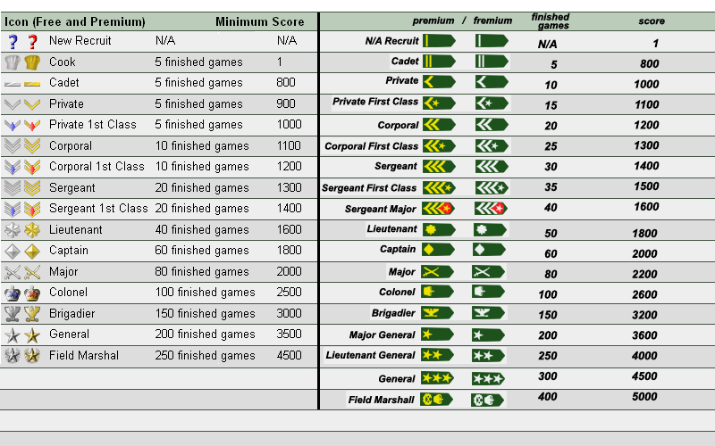
I think that with change rank of Private and private first class,Specialist now fit with others ranks
Image


by Kaplowitz on Sun Mar 30, 2008 5:03 am

I like out current graphics. They are more clean, with thinner edges and less blurry. Also, if you want to re-do them, dont take any of the old ones. they look out of place when compared to the rest.

What you mean? To create complete new ranks? I think that no need for that. Add new ranks and redesing old ranks,its only what need(these is what i think).

Re: NEW RANKS-page 1

PostPosted: Sun Mar 30, 2008 9:26 am
by gimil
These images you have presented qwerts are just a white wash of bevel not used very effectivly. THe results of this is an unrealistic 3D effect and a good bit of blurring.

Re: NEW RANKS-page 1

PostPosted: Sun Mar 30, 2008 9:41 am
by Qwert
gimil
These images you have presented qwerts are just a white wash of bevel not used very effectivly. THe results of this is an unrealistic 3D effect and a good bit of blurring.

If i understand,you say that these what i present its worst then present Icons,right.
Strange,i have some filing that old icons is look very old,and that mine is much better.
Well these is only sugestion,and if these look worst,then someon else maybe can better present better sugestion for new ranks.

Image

Re: NEW RANKS-page 1

PostPosted: Sun Mar 30, 2008 10:11 am
by gimil
I didnt say they were bad. I like the stripe ranks you have. Its the way you've used the bevel on the officer badges that I dont like. But to be honest I still prefer the clean crisp image or the current ones. Sorry