

Conquer Club

WWII:Poland [Quenched]

Care to peruse completed maps? Take a stroll through the Atlas.

Moderator: Cartographers

Forum rules
Please read the Community Guidelines before posting.

Re: Poland 1922 -- V1 -- 17/12/08

Postby the.killing.44 on Tue Dec 16, 2008 11:51 pm

First Glance Post:

Good idea, will probably need some impassability. However, I can't read the terit names without straining my eyes.

Can I ask, what's the deal with the year maps? Not criticism, just wondering…
User avatar
Captain the.killing.44
 
Posts: 4724
Joined: Thu Oct 23, 2008 7:43 pm
Location: now tell me what got two gums and knows how to spit rhymes

Re: Poland 1922 -- V1 -- 17/12/08

Postby Incandenza on Tue Dec 16, 2008 11:51 pm

What's so special about Poland in 1922?
THOTA: dingdingdingdingdingdingBOOM

Te Occidere Possunt Sed Te Edere Non Possunt Nefas Est
User avatar
Colonel Incandenza
 
Posts: 4949
Joined: Thu Oct 19, 2006 5:34 pm
Location: Playing Eschaton with a bucket of old tennis balls

Re: Poland 1922 -- V1 -- 17/12/08

Postby samuelc812 on Tue Dec 16, 2008 11:53 pm

Incandenza wrote:What's so special about Poland in 1922?


The Territories are based on Poland in 1922 - 1939 (before the war) and so i just put 1922, the regions have probably changed since then?
User avatar
Captain samuelc812
 
Posts: 2215
Joined: Sun Dec 30, 2007 6:56 am

Re: Poland 1922 -- V1 -- 17/12/08

Postby Incandenza on Tue Dec 16, 2008 11:59 pm

samuelc812 wrote:
Incandenza wrote:What's so special about Poland in 1922?


The Territories are based on Poland in 1922 - 1939 (before the war) and so i just put 1922, the regions have probably changed since then?


It's just that it's kind of a weak theme... actually, it's not really much of a theme at all. A Poland map isn't a bad idea, but there's much more you could do with it than just giving us a snapshot of the legislative districts. For instance, there's always the medieval kingdom of Poland-Lithuania
THOTA: dingdingdingdingdingdingBOOM

Te Occidere Possunt Sed Te Edere Non Possunt Nefas Est
User avatar
Colonel Incandenza
 
Posts: 4949
Joined: Thu Oct 19, 2006 5:34 pm
Location: Playing Eschaton with a bucket of old tennis balls

Re: Poland 1922 -- V1 -- 17/12/08

Postby samuelc812 on Wed Dec 17, 2008 12:05 am

Incandenza wrote:
samuelc812 wrote:
Incandenza wrote:What's so special about Poland in 1922?


The Territories are based on Poland in 1922 - 1939 (before the war) and so i just put 1922, the regions have probably changed since then?


It's just that it's kind of a weak theme... actually, it's not really much of a theme at all. A Poland map isn't a bad idea, but there's much more you could do with it than just giving us a snapshot of the legislative districts. For instance, there's always the medieval kingdom of Poland-Lithuania


If i was to do that, it would no longer be a map of Poland, i would like to stick to just Poland, although i agree that there could be a better theme, any other ideas?
User avatar
Captain samuelc812
 
Posts: 2215
Joined: Sun Dec 30, 2007 6:56 am

Re: Poland 1922 -- V1 -- 17/12/08

Postby Premier2k on Wed Dec 17, 2008 3:23 am

I like the idea of a poland map.

A couple of things I've noticed though.

1) I don't like the font though, I can't quite make out the names. Can you sharpen it a little or change the font?

2) It's very hard to see the difference in colur between Lublin and Lodz, can you change the colours on these?

Prem.

EDIT: I don't think it has to have a theme, there are plenty of country maps that are just just country maps and don't have themes at all. Keep this one going!
User avatar
Cadet Premier2k
 
Posts: 492
Joined: Tue Oct 02, 2007 5:53 am

Re: Poland 1922 -- V1 -- 17/12/08

Postby MrBenn on Fri Dec 19, 2008 10:25 am

This map has a lot more promise than the Med Basin one.

If you're going for a '1922' theme, then you should try and capture a feel of that era. Poland has had several boundary changes as a result of the World Wars, and the current area known as poland is substantially different from the area you have depicted... If you want to stick to a straight-up geographical map, why not use contemporary geography? I'd much rather you got a completely solid idea of what you wanted to achieve, and then work towards that goal ;-)
Image
PB: 2661 | He's blue... If he were green he would die | No mod would be stupid enough to do that
User avatar
Lieutenant MrBenn
 
Posts: 6880
Joined: Wed Nov 21, 2007 9:32 am
Location: Off Duty

Re: Poland 1922 -- V1 -- 17/12/08

Postby RjBeals on Fri Dec 19, 2008 10:42 am

i don't know. It's a fine basic map. But I'm starting to think the CC is saturated already with this type of map. There seems to be a lot of discussion about themes nowadays. Maybe we should move in that direction?
Image
User avatar
Private RjBeals
 
Posts: 2506
Joined: Mon Nov 20, 2006 5:17 pm
Location: South Carolina, USA

Re: Poland 1922 -- V1 -- 17/12/08

Postby LED ZEPPELINER on Fri Dec 19, 2008 8:55 pm

I think that this map will need impassables, more clear font, and a bigger different between the bonus colors
Sergeant LED ZEPPELINER
 
Posts: 1088
Joined: Tue Nov 25, 2008 10:09 pm

Re: Poland 1922 -- V1 -- 17/12/08

Postby cairnswk on Sun Dec 28, 2008 6:46 am

Samuel...you have a brilliant opportunity to turn this map of Poland into a WWII theme with the invasion of Poland from Germany....that could be a very good theme, but you'd need to do some good research to determine how the gameplay would work.
I am sure you'd have good backing from the foundry regulars if you moved into this theme.
you could have Warsaw being bombed from German Luftwaffe....and the troops moving in across a couple of places on the border to replicate some impassables.
Image
* Pearl Harbour * Waterloo * Forbidden City * Jamaica * Pot Mosbi
User avatar
Private cairnswk
 
Posts: 11510
Joined: Sat Feb 03, 2007 8:32 pm
Location: Australia

Re: Poland 1922 -- V1 -- 17/12/08

Postby sailorseal on Fri Jan 09, 2009 11:25 pm

Great map all around I think I would only do minor tweaks on the bonus scale
User avatar
Cook sailorseal
 
Posts: 2735
Joined: Sun May 25, 2008 1:49 pm
Location: conquerclub.com

Re: Poland 1922 -- V1 -- 17/12/08

Postby herschal on Mon Jan 19, 2009 8:57 pm

Is this map still being worked on? I thinkl it is good and has potential but it needs a few things.
    Impassibles
    more of a 1920's look
    something that makes it look less dull
Private herschal
 
Posts: 42
Joined: Sat Dec 15, 2007 8:41 am

Re: WWII: The Invasion of Poland -V1- 20/1/09

Postby samuelc812 on Mon Jan 19, 2009 10:19 pm

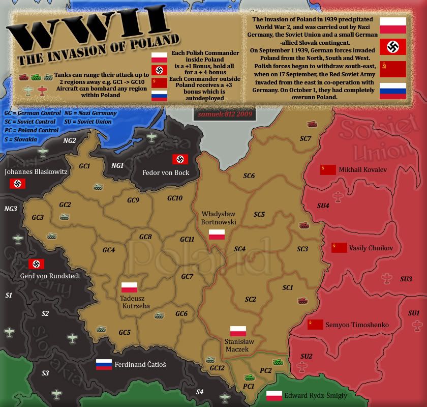
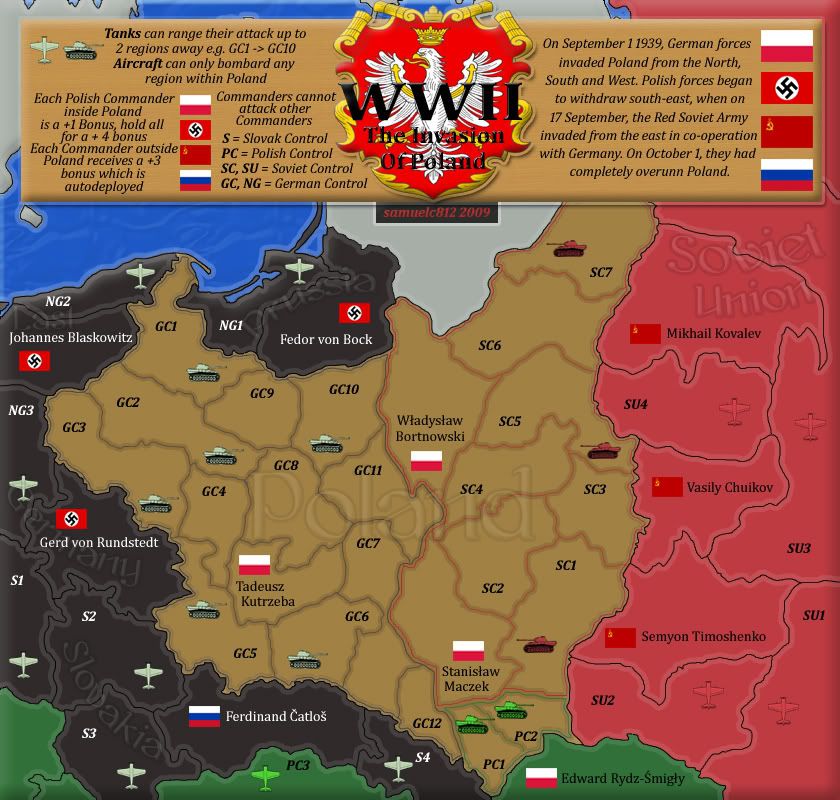
WWII: The Invasion of Poland

What you need to know:
Map-Maker: samuelc812
Map Title: WWII: The Invasion of Poland
Continents: N/A
Regions: 43
Gameplay:
  • Every Player Starts with a Commander outside of Poland, there are 8 of them each one receives a +3 autodeployed bonus each turn.
  • Holding a Polish Commander get's a bonus of +1, Holding all 3 get's +4 bonus.
  • Aircraft can bombard any territory within Poland including Polish Commanders.
  • Tanks can range their attack up to 2 regions.
  • There are no continent bonuses.

Version One:
Click image to enlarge.
image


Feedback Please :)
User avatar
Captain samuelc812
 
Posts: 2215
Joined: Sun Dec 30, 2007 6:56 am

Re: WWII: The Invasion of Poland -V1- 20/1/09

Postby Natewolfman on Tue Jan 20, 2009 12:11 am

I didnt see your original idea, but i like the WWII one =D> looking good keep it up!
User avatar
Sergeant 1st Class Natewolfman
 
Posts: 4599
Joined: Wed Aug 29, 2007 6:37 pm
Location: omaha, NE

Re: WWII: The Invasion of Poland -V1- 20/1/09

Postby Juan_Bottom on Tue Jan 20, 2009 5:24 am

Yeah where is all the feedback?

IMHO Samual812 has a definite talent at making maps.

I could be wrong here in my presumptions, but doesn't the Polish Air Force deserve at least 1 plane? I don't know how/if they did defend their homeland, but certainly the Polish had an air force to call upon.

And it seems to me that the +3 is a pretty high bonus. Especially when you consider how close they are to each other.
User avatar
Sergeant 1st Class Juan_Bottom
 
Posts: 1110
Joined: Mon May 19, 2008 4:59 pm
Location: USA RULES! WHOOO!!!!

Re: WWII: The Invasion of Poland -V1- 20/1/09

Postby samuelc812 on Tue Jan 20, 2009 5:42 am

Juan_Bottom wrote:I could be wrong here in my presumptions, but doesn't the Polish Air Force deserve at least 1 plane? I don't know how/if they did defend their homeland, but certainly the Polish had an air force to call upon.


They probably did and i am not against putting a polish plane in, but i am unsure as of yet where i would put it. The map depicts the Polish withdrawal to the South-East (green) so i doubt they would be doing much stuff in the air. But if there is enough support we can figure something out.


Juan_Bottom wrote:And it seems to me that the +3 is a pretty high bonus. Especially when you consider how close they are to each other.


Remember there are no continent bonuses, So each player having a home and getting an auto-deploy will make gameplay more interesting. I am going to make it so Commanders can't attack each other, so players won't get killed in the first Round.
User avatar
Captain samuelc812
 
Posts: 2215
Joined: Sun Dec 30, 2007 6:56 am

Re: WWII: The Invasion of Poland -V1- 20/1/09

Postby samuelc812 on Tue Jan 20, 2009 5:25 pm

Surely there is more feedback than this :)
User avatar
Captain samuelc812
 
Posts: 2215
Joined: Sun Dec 30, 2007 6:56 am

Re: WWII: The Invasion of Poland -V1- 20/1/09

Postby the.killing.44 on Tue Jan 20, 2009 6:29 pm

Nice one! A whole new map than the first one I saw, which to be honest didn't have much life in this. This, on the other hand, is vibrant and really draws me to it, although I am an avid WWII buff so that might help a bit :) . Some quick thoughts I will leave you with on this:

I would recommend thinking about just using the commanders' last names, just for the sake of territory names and the XML. You could always just use the last names in the XML and the full names on the actual map, but that could confuse some people.

I'm not really feeling the fuzzy static-like outline on the border.

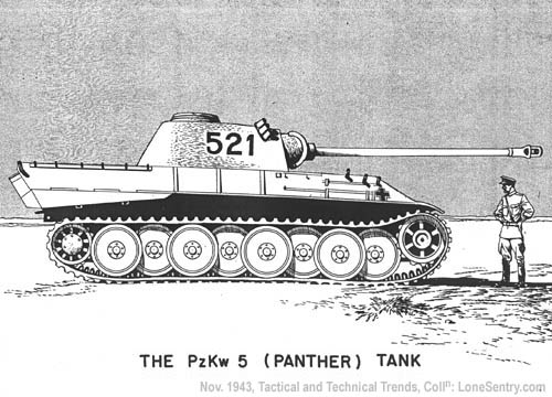
I'd like to see a better representation of tanks than what you have — something more WWII. Some suggestions for outlining:
German Panzer (Panther)
Image

German Tiger
Image

Russian T-34
Image

I really like this map!

.44

P.S. to anyone who is wondering/thinks they're right (and I know someone will say this), the lowercase 'L's of the Pole commanders are supposed to have the little strike through them ;)
User avatar
Captain the.killing.44
 
Posts: 4724
Joined: Thu Oct 23, 2008 7:43 pm
Location: now tell me what got two gums and knows how to spit rhymes

Re: WWII: The Invasion of Poland -V1- 20/1/09

Postby cairnswk on Tue Jan 20, 2009 9:04 pm

samuelc812 wrote:Surely there is more feedback than this :)

Yes, there is more feedback, and here is a big whack....good stuff ;)

As you know i am all for this map, it's a very good to start from where you were previously with the original version.

Juan_Bottom wrote:....
I could be wrong here in my presumptions, but doesn't the Polish Air Force deserve at least 1 plane? I don't know how/if they did defend their homeland, but certainly the Polish had an air force to call upon...


From: http://history.howstuffworks.com/world- ... /printable
As soon as the invasion began, the German air force began attacking the Polish air force and its bases, bombing and strafing roads and railways, and bombing Poland's factories. Within four days Poland's air force was destroyed.

Juan_Bottom is indeed correct, and could use a representation on the map. The Polish Air Force was very active in other theatres of WWII, so if the green at the bottom represents fleeing Poland as has been suggested, then you could place a one-way attack to another one of those green terts that isn't named yet to represent the Air Force to give them two terts.

Some barbed-wire would possibly go astray as impassables on the borders, as i believe this is what was used in many places to stop people escaping over borders.

I know it's only early days for you on this one, and I am sure there will be plenty of feedback coming,...
* the black text on the blue is a bit awkward to read; perhaps look at incorporating that into the legend somehow.
* a suggestion for some tanks for Germany and Russia - invasion forces
* What about the Polish underground. Do some further research, and see if there is anything on that front that can be used in this map, it would assist in the overall essence of this country.
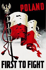
* Perhaps also use the Polish Eagle here on this poster in your legend somehow:
Image

Excellent re-start. :)
Image
* Pearl Harbour * Waterloo * Forbidden City * Jamaica * Pot Mosbi
User avatar
Private cairnswk
 
Posts: 11510
Joined: Sat Feb 03, 2007 8:32 pm
Location: Australia

Re: WWII: The Invasion of Poland -V1- 20/1/09

Postby samuelc812 on Wed Jan 21, 2009 5:19 pm

I am working on the next draft and incorporating the things which you suggested... Meanwhile any other feedback :)
User avatar
Captain samuelc812
 
Posts: 2215
Joined: Sun Dec 30, 2007 6:56 am

Re: WWII: The Invasion of Poland -V1- 20/1/09

Postby samuelc812 on Sat Jan 24, 2009 1:31 am

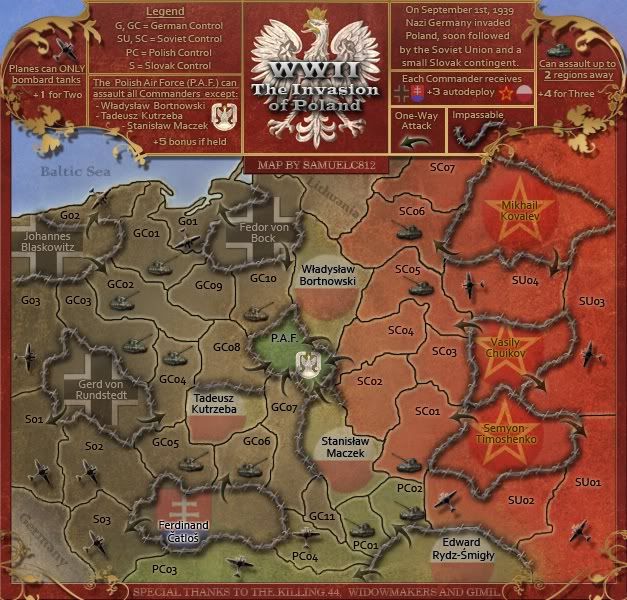
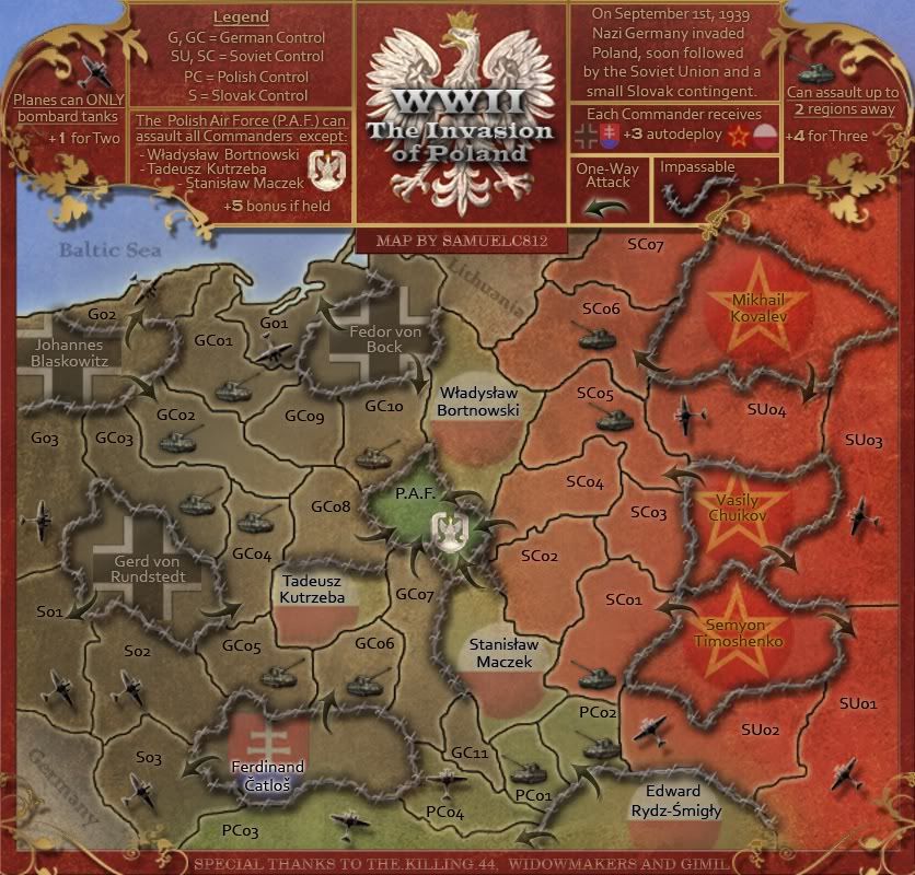
Version 2

Changes:
  • Improved Title with Polish Coat of Arms
  • Improved Legend
  • Improved Tanks
  • Added Polish Plane

Click image to enlarge.
image
User avatar
Captain samuelc812
 
Posts: 2215
Joined: Sun Dec 30, 2007 6:56 am

Re: WWII: The Invasion of Poland -V2- 24/1/09

Postby cairnswk on Sat Jan 24, 2009 2:28 am

Wow, looking very nice. Good work. :)
Now...down to business, see what you can make of these suggestions.
1. You've got the large map at 840px...is there any need for it to be that large, as there is a lot of large empty real estate, and i'm not saying there shouldn't be, but the map size is at the extremity of the limits for only a small number of terts.
2. Can the PC3 plane only attack into Poland?
3. The red planes on the Soviet Union don't kind of stand out, perhaps gray like the German Planes.
4. You know what i did with the heading in Das Scloss?....well now i liked to see something similar with the big brown square, but in the fashion of the emblem. It does look a little unattractive as such a large rectangle, your map has some very nice curvy lines, and a heading in similar style would look much better IMHO.
5. Is there any reason you chose the brown for the header?
6. In order for the text "The invasion of Poland" to be seen against that beackground, i think the emblem could have the opacity changed so that it's a faded emblem on that background.
7. Why is WWII so large, is the map not about the invasion of poland...i would think that should be the larger.
8. i take it you didn't like anything about the Polish underground, or didn't you bother, or did you think it might complicate the map?
Don't forget to rest...and keep up the great work. :)
Image
* Pearl Harbour * Waterloo * Forbidden City * Jamaica * Pot Mosbi
User avatar
Private cairnswk
 
Posts: 11510
Joined: Sat Feb 03, 2007 8:32 pm
Location: Australia

Re: WWII: The Invasion of Poland -V2- 24/1/09

Postby samuelc812 on Sat Jan 24, 2009 2:52 am

Thanks for commenting :)

cairnswk wrote:Wow, looking very nice. Good work. :)
Now...down to business, see what you can make of these suggestions.
1. You've got the large map at 840px...is there any need for it to be that large, as there is a lot of large empty real estate, and i'm not saying there shouldn't be, but the map size is at the extremity of the limits for only a small number of terts.

I guess you're right i just thought i would make it at it's extremity so i could have some more detail, but i'll see what i can do ;)
cairnswk wrote:2. Can the PC3 plane only attack into Poland?

Yes, Should it not?
cairnswk wrote:3. The red planes on the Soviet Union don't kind of stand out, perhaps gray like the German Planes.

I guess that could work :) But then i would have to change the Red Tanks as well to tie in ;)
cairnswk wrote:4. You know what i did with the heading in Das Scloss?....well now i liked to see something similar with the big brown square, but in the fashion of the emblem. It does look a little unattractive as such a large rectangle, your map has some very nice curvy lines, and a heading in similar style would look much better IMHO.

I'll see what i can do ;)
cairnswk wrote:5. Is there any reason you chose the brown for the header?

I chose brown because it was the only colour i thought would look good, but looking at it now i'm having second thoughts.
cairnswk wrote:6. In order for the text "The invasion of Poland" to be seen against that beackground, i think the emblem could have the opacity changed so that it's a faded emblem on that background.

I agree completely ;)
cairnswk wrote:7. Why is WWII so large, is the map not about the invasion of poland...i would think that should be the larger.

Very True ;)
cairnswk wrote:8. i take it you didn't like anything about the Polish underground, or didn't you bother, or did you think it might complicate the map?

I thought it mite complicate the map, which isn't really what i wanted to do, sorry ;)
Don't forget to rest...and keep up the great work. :)

I'll try :lol:
User avatar
Captain samuelc812
 
Posts: 2215
Joined: Sun Dec 30, 2007 6:56 am

Re: WWII: The Invasion of Poland -V2- 24/1/09

Postby cairnswk on Sat Jan 24, 2009 3:23 am

samuelc812 wrote:
cairnswk wrote:2. Can the PC3 plane only attack into Poland?

Yes, Should it not?

Well, i guess it should as it was meant to represent the out-of-poland pilots.

But what did you think about the idea of having the polish air force in poland also on one tert to represent the attack proper when the luftwaffer initally attacked?

cairnswk wrote:3. The red planes on the Soviet Union don't kind of stand out, perhaps gray like the German Planes.

I guess that could work :) But then i would have to change the Red Tanks as well to tie in ;)

OK.


cairnswk wrote:5. Is there any reason you chose the brown for the header?

I chose brown because it was the only colour i thought would look good, but looking at it now i'm having second thoughts.

yeah, look see what others think first before you go changing it...they might like it.

cairnswk wrote:8. i take it you didn't like anything about the Polish underground, or didn't you bother, or did you think it might complicate the map?

I thought it mite complicate the map, which isn't really what i wanted to do, sorry ;)
OK. that's cool.
Image
* Pearl Harbour * Waterloo * Forbidden City * Jamaica * Pot Mosbi
User avatar
Private cairnswk
 
Posts: 11510
Joined: Sat Feb 03, 2007 8:32 pm
Location: Australia

Next

Return to The Atlas

Who is online

Users browsing this forum: No registered users