[Official] Brazil REVAMP [Quenched]
Now Available on the START A GAME SCREEN!



 .
.
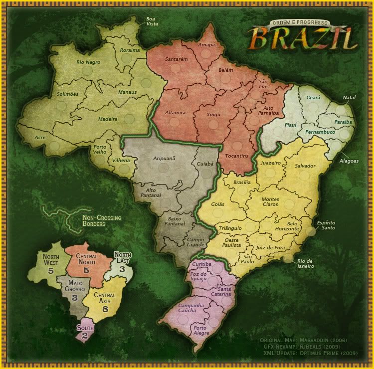
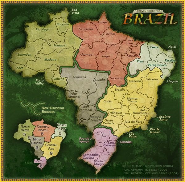
The 2 images above are my final images. I think this map has lived it's life. I've addressed all feedback and fixed what needed fixed. I'm done with this map. I've gotten some really positive feedback from it - I think when it's launched the general site will favor it over Marv's. Hope you guys understand, but I don't have the time or patience anymore to nit-pick this map apart. If there is a graphical problem relating to the xml, then let me know - otherwise, I've completed this map.
----------------------------------------------------------------------------------------------------------
----------------------------------------------------------------------------------------------------------
ORIGINAL POST
Previous Maps
http://www.rjbeals.com/Brazil/Brazil-RjBeals-Rev-03.jpg
http://www.rjbeals.com/Brazil/Brazil-Rj ... ound2a.jpg[
Original (Marv's) Brazil
http://www.conquerclub.com/maps/Brazil.L.jpg
Wow.. 385 votes! I guess the community likes the map. I know Marv has some issues with this map.
I would like to discuss the tilt, the background (green) and the title a little more. If you are absolutely firm about not having a tilt on the map, then I'll rework it - but I feel it doesn't take away from the map. I wonder what the "reactions in the Portuguese forum" were all about?


 .
.The 2 images above are my final images. I think this map has lived it's life. I've addressed all feedback and fixed what needed fixed. I'm done with this map. I've gotten some really positive feedback from it - I think when it's launched the general site will favor it over Marv's. Hope you guys understand, but I don't have the time or patience anymore to nit-pick this map apart. If there is a graphical problem relating to the xml, then let me know - otherwise, I've completed this map.
----------------------------------------------------------------------------------------------------------
----------------------------------------------------------------------------------------------------------
ORIGINAL POST
Previous Maps
http://www.rjbeals.com/Brazil/Brazil-RjBeals-Rev-03.jpg
http://www.rjbeals.com/Brazil/Brazil-Rj ... ound2a.jpg[
Original (Marv's) Brazil
http://www.conquerclub.com/maps/Brazil.L.jpg
Wow.. 385 votes! I guess the community likes the map. I know Marv has some issues with this map.
Marvaddin wrote:RJ, like I said before, I intend to use the veto "super"-powers to the tilt, and this because a simple reason: Im not minimally convinced its necessary. It doesn't change too much the map proportions like it did to Portugal and Italy (and even doing that, its not something people from a country would love; I saw some of the reactions in the Portuguese forum, and I agree to them). See, you can decrease or remove the square around the map, put the image borders nearer to the map, decrease even the map a bit, because in most territories we have free space. Im sure you can do it without the tilt.
About the colours in the title, and the lack of national symbol, well, if your map really wins, we can discuss it properly. Like someone said, we have now 2 legends. I love the minimap, but I know we need have the continent names. How about putting them in the minimap, having some free space to the flag? Well, eliminating the tilt we will anyway have some free space in the bottom right corner. And the title, well, I can live with that, but before we can see what are the options having green and yellow only, or with blue. If this one is really the best... well, we will see.
A little suggestion: although I like the background, Brazil is not a big jungle like some people think. We have cities with +10M people, factories, etc. What you think about having the jungle in one side of the background (W side, preferentially) and other things (like even the ocean) in the other?
Beyond that, some misspelled names, and the letters "p" and "g" being a bit alike, I loved the map! Congratulations!
I would like to discuss the tilt, the background (green) and the title a little more. If you are absolutely firm about not having a tilt on the map, then I'll rework it - but I feel it doesn't take away from the map. I wonder what the "reactions in the Portuguese forum" were all about?
