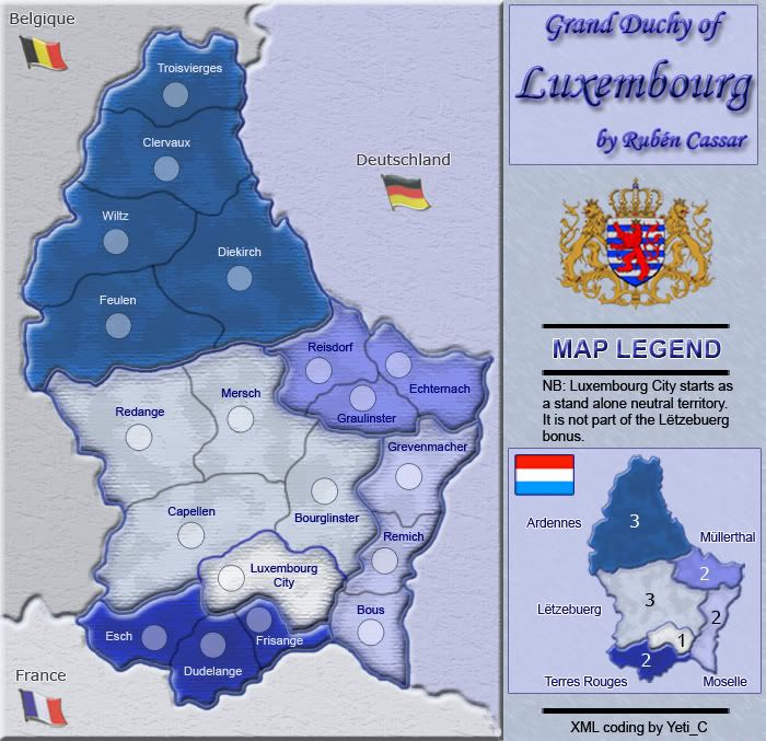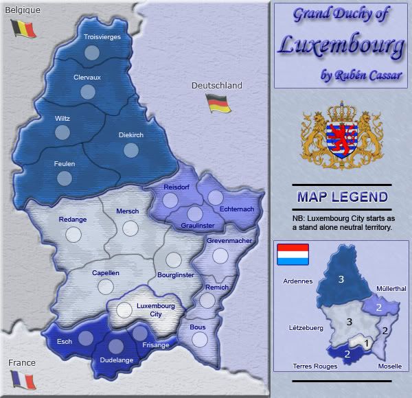


Territories: 19 (18 + 1 neutral)
Regions: 5
Special Bonuses: Luxembourg City will start as a neutral (3) and whoever conquers it gets +1.
Impassable Objects: Since this is a very small map I was thinking that I should not include any impassable objects to make the gameplay fast.
I have added some textures to the bordering states and put up a poll. I kept the textures subtle on purpose because I don't want to affect the simplicity of the map or detract the attention from Luxembourg itself.
Version 1.13 Small

Version 1.13 Big

Version 1.12 - New texture for bordering states

Version 1.11a - New flags
http://i287.photobucket.com/albums/ll127/Ruben_Cassar/Luxembourg111a.jpg
Version 1.10 - New bonuses, region renamed to Lëtzebuerg, new title and minor graphical refinements
http://i287.photobucket.com/albums/ll127/Ruben_Cassar/Luxembourg110.jpg
Version 1.9 - Added region names to the mini map
http://i287.photobucket.com/albums/ll127/Ruben_Cassar/Luxembourg19.jpg
Version 1.8 - New mini map, refined coat of arms, changed territory name, added flag to mini map.
http://i287.photobucket.com/albums/ll127/Ruben_Cassar/Luxembourg18.jpg
Version 1.7
http://i287.photobucket.com/albums/ll127/Ruben_Cassar/Luxembourg17.jpg
Version 1.6
http://www.uploadgeek.com/uploads456/0/Luxembourg1.6.jpg
Version 1.5
http://www.uploadgeek.com/uploads456/0/Luxembourg1.5.jpg
-----------------------------------------------------------------------------------------------------------------------------------------------------
I want to make a Luxembourg map.
However I was thinking of keeping the territory number low. I was thinking 18 like Doodle Earth. I remember I was very sceptical when Doodle Earth was being made and I objected against such a low number of territories, however it seems to be very popular and the concept seems to have worked.
Is there demand for a map with 18 territories for quick games and 1vs1? Give me your feedback and I'll decide if this is the way to go for this map.


