Page 1 of 25

Rail Europe [Quenched]

PostPosted: Sat Sep 01, 2007 8:52 am
by cairnswk
RAIL EUROPE

Image Image Image Image Image Image

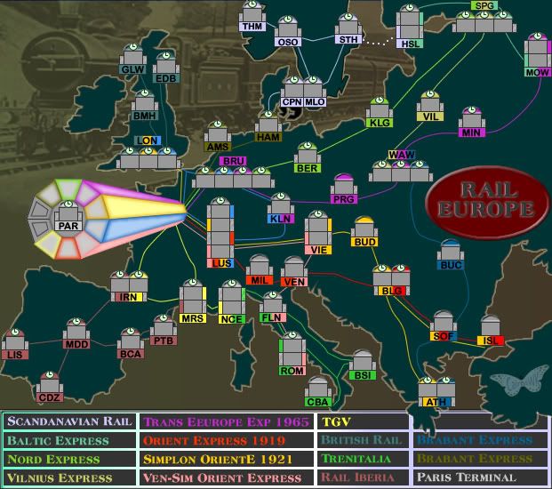
* This is a cross section of trains that have run across the last 100 years or more, with a small creative artistry to connect in a couple of cases.
* The Flying Scotsman features in the background.
* The stations are modelled on the Helsinki and Paris Gard du Nord station (hope this appeals)
* There is a special station on this map at Copenhagen/Malmo (noted on this map as a single station but in reality connect two countries)

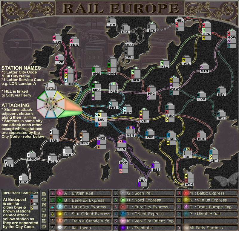
Current Version 34 - updated
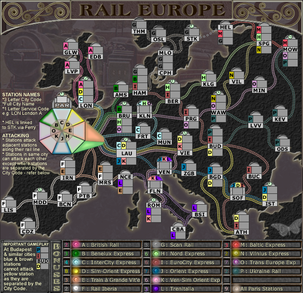
Image

Click image to enlarge.
image


Why?

There is already an American version, so let's no leave our European colleagues out of the picture.

CONCEPT
The next in the RAIL series, this map is slightly more complicated than it's American cousin.

Here is a list of continents and territories:

Numbers of Territories: 83
Continents: 17

(6)Scandanavian Express
Copenhagen-Malmo-Stockholm-Oslo-Tronheim-Helsinki

(3)Baltic Express
Moscow-St Petersburg-Helsinki

(5)Nord Express
Paris-Brussels-Berlin-Kalingrad-St Petersburg

(3)Vilnius Express
Warsaw-Vilnius-St Petersburg

(6)TEE 1965
Paris-Brussels-Prague-Warsaw-Minsk-Mowcow

(7)Orient Express 1919
Paris-Luasanne-Milano-Venice-Belgrade-Sofia-Istanbul

(8)Simplon Orient Express
Paris-Luasanne-Vienna-Budapest-Belgrade-Athens-Sofia-Istanbul

(6)Ven-Sim Orient Express
Paris-Luasanne-Vienna-Venice-Florence-Rome

(4)TGV
Paris-Irina-Marseilles-Nice

(4)British Rail
London-Edbinburgh-Birmingham-Glascow

(5)Trenitalia
Nice-Florence-Rome-Calabria-Brendissi

(6)Rail Iberia
Irina-Madrid-Barcelona-Port Bou-Lisbon-Cadiz

(4)Brabant Express
Paris-Brussels-Amsterdam-Hamburg

(4)Ukraine Express
Athens-Sofia-Bucharest-Warsaw-Kiev-Moscow

Original Version
Image

PostPosted: Sat Sep 01, 2007 10:38 am
by Kaplowitz
I like the idea, but i dont like the graphics. Ithink that this map should have an extremely similar loook to the other one. Make Europe more 3d (like with mts and stuff), and the bg is pretty wierd. Europe looks more like a bg than the one you have now. The title and legend should look exactly the same as RAIL USA. You should take away the two empty slots on Paris, its looks wierd. Some of the places are missing clocks...not sure if that was on puropose. I think it would be cool if the Paris icon was the Eiffle tower....but thats prob a dumb idea.....

that is all for now.

PostPosted: Sat Sep 01, 2007 11:03 am
by onbekende
train + near me = awesome

PostPosted: Sat Sep 01, 2007 3:59 pm
by cairnswk
Kaplowitz wrote:I like the idea, but i dont like the graphics. Ithink that this map should have an extremely similar loook to the other one. Make Europe more 3d (like with mts and stuff), and the bg is pretty wierd. Europe looks more like a bg than the one you have now. The title and legend should look exactly the same as RAIL USA. You should take away the two empty slots on Paris, its looks wierd. Some of the places are missing clocks...not sure if that was on puropose. I think it would be cool if the Paris icon was the Eiffle tower....but thats prob a dumb idea.....
that is all for now.


On you Kaplowitz, did U read the preamble, you jumped right in there and gobbed...i did ask not to comment on the railway stations, but i guess the clocks are not part of the railway stations are they?

I'm afraid this will be different, and indeed the Europe Rail is different to USA rail. I think you should also recognize that this is only version 1 and some of the things you asked for MIGHT be done but gimme me a break eh? I'm not a bloody miracle worker. :twisted:
And yes, the Eiffle Tower for Paris is not a good idea.

But thank you for the post. :)

PostPosted: Sat Sep 01, 2007 4:03 pm
by Kaplowitz
cairnswk wrote:
Kaplowitz wrote:I like the idea, but i dont like the graphics. Ithink that this map should have an extremely similar loook to the other one. Make Europe more 3d (like with mts and stuff), and the bg is pretty wierd. Europe looks more like a bg than the one you have now. The title and legend should look exactly the same as RAIL USA. You should take away the two empty slots on Paris, its looks wierd. Some of the places are missing clocks...not sure if that was on puropose. I think it would be cool if the Paris icon was the Eiffle tower....but thats prob a dumb idea.....
that is all for now.


I'm not a bloody miracle worker. :twisted:


Then maybe you should reconsider that flavor of sherbert (or w/e the drink was). Cause that's what is expected of you. :P

*waves hands around* "POOF" *great map appears*

PostPosted: Sat Sep 01, 2007 4:08 pm
by KEYOGI
I know it's only early days Cairns, but I find the map incredibly hard to look at because of the colours. It's mainly the area around the Mediterranean where it looks like the sea is land and the land is sea. :wink:

Again, I know it's early days but I find it very disorientating.

PostPosted: Sat Sep 01, 2007 4:21 pm
by edbeard
Even though I can't follow it quite that well yet (I know it will be better once the graphics get done) I'm totally behind this map

PostPosted: Sat Sep 01, 2007 4:26 pm
by cairnswk
Kaplowitz wrote:
cairnswk wrote:
Kaplowitz wrote:I like the idea, but i dont like the graphics. Ithink that this map should have an extremely similar loook to the other one. Make Europe more 3d (like with mts and stuff), and the bg is pretty wierd. Europe looks more like a bg than the one you have now. The title and legend should look exactly the same as RAIL USA. You should take away the two empty slots on Paris, its looks wierd. Some of the places are missing clocks...not sure if that was on puropose. I think it would be cool if the Paris icon was the Eiffle tower....but thats prob a dumb idea.....
that is all for now.


I'm not a bloody miracle worker. :twisted:


Then maybe you should reconsider that flavor of sherbert (or w/e the drink was). Cause that's what is expected of you. :P

*waves hands around* "POOF" *great map appears*


LOL thanks for the laugh...i see everyone has caught the "cairns does sherbert" bug....ah yes...the spices of life eh?
Oh to have that magic wand...wizards like Gandalf live to be a very old age you know...do you want me around for that long? :lol:

PostPosted: Sat Sep 01, 2007 4:27 pm
by cairnswk
KEYOGI wrote:I know it's only early days Cairns, but I find the map incredibly hard to look at because of the colours. It's mainly the area around the Mediterranean where it looks like the sea is land and the land is sea. :wink:

Again, I know it's early days but I find it very disorientating.


Thanks Keyogi...understood....i'll attempt something different.

PostPosted: Sat Sep 01, 2007 4:28 pm
by cairnswk
edbeard wrote:Even though I can't follow it quite that well yet (I know it will be better once the graphics get done) I'm totally behind this map


Thanks edbeard...encouraging. :)

PostPosted: Sat Sep 01, 2007 4:58 pm
by Qwert
One mistake:
BLG means Bulgaria not Belgrade
BGD is Belgrade

PostPosted: Sat Sep 01, 2007 5:01 pm
by Qwert
Do i see good,some insect in corner?

PostPosted: Sat Sep 01, 2007 6:11 pm
by cairnswk
qwert wrote:One mistake:
BLG means Bulgaria not Belgrade
BGD is Belgrade


Thanks Qwert....depends on whose code one uses...unfortunately not all the railway stations have their own three letter codes, most use those codes attached to an airport. As I have an IATA/UFTAA Diploma in Airline Ticketing, I did research to see if there are three letter codes for railway stations in Europe and NO there is not, unless they are attached to an airport. So I have employed "artistic licence".
However, I will change that for you on the next version to BGD.

And yes the INSECT is my new sig.

PostPosted: Sat Sep 01, 2007 7:51 pm
by WidowMakers
Great concept and start Cairns. I really like how you keep the same feel (Rail USA) but change it up enough to make it different. I like the new stations too.

WM

PostPosted: Sat Sep 01, 2007 8:37 pm
by cairnswk
WidowMakers wrote:Great concept and start Cairns. I really like how you keep the same feel (Rail USA) but change it up enough to make it different. I like the new stations too.

WM


Thanks WM...hopefully it will turn out slightly different. :D

PostPosted: Sat Sep 01, 2007 11:34 pm
by cairnswk
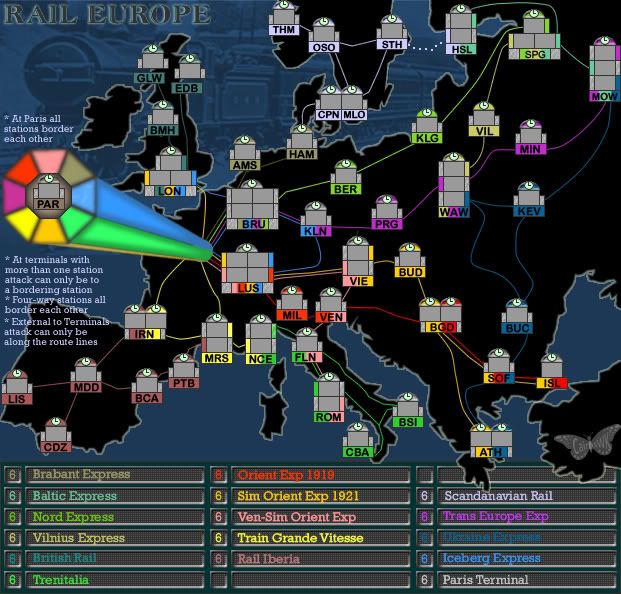
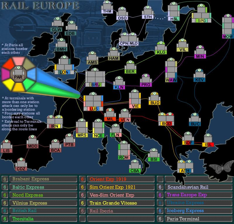
V2 Update

Bonuses are not yet calculated, so please don't comment on all the 6s.

* I borrowed some elements from the original concept of RAIL USA re the Paris station.
* All stations now have their clocks
* Please read the destructions carefully - different station configurations in this map mean slightly different things in RAIL Europe.
* Back to the that fabulous blue and black background that WM conceived and was a big hit on the Rail USA map
* Found a decent font for the Bonus Board.

First time I have managed a large and small version 2.

Image

Image

PostPosted: Sat Sep 01, 2007 11:44 pm
by edbeard
So, you're saying the difference in attack style from this to USA is that Moscow North must go through Moscow middle in order to get to Moscow south?


You're moving along quite quickly I'd say. Very good. How do the side by side stations do with 3 digit army counts? (might as well get that out of the way sooner rather than later).

I guess the only thing left to do visually is actual rails instead of lines? (what's that slow down? well when you work so quickly we expect results!!!)

I'll wait to think about gameplay until you've put out a map with bonuses.

PostPosted: Sat Sep 01, 2007 11:52 pm
by cairnswk
edbeard wrote:So, you're saying the difference in attack style from this to USA is that Moscow North must go through Moscow middle in order to get to Moscow south?
yes


You're moving along quite quickly I'd say. Very good. How do the side by side stations do with 3 digit army counts? (might as well get that out of the way sooner rather than later).

edbeard. they shouldn't be a problem as these station boxes were lifted straight from the configuration of RAIL USA where that was sorted.

I guess the only thing left to do visually is actual rails instead of lines? (what's that slow down? well when you work so quickly we expect results!!!)
yes...luv the expectations, but the quenching won't be as fast. I have asked WM to supply rail lines and will advise him when I am ready to put them on. I don't want to do that just yet in case I have to modify station positions due to someone being discontent with attack plans.

I'll wait to think about gameplay until you've put out a map with bonuses.

I'll try and work the bonuses shortly in the next day or so.

Bonuses

PostPosted: Sun Sep 02, 2007 8:24 am
by cairnswk
How about these bonuses?

5 Brabant Exp
3 Baltic Exp
5 Nord Exp
2 Vilnius Exp
2 British Rail
3 Trenitalia
8 Orient Exp 1919
8 Sim Orient Exp
7 Ven-Sim Or Exp
5 TGV
3 Rail Iberia
2 Scandanavian Rail
7 TEE
5 Ukraine Exp
6 Iceberg Exp
8 Paris

Re: Bonuses

PostPosted: Sun Sep 02, 2007 9:08 am
by cena-rules
cairnswk wrote:How about these bonuses?

5 Brabant Exp
3 Baltic Exp
5 Nord Exp
2 Vilnius Exp
2 British Rail
3 Trenitalia
8 Orient Exp 1919
8 Sim Orient Exp
7 Ven-Sim Or Exp
5 TGV
3 Rail Iberia
2 Scandanavian Rail
7 TEE
5 Ukraine Exp
6 Iceberg Exp
8 Paris


seem fine.

PostPosted: Sun Sep 02, 2007 10:46 am
by Unit_2
i don't realy see a differce in this t othe USA one. i think for you to make this you need to make it look alot differnt... its just way to close to the USA one.

PostPosted: Sun Sep 02, 2007 11:03 am
by gimil
Unit_2 wrote:i don't realy see a differce in this t othe USA one. i think for you to make this you need to make it look alot differnt... its just way to close to the USA one.


its has a similar theme while looking very much diffirent.

Re: Bonuses

PostPosted: Sun Sep 02, 2007 11:31 am
by cairnswk
cena-rules wrote:
cairnswk wrote:How about these bonuses?

5 Brabant Exp
3 Baltic Exp
5 Nord Exp
2 Vilnius Exp
2 British Rail
3 Trenitalia
8 Orient Exp 1919
8 Sim Orient Exp
7 Ven-Sim Or Exp
5 TGV
3 Rail Iberia
2 Scandanavian Rail
7 TEE
5 Ukraine Exp
6 Iceberg Exp
8 Paris


seem fine.


Thanks cena-rules :)

PostPosted: Sun Sep 02, 2007 11:40 am
by cairnswk
Unit_2 wrote:i don't realy see a differce in this t othe USA one. i think for you to make this you need to make it look alot differnt... its just way to close to the USA one.


Thanks for your post Unit_2.
I developed the initial concept for both maps and there are subtle differences in the gameplay. There would be no objection anyway I'm sure if they were both the same as most of the maps in CC are the same gameplay just different geographies.
I can asure you if I have opportunity to do RAIL AUSTRALIA and RAIL ASIA and RAIL AFRICA, there will also be some subtle differences, but I think it is important that having developed a winning formula for RAIL USA in the graphics, we continue that to some extent in these similar themed maps. That is my intention anyway.
And I am sure there will be no objection from the European collegues to have a home-based version of a theme. I don't think the USA holds a monopoly on any theme, do you?

PostPosted: Sun Sep 02, 2007 11:41 am
by cairnswk
gimil wrote:
Unit_2 wrote:i don't realy see a differce in this t othe USA one. i think for you to make this you need to make it look alot differnt... its just way to close to the USA one.


its has a similar theme while looking very much diffirent.


Thanks gimil...yes it is a similar theme and looks somewhat different.