Conquer Club

WWII Europe

Care to peruse completed maps? Take a stroll through the Atlas.

Moderator: Cartographers

Forum rules
Please read the Community Guidelines before posting.

WWII Europe

Postby Qwert on Wed Aug 15, 2007 3:19 pm

small
http://i195.photobucket.com/albums/z188 ... hanges.png
Large
http://i195.photobucket.com/albums/z188 ... hangeL.png

xml code
http://www.fileden.com/files/2008/11/25 ... Finaly.xml

xml,checher
http://www.conquerclub.com/mapmaker/index.php


Map description
name-WWII EUROPE

dimension
small 630x600
large 840x800

Number of territory 110

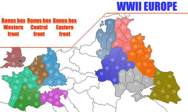
Maps is create from three part
1.WESTERN FRONT
contain 6 countries with 38 territory
-West Germany 8territory
-Sigfried Defence 6 territory
-North Italy 6territory
-Vichy France 6territory
-France 9territory
-Britain 3territory

2.CENTRAL CAMPAIGN
contain 5 country with 26 territory
-East Germany 4 territory
-Poland 5 territory
-East prussia 3 territory
-Central Europe 6 territory
-Balkans 8 territory

3.EASTERN FRONT
contain 6 country with 44 territory
-von Leeb 5territory
-von Bock 7 territory
-von Rundsthedt 7territory
-Moscow Army 10 territory
-Leningrad Army 7 territory
-Stalingrad Army 8 territory

No bonus territory 2
-K(neigbour territory L2)
-WTF(attack territory use for conection betwen V6 and N6)

Special Features

Extra bonuses:
-Western Front -hold any three stars(territory with stars-UK1,F1,W6,N3)

-Central Campaign-Hold Berlin(territory Berlin G4)

-Eastern Front-hold all stars(territory with stars-L2,M2,SA2)

Special gameplay
Bombardment-attack from D1 to UK3,attack from D6 to UK1,attack from W1 to UK2.

One way attack list
Uk3 to F2
V6 to WTF
WTF to N6
F3 to D1
F4 to D2
D4 to D3
D2 to F3
G4 to W2
W3 to G1
C6 to W8
N1 to B1
B1 to N1
vR4 to SA6
SA6 to vR4
vR2 to SA8
SA8 to vR2
M4 to vB3
vB3 to M4
vL4 to L1
L1 to vL4
E3 to vL2
vL1 to P4
P4 to vB7
vB5 to B4
B5 to vR4
----------------

new 6 oktob
http://i195.photobucket.com/albums/z188 ... 06oktb.png
new 25 sept
http://i195.photobucket.com/albums/z188 ... 25sept.png
new 12 sept
http://i195.photobucket.com/albums/z188 ... 12sept.png
new 6 sept
http://i195.photobucket.com/albums/z188 ... 06sept.png
new 4 sept
http://i195.photobucket.com/albums/z188 ... 04sept.png
new 31 avg
http://i195.photobucket.com/albums/z188 ... 031avg.png
new 28 avg
http://img399.imageshack.us/img399/5326 ... 302jx3.png
new 25 avg
http://img147.imageshack.us/img147/1435 ... 302wn8.png
http://i195.photobucket.com/albums/z188 ... 015avg.png
new 11
http://i195.photobucket.com/albums/z188 ... 011avg.png

Like i say before,i will try to create WWII EUROPE colecting two mine map-WWII EASTERN FRONT and WWII WESTERN FRONT together with third part WWII CENTER FRONT.
Last edited by oaktown on Tue Mar 10, 2009 6:26 pm, edited 62 times in total.
Reason: [Beta]
Image
NEW REVOLUTION-NEW RANKS PRESS THESE LINK viewtopic.php?f=471&t=47578&start=0
User avatar
Major Qwert
SoC Training Adviser
 
Posts: 9262
Joined: Tue Nov 07, 2006 5:07 pm
Location: VOJVODINA

Postby DiM on Wed Aug 15, 2007 3:28 pm

first big problem size :roll:
it is 1000px wide and already some terits are very squished. if you reduce it even more it will look like crap. :(
ā€œIn the beginning God said, the four-dimensional divergence of an antisymmetric, second rank tensor equals zero, and there was light, and it was good. And on the seventh day he rested.ā€- Michio Kaku
User avatar
Major DiM
 
Posts: 10415
Joined: Wed Feb 14, 2007 6:20 pm
Location: making maps for scooby snacks

Postby Coleman on Wed Aug 15, 2007 3:33 pm

I say he does it anyway. I print out most of the maps and resize them for playing IRL, I don't really care if it makes the site or not.

If the moderators here have a problem with that maybe they can suggest where in the forums he could do this if not in the conceptual section of the map development forums.
Warning: You may be reading a really old topic.
User avatar
Sergeant Coleman
 
Posts: 5402
Joined: Tue Jan 02, 2007 10:36 pm
Location: Midwest

Postby Qwert on Wed Aug 15, 2007 5:10 pm

Yes big problem is size,i will try to put size down,but to put size to be 640px will be very dificulty to read,or to put circle in terittory.
Image
NEW REVOLUTION-NEW RANKS PRESS THESE LINK viewtopic.php?f=471&t=47578&start=0
User avatar
Major Qwert
SoC Training Adviser
 
Posts: 9262
Joined: Tue Nov 07, 2006 5:07 pm
Location: VOJVODINA

Postby edbeard on Wed Aug 15, 2007 5:42 pm

sorry qwert as this is slightly off topic (by the way your map is off to a very nice start)

Maybe at some point in the near future, BOB will become an official part of CC. I say this because of its severe importance to a minority of players. Those who are colourblind cannot play without it. And, many others who are not depend on it as well.

Anyway, possibly for a few extreme cases, some maps will not have to put the names of territories onto the map. Instead, the XML and BOB would allow highlighting of the territory to see its name. After a few games or perhaps in the first game, players would learn the names so as not to have to depend on it totally, but will still have it at their use. Yes it might be slightly cumbersome, but if it allows cartographers to make a map that could not usually be made because of the size limits (which makes putting army circles and names whilst keeping it clear and good looking difficult if not impossible for some maps) then I say it should at least be considered.

I'm not saying every map should be allowed this freedom, but it's just an idea so if it allows us to get more maps then I say why not. Some maps have great potential and we should try to use all the tools available to help them become part of CC.
User avatar
Lieutenant edbeard
 
Posts: 2501
Joined: Thu Mar 29, 2007 12:41 am

Postby DiM on Thu Aug 16, 2007 3:39 am

qwert wrote:Yes big problem is size,i will try to put size down,but to put size to be 640px will be very dificulty to read,or to put circle in terittory.


actually you need to make it down to 630 wide and 600 tall for the small and 840 wide and 800 tall for the large

here's a resize for the small at 630 width.

look at the terits. you have no place for names and army circles.

i say you should go ahead and do just the central front and wait a little more to do this map perhaps some future changes (like increase in map size or clickable maps) will allow it to be good. at this point unfortunatelly it is impossible.

Image
ā€œIn the beginning God said, the four-dimensional divergence of an antisymmetric, second rank tensor equals zero, and there was light, and it was good. And on the seventh day he rested.ā€- Michio Kaku
User avatar
Major DiM
 
Posts: 10415
Joined: Wed Feb 14, 2007 6:20 pm
Location: making maps for scooby snacks

Postby Qwert on Thu Aug 16, 2007 3:23 pm

well i manage to resize map for 1000x700 to 850x500
Image
Image
NEW REVOLUTION-NEW RANKS PRESS THESE LINK viewtopic.php?f=471&t=47578&start=0
User avatar
Major Qwert
SoC Training Adviser
 
Posts: 9262
Joined: Tue Nov 07, 2006 5:07 pm
Location: VOJVODINA

Postby KEYOGI on Thu Aug 16, 2007 4:05 pm

If you're not going to use all that space in Russia, perhaps rotate the map slightly and crop the image. That should allow you to make the actual playable map bigger.
Sergeant 1st Class KEYOGI
 
Posts: 1632
Joined: Tue Oct 10, 2006 6:09 am

Postby DiM on Thu Aug 16, 2007 4:18 pm

the text is almost impossible to see at this point. imagine how it looks at 630*600 :roll:
ā€œIn the beginning God said, the four-dimensional divergence of an antisymmetric, second rank tensor equals zero, and there was light, and it was good. And on the seventh day he rested.ā€- Michio Kaku
User avatar
Major DiM
 
Posts: 10415
Joined: Wed Feb 14, 2007 6:20 pm
Location: making maps for scooby snacks

Postby d.gishman on Thu Aug 16, 2007 8:11 pm

yeah, you have a lot of wasted space going on in Russia there - you might want to change the angle a bit
User avatar
Sergeant 1st Class d.gishman
 
Posts: 310
Joined: Wed Apr 04, 2007 11:11 pm

Postby unriggable on Thu Aug 16, 2007 8:43 pm

Make sure Britain is attackable in this version.
Image
User avatar
Cook unriggable
 
Posts: 8037
Joined: Thu Feb 08, 2007 9:49 pm

Postby Qwert on Fri Aug 17, 2007 9:43 am

KEYOGI Posted: 16 Aug 2007 21:05 Post subject:

--------------------------------------------------------------------------------

If you're not going to use all that space in Russia, perhaps rotate the map slightly and crop the image. That should allow you to make the actual playable map bigger.

I dont sure what you mean?

DiM Posted: 16 Aug 2007 21:18 Post subject:

--------------------------------------------------------------------------------

the text is almost impossible to see at this point. imagine how it looks at 630*600

Strange,i create font to be more readable then World 2.1.because hes font is even smaler then these font.
Image
NEW REVOLUTION-NEW RANKS PRESS THESE LINK viewtopic.php?f=471&t=47578&start=0
User avatar
Major Qwert
SoC Training Adviser
 
Posts: 9262
Joined: Tue Nov 07, 2006 5:07 pm
Location: VOJVODINA

Postby Coleman on Fri Aug 17, 2007 10:02 am

Image
Warning: You may be reading a really old topic.
User avatar
Sergeant Coleman
 
Posts: 5402
Joined: Tue Jan 02, 2007 10:36 pm
Location: Midwest

Postby DiM on Fri Aug 17, 2007 10:20 am

i wonder if coleman put that image to:


1. represent the difference between fonts

or

2. to make us all realize how really big is world 2.1 and how other maps should be allowed to be bigger.


:roll:
ā€œIn the beginning God said, the four-dimensional divergence of an antisymmetric, second rank tensor equals zero, and there was light, and it was good. And on the seventh day he rested.ā€- Michio Kaku
User avatar
Major DiM
 
Posts: 10415
Joined: Wed Feb 14, 2007 6:20 pm
Location: making maps for scooby snacks

Postby Coleman on Fri Aug 17, 2007 10:22 am

KEYOGI wrote:If you're not going to use all that space in Russia, perhaps rotate the map slightly and crop the image. That should allow you to make the actual playable map bigger.

Image
Are you serious? :shock:
Warning: You may be reading a really old topic.
User avatar
Sergeant Coleman
 
Posts: 5402
Joined: Tue Jan 02, 2007 10:36 pm
Location: Midwest

Postby gimil on Fri Aug 17, 2007 10:29 am

he said rotate slightly lol
What do you know about map making, bitch?

natty_dread wrote:I was wrong


Top Score:2403
User avatar
Corporal 1st Class gimil
 
Posts: 8599
Joined: Sat Mar 03, 2007 12:42 pm
Location: United Kingdom (Scotland)

Postby tim02 on Fri Aug 17, 2007 10:32 am

Coleman what KEYOGI meant was rotate the the map into russia so it can be bigger, that way they don't waste all that room in russia, he didn't mean rotate the entire thing :roll:
User avatar
Colonel tim02
 
Posts: 249
Joined: Fri Mar 16, 2007 7:51 pm
Location: Vancouver

Postby Coleman on Fri Aug 17, 2007 10:34 am

Perhaps one of you could demonstrate how best to do that without screwing up the whole map.
Warning: You may be reading a really old topic.
User avatar
Sergeant Coleman
 
Posts: 5402
Joined: Tue Jan 02, 2007 10:36 pm
Location: Midwest

Postby Qwert on Fri Aug 17, 2007 2:44 pm

Thanks coleman.
Well i dont like these,but i rotate map,and resize to 800x600,but still i dont get to map be biger.
Image
Image
NEW REVOLUTION-NEW RANKS PRESS THESE LINK viewtopic.php?f=471&t=47578&start=0
User avatar
Major Qwert
SoC Training Adviser
 
Posts: 9262
Joined: Tue Nov 07, 2006 5:07 pm
Location: VOJVODINA

Postby Qwert on Fri Aug 17, 2007 3:51 pm

Coleman if you dont notice,when i put dimension of font ,i look small map of world 2.1,if i create map with these world 2.1 dimension,then mine font will be biger.
Image
NEW REVOLUTION-NEW RANKS PRESS THESE LINK viewtopic.php?f=471&t=47578&start=0
User avatar
Major Qwert
SoC Training Adviser
 
Posts: 9262
Joined: Tue Nov 07, 2006 5:07 pm
Location: VOJVODINA

Postby mibi on Fri Aug 17, 2007 4:35 pm

DiM wrote:
2. to make us all realize how really big is world 2.1 and how other maps should be allowed to be bigger.


:roll:


for real. we already have a map thats 'against the rules' and no one seems to have a problem with it. i mean the players that is.
User avatar
Captain mibi
 
Posts: 3350
Joined: Thu Mar 01, 2007 8:19 pm
Location: The Great State of Vermont

Postby Qwert on Fri Aug 17, 2007 5:28 pm

I complete agree with you mibi,if some map people like then Andy must find some solution for these,now its look that rules only not count for world 2.1,but people like these map,also i can not create these map to be smaler then now.
Image
NEW REVOLUTION-NEW RANKS PRESS THESE LINK viewtopic.php?f=471&t=47578&start=0
User avatar
Major Qwert
SoC Training Adviser
 
Posts: 9262
Joined: Tue Nov 07, 2006 5:07 pm
Location: VOJVODINA

Postby gimil on Fri Aug 17, 2007 5:40 pm

I agree also there trying to fix something that isn't broken. I have never heard anyone complain about the map sizes, EVER.
What do you know about map making, bitch?

natty_dread wrote:I was wrong


Top Score:2403
User avatar
Corporal 1st Class gimil
 
Posts: 8599
Joined: Sat Mar 03, 2007 12:42 pm
Location: United Kingdom (Scotland)

Postby tim02 on Fri Aug 17, 2007 6:40 pm

I agree with you all world 2.1 is only fun because of it's size, like if you look at doodle earth (just an example) and you are down to 1 territory,
you hardly feel intimidated because you own a percentage of the map and in a escalating game you can still lose,
but if you look at world 2.1 and it's an escalating game your enemy might through in the sack if he's down to one place instead of using the cheapness of escalating cards to his advantage
User avatar
Colonel tim02
 
Posts: 249
Joined: Fri Mar 16, 2007 7:51 pm
Location: Vancouver

Postby hulmey on Fri Aug 17, 2007 8:16 pm

I agree also...Have said this in DIM's map thread as well. Just a point to note mibi and coleman. Your Supermax prison map does not meet the size guide lines either!!!
[img]http://img801.imageshack.us/img801/9761/41922610151374166770386.jpg[/mg]
User avatar
Lieutenant hulmey
 
Posts: 3742
Joined: Fri Nov 03, 2006 7:33 am
Location: Las Vegas

Next

Return to The Atlas

Who is online

Users browsing this forum: No registered users