Conquer Club

District of Alaska - v14.1 [2015-25-05] pg16 [QUENCHED]

Care to peruse completed maps? Take a stroll through the Atlas.

Moderator: Cartographers

Forum rules
Please read the Community Guidelines before posting.

District of Alaska - v14.1 [2015-25-05] pg16 [QUENCHED]

Postby Seamus76 on Mon Feb 18, 2013 1:25 am

ImageImageImageImageImage

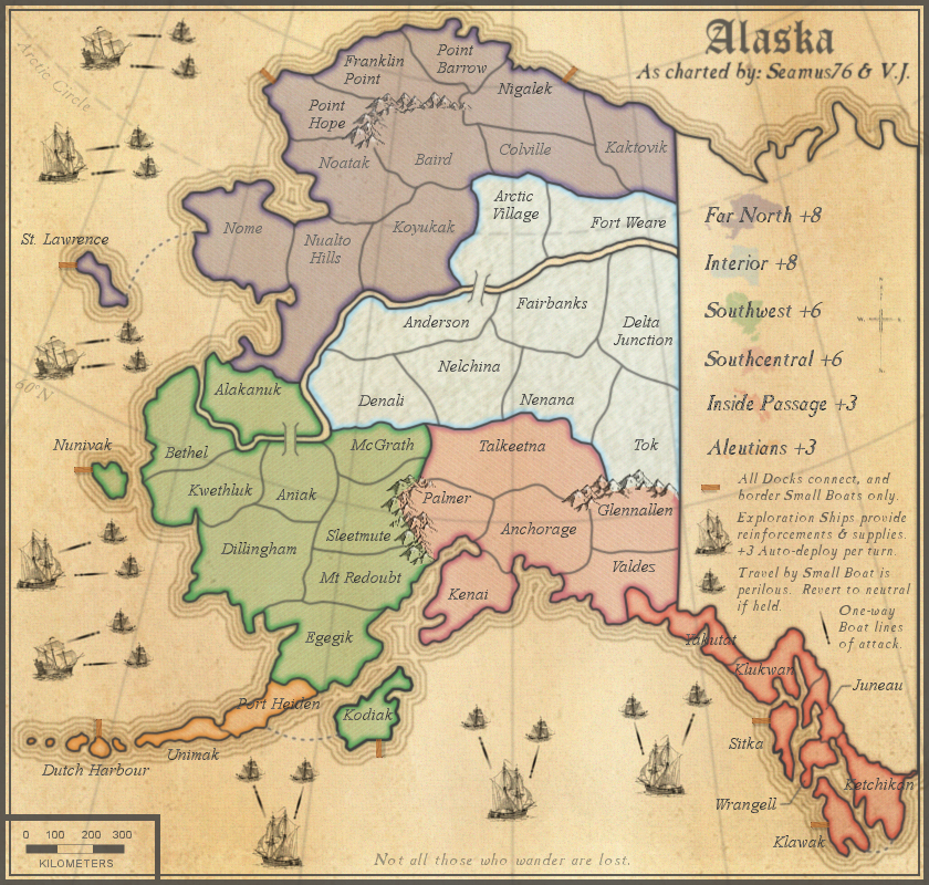
Map Name:Alaska
Mapmaker(s): Seamus76 & V.J.
Number of Territories: 72
Special Features: Too many to name
What Makes This Map Worthy of Being Made: Beautifully crafted, soft graphics with earthy undertones brings players closer than ever before to battling it out in the land of the midnight sun. Auto-deploys, killer neutrals, decays, and Super Region bonuses make this one of the most anticipated maps to come in over a decade.

"The rich graphics bring you in, but it's the gameplay that keeps you coming back." says CC Map Reviewer Mas Sue67

Description: "Not all those who wander are lost."
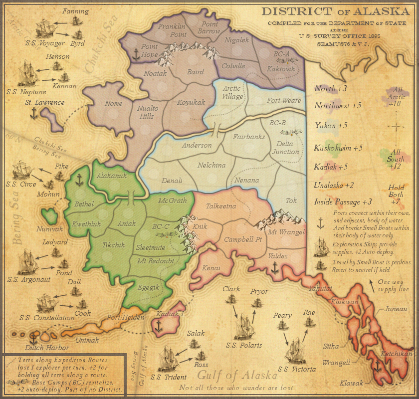
District of Alaska was the designation for Alaska from 1890 through 1912. This map takes place c1895, prior to the Gold Rush, and plays off the arduous task of charting and exploring what some call the Last Frontier. Alaska is also the largest state in the US, and larger than all but 18 Countries in the World.

TERRITORIES

72 territories in total
8 Exploration Ships = +2 auto-deploy
16 Small Boats = Start 2n, and revert to 2n at the top of each turn if held.
7 Ports which are connected to Ports within their own, and adjacent, body of water. They attack, and are attacked by, Small Boats within their body of water only.
Expedition Routes = 12 total terts. Each starts 1n, and loses 1 troop per turn. (Except for Port Heiden, which starts 2n)

BONUSES

Region Bonuses = 7 regions in total (bonuses +2 to +7)
Super Region Bonus = 3 super regions in total (bonuses +7 to +15)
Expedition Route Bonus = +2 for holding all terts along a route (each tert along the route loses 1 troop per turn)
Base Camp Bonus = +2 Auto-deploy (all start 3n)


STARTING POINTS

Currently 37 territories can be starting regions (29 regular terts, and 8 Large Ships).

2p = 11 each = 22 total (9 reg terts plus 2 Large Ships per player)
3p = 11 each = 28 total (9 reg terts plus 2 Large Ships per player)
4p = 8 each = 32 total (7 reg terts plus 1 Large Ship per player)
5p = 6 each = 30 total (5 reg terts plus 1 Large Ship per player)
6p = 5 each = 30 total (4 reg terts plus 1 Large Ship per player)
7p = 5 each = 35 total (4 reg terts plus 1 Large Ship per player)
8p = 4 each = 32 total (3 reg terts plus 1 Large Ship per player)

CURRENT MAP VERSION

v14.1 - Large (840x800)
Click image to enlarge.
image


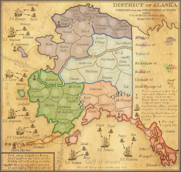
v14.1 - Small (630x600)
Click image to enlarge.
image


CURRENT UPDATE INFO - 2014-23-02:
show


v14.1 - Small (630x600)-with all 888's only
show


MAP VERSION - v11.7 - Large (840x800) - Color Blind Tests:
show


OLD MAP VERSIONS:
show


OLD UPDATE INFO:
show
Attachments
Alaska XML v8.1.xml
Final XML as of 2014-23-02 v8.1
(29.15 KiB) Downloaded 2039 times
Last edited by Seamus76 on Fri May 29, 2015 10:07 am, edited 84 times in total.
User avatar
Sergeant 1st Class Seamus76
 
Posts: 1574
Joined: Fri Feb 25, 2011 5:41 pm
Location: Atlanta, GA

Re: Alaska - v1.0 Large (840x800)

Postby Oneyed on Mon Feb 18, 2013 2:44 am

I like it (you have your own style).
what is TBD territories?
did you thought about any story (golden rushes)?

Oneyed
User avatar
Private 1st Class Oneyed
 
Posts: 1058
Joined: Sat Dec 10, 2011 12:29 pm

Re: Alaska - v1.0 Large (840x800)

Postby x-raider on Mon Feb 18, 2013 3:16 am

Sweet...
(No feedback as of yet)
User avatar
Corporal 1st Class x-raider
 
Posts: 248
Joined: Tue Nov 17, 2009 5:32 am
Location: Lost in the Complexities of the Undiscovered Universe

Re: Alaska - v1.0 Large (840x800)

Postby thenobodies80 on Mon Feb 18, 2013 5:03 am

Visually, I like it...it's clear, color are really visible but soft, nothing hurts my eyes. Yeah, I like it.
From a game perspective, i think that the map could be mo re interesting. I'm not an Alaska expert, but if you tell me that name the first thing that I think is the Gold Rush, then natural places, fishing.
Imo it would be interesting to see something additional on the map, just to move a bit from the classic standard gameplay.

A question, why ports are one way? I got the dock/ports connection etc etc, just I'm wondering what you' re trying to achieve in having them one way. :P

Nobodies
User avatar
Sergeant 1st Class thenobodies80
 
Posts: 5400
Joined: Wed Sep 05, 2007 4:30 am
Location: Milan

Re: Alaska - v1.0 Large (840x800)

Postby chapcrap on Mon Feb 18, 2013 7:45 am

I like the idea.

Too many docks, not enough ports. At least with that bonus structure. Having a +3 with one choke point is no bueno.
Lieutenant chapcrap
 
Posts: 9686
Joined: Sun Feb 03, 2008 12:46 am
Location: Kansas City

Re: Alaska - v1.0 Large (840x800)

Postby AndyDufresne on Mon Feb 18, 2013 10:29 am

I'd kind of like to see the theme and color and general aesthetic of the map go somewhere different. The natural landscape of Alaska---tremendous forests, mountains, rivers---are essentially nonexistent in this map. I can see that you've got a certain style that you've used in other maps, but I'd like you to branch out and see something new! Give yourself a challenge. Best of luck.


--Andy
User avatar
Corporal 1st Class AndyDufresne
 
Posts: 24935
Joined: Fri Mar 03, 2006 8:22 pm
Location: A Banana Palm in Zihuatanejo

Re: Alaska - v1.0 Large (840x800)

Postby BGtheBrain on Mon Feb 18, 2013 10:38 am

*****
Last edited by BGtheBrain on Fri Jun 23, 2017 9:40 am, edited 1 time in total.
User avatar
Captain BGtheBrain
 
Posts: 2770
Joined: Thu Sep 02, 2010 2:50 pm

Re: Alaska - v1.0 Large (840x800)

Postby Seamus76 on Mon Feb 18, 2013 12:27 pm

Thanks for the feedback and comments everyone. I'm hoping we can all work out the gameplay on this one as I think collectively we can come up with something unique and fun.

Oneyed wrote:I like it (you have your own style).
what is TBD territories?
did you thought about any story (golden rushes)?

Thanks Oneyed. Like you I do enjoy making a specific style of map.

x-raider wrote:Sweet...
(No feedback as of yet)

Thanks, x. Let this one marinate and swing back by when you're ready.

thenobodies80 wrote:Visually, I like it...it's clear, color are really visible but soft, nothing hurts my eyes. Yeah, I like it.

Thanks, I was hoping for some initial feedback like that.

thenobodies80 wrote:From a game perspective, i think that the map could be mo re interesting. I'm not an Alaska expert, but if you tell me that name the first thing that I think is the Gold Rush, then natural places, fishing.
Imo it would be interesting to see something additional on the map, just to move a bit from the classic standard gameplay.

You're right, I'm also looking for more from a gameplay perspective but need to get some things sorted out in my head, and hoping for some feedback to help generate some good ideas.

As for the Gold Rush, fishing, etc. see my response to Andy below.

thenobodies80 wrote:A question, why ports are one way? I got the dock/ports connection etc etc, just I'm wondering what you' re trying to achieve in having them one way. :P

I was actually pulling a piece from another larger map I was working on but kind of put aside for the moment. In that I had Captains around the map, who recruited mates (+2 auto), then there were Ships and Ports around. Ports could only be accessed by ship owning captains, so basically it was a type of conditional border, where you had to have a captain and a ship to access the port. So I was bringing over the kind of protection of the port as being a one way out only for this one, but was hoping to get some ideas on how to nail that down. Let me know your thoughts.

chapcrap wrote:I like the idea.

Too many docks, not enough ports. At least with that bonus structure. Having a +3 with one choke point is no bueno.

Thanks chap. The ships/docks were a way to connect all of the Islands in a different way (all though not exactly original), and cut down on too many lines/sea routes from the islands. See above on the whole port, ship/dock thing, and let me know any ideas you might have on numbers.

I'm not sure there are too many choke points on those though. The Islands where the ships/docks are would all have to be protected as well as other borders, so for ex. the Aleutians have 3 ways that would need to be protected. From Kodiak, Egegik, and all the other ships/docks attacking Dutch Harbour. Inside passage also has 3 terts that would need to be protected, which just led me to the +3 bonus for both, but I am very open to adding more, taking some away, or lowering the bonuses to +2 (but I think they are pretty good at +3).

AndyDufresne wrote:I'd kind of like to see the theme and color and general aesthetic of the map go somewhere different. The natural landscape of Alaska---tremendous forests, mountains, rivers---are essentially nonexistent in this map. I can see that you've got a certain style that you've used in other maps, but I'd like you to branch out and see something new! Give yourself a challenge. Best of luck.

Thanks for the feedback Andy. Like you say this is pretty much in the style I like. I'm a big fan of antique style maps. With that being said I think the natural landscapes that can help the gameplay can be explored, like forests, etc. The mountains are based on three large mountain ranges, and I'm not sure I would too many more if any, but other impassables are certainly an option.

My vision for the map was a type of "charting" map, before the gold rush, and something simple with an aesthetically pleasing theme and graphics.

BGtheBrain wrote:I will try to add something useful, but i really like the way this looks.


Thanks so much BG.
ImageImageImage
User avatar
Sergeant 1st Class Seamus76
 
Posts: 1574
Joined: Fri Feb 25, 2011 5:41 pm
Location: Atlanta, GA

Re: Alaska - v1.0 Large [2013-02-18] pg1

Postby RjBeals on Mon Feb 18, 2013 2:23 pm

As I read in another topic, "does CC have too many maps?"..

This is a very nice, straightforward, easy to read map.... but it just blends in with the others on this site. You have good graphical talents. I'm with Andy and say you push yourself to make this map stand out, win an award this year. Alaska has some beautiful geographical features. I suggest bringing them into this map, and possibly gameplay.
Image
User avatar
Private RjBeals
 
Posts: 2506
Joined: Mon Nov 20, 2006 5:17 pm
Location: South Carolina, USA

Re: Alaska - v1.0 Large [2013-02-18] pg1

Postby Seamus76 on Fri Feb 22, 2013 11:42 pm

I'd like to get some thoughts on gameplay for this one. Anyone, anyone?

Personally I like the graphics, and I'm not looking to win any awards. I worked pretty hard, and used a lot of new techniques (for me) to get what I think is a really solid map, that would be a good addition to the site and I'm going to keep pushing this one. So let's come up with something cool that will get the community excited.
ImageImageImage
User avatar
Sergeant 1st Class Seamus76
 
Posts: 1574
Joined: Fri Feb 25, 2011 5:41 pm
Location: Atlanta, GA

Re: Alaska - v1.0 Large [2013-02-18] pg1

Postby koontz1973 on Sat Feb 23, 2013 1:47 am

Seamus, sorry it has taken me so long to get round to commenting on this map, but just not sure what to say till today. Graphically, it is OK and as you get better, your drafts are getting better, making my job harder to spot flaws and have something to say. :twisted:

My vision for the map was a type of "charting" map, before the gold rush

Going before this gold rush is a great idea. This is not an old time period. Looking at Alaska and to see the theme you want (charting) here are some ideas for you to incorporate.

Names, these will need to be changed to Russian or Native Alaskan.
Instead of going wild for the impassables, get rid of mountains and woods. Turn these into unexplored areas. This will mean quite a large redraw on your part as some of the regions may not of been explored yet but I think the extra time would make a far better map in the end. Think Greenland map with its large swath of untouched land in the middle. Add in the trails with a heavy decay or killer neutrals.
Mini bonuses to add. Fur trading posts, trails, ports.
A lot of these mini bonuses can be set around the outside of the map. Either on the water or next to the Canadian border, whilst the interior can become very wild. Make it dangerous to go exploring the interior of the map (charting) but also make it worth while as well. Native tribes could provide shelter and food.

Last thought for you. Alaska is big but the map is small. We really have a lot of maps that have around 50 regions. My advice, even if you really hate the other ideas, would be to get at least another 20-30 regions on this map. You said this is a lot of new for you, but new for you is old for players. Try to give them something that resembles what we have but with a twist to it.
Image
User avatar
Lieutenant koontz1973
 
Posts: 6960
Joined: Thu Jan 01, 2009 10:57 am

Re: Alaska - v1.0 Large [2013-02-18] pg1

Postby RjBeals on Sun Feb 24, 2013 6:09 pm

Seamus76 wrote:Personally I like the graphics, and I'm not looking to win any awards.


Fair enough - the draft looks nice. You seem to have a good attitude and enjoy mapping. I'll follow the thread.
Image
User avatar
Private RjBeals
 
Posts: 2506
Joined: Mon Nov 20, 2006 5:17 pm
Location: South Carolina, USA

Re: Alaska - v1.0 Large [2013-02-18] pg1

Postby generalhead on Tue Feb 26, 2013 10:06 pm

Nice looking map buddy.
Sergeant generalhead
 
Posts: 806
Joined: Mon Apr 26, 2010 10:09 pm

Re: Alaska - v1.0 Large [2013-02-18] pg1

Postby Peter Gibbons on Wed Feb 27, 2013 9:21 am

Names, these will need to be changed to Russian or Native Alaskan.

This comment stood out for me. Can I ask why this is a requirement?
User avatar
Major Peter Gibbons
 
Posts: 1077
Joined: Wed Sep 10, 2008 9:21 am
Location: Washington, DC

Re: Alaska - v1.0 Large [2013-02-18] pg1

Postby koontz1973 on Wed Feb 27, 2013 11:43 am

Peter Gibbons wrote:
Names, these will need to be changed to Russian or Native Alaskan.

This comment stood out for me. Can I ask why this is a requirement?

Not a requirement, but if Seamus is after a map that has some history to it, or as he put it, a charting style of map, then the names on the map would not of come about for many years afterwards. Explorers routinely used local/native names for landmarks. The Russian part was due to history and a lot of the names would of had a Russian influence to them.
Image
User avatar
Lieutenant koontz1973
 
Posts: 6960
Joined: Thu Jan 01, 2009 10:57 am

Re: Alaska - v1.0 Large [2013-02-18] pg1

Postby Seamus76 on Wed Feb 27, 2013 12:04 pm

Peter Gibbons wrote:
Names, these will need to be changed to Russian or Native Alaskan.

This comment stood out for me. Can I ask why this is a requirement?


Hey Peter, thank you so much for taking the time to stop by, I really appreciate it and hope you continue to help me work this one out. So if you have any ideas on how to spice up the gameplay just let me know.

Koontz is right, based on the time period I said I'm basing the map on, which is around the turn of the 20th century (1895), a lot of the maps I'm using reference the older names, which although a little foreign to some players makes for a more accurate map. A lot of the names I'm using now though were used then as well, so there won't be too many changes, but for example Barrow was originally called Point Barrow, so I've changed it to that for the next version.

The flip side of that is, as the map maker I do have some creative flexibility to work with where needed, and will certainly use that. One of the main maps I'm using, in addition to a ton of other maps, research, and reference materials is this really nice map...http://alaskaweb.org/maps/map-1895alaska.jpg. As you can see there are a lot of internal areas that aren't on this map so I'm using a bunch of other things to get accurate tert names.

Thanks again, and please come back soon.
ImageImageImage
User avatar
Sergeant 1st Class Seamus76
 
Posts: 1574
Joined: Fri Feb 25, 2011 5:41 pm
Location: Atlanta, GA

Re: Alaska - v1.0 Large [2013-02-18] pg1

Postby Peter Gibbons on Wed Feb 27, 2013 4:26 pm

Seamus76 wrote:
Peter Gibbons wrote:
Names, these will need to be changed to Russian or Native Alaskan.

This comment stood out for me. Can I ask why this is a requirement?


Hey Peter, thank you so much for taking the time to stop by, I really appreciate it and hope you continue to help me work this one out. So if you have any ideas on how to spice up the gameplay just let me know.

Koontz is right, based on the time period I said I'm basing the map on, which is around the turn of the 20th century (1895), a lot of the maps I'm using reference the older names, which although a little foreign to some players makes for a more accurate map. A lot of the names I'm using now though were used then as well, so there won't be too many changes, but for example Barrow was originally called Point Barrow, so I've changed it to that for the next version.

The flip side of that is, as the map maker I do have some creative flexibility to work with where needed, and will certainly use that. One of the main maps I'm using, in addition to a ton of other maps, research, and reference materials is this really nice map...http://alaskaweb.org/maps/map-1895alaska.jpg. As you can see there are a lot of internal areas that aren't on this map so I'm using a bunch of other things to get accurate tert names.

Thanks again, and please come back soon.

Ah, I didn't notice you said you were basing it off 1895--my fault. I understand the desire to be historically accurate, I was just caught a bit that it seemed a requirement by the foundry staff that naming had to be historically accurate.

I like the start of the map. My only initial thought is that a 49 territory map with two +8s and two +6s seems like it will dissuade bonus collection. I understand the interest for accuracy, but maybe the Far North could be divided into two regions--once centered around Nome, the other around Barrow/Prudhoe. You might move Arctic Village and Fort Yukon into the new Barrow/Prudhoe bonus, too.

I also think you might move Egigik and/or Kodiak in with the Aleutians because, again, a 10-territory +6 on a 49 territory map isn't going to be collected too often.

I think changes along those lines would give more balance to the map and make for more dynamic gameplay.

Also, aesthetically, while I like the clean feel of the map, I must say that the color scheme and tone immediately reminds me of the Germany map. I know they aren't exactly the same and others might not feel they are that close, but I just wanted to point that out. I think some changes in color/tone would make this more unique--but that might be down the road.
User avatar
Major Peter Gibbons
 
Posts: 1077
Joined: Wed Sep 10, 2008 9:21 am
Location: Washington, DC

Re: Alaska - v1.0 Large [2013-02-18] pg1

Postby MoB Deadly on Wed Feb 27, 2013 4:58 pm

Holy cow, what a great beginning. I love this map already haha
Image
Art by: codierose | High Score: 2550
User avatar
Corporal 1st Class MoB Deadly
 
Posts: 2381
Joined: Sun Jan 11, 2009 2:07 am

Re: Alaska - v1.0 Large [2013-02-18] pg1

Postby Seamus76 on Mon Mar 04, 2013 1:17 am

CURRENT UPDATE INFO - 2013-03-04:
Thanks everyone for the positive feedback. Here is the second version, which contains a big change/addition to the game play.
- Added Exploration ships, which provide +3 auto-deploy per turn. Each player will start with 1 or 2 depending on the game type. In addition to other territories randomly deployed throughout the map as normal.
- Added Small Boats, which help transport to and from the mainland. Since travel by small boat in these waters is perilous, and risky at best, these small boats revert to 1n at the top of each turn if held.
- The attack arrows indicate the one way attack to and from the Exploration ships.
- Added a little color to the mountains.

Things to do (among other things):
- Add name labels to the Exploration Ships and Small Boats.
- Work to make all of the "mini-map" images more clear, especially the smaller ones towards the bottom of the region bonus list.
- Put a lighter glow behind the tert names to make them stand out more, especially on the smaller islands, etc.
- In addition to the glow I will be adding army number circles to help indicate where the regions exactly are. (ex. ports, islands, etc.)
- Add the rest of the general aesthetic stuff, like ocean labels, etc.

CURRENT MAP VERSION

v2.0 - Large (840x800)
Click image to enlarge.
image
ImageImageImage
User avatar
Sergeant 1st Class Seamus76
 
Posts: 1574
Joined: Fri Feb 25, 2011 5:41 pm
Location: Atlanta, GA

Re: Alaska - v2.0 Large [2013-03-04] pg2

Postby koontz1973 on Mon Mar 04, 2013 2:16 am

Seamus, like the update but some concerns. Docks all connect. This will mean you can get from one side to the other very quickly. Same goes for the ships. All small boats connect to all docks. So a player only needs to take 3 regions to attack other players big ships.
Image
User avatar
Lieutenant koontz1973
 
Posts: 6960
Joined: Thu Jan 01, 2009 10:57 am

Re: Alaska - v2.0 Large [2013-03-04] pg2

Postby Oneyed on Mon Mar 04, 2013 5:13 am

koontz1973 wrote:Seamus, like the update but some concerns. Docks all connect. This will mean you can get from one side to the other very quickly. Same goes for the ships. All small boats connect to all docks. So a player only needs to take 3 regions to attack other players big ships.


agreed.

you could try to divide sea?
there is Gulf of Alaska (with 3 big ships), Chukchi sea (with 2 big ships), Bering sea (with 3 big ships). and Docks connect to small ships in the same sea.

Oneyed
User avatar
Private 1st Class Oneyed
 
Posts: 1058
Joined: Sat Dec 10, 2011 12:29 pm

Re: Alaska - v2.0 Large [2013-03-04] pg2

Postby koontz1973 on Mon Mar 04, 2013 6:16 am

Oneyed wrote:you could try to divide sea?
there is Gulf of Alaska (with 3 big ships), Chukchi sea (with 2 big ships), Bering sea (with 3 big ships). and Docks connect to small ships in the same sea.

Oneyed

Not a bad idea. It would allow for some in fighting and make the game far less open, but still allow some movement.
Image
User avatar
Lieutenant koontz1973
 
Posts: 6960
Joined: Thu Jan 01, 2009 10:57 am

Re: Alaska - v2.0 Large [2013-03-04] pg2

Postby Seamus76 on Mon Mar 04, 2013 12:11 pm

CURRENT UPDATE INFO - 2013-03-04:
So I added the three bodies of water labels, and changed the Deck legend text to say "All docks connect, and border Small Boats within their bodies of water". Obviously the labels need work, but would labeling the waters and including the text in the legend be enough?
- Also removed the dock at Nigalek. One it's in another body of water, and two to help slow down the movement around the map and increase strategic gamepaly.

Things to do (among other things):
- Add name labels to the Exploration Ships and Small Boats.
- Work to make all of the "mini-map" images more clear, especially the smaller ones towards the bottom of the region bonus list.
- Put a lighter glow behind the tert names to make them stand out more, especially on the smaller islands, etc.
- In addition to the glow I will be adding army number circles to help indicate where the regions exactly are. (ex. docks, islands, etc.)
- Add the rest of the general aesthetic stuff.

CURRENT MAP VERSION

v2.1 - Large (840x800)
Click image to enlarge.
image
ImageImageImage
User avatar
Sergeant 1st Class Seamus76
 
Posts: 1574
Joined: Fri Feb 25, 2011 5:41 pm
Location: Atlanta, GA

Re: Alaska - v2.1 Large [2013-03-04] pg2

Postby koontz1973 on Mon Mar 04, 2013 12:14 pm

I like it.
Image
User avatar
Lieutenant koontz1973
 
Posts: 6960
Joined: Thu Jan 01, 2009 10:57 am

Re: Alaska - v2.1 Large [2013-03-04] pg2

Postby Seamus76 on Thu Mar 07, 2013 1:03 am

CURRENT UPDATE INFO - 2013-03-07:
- Added names to the large ships. Does anyone have any thoughts on a nice, simple naming convention for the Small Boats? Something that doesn't take up very much room, and wouldn't need additional explanation elsewhere, as space is limited. SB-Nep-1, SB-Nep-2 for the S.S. Neptune Small Boats, maybe?
- Moved some of the ships sets around, as well as the names of the waters.
- I also added some army circles to the Far North just to see what they would look like.

As for the docks, and which ship sets they attack, is it clear? Right now it looks like St Lawrence is attacked by both the Bearing Sea ships, and the Chukchi Sea, depending on if the orientation of the dock determines which waters attacks it. (I don't mind it being attacked by both, just wondering.) Or should St Lawrence dock be turned up so that it goes into Chukchi rather than looking like both. This would give those two ship sets two docks, and the 3 in Bearing Sea only 2. Thoughts?

Things to do (among other things):
- Determine naming convention and add name labels to the Small Boats.
- Work to make all of the "mini-map" images more clear, especially the smaller ones towards the bottom of the region bonus list.
- Put a lighter glow behind the tert names to make them stand out more, especially on the smaller islands, etc.
- In addition to the glow I will be adding army number circles to help indicate where the regions exactly are. (ex. docks, islands, etc.)
- Add the rest of the general aesthetic stuff.

CURRENT MAP VERSION

v2.2 - Large (840x800)
Click image to enlarge.
image
ImageImageImage
User avatar
Sergeant 1st Class Seamus76
 
Posts: 1574
Joined: Fri Feb 25, 2011 5:41 pm
Location: Atlanta, GA

Next

Return to The Atlas

Who is online

Users browsing this forum: No registered users