Page 1 of 5
New Map: Space [Quenched]

Posted:
Tue Apr 25, 2006 7:34 pmby Jota
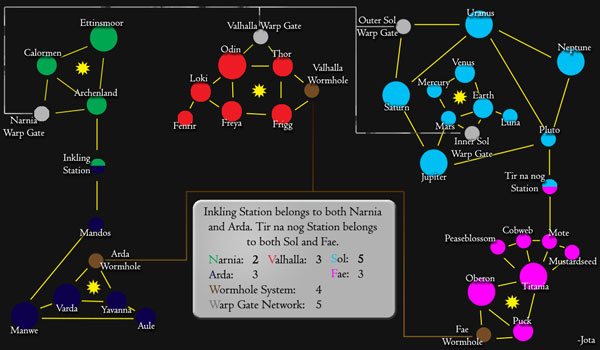
This is the new map I'm working on right now. Note that the graphics are still a bit crude: I fully intend to make it nicer-looking before it's done, but I wanted some feedback on the layout before I did anything that would be too difficult to change.
[url=http://grunk.org/risk/space1-large.jpg]

(Click for large version)[/url]
I thought I'd try to play around a bit with borders and connectivity with this one, not entirely unlike what I did with the Crossword map, but in a rather different way. And hopefully this one will appeal more to the folks who like to feel they're conquering real territory.
I'm interested in hearing both what people think about the general idea and what they think about the specifics of the map.
Constructive criticism only, please.

Posted:
Tue Apr 25, 2006 8:01 pmby supermarcol
I'd like to see more connection out of the warpgate and wormhole systems. The movement between continents is too dependent on them in my opinion, it allows holding almost all continents with 2 points only. Owning them also prevent players to attack each others. Maybe give no extra armies for them?

Posted:
Tue Apr 25, 2006 9:24 pmby DublinDoogey
looks like it would be a good map, it's interesting that you've combined real astrology with mythical and literature astrology. I'm not thinking clear enough right now to really say much else, but looks good so far

Posted:
Tue Apr 25, 2006 9:33 pmby Fieryo
ok, wow. I must say this map is very impressive. im not a big fan of the crossword map, but this one looks interesting to say the least. You have done a nice job of integrating new aspects (joint "countries") and making a very original map that i look forward to playing.

Posted:
Wed Apr 26, 2006 12:27 amby MrConfigT
Good idea for a map, I stared making a star trek or starwars based map, but there are way too many systems to make a cool map.
What you've done though looks like it'll work.
Can't Wait.

Posted:
Wed Apr 26, 2006 9:37 amby bob the fig
it doesn't look very connected, but i like the idea

Posted:
Wed Apr 26, 2006 11:09 amby KoolBak
Jota..thanks for your hard work on the maps..I love the crossword...what about more real type pix for the planets? If you want, I have some cool pix I had been working with..pm me and I will email them to you for your assessment..with all the games I constantly have going and my kids and my biz, I cannot seem to make the time to finish anything worthy of posting....

Posted:
Wed Apr 26, 2006 12:10 pmby Darkfire001
The joint countries is really nifty.

Posted:
Wed Apr 26, 2006 3:03 pmby Jota
supermarcol wrote:I'd like to see more connection out of the warpgate and wormhole systems.
That's interesting. This is actually the third version of the idea. The original concept was to just have one transit system (not both) and to make
all inter-system travel pass through it. That notion passed fairly quickly, and the first full draft had six star systems, both the warp gates and the wormholes (like they are now) and only one pair of systems that were directly connected.
It wasn't until I revised it again to digitize it that I decided to drop one star system and add a second direct link, thinking that would make a good compromise between the remoteness of space and inter-continent connectivity -- it does mean that 80% of them now have direct connections to other star systems. I'm a little worried that if I move any further in that direction that it might take away from the whole warp gate gimmick.
The movement between continents is too dependent on them in my opinion, it allows holding almost all continents with 2 points only. Owning them also prevent players to attack each others. Maybe give no extra armies for them?
Giving high bonuses for holding the transit systems was actually partly intended to
address the problem of star systems being too easy to hold: I wanted it to be worth other players' time and effort to try to control the gate/wormhole that adjacent to your system, so that you can't just sit on it consolidating your borders. Also, I did make sure that every continent bordered on at least two others, generally with multiple border countries at each.
Of course, just because I had reasons doesn't mean they were right: what's the general opinion on this?

Posted:
Wed Apr 26, 2006 5:01 pmby AndyDufresne
I'm interested in the idea of the map. I always like different and unique maps. That said,
---I forsee a lot of continent sitting in this map. Even if you do control the wormhole or warp gate connected to your continent, I still forsee mostly border build ups with little attacking. I'm not sure how to alleviate this problem without adding something similar to more borders. In a large number of maps there is usually a lost continent. Sometimes two in certain maps. They just are too big to hold right away, so no one particularly goes for them. They mostly just become a battle ground for cards or limiting borders for your bonus continent. This map doesn't seem to have an "asia" of sorts. That necessarily isn't a bad thing. I know that exact copies of the original map wouldn't be entertaining to play. But the 'Lost Continent' usually spices up play. Hm, **shrugs**.
---The Legend obviously needs some work, but I'm sure that is coming later. I'd suggest though making the whole continent name correspond with the color on the map, rather than the first letter. And of course centering the wormhole and warp gate names on the legend would help improve the isual quality. Perhaps bolder in font would add some more visual appeal to it.
--Andy

Posted:
Wed Apr 26, 2006 7:12 pmby Marvaddin
Another map I will not play. It doesnt seem a map to me. Its imaginative, of course, but these simple, non-textured graphics, with the black background... ugly!! If you can use some Master of Orion or Ascendancy graphics, a greater image, with a good bakground... the interests would increase. Looks like an WAW map

About the continents, more connections would be good, and not those great bonuses for the Worm / Warp that have only 3 and 4 territories. Make it a more traditional map, and I think I (and many others) will play.

Posted:
Thu Apr 27, 2006 3:20 pmby Jota
AndyDufresne wrote:---I forsee a lot of continent sitting in this map. Even if you do control the wormhole or warp gate connected to your continent, I still forsee mostly border build ups with little attacking.
Hmm. There's a chance that the deep space stations might help alleviate that somewhat: it's impossible for one player to hold Narnia while another player sits on Arda, for example, since they each need to own Inkling Station to collect a continent bonus.
In a large number of maps there is usually a lost continent. Sometimes two in certain maps. They just are too big to hold right away, so no one particularly goes for them.
I'd been thinking that Sol might fill the role of "big, unwieldy continent" somewhat, with its eleven countries and five borders. But maybe it needs to go further.
This also brings up a serious issue I noticed yesterday, but I'll address that in a second post, to make it easier to read.

Posted:
Thu Apr 27, 2006 3:26 pmby Blitzkreig
Marvaddin wrote:Another map I will not play. It doesnt seem a map to me. Its imaginative, of course, but these simple, non-textured graphics, with the black background... ugly!! If you can use some Master of Orion or Ascendancy graphics, a greater image, with a good bakground... the interests would increase. Looks like an WAW map

About the continents, more connections would be good, and not those great bonuses for the Worm / Warp that have only 3 and 4 territories. Make it a more traditional map, and I think I (and many others) will play.
Yeah I'm not a big fan although don't get all up in my face about it

Posted:
Thu Apr 27, 2006 3:37 pmby Jota
Currently, if you can take both Sol and the Warp Gate Network at the same time (difficult, but holding Sol will give you a decent position to attempt it from), then you'll be down to only three borders you need to defend in order to get a bonus of ten armies.
Now, maybe the difficulty of pulling that off justifies it. But probably not. One thing to do would be to reduce the Warp Gates and Wormholes to 4 and 3 respectively. Another thing -- and this would also address some of the other concerns people have had -- would be to add a deep space station between Valhalla and Sol (similar to Inkling Station and Tir na nog Station). That itself brings up two issues, though:
A) Adding another country would bring the map from 40 to 41 countries total. That'd be a slight shame, since 40's a cool number. But that's a minor point.
B) Adding a country there would make it hard to justify not increasing Sol's bonus to 6, since it'd now be a total of 12 countries with six borders. Increasing its bonus could arguably defeat the whole purpose of the exercise (since Sol + Warp Gates would still >= 10). Or maybe the extra border would make it all OK, because it'd make Sol that much harder to control in the first place.
Removing one of the countries from Sol would probably address both of those issues. If I went that route, it'd probably end up being either Mercury, Luna, or Pluto. But that'd make me sad: I'm kinda attached to Sol, what with it being my home and all. Any thoughts on the whole matter?

Posted:
Thu Apr 27, 2006 5:49 pmby AndyDufresne
Hm well...
---Stick with 40 countries. Making the map 41 would be the ignorant thing to do, so I think you are right about not leaning that direction. Some sort of an attack route would help as you suggested (Perhaps a 'Blackhole' or something similar to keep with the space theme). And knocking down the wormholes and warp gates is probably the correct thing to do. Almost could make an argument to knock them ever further to 3 and 2, but probably 4 and 3 would work.
--Andy

Posted:
Thu Apr 27, 2006 11:49 pmby Jota
For the sake of comparison, here are a couple of versions of the map that include a link between Valhalla and Sol. Instead of modifying the Sol system too much, I fiddled with the number of planets in Valhalla instead:
42 countries
40 countries
Despite the fact that 40 seemed like a nicer number, I think I might be slightly favoring the first of these two, since Valhalla seems a bit more balanced there.
(Note: I'll be adding the lines linking up the wormholes and warp gates back in later; I just didn't want to put them in when I'd just be likely to be moving them again. Also, do keep in mind that the graphics are intentionally still slightly crude at this stage. While I welcome suggestions for improving them, please don't judge the map based on the fact that it's not entirely pretty yet.)

Posted:
Fri Apr 28, 2006 6:16 pmby AndyDufresne
I think 42 seems like it gives an overall balance better than the 40. Valhalla then becomes more of a midsized continent which I believe is the way to go. The map is coming along, hopefully I'll get around to commenting more on it later.
--Andy

Posted:
Sun Apr 30, 2006 12:55 amby Jota
Now that the layout may be approaching finished, I'm turning towards appearances.
This is the current version I'm working from.
I've roughed three different styles of planet images. Saturn, Venus and Mars are in Style A; Odin, Loki and Fenrir are in Style B; and Titania, Puck and Peaseblossom are in Style C. Which is preferred?
How do people feel about the straight lines linking "adjacent" planets? Are they fine the way the are, or should they be replaced with something fancier?
What about the "star" images? Are the current iconic ones fine, or should they be replaced with something more interesting/realistic?
Is the difference between the three planet sizes obvious enough? How are the color choices for the continents (and the border lines)? How's the legend now? Are there any other aesthetic issues people want addressed?

Posted:
Sun Apr 30, 2006 5:36 amby freakshow
Personally I like style A better. Keep up the good work Jota this map is looking awsome.

Posted:
Sun Apr 30, 2006 2:20 pmby Marvaddin
A is much better, of course. Why are no mention in the leggend for Yggdrasil? What an ugly legend, too... I expect a new one. What Im not convinced is about these systems warp and worm... will it be a good thing? And for this map I think we dont need backgrounds for the numbers.

Posted:
Sun Apr 30, 2006 2:42 pmby DublinDoogey
I expect a new one.
while you post good advice, don't you think that's a little bossy/blunt. It is
jota's map.

Posted:
Sun Apr 30, 2006 3:33 pmby AndyDufresne
Lets see...
---Legend does need some work. Just kind of seems to stick out and not go with the over all universal flow of the map. Of course adding maybe visuals as planets and stars, or galaxies etc, would help the visual appeal there. Sol, in the legend, is a little hard to read, but once you revamp the legend and make it look more appealing that can easily be dealt with.
---Style A of course as everyone said looks the most appealing. I don't go with it, definitely. And as for the map maybe not needing the number circles, that could be the case, for the countries are either very dark or light enough that most could be seen, but keeping the circles isn't necessarily a bad thing if you do end up using them. They almost seem like an optical illusion though. The ones that nearly touch the outer rim of hte planets seem larger than the ones that stay further inward. I think it is just an illusion, otherwise if not they should all be the same size.
---The yellow lines linking the adjacent planets I like. It actually goes with the space theme. Reminds me of constellations and connecting the dots of the sky. But if you did spruce them up, I'd be interesting to see what you currently have in mind.
===========================
Hopefully I'll be back again to comment further if needed.
--Andy

Posted:
Sun Apr 30, 2006 4:08 pmby freakshow
Marvaddin wrote:I expect a new one..
You know Marv you can be an ass sometimes, or as it may be most of the time.

Posted:
Sun Apr 30, 2006 5:02 pmby Marvaddin
freakshow wrote:Marvaddin wrote:I expect a new one..
You know Marv you can be an ass sometimes, or as it may be most of the time.
Yeah. I, for example, disapprove sending unfinished maps. What do you think you are, huh?
And its not Jota's map simply. It will be used by all Conquer Club players, or its the real goal at least. So I fell free to give my opinion, even if it is against what the maker thinks. Even why this is the objective of the forum, if it was Jota's map simply, no need to a forum, huh? I believe this legend is of low quality, and I honestly expect a new one. If you guys dont expect, if you want play really ugly maps, beg to lack to return 1st version of Indochina and shut up. Im only working to have better maps here, Im giving opinions about maps and not people. And the legend can be this way, but respect I really expect, at minimum.

Posted:
Sun Apr 30, 2006 5:48 pmby Banana Stomper
Marvaddin wrote:...for this map I think we dont need backgrounds for the numbers.
The backrounds are totally necessary here, unless you move the number of players on the area off to the side. Last time i checked, red on red doesn't work so well.

